In this section: |
The Control Panel provides access to logical groupings of all property controls and options in one location. This feature minimizes the need to go to other areas of the application to view or modify application properties.
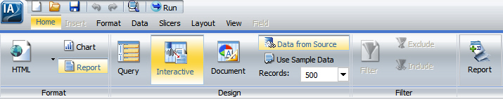
Property controls and options are grouped logically by functionality, using a set of tabs located at the top of the Control Panel. Each tab provides a collection of related groups containing icons (buttons). The tabs, which are located below the Application Main Menu and Quick Access Toolbar, include Home, Insert, Format, Data, Layout, View, and Field, as shown in the following image. The Home tab is selected by default when you first open InfoAssist.
The Control Panel also provides a Series tab when you are creating a chart.
When selected, each tab opens a different view of the Control Panel by exposing groups that contain clustered, highly visible icons. You control some properties just by clicking the icon (button), while others have drop-down menus for selecting options. Some options open dialog boxes that provide additional property controls.
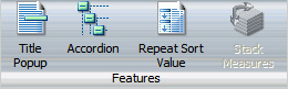
The layout of the Control Panel spans the width of the application window. It displays all property controls using different sized icons and groups, depending on the size of the monitor and application window. When you reduce the size of the application window, some groups, which contain property controls, are collapsed into single buttons as determined by the amount of available space. The following image shows the Features group, from the Format tab, collapsed into a single button.

When a group of property controls is collapsed into a single button, the individual property icons are removed from view, but are still available. Selecting a collapsed group button restores the group to its normal full size and displays all of the individual property icons. The following image shows the expanded Features group.
When expanding a collapsed group, the Control Panel collapses a neighboring group to make enough room to expand the selected group.
When a property control icon (button) or option in a pop-up menu or dialog box is gray in color, that functionality is not available for that report as it currently exists. Some functionality is available for reports only, charts only, or compound documents only. In some situations, selecting one or more options makes other options incompatible with the previously selected ones. As a result, the incompatible options are gray and unavailable for selection. InfoAssist automatically makes incompatible options unavailable (gray) as you create and modify a report.
Note: For some icons, their availability is a result of an administrative setting. If you do not have access to that property, contact your administrator to gain access.
The Home tab enables you to control the most commonly used properties and options from the Format, Design, Filter, and Report groups, as shown in the following image.
The Home tab provides the following property control groups.
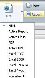
Displays a button showing the current output format plus buttons to toggle between creating a report (the default) or a chart. The drop-down menu for the output format button displays all supported output format options, which include HTML (the default for charts and reports), active report, active Flash, PDF (the default for compound documents), active PDF, Excel 2007 (reports designed in Interactive and Query Design views only), Excel 2000, Excel Formula (reports designed in Interactive and Query Design views only), Excel Pivot (reports designed in Interactive and Query Design views only), and PowerPoint, as shown in the following image.
When you run a report, the output is created in the format that is currently selected. You can also select output format options from the Output Types group in the Format tab of the Control Panel and from the output format button in the Status Bar.
Selecting Report or Chart determines whether report-specific or chart-specific functionality is available in the InfoAssist tool. The default name ReportX or ChartY will be given for each new report or chart created in a given InfoAssist session, where X and Y are numbers that increase in numerical order starting from 1. For more information on switching between multiple reports, see Using the View Tab.
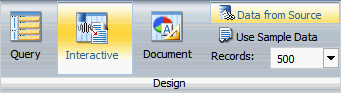
Enables you to select the design mode for creating reports, and design preview options for accessing data. The design preview options include Query Design view, Interactive Design view (the default), or Document view. The design options include Data from Source (the default), Use Sample Data, and Records. The Design group is shown in the following image.
Selecting Interactive Design view displays a preview of the report in the Results Panel as you create the report. Selecting Query Design view displays the Query Design pane in the Results Panel, which provides a large work area for creating the report. Query Design view also reduces processing time because it does not access the actual data source as you create the report.
Selecting Document view displays the Document Layout Canvas in the Results Panel, where you can add text, images, lines, reports, and charts to create a compound document. For more information about Document view, see Using Document View and Building Compound Documents.
Selecting Data from Source uses the selected data source to display a live preview of the output in the Results Panel. Selecting Use Sample Data displays sample data, which reduces processing time by eliminating the need to access the actual data source.
The Records option limits the number of rows retrieved from the data source when Interactive Design view is selected. This feature is useful in reducing response time if you are working with a large amount of data. Type the desired number of rows directly in the Records field, or use the drop-down menu to select one of the preset record limits. The preset choices are All rows, 1, 10, 50, 100, 500, and 1000.
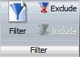
Provides the Filter button, which opens the simple filter dialog box for creating WHERE statements. WHERE statements enable you to select only the data that you want and to exclude unwanted data. You also have options to Exclude or Include an existing Filter, as shown in the following image.
In the simple filter dialog box, you can create simple filters using the Values, Prompt, and Relational Operators menus. For more information, see Using the Field Tab. For more information on creating advanced filters, see Using the Data Tab.
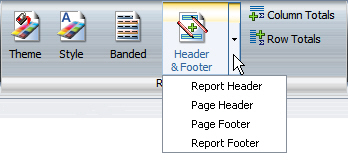
Provides options that you can select to enhance a report, including Theme, Style, Banded (reports only), Header/Footer, Column Totals (reports only), and Row Totals (reports only), as shown in the following image.
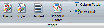
Selecting Theme opens a dialog box where you can select a theme, other than the default (or selected) application theme, to style your report or chart. To select from an assortment of color-coded WebFOCUS StyleSheet themes that are standard with InfoAssist, select the Template button and choose a theme. Appended to the name of each standard theme is the following string: _theme.sty. You can choose black, blue, charcoal, combined gradient, gray, navy, ocean, ruby, or turquoise.
To select a customized Cascading Style Sheet theme created by you or someone else in your organization, select the Managed Reporting button and search for a customized theme in the Other Files folder in the selected Dashboard Domain. You can also select a document styling theme or an application theme to style all reports created in InfoAssist. Use the Environment and Styling section of the Options window, which is accessible by selecting Options in the Application Main Menu. You can also select Change Default Options in the splash (start-up) screen that appears when you launch InfoAssist. For more information, see Environment and Styling.
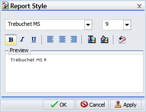
The Style button is available in Query Design view, Interactive Design view, and Document view. Selecting Style opens a dialog box for applying global styling to the entire report. The available styling options are font family, font size, font color, background color, text justification (left, center, right), font styling (bold, italic, underline), and resetting to styles from the template. The styling options are shown in the following image.
For more information about styling reports, see Styling Reports.
For reports only, selecting Banded opens a color selection dialog box for choosing a color that provides an alternating color scheme for the report. The report output will display alternating rows of data, using a white background for one row and a background of the selected color for the next row. This pattern continues throughout the report. For more information, see How to Style Rows of Data With Alternating Colors in a Report.
The following image shows the color selection dialog box that opens when you select the Banded reporting option.
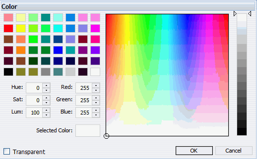
Use the color selection dialog box for choosing colors throughout InfoAssist. When choosing colors, you can click a color square on the left side of the dialog box, or click an area of the color palette on the right side of the dialog box. You can also select colors by typing numbers in the Hue, Sat, and Lum fields, or the Red, Green, and Blue fields. You can also use the up and down arrows next to each field to set numeric values. To make your choice of color transparent, for the purpose of overlay and translucency, select the Transparent check box.
The Header/Footer button is available in Query Design view, Interactive Design view, and Document view.
Clicking the Header/Footer button opens the Heading & Footing dialog box, from which you can add and style headings and footings.
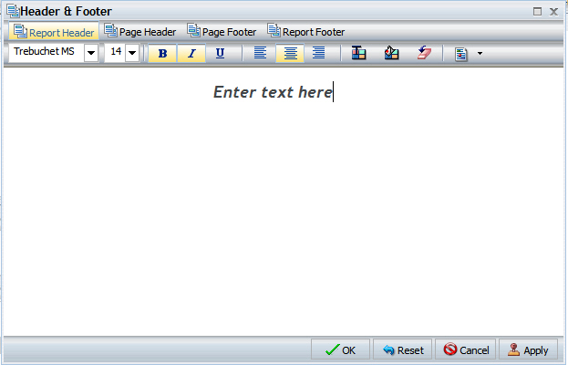
The following image shows the Heading & Footing dialog box with Report Heading active by default. It contains sample report heading text (Dollar Sales by Product and Region).
Another way to access the Heading & Footing dialog box is to click the arrow next to the Header/Footer button. It opens a drop-down menu from which you can select the heading or footing that you want to work with. After you make your selection, the Heading & Footing dialog box opens, and the heading or footing that you selected is active. The following image shows the drop-down menu for a report, from which you can select the active heading or footing.
From the Heading & Footing dialog box, you can add and style the active heading or footing, or choose a different one to work with by selecting the applicable tab. You can switch among tabs, but InfoAssist does not save changes made on the tabs until you click Apply or OK. If you click Apply, the Heading & Footing dialog box remains open. If you click OK, the dialog box closes.
You can style a selected heading or footing using the options on the styling ribbon. From left to right, you can customize the font type, font size, and font style (bold, italic, or underline). You can justify text (left, center, or right), select the font color and background color, and restore styling settings to their default value from the template.
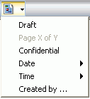
You can also insert "quick text" into a heading or footing. Quick text is supplied for you. It includes information that is typically useful in identifying a report or chart. From the preformatted text drop-down menu, you can select Draft, Page X of Y, Confidential, Date (multiple formats), Time (multiple formats), or Created by (followed by a name), as shown in the following image.
For
charts, an icon  on
the far right of the styling ribbon is enabled. This icon provides
two options for controlling the way in which the page heading and page
footing are rendered. The default option, Create Heading and Footing
as Text, renders the heading and footing as text elements that are
separate from the chart image. The option Embed Heading and Footing
in the Chart renders the heading and footing text as part of the
chart image.
on
the far right of the styling ribbon is enabled. This icon provides
two options for controlling the way in which the page heading and page
footing are rendered. The default option, Create Heading and Footing
as Text, renders the heading and footing as text elements that are
separate from the chart image. The option Embed Heading and Footing
in the Chart renders the heading and footing text as part of the
chart image.
Once you have added a heading or footing to a report or chart, you can double-click it on the canvas in design mode to reopen the Heading & Footing dialog box. You can also right-click an existing heading or footing in design mode and select Edit from the menu to open the dialog box.
For more information on adding and styling headings and footings, see How to Add Headings and Footings to a Report and Adding a Page Heading and Page Footing to a Chart.
For reports only, selecting Column Totals adds a grand total row to the bottom of the report to sum numeric data in each column. For reports only, selecting Row Totals adds a grand total column to the right side of the report to sum numeric data in each row. For more information, see How to Add Column Totals to a Report and How to Add Row Totals to a Report.
The Insert tab is accessible only while in Document view. If you are in Interactive Design view or Query Design view, the Insert tab will be grayed out and unavailable, as shown in the following image.
The Insert tab enables you to add reports, charts, existing reports, text, images, and active form controls (for active report, active PDF, and active Flash outputs only) to a canvas in Document view, as shown in the following image.
The Insert tab provides the following groups.
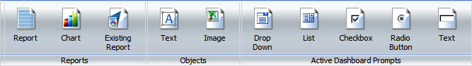
Enables you to insert reports, charts, and existing reports into your compound document. You can add multiple reports and charts to a single canvas with these buttons. The Reports group is shown in the following image.
Selecting Report inserts a report placeholder in the top-left corner of the canvas.
Selecting Chart inserts a chart placeholder in the top-left corner of the canvas.
Selecting Existing Report opens the Open dialog box where you can select an existing report to be inserted in the top-left corner of the canvas.
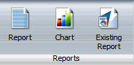
Enables you to insert text and images into your compound document. The Objects group is shown in the following image.
Selecting Text inserts an inline text object in the top-left corner of the canvas.
Selecting Image causes an Open dialog box to appear. Browse to the desired image and click OK to insert it in the top-left corner of the canvas.
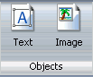
Enables you to insert active form controls into your compound document. You can add multiple controls to a single canvas with these buttons. This group is only visible when the output format of the compound document is set to active report, active PDF, or active Flash. The Active Dashboard Prompts group is shown in the following image.
Selecting Drop Down inserts a drop-down control placeholder in the top-left corner of the canvas.
Selecting List inserts a list control placeholder in the top-left corner of the canvas.
Selecting Checkbox inserts a checkbox control placeholder in the top-left corner of the canvas.
Selecting Radio Button inserts a radio button control placeholder in the top-left corner of the canvas.
Selecting Text inserts a text area control placeholder in the top-left corner of the canvas.
For more information on inserting active form controls, see Adding Active Technologies Form Controls to a Compound Document.
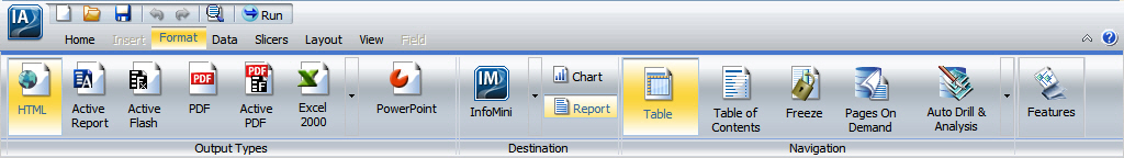
The Format tab provides different options for selecting output formats and other reporting features, depending on whether you are creating a report or a chart. For reports, the Format tab provides access to the Output Types, Destination, Navigation, and Features groups, as shown in the following image.
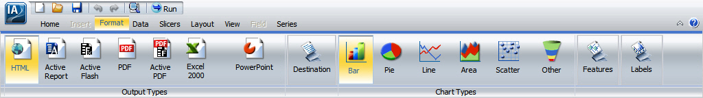
For charts, the Format tab provides access to the Output Types, Destination, Chart Types, Features, and Labels groups, as shown in the following image.
The Format tab provides the following groups and options.
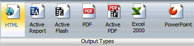
Provides buttons that you can select to create output in any of the supported formats, which include HTML (the default for charts and reports), active report, active Flash, PDF (the default for compound documents), active PDF, Excel formats (Excel 2000 only for charts and Compound documents), and PowerPoint, as shown in the following image. For more information on the additional Excel formats available for reports, see Excel Output for Reports.
Note: The active PDF output can only be displayed if you have Adobe® Reader® 9.0 or higher.
When you run a report, the output is created in the format that is currently selected. You can also set output format options from the output format button in the Status Bar.
Provides buttons that enable you to easily toggle between creating a report (the default) or a chart and a button to enable the creation of an InfoMini application, as shown in the following image.
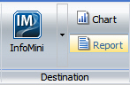
Selecting InfoMini enables the creation of an InfoMini application. For more information on using InfoMini, see Building InfoMini Applications.
Selecting Report or Chart determines whether report-specific or chart-specific functionality is available in the InfoAssist tool. If you switch from Report to Chart or Chart to Report, all selected options specific to each type of report are maintained during the current session until you save the report. When you save a report, chart-specific options are not maintained. When you save a chart, report-specific options are not maintained.
For reports only, the Navigation group provides buttons for selecting options that affect output display and navigation. These options include Table, Table of Contents, Freeze, Pages On Demand, and Auto Drill & Analysis, as shown in the following image.
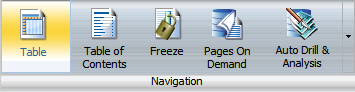
Table is selected by default and generates standard WebFOCUS browser output.
Selecting Table of Contents generates output by displaying a table of contents icon in the top-left corner where report output is normally displayed. Selecting the table of contents icon opens a menu that enables you to select (view) individual values of the first sort (BY) field, one value at a time. You can also select options to view the entire report or remove the table of contents. For more information, see How to Create Table of Contents Reports. The Table of Contents option is activated only when HTML, active report, Excel, or PowerPoint output format is selected.
Selecting Freeze generates output with column titles that freeze (remain in view) when you scroll through pages of the report output. For more information, see How to Freeze Column Titles in a Report.
Selecting Pages On Demand displays one page of output at a time. This option provides a menu bar at the bottom of the report output, where you can choose to view additional pages of output. For more information, see How to Create Pages On Demand Reports. The Pages On Demand option is activated only when HTML or active report output format is selected.
Selecting Auto Drill & Analysis generates output which invokes OLAP processing. For more information, see How to Create OLAP Reports. The OLAP option is activated only when HTML output format is selected.
Provides buttons for selecting specialized reporting features, including Title Popup, Accordion, Repeat Sort Value, Stack Measures, and Excel Formula, as shown in the following image.
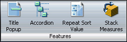
Selecting Title Popup displays pop-up titles when the mouse pointer hovers over a column title in the report output. For more information, see How to Add Pop-Up Titles to a Report. The Title Popup feature is activated only when HTML output format is selected.
Selecting Accordion creates expandable views of data for each vertical sort field. This option displays data values only for the first vertical sort field when you first view the output. You can manually expand your view to expose the data values of lower-level sort fields. For more information, see How to Create Accordion Reports. The Accordion feature is activated only when HTML or active report output format is selected.
Selecting Repeat Sort Value displays all repeated sort values in the output instead of blanks after the first instance of a new sort value, which is the default behavior.
Selecting Stack Measures displays all numeric measure field names in a column of the report output with the corresponding numeric data values displayed. For more information, see How to Implement Stacked Measures. The Stack Measures feature is activated only when HTML, Excel, or PowerPoint output format is selected.
Provides buttons for selecting custom chart features, including 3D Effect, Rotate, Reference, Annotate, and Grid lines, as shown in the following image.
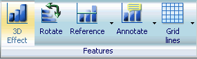
Selecting 3D Effect (the default) sets the three-dimensional view to on or to off. The 3D Effect feature is disabled for 3D, stock, gauge, gauge thermometer, pareto, spectral map, and funnel chart types.
Selecting Rotate toggles between a vertical display or horizontal display of a chart. For more information, see How to Rotate a Chart. The Rotate feature is disabled for pie, scatter, 3D, stock, gauge, gauge thermometer, pareto, spectral map, and funnel chart types.
Selecting Reference opens a drop-down menu that provides the Add Reference Line to Y-Axis and Add Reference Line to X-Axis options. Selecting one of these options opens the appropriate Reference Line dialog box, where you can set the specific X-Axis or Y-Axis value, type the desired text, and position the reference line on a chart. For more information, see How to Display Reference Lines. The Reference feature is disabled for pie, 3D, stock, gauge, gauge thermometer, pareto, spectral map, and funnel chart types.
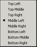
Selecting Annotate opens a drop-down menu that provides the Add an annotation option. Selecting this option opens the Annotation dialog box, where you can type the desired text and position the annotation on a chart. The choices for Position are Top Left, Top Middle, Top Right, Middle Left, Middle Right, Bottom Left, Bottom Middle, and Bottom Right, as shown in the following image. For more information, see How to Display Annotations.
Selecting Grid lines opens a drop-down menu that provides options to add O1 Minor Gridlines and Y1 Minor Gridlines to the O1 Major Gridlines and Y1 Major Gridlines that are displayed by default on a chart. You can also deselect the default grid lines to suppress their display on a chart. For more information, see How to Display Grid Lines.
Note: The chart features are grayed out and unavailable when designing a chart that will be output in active report, active Flash, or active PDF formats.
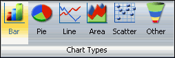
For charts only, the Chart Types group provides buttons for selecting the most commonly used chart types, which include Bar (the default), Pie, Line, Area, and Scatter. You can also click the Other button to select additional chart types. The Chart Types group is shown in the following image.
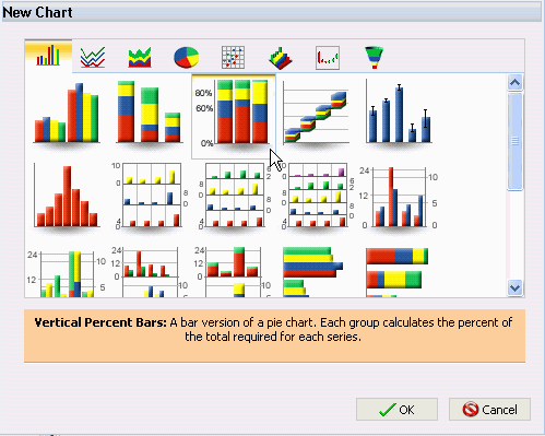
When you click Other, the New Chart dialog box opens. Across the top of the dialog box are eight tabs, which are depicted by icons. Each tab represents a chart type category. As shown in the following dialog box, the left-most tab represents the bar chart category, which is selected by default. When selected, it displays thumbnail images of the bar chart variations that are supported by InfoAssist.
In this example, the Vertical Percent Bar chart type is selected. A description of the selected chart type is provided beneath the images.
Note: You can only choose from Bar, Pie, Line, and Scatter charts if the output format selected is active report.
For more information on the chart types that you can choose from, see Selecting a Chart Type.
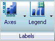
Provides the Axes and Legend buttons, which have drop-down menus for selecting a specific option.
Selecting Axes enables you to choose the following:
The two Rotate options provide a choice of None (the default), 45, 90, and 270 degrees. For more information, see How to Customize the Display of Axis Labels.
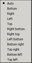
Selecting Legend opens a drop-down menu, where you can select or deselect Show Legend to display or hide the legend on a chart, change the default Legend Position, and change the default Legend Orientation. The choices for Legend Position are Auto (the default), Bottom, Right, Left, Top, Right bottom, Right top, Left bottom, Bottom right, Top right, Bottom left, and Top left, as shown in the following image.
For Legend Orientation, the choices are Auto (the default), Vertical, and Horizontal. For more information, see How to Customize the Display of Legend Labels.
The Data tab provides access to data manipulation and data display properties and options in the Calculation, Join, Filter, and Data Source groups, as shown in the following image.

The Data tab provides the following groups and options.
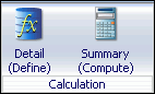
Provides the Detail and Summary buttons, which enable you to create Define and Compute fields, as shown in the following image.
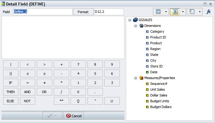
Selecting Detail opens the DEFINE Field Creator dialog box, which enables you to create a defined field, type a name for the field, and enter a format. Note that a Define field is added to the actual data.
Selecting Summary opens the COMPUTE Field Creator dialog box, which enables you to create a computed field, type a name for the field, and enter a format.
The Field Creator dialog boxes, which open when you select Detail or Summary, provide similar functionality, including options to display data source fields in a Tree, Dimension, or List view. You can also view a complete set of functions instead of data source fields by selecting the Functions button. The following image shows the DEFINE Field Creator dialog box.
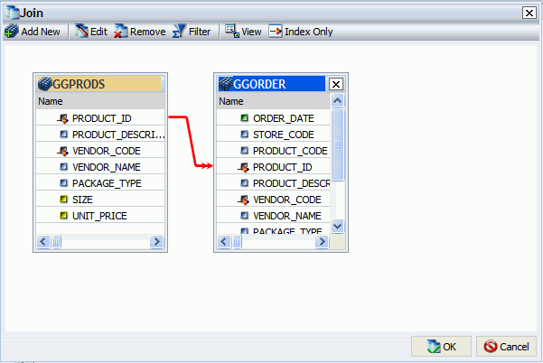
Provides the Join button, which you can select to open the Join dialog box. From that dialog box, you can create a new join, edit or delete existing joins, and add data sources to a join. The Join group is shown in the following image.
Note: The Join group is not available when working with Reporting Objects or SAP BW, Essbase, or Microsoft SQL Server Analysis Services cubes.

The following image shows the Join dialog box with two data sources joined by the common PRODUCT_ID indexed field.
Using conditional joins, you can establish joins based on conditions other than equality between fields. In addition, the host and cross-referenced join fields do not have to contain matching formats, and the cross-referenced field does not have to be indexed.
The conditional join is supported for FOCUS and all relational data adapters. Because each data source differs in its ability to handle complex conditional criteria, the optimization of the WHERE syntax differs depending on the specific data sources involved in the join and the complexity of the conditional criteria.
For FOCUS data sources, if the host and cross-referenced join fields do not have common matching formats, the following message appears.
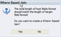
Note: If you click Yes, the Advanced Filter dialog box displays, where you can create a Where-Based Join.
If the cross-referenced join field does not have an index, the following message appears.
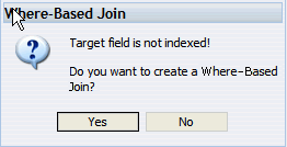
Note: If you click Yes, the Advanced Filter dialog box displays, where you can create a Where-Based Join.
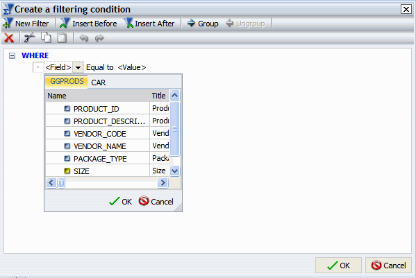
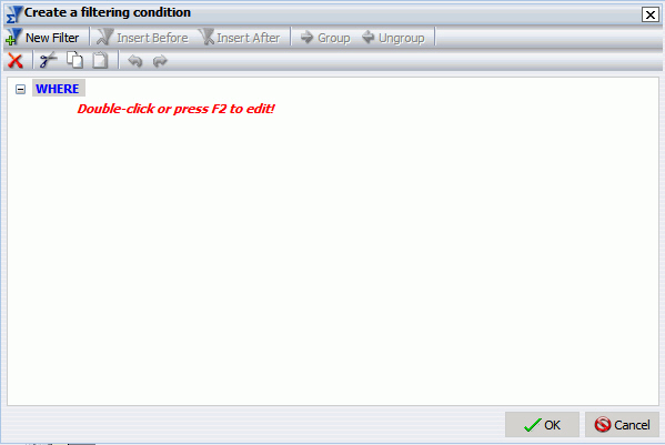
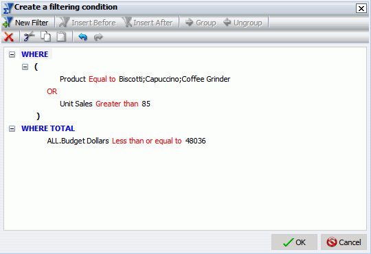
To create a Where-Based Join, create a filtering condition, as shown in the following image.
Provides advanced filtering options, through an Advanced Filter dialog box. Advanced Filter options include the ability to use Where and Where Total, in addition to enabling And, as well as Or, conjunctions in a single expression. You can also group conditions and expressions, as well as apply functions and calculations within criteria. This option provides more functionality than the Simple Filter. For more information on the simple filter, see Using the Field Tab. The Filter group is shown in the following image.
Note: The Filter group is not available when working with SAP BW, Essbase, or Microsoft SQL Server Analysis Services cubes.

In the Advanced Filter dialog box, you can create Where and Where Total filters, as shown in the following image.
You can change between Where and Where Total by double-clicking on WHERE.
Double-clicking on the Double-click or press F2 to edit! text opens drop-down menus for Fields, Operators, and Values. You can retrieve fields and values from the Master File and data source.
The Field drop-down menu provides a field list from the Master File.
The Equal to (default value) drop-down menu provides the following operators:
The Value drop-down menu opens a dialog box with multiple options, as shown in the following image.
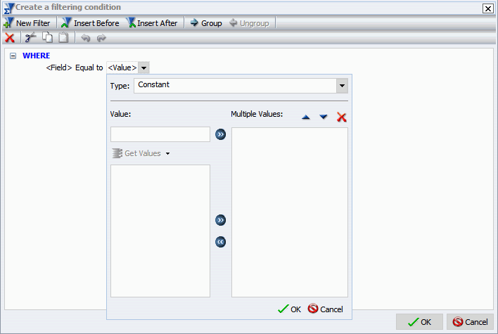
The type drop-down menu contains the following options.
The value area contains a text input box that you can use to manually insert values. It also contains a Get Values drop-down menu, which supplies the following options.
Note: The Get Values drop-down menu will only be accessible if you have already selected a field.
After selecting the desired values, you can move them into and out of the Multiple Values area with the left and right arrows. You can also change the value order and delete values with the up and down arrows and the delete icon.
After creating a condition, you can insert additional conditions before and after the selected condition by using the Insert Before and Insert After buttons at the top of the Advanced Filter dialog box. You can use either And or Or conjunctions to link conditions and the Group and Ungroup buttons to nest and organize conditions.
You can create additional filters by selecting the New Filter button at the top of the Advanced Filter dialog box.
After creating the desired filters, pressing OK will save and apply the filters. You can access them from the Filter pane of the Resources panel.
Provides the Add Data Source and Switch Data Source buttons. The Data Source group is accessible only while in Document view. If you are in Interactive Design view or report Design view, the group will be grayed out and unavailable. The Data Source group is shown in the following image.
Note: The Data Source group is grayed out and unavailable when working with Reporting Objects.
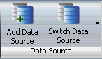
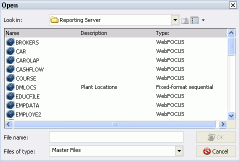
Selecting Add Data Source allows you to add additional data sources to a compound document, which enables inserting reports from different data sources into the same document. An Open dialog window will appear, as shown in the following image.
Selecting Switch Data Source allows you to choose which data source is currently active and being used to create new reports. A drop-down list with all of the data sources that have been added will appear, as shown in the following image.
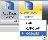
You can also switch data sources by selecting a report that is using a data source different than the one that is currently active.
The Slicers tab provides the ability to create and edit slicers, as shown in the following image. For more information on Slicers, see Using Slicers.
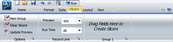
The Slicers tab provides the following groups and options.
Provides the New Group, Clear Slicers, and Update Preview buttons.
Provides the Preview and Run Time drop-down menus.
Provides a group for each Slicer group that is added.
The Layout tab provides access to page display and layout options from the Page Setup, Size & Arrange (Document View only), and Report groups, as shown in the following image.
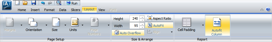
The Layout tab provides the following groups and options.
Provides the Margins, Orientation, Size, Units, and Page Numbers (reports only) buttons, which enable you to customize the page setup for the output of your report.
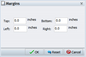
Selecting Margins enables you to set margin values by choosing Normal (1 inch all around), Narrow (.5 inch all around), Moderate (.5 inch left/right), Wide (1.5 inch left/right), or Custom. Choosing Custom opens the Margins dialog box, as shown in the following image, where you can set specific margins as needed.
Selecting Orientation enables you to set the orientation of your report to portrait or landscape.
Selecting Size enables you to select the size of the paper for printing output. You can choose A3, A4, A5, Letter, Legal, Tabloid, or PowerPoint.
Selecting Units enables you to select the unit of measurement used for customizing the dimensions of your report or chart. You can choose Inches, Centimeters, Points, or Pixels.
For reports only, selecting Page Numbers enables you to select page numbering options. You can choose one of the following:
The Page Numbers value is overridden by header and footer text options.
Provides Height and Width, Auto Overflow, Aspect Ration, Autofit, and Align buttons. The Size & Arrange group is only available in Document view. For more information on using the options available in the Size & Arrange group to layout components in a compound document, see Editing Components in a Compound Document.
Provides the Cell Padding (reports only) and Autofit Column (reports only) buttons, which enable you to customize report spacing settings.
Selecting Cell Padding opens the Cell Padding dialog box. From that dialog box, you can set specific values to control the amount of space inserted between rows and columns in a report. For more information, see How to Use Cell Padding in a Report.
Selecting Autofit Column limits the width of columns in a report to be no wider than the largest value in each column. Autofit Column is selected by default.
The View tab provides access to report design viewing properties and options in the Design, Show/Hide, Data Panel, Query Panel, Output Window, and Query groups as shown in the following image.

The View tab provides the following groups and options.
Enables you to toggle between Query (Design view), Interactive (Design view), and Document (Design view) as shown in the following image. Once Document view is selected you cannot toggle back to Query or Interactive view.
Selecting Query (Design view) displays the Query Design pane in the Results Panel, providing a larger area for creating the report. By default, the Query Design pane is displayed in the lower half of the Resources Panel. Selecting Interactive (Design view) displays a preview of the report that is being created in the Results Panel. For details, see Understanding the Results Panel.
Provides the Resources, Ruler, and Grid buttons, as shown in the following image, which enables you to choose different viewing options while working with reports and output.
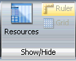
The default view in InfoAssist shows both the Resources Panel and the Results Panel at the same time. Selecting Resources minimizes the Resources Panel and expands the size of the Results Panel to also occupy the area where the Resources Panel normally appears. The Results Panel can display a preview of a report, output of a report, or the Query Design pane.
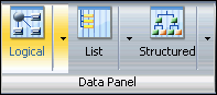
Enables you to display data source fields in the Data pane (Resources Panel), using different views that are labeled Logical (the default), List, and Structured. All three views provide options for displaying each data source field as a Title, Description, or Field Name. The List view also includes options to show the Alias, Format, and Reference of each field. The Data Panel group is shown in the following image.
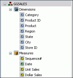
The following is an example of the default Logical view, displaying the Title of each field.
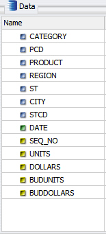
The following is an example of the List view, displaying the (data source) Field Name of each field.
The following is an example of the Structured view, displaying the Description of each field.
Provides the Tree (the default), Areas 2x2, and Areas 1x4 buttons to select different views of the Query Design pane. The following image shows the Query View group.

You can display the filter and data source field containers in the Query Design pane in one of three ways: in a two-column by two-row grid by selecting Areas 2x2, in a one-column by four-row grid by selecting Areas 1x4, or in the default data tree (which has no grid) by selecting Tree. For example, the following image shows the Query Design pane when Areas 2x2 is selected for a report.
Provides the Arrange, Output Location, and Switch Output buttons, as shown in the following image.
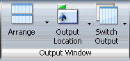
Selecting Switch Output opens a drop-down menu for choosing to view any active output window. Selecting the Arrange button opens a drop-down menu for choosing to display multiple output windows in several different ways. For example, the following image shows how you can display three output windows when you select Tile Vertically.

Selecting the Output Location button opens a drop-down menu for choosing to direct new output to a Single Tab (the default), New Tab, Single Window, or New Window. For details, see Understanding the Output Window.
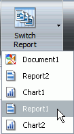
Provides the Switch Report button, as shown in the following image, which allows you to switch between multiple reports.

Selecting Switch Report opens a drop-down menu for choosing any active report or chart. You may have multiple reports and charts open in the application window, as shown in the following image.
Note: You can also switch reports from the Status Bar, for more information, see Using the Status Bar.
The Field tab appears in the Control Panel when you select a data source field in the Query Design pane or Layout Canvas. The options available in the Field tab are specific to the data type that is selected. The options available for numeric fields are different from the options available for non-numeric and date fields. The Field tab provides access to the Filter, Sort, Break, Style, Format, Specific, Visibility, and Links groups, as shown in the following image.

The Fields tab provides the following groups and options.
Provides simple filtering options, including Filter, Exclude, Include, and Prompt. The Filter group is shown in the following image.
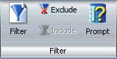
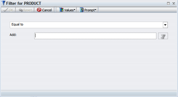
Selecting Filter opens the simple filter dialog box for creating or modifying WHERE statements. WHERE statements enable you to select only the data that you want and to exclude all unwanted data. The following choices are available in the Values drop-down menu:
The following choices are available in the Prompt drop-down menu:
Selecting any Prompt option changes the purpose of the dialog box to creating an auto prompting parameter that you can select when you run a report. When you select the Prompt using Data Values (Dynamic) option or the Prompt using Text Input (Simple) option, the Values drop-down menu is disabled (gray). The Filter dialog box is shown in the following image.
When you select an existing filter in the Filter area of the Query Design pane, choosing Exclude removes, but does not delete, the filter from the report. When you select a filter that was previously excluded from a report in the Filter area of the Query Design pane, choosing Include restores the filter to the report.
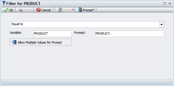
Selecting Prompt opens the Filter dialog box for creating an auto prompting parameter that you can select when you run a report. The Filter dialog box is used to create both filters and auto prompting parameters. The following choices are available in the Prompt drop-down menu:
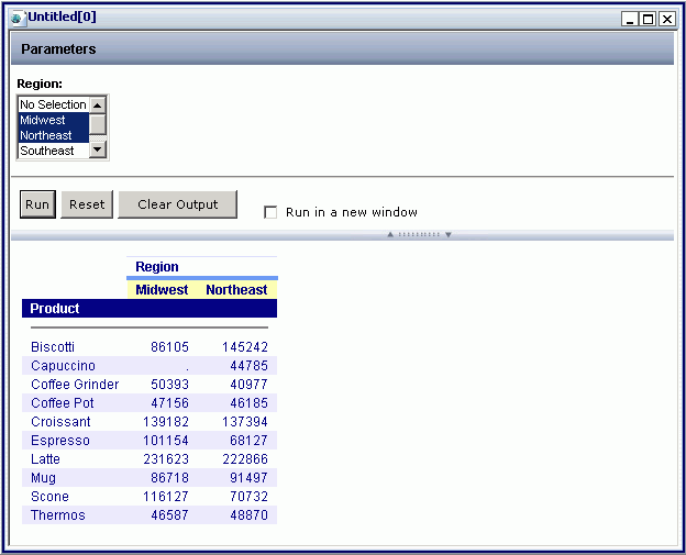
Selecting the Allow Multiple Values for Prompt button displays a multi-select menu in the output window when you create a dynamic auto prompting parameter for a field and then run the report. The Filter dialog box, shown in the following image, creates a filter that displays a dynamic auto-prompt, when the report is run, for the Product field. The dynamic auto-prompt lists the products that you can select.
The following is an example of a window that prompts the user for a parameter value. This window is displayed when you run a report after creating a dynamic auto prompting parameter for the Product field.
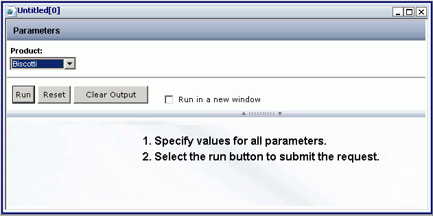
If you select the Allow Multiple Values for Prompt button while creating a dynamic auto prompting parameter, a multi-select menu is displayed when the report is run. Selecting multiple parameter values displays output in the same window as the prompt, as shown in the following image.
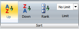
Provides sort options, including the default Up (ascending sort), Down (descending sort), Rank (reports only), and Limit (reports only). The Sort group is shown in the following image.
Selecting Up (default) sorts the selected field in ascending order.
Selecting Down sorts the selected field in descending order.
Selecting Rank inserts a rank column immediately to the left if a BY field is selected and copies the field as a BY field and adds a rank column to the left of the BY field if a Measure is selected. Ranking a Measure will result in two copies of the field, the original Measure and the BY field that is created during ranking.
The Limit drop-down menu allows you to specify the number of unique values displayed for a sort group that has been added.
For more information about these report options, see Using Custom Reporting Features.
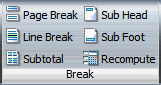
For reports only, the Break group, as shown in the following image, enables you to customize a report by adding a Page Break, Line Break, Subtotal (for numeric fields only), Sub Head, Sub Foot, and Recompute to the report output. The Break group is shown in the following image.
Selecting Page Break starts a new page when the primary sort field changes.
Selecting Line Break inserts a line in the report output when the primary sort field changes.
Selecting Sub Head opens a dialog box where you can type text to add a subheading just below the column titles in the report output when the primary sort field changes.
Selecting Sub Foot opens a dialog box where you can type text to add a subfooting at the end of the data on each page of the report output when the primary sort field changes.
Selecting Subtotal inserts a line, total text (TOTAL FIELD Value), and subtotals for all numeric fields when the primary sort field changes.
Selecting Recompute recalculates the result of a Compute command. Recompute is similar to Subtotal in that it recalculates only at the specified sort break. Recompute is not available for ACROSS fields.
For more information about these report options, see Using Custom Reporting Features.
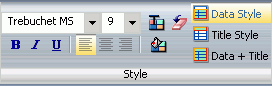
Provides styling options for reports and charts. For a selected field in a report, you can customize the font type, font size, font color, and background color. You can also justify text (left, center, right), style fonts (bold, italic, underline), and restore styling to the default values. You can apply styling to the Data (the default), column Title, or both the Data and column Title for the selected field in a report. The Style group is shown in the following image.
For more information about styling reports, see Styling Reports.
Provides formatting options for virtual or column fields including Alphanumeric, Integer, Decimal, Currency, Percentage, Comma, and Decimal Spaces. The Format group is shown in the following image.
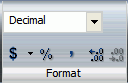
The drop-down menu provides three field-type options for the selected column, which are Alphanumeric, Integer, and Decimal. Selecting the fourth option, More Options..., opens the Field Format Options dialog box, which provides further formatting options for the selected field. For more information, see Changing a Field Format.
You can also apply floating and non-floating currency and percent signs, and commas. You can increase and decrease decimal places by selecting the appropriate buttons under the drop-down menu.
Provides additional options for a selected field, including Data Bars (reports only), Aggregation, and Traffic Lights, as shown in the following image.

For reports only, selecting Data Bars adds a data visualization column to the right of a selected numeric field. The column displays values in each row using horizontal bars that extend from left to right in varying lengths, depending on the corresponding data values. For more information, see How to Add Data Visualization Bars to a Report.
Selecting Aggregation opens a drop-down menu, as shown in the following image. The choices are None (the default), Sum, Average, Count, Count Distinct, Percent of Count, First Value, Last Value, Maximum, Minimum, Total, Percent, Row Percent, and Average Square.
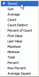
Sum is the default aggregation type value for all numeric fields added to the Measure field container in the Query Design pane. Changing the Measure field container from Sum to Print, Count, or List overrides all assigned aggregation type values. For more information related to reports, see How to Display Measure Data Using Aggregation Options in a Report. For more information related to charts, see How to Display Measure Data on a Chart Using Aggregation Values.
Selecting Traffic Lights opens the Traffic Light Condition dialog box. From that dialog box you can add new conditional styling or modify existing conditional styling by applying traffic light (and other) colors to a selected field in the output when the field meets specified criteria. For more information related to reports, see How to Apply Traffic Light Conditional Styling to Data in a Report. For more information related to charts, see How to Apply Traffic Light Conditional Styling to a Chart.
Enables you to hide or show a selected field in the output. Fields added to a report or chart are visible in the output by default. Selecting Hidden in the Visibility group, as shown in the following image, hides the selected field (suppresses its display) in the output.

To display a hidden field, select Hidden again.
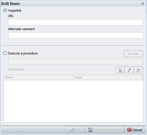
Enables you to add a hyperlink or drill-down procedure to a selected field in a report by selecting Hyperlink in the Links group, as shown in the following image.

When you select Hyperlink, the Drill Down dialog box opens. From that dialog box, you can configure a hyperlink or drill-down procedure for the selected field. Clicking that field in report output takes you to the specified URL or executes the specified procedure. The Drill Down dialog box is shown in the following image.
The Series tab, which appears in the Control Panel only when you are working with charts, provides access to chart properties and options through the Select, Properties, Line, and Pie groups, as shown in the following image.
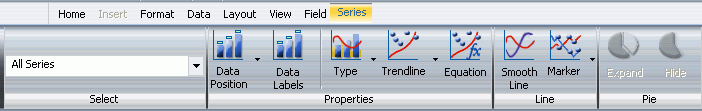
The Series tab provides the following property control groups.
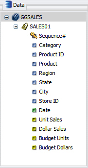
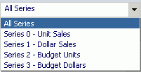
Provides a drop-down menu for selecting a specific measure field to which to apply one or more of the options that are available in the Series tab. The default setting is All Series, which applies the selected options to all the measure fields in the report. The following image shows the Select drop-down menu for a report with four measure fields (Unit Sales, Dollar Sales, Budget Units, and Budget Dollars).
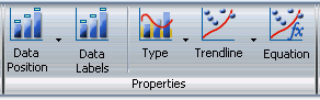
Provides the Data Position, Data Labels, Type, Trendline, and Equation options to further enhance a chart, as shown in the following image.
Selecting Data Position opens a drop-down menu with options for selecting a location at which to display data values as labels on a chart. The choices are:
For more information, see How to Display Data Labels.
Selecting Data Labels enables you to add labels to a chart, or remove them.
Selecting Type opens a drop-down menu with options for selecting different chart types. The choices are None (the default), Bar, Line, and Area.
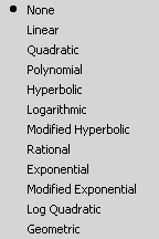
As shown in the following image, selecting Trendline opens a drop-down menu that provides options for adding a trendline to a chart. The choices are None (the default), Linear, Quadratic, Polynomial, Hyperbolic, Logarithmic, Modified Hyperbolic, Rational, Exponential, Modified Exponential, Log Quadratic, and Geometric. For more information, see How to Display Trendlines. The Trendline menu is shown in the following image.
Selecting Equation displays the associated mathematical equation for the selected trendline on the chart.
Provides the Smooth Line and Marker options, as shown in the following image.
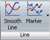
Selecting Smooth Line draws the chart using smooth lines. For more information, see How to Display Smooth Lines.
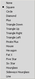
Selecting Marker enables you to change the display of the default data and legend markers on line and scatter chart types. As shown in the following image, in the drop-down menu that opens, the marker display options are None, Square (the default), Circle, Diamond, Plus, Triangle Down, Triangle Up, Triangle Right, Triangle Left, Pirate Plus, House, Hexagon, Fat X, Five Star, Six Star, Hourglass, Sideways Hourglass, and Line. For more information, see How to Customize the Display of Markers.
Provides options to Expand or Hide slices in a pie chart, as shown in the following image.
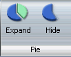
The Pie group is activated only when you select Pie in the Chart Types group of the Format tab.
| WebFOCUS |