Using Custom Chart Features
Your presentation of data on a chart is successful when
it communicates to your audience the message that is intended. InfoAssist
helps you meet the needs of your audience and convey your message
by providing numerous chart features. For example, you can adjust
the appearance of a chart, add layers of information, or customize
the labels that identify the data that is displayed.
Note: The following custom chart features are only available
to charts that are being output in HTML, PDF, Excel 2000, or PowerPoint
format.
You can use the following custom features when creating charts
with a compatible output format.
- Rotate the
orientation of a chart. For details, see How to Rotate a Chart.
- Add reference
lines to a chart. For details, see How to Display Reference Lines.
- Add annotations
to a chart. For details, see How to Display Annotations.
- Change the
display of grid lines on a chart. For details, see How to Display Grid Lines.
- Add a trendline
to a chart. For details, see How to Display Trendlines.
- Customize
the display of axis labels on a chart. For details, see How to Customize the Display of Axis Labels.
- Customize
the display of legend labels on a chart. For details, see How to Customize the Display of Legend Labels.
- Add data labels
to a chart. For details, see How to Display Data Labels.
- Customize
the display of markers on line and scatter chart types. For details,
see How to Customize the Display of Markers.
- Display line
charts using smooth lines. For details, see How to Display Smooth Lines.
After you have designed a chart with the desired custom features,
you can make it more meaningful by adding a page heading and page
footing. For details, see Adding a Page Heading and Page Footing to a Chart.
x
Procedure: How to Rotate a Chart
You
can rotate bar, line, and area chart types to change the orientation
of the data.
-
Create a chart.
-
Click the Format tab in the Control Panel.
-
Click Rotate in the Features group.
-
Run the report.
The chart is rotated 90 degrees clockwise. The following
is an example of a bar chart that is rotated.
x
Procedure: How to Display Reference Lines
Reference
lines draw attention to specific data locations on a chart. You
can add up to three horizontal (X-axis) and three vertical (Y-axis)
reference lines to a chart.
-
Create a chart.
-
Click the Format tab in the Control Panel.
-
Click Reference in the Features group.
-
In the drop-down menu that opens, click one of the following:
- Add Reference
Line to Y-Axis
- Add Reference
Line to X-Axis
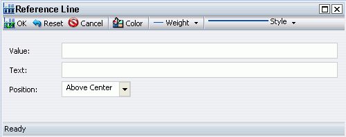
The Reference Line dialog box opens, as shown in
the following image.
-
In the Value field, type the specific X-axis value or Y-axis
value that indicates where to display the reference line.
-
In the Text field, type the desired text for the reference line.
-
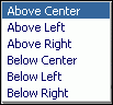
In the Position drop-down menu, click the desired position
of the reference line on the chart.
The choices are Above Center (the default), Above
Left, Above Right, Below Center, Below Left, and Below Right, as
shown in the following image.
-
Set the desired Color, Weight, and Style values for the reference
line.
The choices for Weight are 1px - Light (the default),
2px - Medium, and 3px - Heavy.
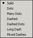
The choices for Style
are Solid (the default), Dots, Many Dots, Dashed, Dashed Dots, Long
Dash, and Mixed Dashes, as shown in the following image.
Clicking Color opens
the Color dialog box, where you can select a standard or custom
color. The selected color is applied to both the reference line
and the text.
-
Click OK to
save the values that you supplied and close the Reference Line dialog
box.
-
Run the report.
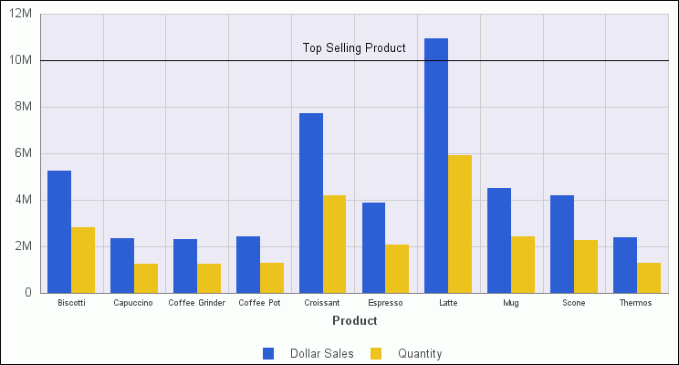
The reference line is added to the chart. The following
is an example of a bar chart with a Y-axis reference line. The reference
line was added by typing 10000000 in the Value field, and Top Selling
Product in the Text field. The reference line uses the default Above
Center setting for Position.
x
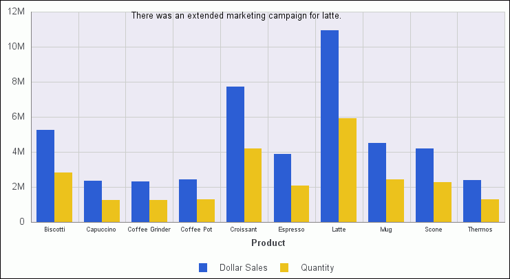
Procedure: How to Display Annotations
Annotations
are explanatory notes or comments. You can add up to eight annotations on
a chart.
-
Create a chart.
-
Click the Format tab in the Control Panel.
-
Click Annotate in the Features group.
-
In the drop-down menu that opens, click Add an annotation.
The Annotation dialog box opens, as shown in the
following image.
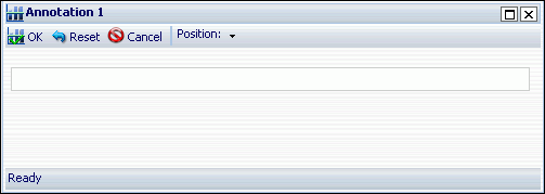
-
In the text input field, type the desired text for the annotation.
-
In the Position drop-down menu, click the desired position
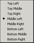
for the annotation on the chart.
The choices are Top Left, Top Middle, Top Right,
Middle Left (the default), Middle Right, Bottom Left, Bottom Middle,
and Bottom Right, as shown in the following image.
-
Click OK to
save the values that you supplied and close the Annotation dialog
box.
-
Run the report.
The annotation is added to the chart. The following
is an example of a bar chart with an annotation.
x
Procedure: How to Display Grid Lines
You
can add O1 Minor Gridlines and Y1 Minor Gridlines to the O1 Major
Gridlines and Y1 Major Gridlines that are displayed by default on
a chart.
-
Create a chart.
-
Click the Format tab in the Control Panel.
-
Click Grid lines in the Features group.
-
In the drop-down menu that opens, select or deselect any of
the grid line options.
The O1 Minor Gridlines and Y1 Minor Gridlines options
are deselected by default, and the O1 Major Gridlines and Y1 Major
Gridlines options are selected by default.
You can deselect
any of the grid lines, including the default grid lines. Deselected grid
lines do not display on the chart.
-
To select or deselect other grid line options, repeat steps
3 and 4.
-
Run the report.
The selected grid lines are added to the chart,
and any deselected grid lines are removed. The following is an example
of a bar chart that displays O1 Minor Gridlines and Y1 Minor Gridlines
and the default grid lines, O1 Major Gridlines and Y1 Major Gridlines.
x
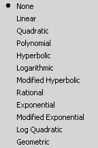
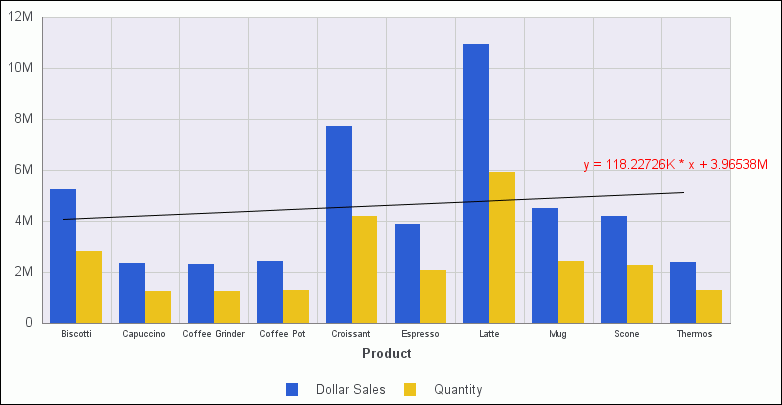
Procedure: How to Display Trendlines
A trendline
is a line that is drawn over the plot area of a chart to show the
pattern of the data points. The pattern reveals a statistical trend.
-
Create a chart.
-
Click the Series tab in the Control Panel.
-
Click Trendline in the Properties group.
-
In the Trendline drop-down menu that opens, click the type
of trendline that you want to display. The choices are None (the
default), Linear, Quadratic, Polynomial, Hyperbolic, Logarithmic,
Modified Hyperbolic, Rational, Exponential, Modified Exponential,
Log Quadratic, and Geometric, as shown in the following image.
-
Optionally, to display the mathematical equation for the selected trendline
option, click Equation in the Properties
group of the Series tab.
-
Run the report.
The chart displays the selected trendline option.
The following image shows a trendline that is displayed with the
Linear option. The mathematical equation for the option is displayed
above the trendline.
x
Procedure: How to Customize the Display of Axis Labels
You
can display, hide, stagger, and rotate both the X-Axis (O1) labels
and the Y-Axis (Y1) labels by making selections in the Axes drop-down
menu.
-
Create a chart.
-
Click the Format tab in the Control Panel.
-
Click Axes in the Labels group.
-
In the drop-down menu that opens, select or deselect any of
the following axis display options:
- Show O1-Axis
Labels (selected by default)
- Show Y1-Axis
Labels (selected by default)
- Stagger O1-Axis
Labels
- Stagger Y1-Axis
Labels
- Rotate O1-Axis
Labels
- Rotate Y1-Axis
Labels
The two Rotate options provide a choice of None
(the default value), 45, 90, and 270 degrees.
-
To select or deselect other axis display options, repeat steps
3 and 4.
-
Run the report.
The selected axis display options appear on the
chart. The following is an example of a bar chart with both the
Rotate O1-Axis Labels and Rotate Y1-Axis Labels options selected
and set to 45 degrees.
x
Procedure: How to Customize the Display of Legend Labels
By
default, when there are two or more measure fields in a report,
the titles of the fields automatically appear in a legend on the
chart. You can specify the position of a legend on a chart, or its
orientation. You can also suppress the display of the legend.
-
Create a chart with two or more measure fields.
-
Click the Format tab in the Control Panel.
-
Click Legend in the Labels group.
-
In the drop-down menu that opens, do one of the following.
- Select or
deselect Show Legend.
- Highlight Legend
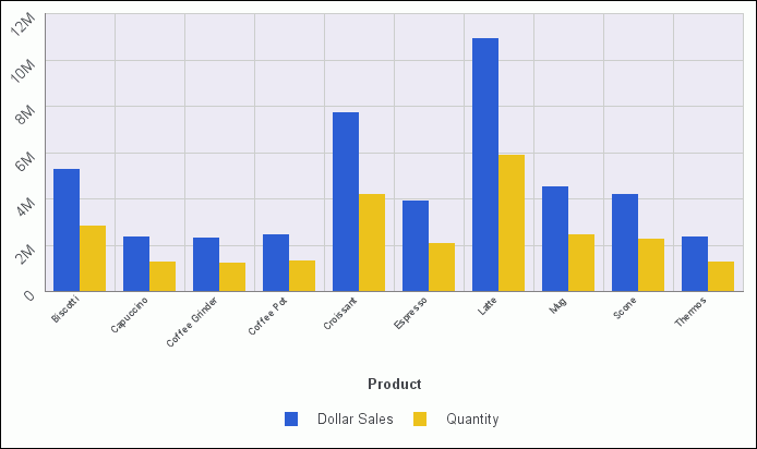
Position and click one of the available options. The
choices for positioning the chart legend are Auto (the default), Bottom,
Right, Left, Top, Right bottom, Right top, Left bottom, Bottom right,
Top right, Bottom left, and Top left, as shown in the following
image.
- Highlight Legend
Orientation and click one of the available options.
The choices are Auto (the default), Vertical, and Horizontal.
-
To select or deselect other legend display options, repeat
steps 3 and 4.
-
Run the report.
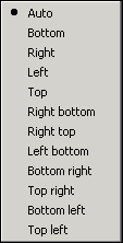
The selected legend display options appear on the
chart. The following is an example of a bar chart with the Legend
Position set to Right bottom and the Legend Orientation set to Vertical.
x
Procedure: How to Display Data Labels
You
can display data labels (values) on a chart in a variety of ways.
-
Create a chart.
-
Click the Series tab in the Control Panel.
-
Click Data
Labels in the Properties group to enable label display.
-
Click Data Position in the Properties group.
-
In the drop-down menu that opens, select one of the following
data label display options:
- Above (the
default)
- On top edge
- Below top
edge
- Center
- Base
-
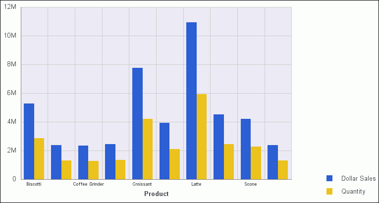
Run the report.
The chart displays the selected data label option.
The following image shows data labels that are displayed using the
Center display option.
x
Procedure: How to Customize the Display of Markers
By
default, data markers are automatically displayed on line and scatter
chart types. If a line or scatter chart type contains more than
one measure field, markers are also displayed in the legend. You
can change the default shape of the data and legend markers, to
a shape of your choice.
-
Create a chart for a line or scatter chart type.
-
Click the Series tab in the Control Panel.
-
From the
drop-down list in the Select group, click the series (field) to which
the marker will apply.
-
Click Marker in the Line group.
-
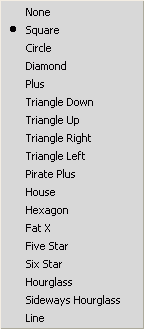
In the marker drop-down menu that opens, click the desired
marker shape. The options are None, Square (the default), Circle,
Diamond, Plus, Triangle Down, Triangle Up, Triangle Right, Triangle
Left, Pirate Plus, House, Hexagon, Fat X, Five Star, Six Star, Hourglass,
Sideways Hourglass, and Line, as shown in the following image.
-
If applicable,
repeat steps 3, 4, and 5 to select different markers for other series
in the report.
-
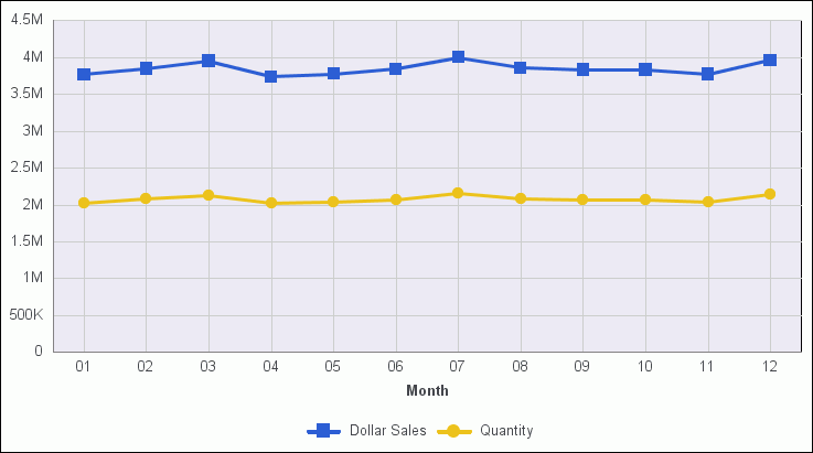
Run the report.
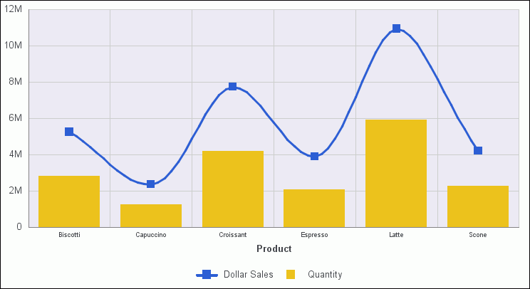
The chart displays the selected marker shapes. The
following image shows the Square marker for Dollar Sales, and the
Circle marker for Quantity. The markers are used to display points
of data on the line chart. They are also used in the legend to identify
the data that is displayed.
x
Procedure: How to Display Smooth Lines
-
Create a chart and do one of the following.
- Click the Format tab,
and click Line in the Chart Types group.
- In any type
of chart, click the numeric measure field in the Query Design pane, click
the Series tab, click Type in
the Properties group, and click Line. Use
this technique to create a combination chart that displays different
types of chart data (for example, bar or line) for different measure
fields.
-
Click the Series tab, and click Smooth
Line in the Line group.
-
Run the report.
In the following combination
chart, the Line type and smooth lines were applied to the Dollar
Sales field. The Bar type was applied to the Quantity field.