In this section: |
In Interactive Design view, the canvas on the right of the window provides a preview of the report that you are creating or modifying. For charts, the preview is called active because the chart image is live, not static. InfoAssist can recognize and quickly process your mouse actions on the chart.
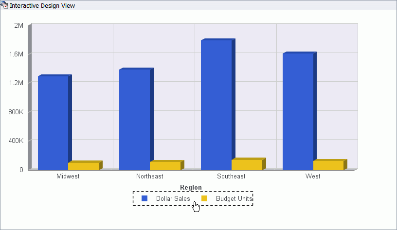
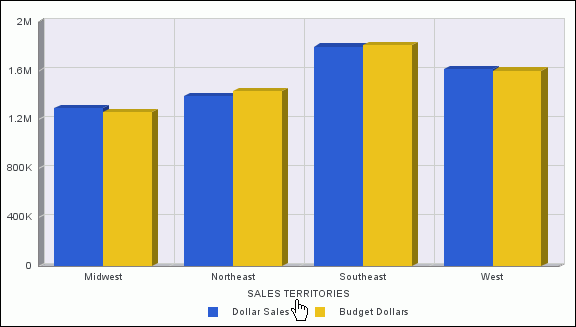
In active preview, when you move the mouse over a graph element (legend, axis label, title) the bounding area will be highlighted with a dotted line, as shown in the following image where the legend is highlighted.
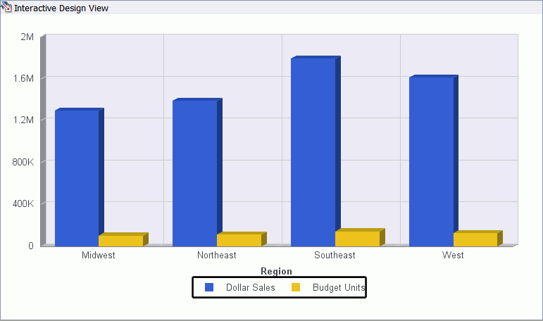
In active preview, when you select a graph element (legend, axis label, title) the bounding area will be highlighted with a solid line, as shown in the following image where the legend is highlighted.
In active preview, right-clicking an element on a chart opens a pop-up menu with the design options that are available for that element. Once you have made a choice from the menu, InfoAssist applies it to the chart element, so that you see the result right away. In InfoAssist, the pop-up menus in active preview for charts are called right-click menus.
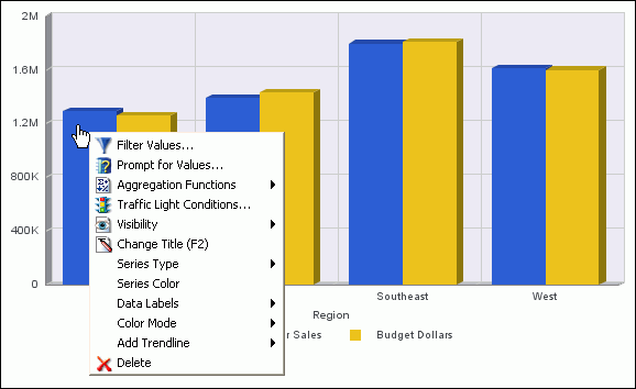
This image shows an active preview of a bar chart in Interactive Design view. In this example, the right-click menu for a series (field) element is displayed.
Right-click menus are enabled for charts that are generated with either sample data or live data from your data source.
The following topics describe the chart elements and right-click menus that you can work with to design your charts in active preview.
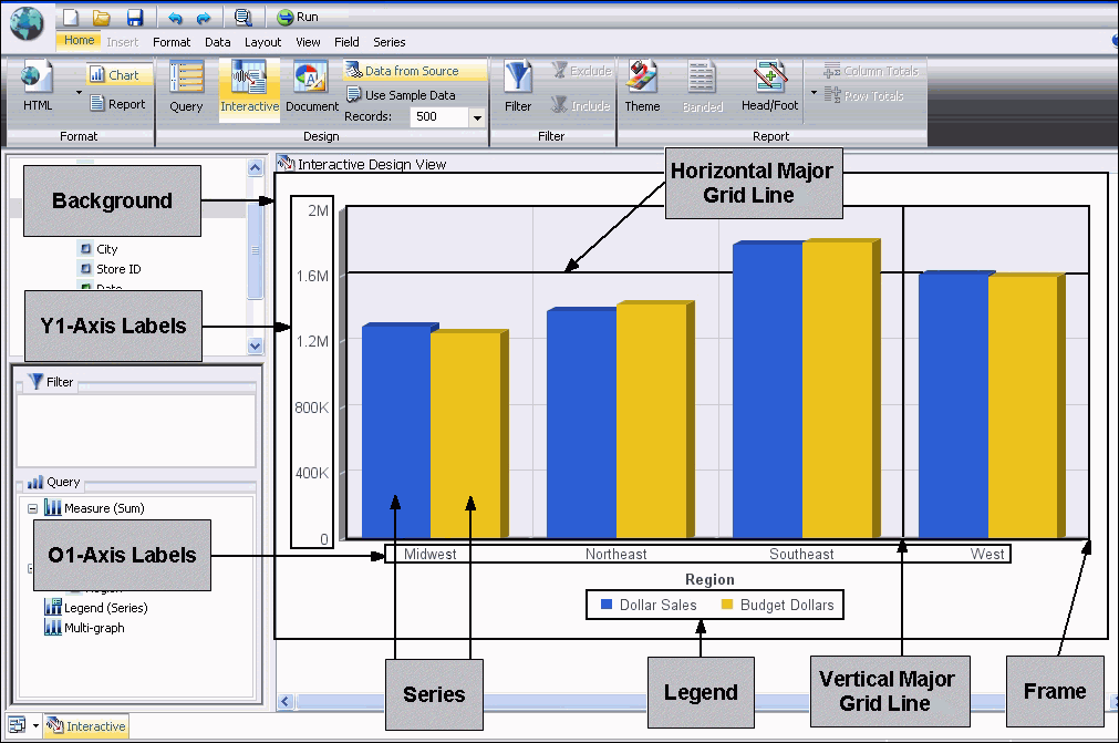
This diagram identifies many of the key elements that you can customize on a chart. The elements that are shown are included on a default vertical bar chart. Depending on the type of chart that you are creating, the elements and their associated right-click menu options will vary.
You can customize optional elements on a chart, that is, elements that are not included by default. For example, you can draw minor grid lines on a bar chart and customize them, using the options on the minor grid line right-click menu. For instructions on drawing minor grid lines, see How to Display Grid Lines.
How to: |
A series is a data source field that is included in a chart. You can customize a series in a number of ways.
When you right-click a series on a chart in Interactive Design view, a menu similar to the following is displayed.
Tip: The options that you see on the menu depend on the type of chart that you are creating. For example, you do not see Series Type for a pie chart, but you do see it for a bar, line, and area chart.
The options on the menu are described in the following table.
|
Option |
Description |
|---|---|
|
Filter Values |
Enables you to create or modify a WHERE statement, using the Filter dialog box. With a WHERE statement, you select only the data that you want to display, and exclude unwanted data. For information on filtering your data, see Using the Data Tab and Using the Field Tab. |
|
Prompt for Values |
Enables you to create an auto-prompt parameter, using the Filter dialog box. With this type of parameter, you are prompted for a value for a data source field when you run a report. The output displays information only for the field value that you choose. For information on creating an auto-prompt parameter, see Using the Field Tab. |
|
Aggregation Functions |
Assigns an aggregation value to a numeric measure field in a report. Aggregation values include the following: None (the default), Sum, Average, Count, Percent of Count, First Value, Last Value, Maximum, Minimum, Total, Percent, Row Percent, Average Square For instructions, see How to Display Measure Data on a Chart Using Aggregation Values. |
|
Traffic Light Conditions |
Enables you to specify the color of numeric measure fields in the output, depending on conditions that you set. By default, a chart displays values that satisfy the first condition in green and values that satisfy the second condition in red. You use the Traffic Light Condition dialog box to specify the conditions and colors. For instructions, see How to Apply Traffic Light Conditional Styling to a Chart. |
|
Visibility |
Controls the display of the selected series (field) on a chart. The value Hide suppresses the display of the series, and the default value Show displays the series. For instructions, see How to Suppress the Display of a Series. |
|
Change Title |
Enables you to edit the title of the selected series. On the Edit Title dialog box, type the new title in the Enter Title field and click OK. |
|
Series Type |
Changes the chart type of the selected series to Bar, Line, or Area. The option None (the default) returns the series to the chart type that was in effect before you changed it. This option applies to bar, line, and area chart types only. |
|
Series Color |
Enables you to specify the color of the selected series, using the Color dialog box. For information on the Color dialog box, see How to Customize the Background Color. |
|
Data Labels |
Controls the display of data labels (values) on the selected series. The default value Hide suppresses the display of labels, and the value Show displays labels. This option does not apply to the gauge chart type. |
|
Color Mode |
Controls how color is applied to a series (measure field) on a chart. The possible settings are By Series (the default) and By Group. For example, assume that there is only one series on a sample bar chart. The By Series setting applies the same color to all the bars in the series. The By Group setting applies a different color to each bar. For instructions and sample output based on each setting, see How to Control the Color Mode. |
|
Add Trendline |
Draws a line on a chart to indicate a statistical trend. You can choose from the following types of trendlines: None (the default), Linear, Quadratic, Polynomial, Hyperbolic, Logarithmic, Modified Hyperbolic, Rational, Exponential, Modified Exponential, Log Quadratic, Geometric This option does not apply to the pie, funnel, 3D, gauge, or stock chart type. For an example of a chart with a trendline, see How to Display Trendlines. |
|
Delete |
Removes the selected series from the report and updates the active preview accordingly. |
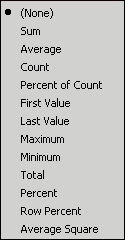
You can display numeric measure data using a variety of aggregation values.
The choices are None (the default), Sum, Average, Count, Percent of Count, First Value, Last Value, Maximum, Minimum, Total, Percent, Row Percent, and Average Square, as shown in the following image.
If you change the Measure (Sum) field container in the Query Design pane from Sum to Print, Count, or List, the change overrides all assigned aggregation values.
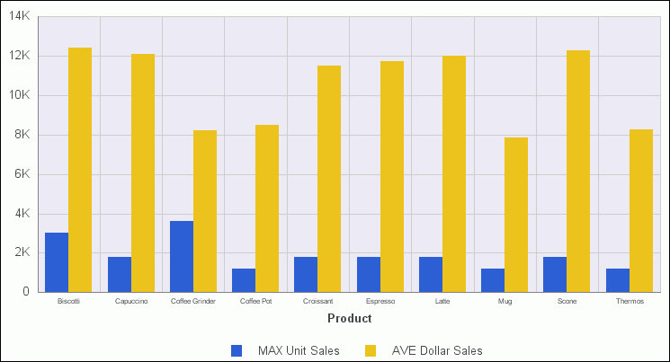
In the following image, the aggregation value of Maximum (MAX) was applied to Unit Sales, and the value of Average (AVE) was applied to Dollar Sales.
You can apply traffic light conditional styling to a selected numeric measure field on a chart. By default, the chart displays the values that satisfy the first condition in green, and the values that satisfy the second condition in red.
The Traffic Light Condition dialog box opens, displaying the green light selection fields. You can select and type green light criteria in these fields.
WebFOCUS will display data values that meet the criteria in green in the chart output.
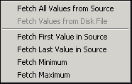
Alternatively, you can click an option in the Values drop-down menu, and double-click the desired data value in the Data Values dialog box that opens. As shown in the following image, from the Values drop-down menu, you can click Fetch All Values from Source, Fetch Values from Disk File, Fetch First Value in Source, Fetch Last Value in Source, Fetch Minimum, or Fetch Maximum.
The red light selection fields are displayed in the Traffic Light Condition dialog box, where you can select and type red light criteria.
WebFOCUS will display data values that meet the criteria in red in the chart output.
Alternatively, you can click an option in the Values drop-down menu, and click the desired value in the Data Values dialog box that opens.
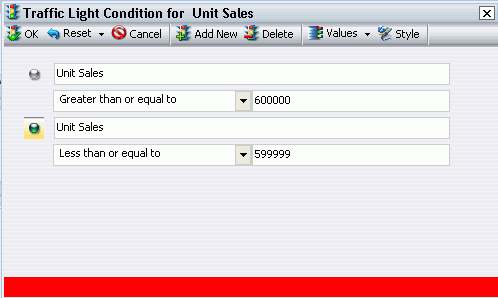
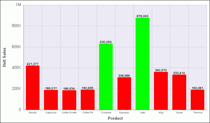
The following image shows the Traffic Light Condition dialog box. It contains criteria to display values for Unit Sales that are greater than or equal to 600000 in green, and values for Unit Sales that are less than or equal to 599999 in red.
In the Traffic Light Condition dialog box, you can perform the following actions.
 icon
to open the Color dialog box, where you can select a color different
from the default green and red colors that appear for the first two
conditions. When selecting colors, you can click a color square
on the left side of the dialog box, or click an area of the color
palette on the right side of the dialog box. You can also select
colors by typing numbers in the Hue, Sat, and Lum fields, or in
the Red, Green, and Blue fields. You can also use the up and down
arrows next to each field to set numeric values.
icon
to open the Color dialog box, where you can select a color different
from the default green and red colors that appear for the first two
conditions. When selecting colors, you can click a color square
on the left side of the dialog box, or click an area of the color
palette on the right side of the dialog box. You can also select
colors by typing numbers in the Hue, Sat, and Lum fields, or in
the Red, Green, and Blue fields. You can also use the up and down
arrows next to each field to set numeric values.The following image shows a sample bar chart, with traffic light conditional styling applied. The Unit Sales data is displayed in either green or red, according to the criteria that was specified in the Traffic Light Condition dialog box.
The chart also displays data labels for each Unit Sales measure value.
In this procedure, you will suppress the display of a series (field) in the chart output. For this option to work correctly, the chart that you are designing must include more than one series.
A drop-down menu provides values for controlling the display of the selected series.
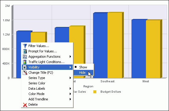
Tip: You can restore the series to the output. One way to do that is to right-click the name of the series in the Query Design pane in the Resources panel, highlight Visibility, and click Show from the pop-up menu. Another way to restore the series is to use the Hidden toggle in the Visibility group on the Field tab.
With the Color Mode option, you can control how color is applied to a series (measure field) on a chart. The possible settings are By Series (the default) and By Group.
In this procedure, you will run a bar chart with a single series, using the default By Series setting. Then you will run the same report, using the By Group setting.
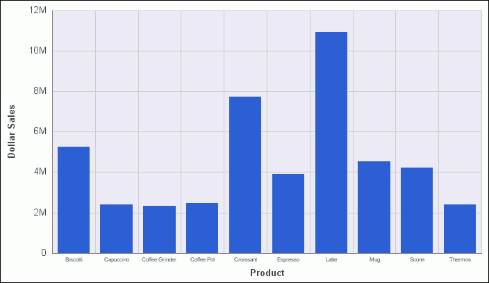
In the following sample output, all the bars in the single-series report are displayed in the same color.
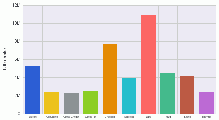
In the following sample output, each bar in the single-series report is displayed in a different color.
How to: |
You can adjust the appearance of the background and frame to achieve a visual effect that is different from the default.
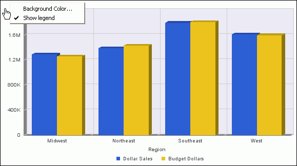
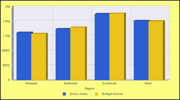
The following image shows the menu that is displayed when you right-click the background of a bar chart.
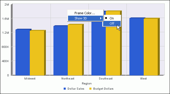
The following image shows the menu that is displayed when you right-click a frame on a bar chart. In the image, the Show 3D option is On (the default).
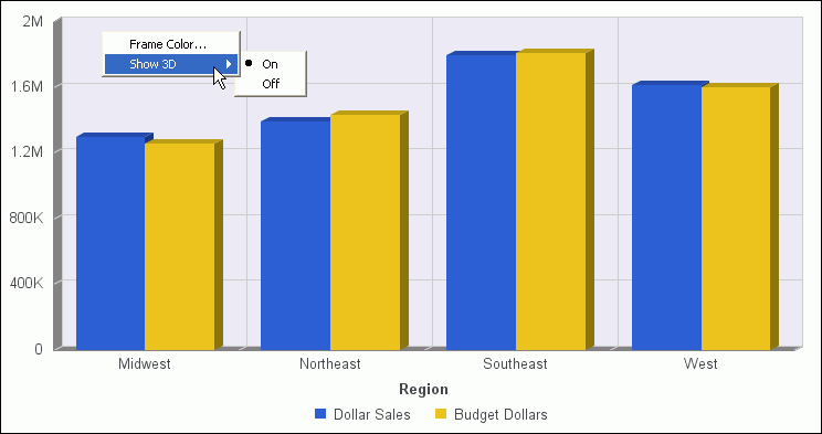
The frame element does not apply to the pie, 3D, spectral map, or pareto chart type.
The options for the background and frame elements are described in the following table.
|
Element |
Option |
Description |
|---|---|---|
|
Background |
Background Color |
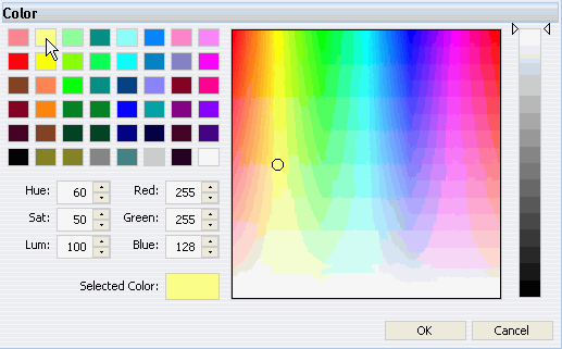
Enables you to specify the color of the background, using the Color dialog box. For instructions, see How to Customize the Background Color. |
|
Show legend |
Controls the display of the legend on the background. When selected, it displays the legend. When deselected, it suppresses the display of the legend. | |
|
Frame |
Frame Color |
Enables you to specify the color of the frame, using the Color dialog box. |
|
Show 3D |
Controls the depth of the frame. The default value On renders the frame in 3D depth. The value Off renders the frame in one dimension. For instructions, see How to Remove 3D Depth From a Bar Chart. |
In this procedure, you will change the color of the background of a chart from white (the default), to a color of your choice.
The following menu is displayed.
The Color dialog box opens.
When selecting colors, you can click a color square on the left side of the dialog box, or click an area of the color palette on the right side of the dialog box. You can also select colors by typing numbers in the Hue, Sat, and Lum fields, or in the Red, Green, and Blue fields. You can also use the up and down arrows next to each field to set numeric values.
In the following image, a shade of yellow has been selected.
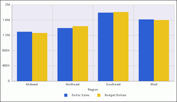
3D depth for bar charts is enabled by default. In this procedure, you will remove 3D depth from a default vertical bar chart, using the frame right-click menu.
A chart can contain several types of grid lines. All grid lines are drawn across the entire region of the chart.
Minor grid lines supplement major grid lines. If a plot point falls in between major grid lines, you can use minor grid lines for more precise interpretation of the data.
For information on adding grid lines to a chart, or removing them, see How to Display Grid Lines.
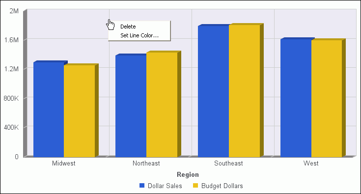
Using the applicable right-click menu, you can remove any type of grid line or change its color.
The following image shows the menu that is displayed when you right-click any type of grid line on a chart. In this example, a vertical major grid line is selected.
The options for the grid line elements are described in the following table.
|
Element |
Option |
Description |
|---|---|---|
|
Horizontal Major Grid Lines Horizontal Minor Grid Lines Vertical Major Grid Lines (Ordinal Axis) Vertical Minor Grid Lines (Ordinal Axis) Vertical Major Grid Lines (Numeric Axis) Vertical Minor Grid Lines (Numeric Axis) |
Delete |
Removes the grid line from the chart and updates the active preview accordingly. |
|
Set Line Color |
Enables you to specify the color of the grid line, using the Color dialog box. |
A chart can contain the following types of axis labels.
Using the applicable right-click menu, you can delete, stagger, rotate, and style any type of axis label. You can also format any type of axis label except the O1-axis label.
The following image shows the menu that is displayed when you right-click a Y1-axis label on a chart.
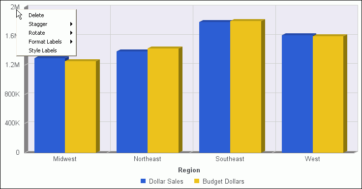
The options for the axis label elements are described in the following table. For an example of a chart with customized axis labels, see How to Customize the Display of Axis Labels.
|
Element |
Option |
Description |
|---|---|---|
|
O1-Axis Labels |
Delete |
Removes the labels from the chart and updates the active preview accordingly. |
|
Stagger |
Controls the positioning of the labels. The On value positions the labels in a zigzag pattern. The Off default value positions the labels in a straight row. | |
|
Rotate |
Rotates the labels a specified number of degrees: None (the default), 45, 90, or 270. | |
|
Style Labels |
Enables you to apply styling to the labels, using the Style dialog box. You can specify font name, font size, font style (bold, italic, underline), text justification (left, center, right), and font color, or reset the styling to the default. | |
|
Y1-Axis Labels Y2-Axis Labels X1-Axis Labels |
Delete |
Removes the labels from the chart and updates the active preview accordingly. |
|
Stagger |
Controls the positioning of the labels. The On value positions the labels in a zigzag pattern. The Off default value positions the labels in a straight row. | |
|
Rotate |
Rotates the labels a specified number of degrees: None (the default), 45, 90, or 270. | |
|
Format Labels |
Formats the labels according to the value that you specify: General (the default), No decimal, Percent with no decimal, Percent with one decimal, Percent with two decimals, Currency general, Currency with no decimal, General in thousands, Currency in thousands, General in millions, Currency in millions, General in billions, Currency in billions, General in trillions, Currency in trillions, Thousands separator no decimal, Thousands separator two decimals, Date short, Date medium, Date long, Date full, Percent with no decimal/100, Percent with one decimal/100, Percent with two decimals/100. | |
|
Style Labels |
Enables you to apply styling to the labels, using the Style dialog box. You can specify font name, font size, font style (bold, italic, underline), text justification (left, center, right), and font color, or reset the styling to the default. |
How to: |
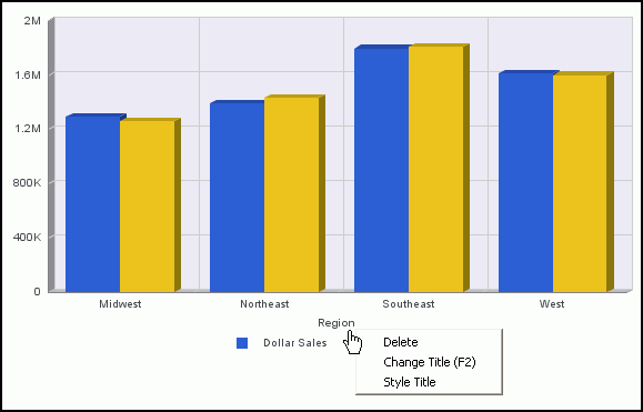
A chart can contain the following types of axis titles.
Using the applicable right-click menu, you can delete any type of title, change the text for the title, or style the title.
The following image shows the menu that is displayed when you right-click the O1-axis title on a chart.
The options for the title elements are described in the following table.
|
Element |
Option |
Description |
|---|---|---|
|
O1-Axis Title Y1-Axis Title Y2-Axis Title X1-Axis Title |
Delete |
Removes the selected title from the chart and updates the active preview accordingly. |
|
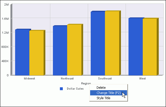
Change Title |
Enables you to edit the selected title. For instructions, see How to Change the Text for the O1-Axis Title. | |
|
Style Title |
Enables you to apply styling to the selected title, using the Style dialog box. You can specify font name, font size, font style (bold, italic, underline), text justification (left, center, right), and font color, or reset the styling to the default. |
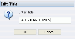
In this procedure, you will change the default text for the O1-axis title. The default text is the name of a sort field in the chart.
The Edit Title dialog box opens.
In this example, the new text is SALES TERRITORIES.
The legend contains information that is necessary to accurately interpret the data on a chart. By default, a chart displays either a Y1-axis title if there is a single measure field, or a legend if there are multiple measure fields.
The following image shows the menu that is displayed when you right-click a legend on a chart.
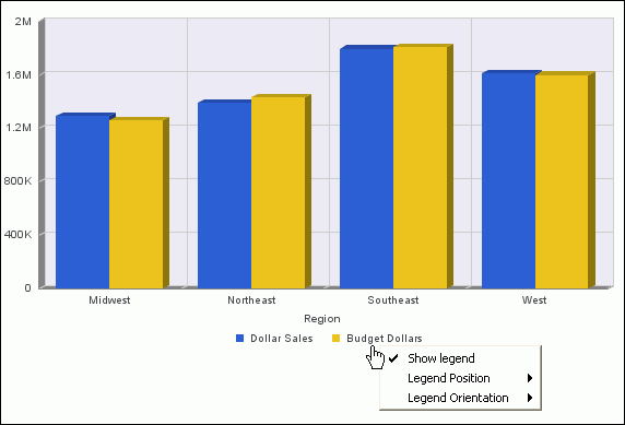
If you right-click the background area around the legend, two additional options are available: Legend Area Color and Legend Border Color. All the options for the legend element are described in the following table.
|
Option |
Description |
|---|---|
|
Show Legend |
Controls the display of the legend. When you check this option (the default), InfoAssist displays the legend. When you deselect this option, InfoAssist suppresses the display of the legend. The background right-click menu has an option to restore the legend after it has been suppressed. |
|
Legend Position |
Controls the placement of the legend on the chart. Possible values are: Auto (the default), Bottom, Right, Left, Top, Right bottom, Right top, Left bottom, Bottom right, Top right, Bottom left, Top left For an example of a customized legend, see How to Customize the Display of Legend Labels. |
|
Legend Orientation |
Controls the orientation of the legend on the chart. Possible values are: Auto (the default), Vertical, Horizontal For an example of a customized legend, see How to Customize the Display of Legend Labels. |
|
Legend Area Color |
Enables you to specify the color of the legend background area, using the Color dialog box. This option is available only when you right-click the area around the legend. |
|
Legend Border Color |
Enables you to specify the color of the border around the legend background area, using the Color dialog box. This option is available only when you right-click the area around the legend. |
| WebFOCUS |