Modifying Graph Properties With Chart Editing Forms
In this section: Reference: |
The Chart Editor provides access to a complete array
of user interfaces, referred to as chart editing forms, that are
easy to use and enables you to utilize advanced chart customizing
options for every modifiable graph property. You can modify properties such
as size, style, location, alignment, width, height, color, and text
to display for graph elements including frames, series, legends,
titles, and data. Other modifiable areas include axis scale customization,
advanced 3D chart handling, the ability to create annotations, and expanded
font type selection.
Most of the chart editing forms are available from the Chart
Editor tab and are described in this section. Additionally, there
are chart editing forms you can access from the Data Selection tab.
The Chart Properties and Field Properties forms enable you to modify chart
elements and field properties while working with data fields in
the query pane. Detailed information for using these properties
forms can be found later in this section.
When you select a chart editing form, a corresponding set of
Properties appears below the graph preview area. A specific chart
editing form is available for each set of related chart editing
options. Chart editing forms provide you with drop-down lists, text
boxes, and color palettes for selecting options, entering information,
and modifying colors. Chart editing forms also provide the following
options for viewing properties:
- Click
 to
view properties sorted in alphabetical order. Click the Property
column heading to reverse the order. This button toggles between
this view and viewing properties with groupings, which is the default
view.
to
view properties sorted in alphabetical order. Click the Property
column heading to reverse the order. This button toggles between
this view and viewing properties with groupings, which is the default
view.
- Click
 to view
properties with groupings (related properties), which is the default
view. This button toggles between this view and the alphabetical
order view.
to view
properties with groupings (related properties), which is the default
view. This button toggles between this view and the alphabetical
order view.
- Click
 to show
a description of the selected property in a panel below the chart
editing form. This button toggles between showing and hiding the
property description.
to show
a description of the selected property in a panel below the chart
editing form. This button toggles between showing and hiding the
property description.
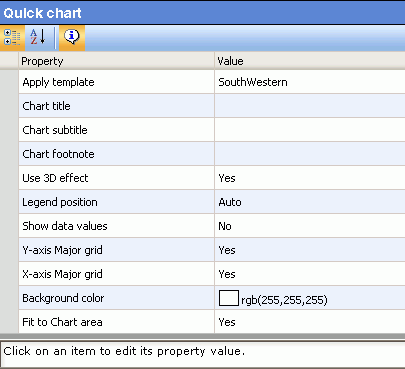
The following image shows the chart editing form for Quick chart,
which is available in the Chart folder, with the property description
option enabled.
In each of the chart editing forms, you can edit a setting for,
or add text to, a chart element listed in the Property column. To
change the attributes for any chart element, click or double-click
the Value column area to the right of the chart element you want
to edit, and modify the setting or text value.
Use the following guidelines to perform edits to any of the chart
elements listed in the various chart editing forms:
- For text-based
chart elements to which you want to add new or editing existing text,
double-click the Value column area next to the desired chart element
and type the desired text.
- For setting-based
chart elements for which you want to change the current setting, click
the Value column area next to the desired chart element and use
the drop-down list at the far right of the row to select the new
setting.
- For color-based
chart elements for which you want to change the color, click the color
square in the Value column next to the desired chart element and
select the desired color from the color selection dialog box that
appears.
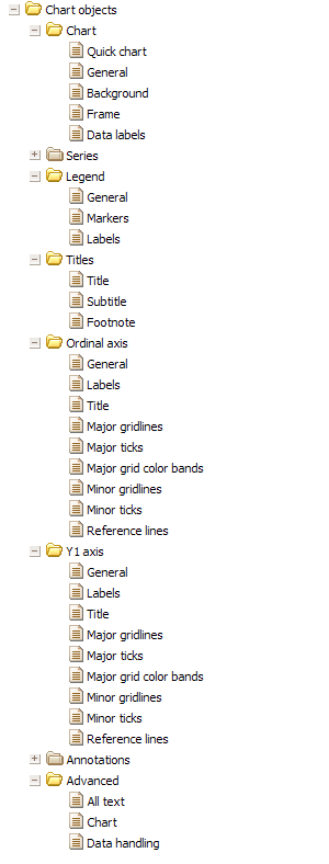
The following image shows all the chart object folders of the
Chart Editor. The associated chart editing forms (document icons)
are displayed where the folders are expanded.
x
Reference: Chart Editor Folders and Forms
The
Chart Editor contains a set of chart editing forms within each chart
object folder, as shown in the following table:
|
Chart Object Folder
|
Chart Editing Forms
|
|---|
|
Chart
|
Quick Chart, General, Background, Frame,
Data labels
|
|
Series
|
All series, Series 0 (When a sort field
is added to the Series-legend sort container in the query pane,
additional Series forms are added so that the total number of forms
equals the number of unique values for that sort field. These values
are also displayed in the legend area below the graph.)
|
|
Legend
|
General, Markers, Labels
|
|
Titles
|
Title, Subtitle, Footnote
|
|
Ordinal axis
|
General, Labels, Title, Major gridlines,
Major ticks, Minor gridlines, Minor ticks
|
|
Y1 axis
|
General, Labels, Title, Major gridlines,
Major ticks, Minor gridlines, Minor ticks, Reference lines
|
|
Annotations
|
Annotations 0, Annotations 1, Annotations
2, Annotations 3, Annotations 4
|
|
Advanced
|
Script editor, All text, Chart, Data handling
|
Only the chart editing forms in the Chart folder
are documented in the following topics. Since each property in the
chart editing forms has a property description available to explain the
functionality of that property, refer to the property descriptions
for more information about editing the chart elements in the chart
editing forms located in the other Chart Object folders, which include
Series, Legend, Titles, Ordinal axis, Y1 axis, Annotations, and Advanced.
x
Reference: Chart Editor Considerations
There
are some properties in the Chart Editor that are mutually exclusive.
For example, setting Rectangle values of a graph (x, y, width, height)
in the Frame form is not possible when the Fit to Chart area attribute
in the Quick chart form (also in the General form) is set to Yes
(enabled). Yes is the default value. To edit a graph x, y, width,
and height values, you must first disable the Fit to Chart area attribute
(set to No).
xChart Folder Editing Forms
In the Chart Editor, the Chart folder provides you with
chart editing forms for the chart elements most often customized
by users of Advanced Graph Assistant. The chart elements you can
modify and the corresponding values you can use are shown in the following
tables for each chart editing form found in the Chart folder.
x
Reference: Chart - Quick Chart Properties
The
following table lists the properties and values you can use in the
Quick Chart form.
|
Property
|
Value
|
|---|
|
Apply template
|
Select from Southwestern, Pastels, Extruded
pastels, Cylinders on gray, Plum on white, Greys, Fade to gray,
True Colors, Color to white, Red Accent, Beveled on tan, or Default.
|
|
Chart title
|
Type desired title text.
|
|
Chart subtitle
|
Type desired subtitle text.
|
|
Chart footnote
|
Type desired footnote text.
|
|
Use 3D effect
|
Select from Yes or No to turn the 3D depth
effect on or off.
|
|
Legend position
|
Set the placement location of the legend.
Select from Free Float, Auto, Bottom, Right, Left, Top, Right Top,
Right Bottom, Left Top, Left Bottom, Left Top, Left Bottom, Bottom
Left, Bottom Right, Top Left, or Top Right.
|
|
Show data values
|
Select from Yes or No to display data label
values or not.
|
|
Y-axis Major grid
|
Select from Yes or No to display the Y-axis
major grid or not.
|
|
X-axis Major grid
|
Select from Yes or No to display the X-axis
major grid or not.
|
|
Background color
|
Click a color square to select the background
fill color.
|
|
Fit to Chart area
|
Select from Yes or No to turn auto placement
on or off.
|
x
Reference: Chart - General Properties
The
following table lists the properties and values you can use in the
General form.
|
Property
|
Value
|
|---|
|
Transparent border color
|
Select from true or false to make the border
color transparent or not.
|
|
Background color
|
Click a color square to select the background
fill color.
|
|
Bar width
|
Set the numeric value for the bar width.
|
|
Bar spacing
|
Set the numeric value for the bar spacing.
|
|
Default marker size
|
Set numeric values for the default marker
size.
|
|
Fit to Chart area
|
Select from Yes or No to turn auto placement
on or off.
|
x
Reference: Chart - Frame Properties
The
following table lists the properties and values you can use in the
Frame form.
|
Property
|
Value
|
|---|
|
Depth angle
|
Set the numeric value for the frame depth
angle.
|
|
Depth radius
|
Set the numeric value for the frame depth
radius.
|
|
Transparent frame color
|
Select from Yes or No to make the frame
fill color transparent or not.
|
|
Frame fill color
|
Click a color square to select the frame
fill color.
|
|
Transparent frame border color
|
Select from Yes or No to make the frame
border color transparent or not.
|
|
Frame border color
|
Click a color square to select the frame
border color.
|
|
Frame shadow
|
Show shadow - Select from Yes or No to display
a shadow for the frame or not.
Horizontal offset - Set the
numeric value for the X-axis offset of the frame shadow.
Vertical
offset - Set the numeric value for the Y-axis offset of the frame
shadow.
Shadow color - Click a color square to select the
shadow color.
|
|
Side frame
|
Transparent color - Select from Yes or No
to make the side frame fill color transparent or not.
Frame
color - Click a color square to select the side frame fill color.
Transparent
border color - Select from Yes or No to make the side frame border
color transparent or not.
|
|
Bottom frame
|
Transparent color - Select from Yes or No
to make the bottom frame fill color transparent or not.
Frame
color - Click a color square to select the bottom frame fill color.
Transparent
border color - Select Yes or No to make the bottom frame border
color transparent or not.
|
x
Reference: Chart - Background Properties
The
following table lists the properties and values you can use in the
Background form.
|
Property
|
Value
|
|---|
|
Show background border color
|
Select whether to show the chart background
border color.
|
|
Background color
|
Select a background color for current graph.
|
|
Background fill type
|
Select whether to fill the area with a solid
color or a gradient effect.
|
|
Number of gradient colors
|
Select the number of colors that will be
used to create the gradient effect. To create the Two color gradient,
select Color A and Color B. For Three color gradient, the third
color is the same as Color A.
|
|
Gradient direction
|
Select the direction of color progression
on a shape.
|
|
Background gradient color A
|
Select the start color for the gradient
effect.
|
|
Background gradient color B
|
Select the stop color for the gradient effect.
|
x
Reference: Chart - Data Labels Properties
The
following table lists the properties and values you can use in the
Data Labels form.
|
Property
|
Value
|
|---|
|
Show data values
|
Select from Yes or No to display data values
or not.
|
|
Position
|
Set the data values position. Select from
Above, On top edge, Below top edge, Center, or Base.
|
|
Format data text
|
Set the format of the data labels.
Select
from Use Pattern, General, No decimal, Percent with no decimal,
Percent with one decimal, Percent with two decimals, Currency general,
Currency with no decimal, General in thousands, Currency in thousands,
General in millions, Currency in millions, General in billions,
Currency in billions, General in trillions, Currency in trillions,
Thousands separator no decimal, or Thousands separator two decimals.
|
|
Text format pattern
|
Edit the text format pattern for the data
labels (default is #.#).
|
|
Use color when data text value is negative
|
Select from true or false to use or not
use color to display data text when the values are negative.
|
|
Negative color
|
Click a color square to select the color
for negative values in the data labels.
|
|
Font size
|
Set the numeric value for the font size
of the data labels text.
|
|
Font style
|
Set the font style for the data labels text.
Select from Plain, Italic, Bold, Italic Bold, Underline, Italic
Underline, Bold Underline, or Bold Italic Underline.
|
|
Horizontal justification
|
Set the horizontal justification positioning
for the data labels text. Select from Left, Center, or Right.
|
|
Data text color
|
Click a color square to select the data
text color.
|
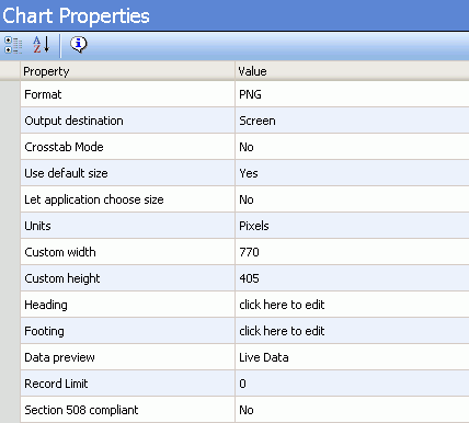
xUsing the Chart Properties Form to Modify a Graph
The Chart Properties form provides you with an interface
to select output options and modify various chart elements in your
graph. The following image shows the properties you can modify and
the corresponding default values in the Chart Properties form:
x
Procedure: How to Access the Chart Properties Form
-
Click the chart in the graph preview area.
or
Click the Chart
 icon
in the query pane below the Available Fields tab.
icon
in the query pane below the Available Fields tab.
-
The
Chart Properties form is displayed below the graph preview area.
x
Reference: Chart Properties
For
the Chart Properties form, the chart elements you can modify and
the values you can use are listed in the following table.
|
Property
|
Value
|
|---|
|
Format
|
Select from PNG, JPEG, GIF, or SVG.
|
|
Output destination
|
Select from Screen, File, or Printer.
|
|
Name
|
Type a name. The default is HOLD. This property
is only displayed when you select File for Output destination.
|
|
Crosstab Mode
|
Select from Yes or No. Displays the Series-legend
icon and enables secondary X-axis functionality.
|
|
Use default size
|
Select from Yes or No.
|
|
Let application choose size
|
Select from Yes or No.
|
|
Units
|
Pixels is the default and only value for
Units.
|
|
Custom width
|
You can edit the numeric value for the width.
|
|
Custom height
|
You can edit the numeric value for the height.
|
|
Heading
|
Click the text, then click the browse (...)
button to launch heading dialog, and add or edit the FOCUS heading
value.
|
|
Footing
|
Click the text, then click the browse (...)
button to launch footing dialog, and add or edit the FOCUS footing
value.
|
|
Data Preview
|
Select Sample Data to
view sample data in the graph preview area. Select Live Data,
which is the default, to view live data in the graph preview area.
|
|
Record limit
|
You can edit the numeric record limit value
(default is 0).
|
|
Section 508 compliant
|
Select from Yes or No.
|
|
Summary text for graph
|
Type text. This property is only displayed
when you select Yes for Section 508 compliant.
|
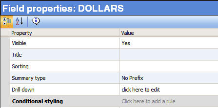
xUsing Field Properties Forms to Modify a Graph
The Field properties forms provide you with an interface
to modify properties for an individual field. There are two types
of Field properties forms, one for the Y-axis, and one for all other
dimensions.
The following image shows the Y-axis Field properties form for
the selected field.
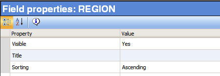
The following image shows the Field properties form used for
all other dimensions.
x
Procedure: How to Access the Field Properties Forms
-
Click
a field in the query pane, located below the Available Fields tab.
-
The
Field properties form is displayed below the graph preview area.
x
Reference: Field Properties
For
the Y-axis Field properties forms, the chart elements you can modify
and the values you can use are listed in the following table.
|
Property
|
Value
|
|---|
|
Visible
|
Select from Yes or No. Yes displays the
selected field in the graph output, and is the default value. No
hides the field (does not display in the output). For more information,
see Hiding the Display of Y-axis, X-axis, or Multi-graph Data.
|
|
Title
|
Type text to change the selected field name
in the output. For more information, see Editing Vertical (Y-axis) and Horizontal (X-axis) Data Labels.
|
|
Sorting
|
Select Ascending or Descending to change
the order in which the data is displayed for the selected sort field.
|
|
Summary type
|
Select one of the values from the drop-down
list to assign a numeric summary type value to the selected Y-axis
field. For more information, see Assigning a Numeric Summary Type Value to Y-axis Data.
|
|
Drill down
|
Create a drill-down link for the selected
field. Click the text, then click the browse (...) button to launch
the drill down dialog box. For more information, see Linking Graphs to Other Resources.
|
|
Conditional Styling
|
Create a conditional styling rule for the
selected field. Click the text, then click the New styling rule
button to launch the Create conditional styling rule dialog. For
more information, see Applying Conditional Styling to a Graph.
|
For the Field properties form for all other
dimensions, the chart elements you can modify and the values you
can use are listed in the following table.
|
Property
|
Value
|
|---|
|
Visible
|
Select from Yes or No. Yes displays the
selected field in the graph output, and is the default value. No
hides the field (does not display in the output).
|
|
Title
|
Type text to change the selected field name
in the output. For more information, see Editing Vertical (Y-axis) and Horizontal (X-axis) Data Labels.
|
|
Sorting
|
Select Ascending or Descending to change
the order in which the data is displayed for the selected sort field.
|