Applying Conditional Styling to a Graph
You can add further value to your graph by using conditional
styling to highlight certain Y-axis data with specific styles and
colors. Conditional styling, also referred to as stoplighting, enables
you to define conditions that determine when to apply particular fonts,
point size, text style, foreground and background color, and drill-down
procedures to the data in your report when the report is run.
For example, you can apply the color red to all departments that
did not reach their sales quotas and apply the color black to all
departments that reached their sales quotas. In this example, the
user can view quickly which departments did or did not reach their quotas.
To examine how the results of one department may impact the results
of a second department, you may want to provide a drill down to
a report that examines this possibility.
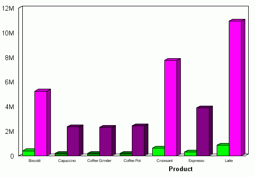
Example: Applying Conditional Styling to a Graph
The following illustrates how you can
apply conditional styling to a graph. In this example:
- Pink is specified as the color for data
in the DOLLARS column when the value is greater than five million
(5M).
- Dark purple is specified as the color
for data in the DOLLARS column when the value is less than or equal
to five million (5M).
- Bright green
is specified as the color for data in the UNITS column when the
value is greater than two hundred thousand.
- Dark green
is specified as the color for data in the UNITS column when the
value is less than or equal to two hundred thousand.
The
output is shown in the following image.
x
Procedure: How to Add Conditional Styling to a Graph
-
Click
the Data selection tab.
-
Click
the Available Fields tab below the Data selection
pane.
-
Select
the Y-axis field, listed in the query pane below the Chart icon,
to which you want to apply conditional styling.
-
Click
the Click here to add a rule text in the Value
column to the right of where Conditional Styling is listed in the
Property column of the Field Properties pane.
The New Styling Rule button appears in place of the text
you just clicked.
-
Click
the New Styling Rule button.
The Create Conditional Style Rule dialog box opens, as
shown in the following image.
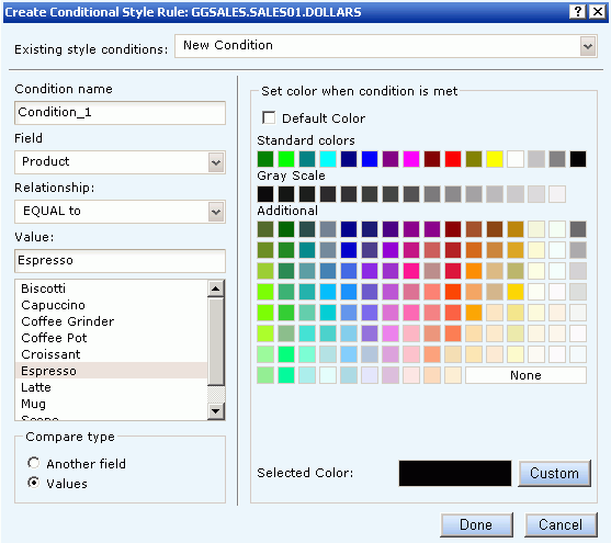
-
Make
sure the desired condition is listed in the Condition name field.
You can also select an existing or new condition using
the Existing style conditions drop-down list.
-
Select
the desired field from the Field drop-down list.
-
Select
the desired relationship operator from the Relationship drop-down
list.
Your choices are: EQUAL to, NOT EQUAL to, GREATER THAN,
LESS THAN, GREATER THAN or EQUAL to, and LESS THAN or EQUAL to.
-
Select Another
field or Values for the desired
Compare type.
The Value selection list is populated with existing data
source fields or values.
-
Specify a value by doing one of the
following:
- Select the desired field or value from
the Value selection list to populate the Value box.
or
- Type a literal value in the Value box.
-
Select
a color from the 'Set color when condition is met' color palette.
Alternately, you can click the Custom button to select
a custom color.
Note: You have to deselect the Default
Color check box to select a color.
-
Click Done.
x
Procedure: How to Edit Existing Conditional Styling in a Graph
-
Click
the Data selection tab.
-
Click
the Available Fields tab below the Data selection
pane.
-
Select
the Y-axis field, listed in the query pane below the Chart icon,
to display the Field Properties pane below the graph preview area.
-
Find
the existing condition you want to edit that is listed under the Conditional
styling heading in the Property column of the Field Properties pane,
then click the corresponding conditional rule text in the Value
column.
The conditional rule text becomes grayed-out, and edit
and delete buttons appear in the Value column.
-
Click
the edit
 button
to the far right of the conditional rule text in the Value column.
button
to the far right of the conditional rule text in the Value column.
The Create Conditional Style Rule dialog box opens.
-
Select
the appropriate values for all fields required to perform the desired
edits to the existing conditional styling rule. For more details,
see How to Add Conditional Styling to a Graph.
-
Click
the Update Condition button.