This section provides an overview of how to communicate
with the Winform Painter, how to begin and end a Painter session,
how to save your work, and which files are produced by the Painter.
To select any item in the Winform Painter, or in a Winform at
run time—for example, to select a menu option, an item in a list
box, a radio button, or to click a button—position the cursor on
that item and then press the Enter key. (Pressing a function key
has the same effect as pressing Enter, but will also perform whatever
action is associated with that function key.)
Because the Winform Painter runs in a mainframe environment,
the host computer does not become aware of what you (or an end user)
do on the screen until you press the Enter key or a function key.
x
A dialog box is used to request information about a
task you are performing, or to supply needed information.
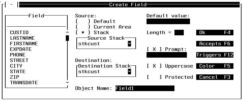
For example, a dialog box is displayed if you choose Field from the
Objects menu. In the Create Field dialog box, you specify the field
name, its input (or source), its output (or destination), and other
information about displaying the field.
Most dialog boxes contain options you can select. After you specify
options, you can choose a command button to carry out a command.
Often you need to move within a dialog box to select one or more
options. When you enter the dialog box, the cursor is on the first
option. To move to another option, you can press the Tab key to
move forward through the options or you can press the Tab and the Shift
key to move backward through the options. Inside a dialog box, PF3
is always Cancel or No and PF4 is always OK or Yes. When a dialog
box offering several options has a default option, Enter always
selects the default.
The kinds of controls that you may see in a dialog box are described
in the following sections.
x
You type information into an entry field.
When you move into an empty entry field, the cursor appears on
the left side of the box. Whatever is typed into the entry field
is started where the cursor is. You can enter more text than will
fit in the box by scrolling the text. This is done by positioning
the cursor at the end of the editable area and pressing PF11. PF10
scrolls left and PF11 scrolls right.
x
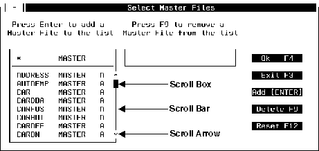
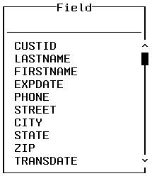
A list box displays a list of choices. If there are
more choices than can fit in the box, scroll bars are provided so
you can move through the list. The selected item is displayed in
a different color than the rest of the list on terminals that support
color. The following shows a list box (with scroll bar annotations)
displaying a list of all of the Master Files available.
In list boxes and anywhere else scroll bars might appear on the
screen, scroll bars can be used as follows:
|
To scroll ...
|
Move the cursor to ...
|
|---|
|
One line up or down.
|
The up or down arrow on the vertical scroll
bar and press the Enter key.
|
|
One screen up or down.
|
Just above or below the arrow on the vertical
scroll bar and press the Enter key.
|
|
One position left or right.
|
The right or left arrow on the horizontal
scroll bar and press the Enter key.
|
|
One screen left or right.
|
Just to the right or left of the arrow on
the horizontal scroll bar and press the Enter key.
|
When you scroll through a list, the scroll box moves up, down,
left or right to indicate where you are in the list.
To select an item from a list box, move through the list as specified
above. When the item you want is displayed, move the cursor to that
entry and press the Enter key.
x
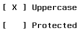
A check box indicates that you can select or clear (that
is, deselect) the indicated option. You can select an option by
typing any character in the middle of the check box; after you press
the Enter key or a function key, the check box is shown with an
X in the middle. You can clear an option by removing the X from
the check box.
Check boxes are displayed using square brackets or angle brackets,
depending on your hardware. If strange characters appear instead
of brackets, select the Terminal option from
Preferences in the File menu to get something more appropriate to
display. For more details see Preferences.
x
The Control box is used to alter the size of, or move
a Winform. The Control box is in the upper left-hand part of the
Winform. It is a dash framed by two parallel lines. If you position
the cursor between the two parallel lines and press the Enter key,
the Control box menu is displayed:

At run time the control box allows you to move or close the Winform
but not size or zoom it. For details about Move, Size and Zoom,
see Size, Zoom and Move.
x
Radio buttons represent mutually exclusive options.
You can select only one radio button at a time. A radio button is
indicated by parentheses, and the selected button displays an asterisk.
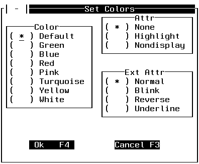
To select a radio button, move the cursor to the button—to the
middle position between the button's parentheses—and type any character.
When you then press the Enter key or a function key, that button
is selected, and it displays an asterisk.
If more than one option is selected, only the last option is
considered selected and all other options are left blank. If the
keyboard locks after you type a key, it probably means that the
cursor was not in the middle of the radio button. If this happens,
press the Reset key and try again.
x
You click a command button to initiate an immediate
action, such as carrying out or canceling a command. The OK and Cancel buttons
are common command buttons. They usually are located along the bottom
or on the right side of the dialog box. To click a command button, move
the cursor to the button and then press the Enter key. Or, if the
button has a shortcut key, you can click the button even faster
simply by pressing its key. (A shortcut key is a function key assigned
to a button. When a button has a shortcut key, the key name is usually displayed
next to the button name.) In the sample screen, the Cancel button's
shortcut key is F3: you can click the button either by pressing
F3, or by moving the cursor to the Cancel button
and pressing Enter.
In some dialog boxes, one command button is the default. In addition
to the standard ways to click a button described previously, you
can always click the default button by pressing Enter. On terminals
that support color, the default button is the color of the terminal's
unprotected high intensity field attribute.
The following shows the command buttons at the bottom of the
Listbox dialog box:

x
When an entry field appears together with a list box,
the combination is known as a combo box. You can place a value into
the entry field by selecting it from the list box or by typing it
directly into the entry field.
The following shows the combo box in the Create Field dialog
box:
Note that combo boxes that you create in a Winform are similar
to drop-down list boxes.
x
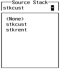
A drop box is an entry field with a down-arrow (v) button.
When you click the button, the Painter displays a list box directly
adjacent to the display field (as if the list had dropped down from
the field). When you select a value from the list box, the Painter
copies it to the display field and removes the list box.
The following shows the initial display field in the Create Field
dialog box:
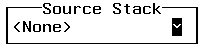
After clicking the button, the drop box is displayed:
x
The ability to display colors depends upon your terminal,
or if you are using a PC, your terminal emulation software, and
on describing it correctly to Maintain. This is discussed in Preferences.
x
Winforms can have borders around them. The physical
look of these borders is determined by your terminal or your terminal
emulation software. If your terminal is not capable of generating
solid lines, your work may not match some of the examples in this
document. The only difference is in appearance, not functionality.
You can adjust the settings for borders. This is discussed in Preferences.