Inserting a Graph Object

In this section:

How to:

Reference:

This section explains how to insert a Graph object.


Top of page

x
Procedure: How to Insert a Graph Object in Power Painter
  1. Select the Graph button from the Toolbox palette and drag it onto the canvas.

    or

    Select Graph from the Insert menu.

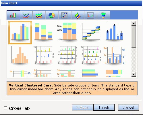
    The New Chart dialog box appears.

    New Chart

  2. Select a chart type and click Finish.

    The graph appears on the canvas.

    Tip: To view the New Chart dialog box after the graph has been added to the canvas, select Show Chart Types from the right-click context menu of the graph.

  3. From the Data Sources palette, select a field and drag it to the graph object.

    When you drag a field into the graph, drop the field on the Y axis, X group axis, Coordinated, or other specialized field container in the Query pop-up dialog box that appears, as shown in the following image.

    Query pop-up

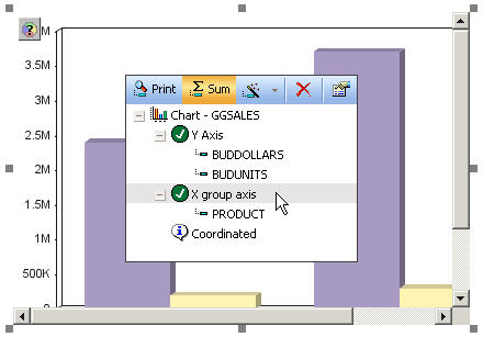
    You can also double-click a field to automatically add it to the graph. Numeric fields, such as decimal and floating point, are added to the Y axis (or other specialized) container. Non-numeric fields, such as alphanumeric and date fields, are added to the X group axis (or other specialized) container.

    Note: The Coordinated field container contains a common sort field for creating multiple reports and graphs that are burst into separate page layouts. Each value for a coordinated sort field displays on a separate page.

  4. To edit or delete fields in a graph, select the desired graph object in the canvas, then open the Query pop-up dialog box or Query palette.
    • To open the Query pop-up dialog box, click the Query button above the selected report object (or right-click the report object and select Query from the context menu).
    • To open the Query palette, from the View menu, select Palettes, then select Query from the Palettes submenu.

    The Y axis, X group axis, and Coordinated field containers appear with the selected fields in the graph. Note that some specialized graphs have other field containers. You can drag and drop fields into different containers, delete fields, add and edit compute fields, and view properties for a selected field from this dialog box. You can also select Print to display all of the values found in the data source for a selected field, or select Sum to sum the values of a selected numeric field.

  5. To customize the properties of a field in the graph, right-click the desired field in the Query pop-up dialog box or Query palette, select Properties, then modify the properties in the Field properties palette. For details, see Field Properties.
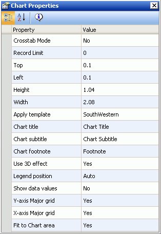
  6. To customize the properties of the entire graph, right-click the desired graph object, select Properties, and modify the properties in the Chart properties palette. For details, see Chart Properties.
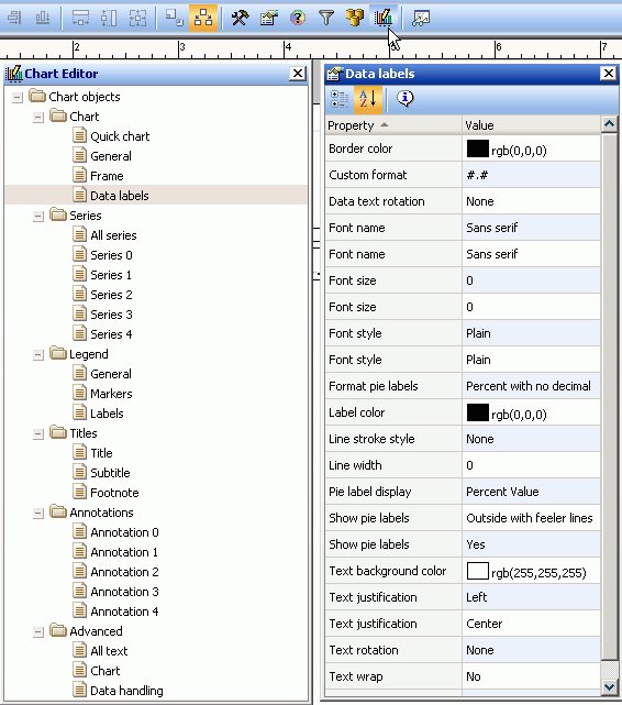
  7. To further customize the chart titles, legends, axes, and other properties, from the View menu, select Palettes, then select Chart Editor from the Palettes submenu.
  8. Select Save from the File menu to save the graph.

Top of page

x
Reference: Chart Properties

For most chart types, when a graph object is selected, the following properties are available from the Chart properties palette.

Chart Properties

Note: Some chart types with unique properties, such as pie and three dimensional charts, have specialized properties not shown below.

Crosstab Mode

Select from Yes or No. Displays the Series-legend icon and enables secondary X-axis functionality.

Record limit

Type a number to edit the record limit value.

Top

Indicates the starting position for the top edge of the graph. You can type in a different value to change the position or manually drag the graph on the canvas.

Left

Indicates the starting position for the left edge of the graph. You can type in a different value to change the position or manually drag the graph on the canvas.

Height

Indicates the height of the graph object. You can type in a different value to change the height or manually drag the graph object on the canvas.

Width

Indicates the width of the graph object. You can type in a different value to change the width or manually drag the graph object on the canvas.

Apply template

Select from any of the available templates to apply a predefined color scheme to change the appearance of your chart.

Chart title

Type the desired title text.

Chart subtitle

Type the desired subtitle text.

Chart footnote

Type the desired footnote text.

Use 3D effect

Select from Yes or No to apply or not apply a three dimensional effect on the graph.

Legend position

Select the desired option for positioning the chart legend.

Show data values

Select from Yes or No to display or not display data values on the graph.

X-axis Major grid

Select from Yes or No to display or not display X-axis major grid lines on the graph.

Y-axis Major grid

Select from Yes or No to display or not display Y-axis major grid lines on the graph.

Fit to Chart area

Select from Yes or No to turn auto placement on or off.


Top of page

x
Reference: Chart Editor Dialog Box

When the Chart Editor dialog box is open in Power Painter, properties are available for each object in the chart editor. The following image is an example of the Chart Editor and the Data labels properties palette in Power Painter.

Chart Editor

For details about the chart editor and its object properties, see the Creating Charts With Graph Tools manual.


Top of page

x
New Minimum and Maximum Y-Axis Value Parameters for Gauge Charts

There are two new parameters, Minimum Y-axis value and Maximum Y-axis value. These parameters improve the readability of your gauge charts.

While in Power Painter, select a gauge chart and open the Chart Editor by clicking on the Chart Editor button on the toolbar. Navigate to the Gauge axis parameters and click on the General category. Click on the Show Properties button to view and set these new parameters as shown in the following image.


WebFOCUS