The Properties tab is used to set properties options for one
or more components of a graph.
x
Reference: Legend Properties Dialog Box
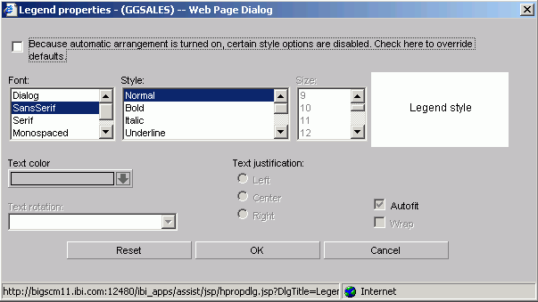
Click the Style
Legend Text button on the Settings tab in the Properties
tab to open the Legend properties dialog box as shown in the following image of the Managed Reporting environment.
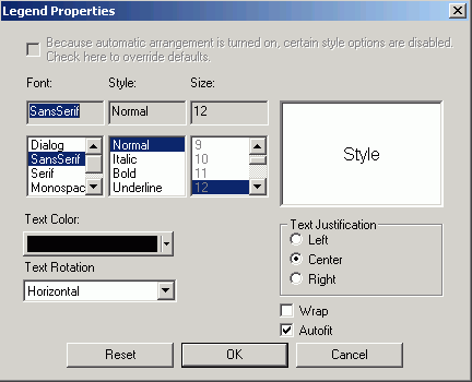
Click the Style Legend Text button
on the Settings tab in the Properties tab to open the Legend properties
dialog box as shown in the following image of the Developer Studio
environment.
-
Font
- Select the font type.
-
Style
- Select the font style.
-
Size
- Select the text size.
-
Text Color
- Select a text color from the drop-down list.
-
Text Rotation
-
Horizontal. Displays
legend text in a horizontal orientation that reads left to right.
Vertical - Bottom to top. Displays
legend text in a vertical orientation that reads from bottom to
top.
Vertical - Top to bottom. Displays
legend text in a vertical orientation that reads from top to bottom.
45 -degree botton to top. Displays
legend text in a diagonal that reads from bottom to top.
-
Text Justification
- Indicate whether the text will be left, center, or right
justified.
-
Autofit
-
Checked. This is the default. Automatically adjusts
the legend font size to fit the graph and disables the Size drop-down
list.
Unchecked. To select a different legend font
size, uncheck this box and select the font size in the Size drop-down
list.
-
Wrap
- Check to enable wrapping the text.
x
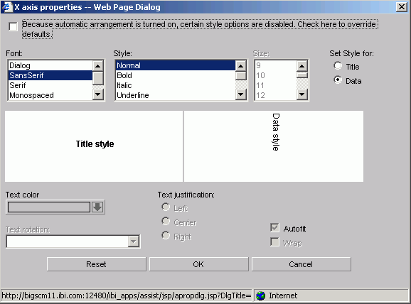
Reference: X-Axis Label Properties Dialog Box
Click the Style
Labels button on the X axis tab of the Properties tab to
open the X axis properties dialog box as shown in the following
image of the Managed Reporting environment.
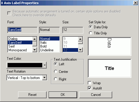
Click the Style Labels button
on the X-axis tab of the Properties tab to open the X-axis properties
dialog box as shown in the following image of the Developer Studio
environment.
-
Font
- Select the font type.
-
Style
- Select the font style.
-
Size
- Select the text size.
-
Text Color
- Select a text color from the drop-down list.
-
Text Rotation
-
Horizontal. Displays text in a horizontal orientation
that reads left to right.
Vertical - Bottom to top. Displays
text in a vertical orientation that reads from bottom to top.
Vertical - Top to bottom. Displays
text in a vertical orientation that reads from top to bottom.
45-degree bottom to top. Displays
text in a diagonal that reads from bottom to top.
-
Text Justification
- Indicate whether the text will be left, center, or right
justified.
-
Set Style For
- Select to style Title or Data.
-
Autofit
-
Checked. This is the default. Automatically adjusts
the X-axis font size to fit the graph and disables the Size drop-down
list.
Unchecked. To select a different X-axis font
size, uncheck this box and select the font size in the Size drop-down
list.
-
Wrap
- Check this box to wrap the text.
x
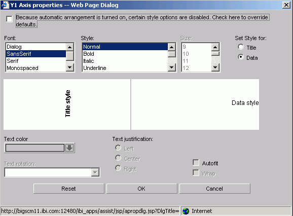
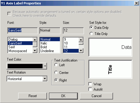
Reference: Y-Axis Label Properties Dialog Box
Click the Style
Labels button on the Y-axis tab of the Properties tab
to open the Y1 Axis properties dialog box as shown in the following
image of the Managed Reporting environment.
Click the Style Labels button
on the Y-axis tab of the Properties tab to open the Y-axis properties
dialog box as shown in the following image of the Developer Studio
environment.
-
Font
- Select the font type.
-
Style
- Select the font style.
-
Size
- Select the text size.
-
Text Color
- Select a text color from the drop-down list.
-
Text Rotation
-
Horizontal. Displays text in a horizontal orientation
that reads left to right.
Vertical - Bottom to top. Displays
text in a vertical orientation that reads from bottom to top.
Vertical - Top to bottom. Displays
text in a vertical orientation that reads from top to bottom.
45-degree bottom to top. Displays
text in a diagonal that reads from bottom to top.
-
Text Justification
- Indicate whether the text will be left, center, or right
justified.
-
Set Style For
- Select to style Title or Data.
If you have selected
more than one Y-axis field, the Title option will not be available in
the Label Properties dialog box. The Data option will be selected
by default.
-
Autofit
-
Checked. Automatically adjusts the Y-axis font size
to fit the graph and disables the Size drop-down list.
Unchecked. This
is the default. To select a different Y-axis font size, select the
font size in the Size drop-down list.
-
Wrap
- Check this box to wrap the text.
x
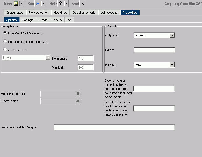
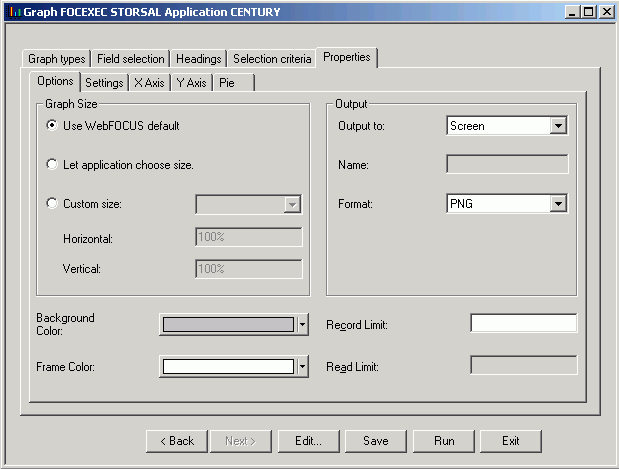
Reference: Graph Assistant Properties Tab (Options)
The following
image shows the Options subtab of the Properties tab, in the Managed Reportingenvironment.
The following image shows the Options
subtab of the Properties tab, in the Developer Studio environment.
x
x
-
Graph Size
- Select the WebFOCUS default size, let the applet
application choose the size, or set a custom size for horizontal
and vertical, both in pixels. For more information about graph size,
see How to Set the Graph Height and Width. x
x
-
Output
- Select Screen
, File, or Printer from
the list box. If you select:
Screen, the
output appears in the browser. Choose: PNG, SVG, GIF, JPEG.
You
may choose PDF/SVG, PDF/GIF in the Managed Reporting environment.
File, enter a file name and select
a file type: PNG, SVG, GIF, or JPEG.
Printer, graph
output is sent directly to the default printer of your browser.
Choose: PNG, SVG, GIF, JPEG.
Note: To
include a graph in the Document Composer, the graph must be saved
in .SVG format.
x
-
Background Color
- Select a background color from the color picker for the current
graph. x
-
Frame Color
- Select a frame color from the color picker for the current
graph.
-
Stop retrieving records after the specified number have been included in the report
/Record Limit
-
Note: This option appears as Stop
retrieving records after the specified number have been included
in the report in the Managed Reporting environment,
and as Record Limit in the Developer Studio
environment of the Graph Assistant.
Record limits are used
to limit the amount of data that appears or is used in your graph.
-
Limit the number of read operations performed during report generation/Read Limit
-
Note: This option appears as Limit the
number of read operations performed during report generation in
the Managed Reporting environment, and as Read Limit in
the Developer Studio environment of the Graph Assistant.
Read
limits are used to limit the amount of records retrieved (or read)
from the data source. The Read Limit option is not available with
FOCUS data sources.
-
Summary Text for Graph
- Provides a SUMMARY attribute for reports and graphs that
maps to the HTML <TABLE SUMMARY> tag. A description of the
graph is placed into a summary object inside the HTML table in the
source code. This complies with section 508 accessibility.
The
description of the graph can be no longer than 500 characters.
x
x
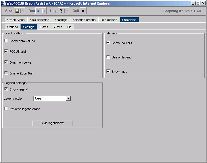
Reference: Graph Assistant Properties Tab (Settings)
The
following image shows the Settings subtab of the Properties tab, in the Managed Reporting environment.
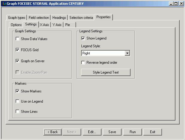
The following image shows the Settings
subtab of the Properties tab, in the Developer Studio environment.
Graph Settings
x
-
Show Data Values
- Check this box to display data values in your graph. If this
box is unchecked, data values will not be included. x
-
FOCUS Grid
- Grids are parallel lines drawn across a graph at the vertical
and horizontal class marks on the axes. Check this box if you want
to display gridlines. This option is only available on connected
point plots, histograms, bar charts, and scatter diagrams. x
-
Graph on Server
- Runs the graph on a server (rather than your local machine)
and produces the graph as an HTML file with a GIF image. Graph on
Server cannot be used when the Enable Zoom/Pan box is checked.
Note: This
option is only available if the server was configured for server side
graphics.
x
-
Enable Zoom/Pan
- Enables you to zoom on a graph. This feature is available
for all graphs except radar, polar, 3D, pie, spectral, and stock
graphs. Enable Zoom/Pan cannot be used when the Graph on Server
box is checked.
Legend Settings
x
-
Show Legend
- Check this to display the legend in your graph. x
-
Legend Style
- Select the position for the text of the legend. You may select
to have the text on the right or left side, above or below the legend
marker, or inside the legend marker. x
-
Reverse Legend Order
- Enables the display of the graph legend in reverse order.
This is generally most helpful when Reverse Order of Groups is selected. x
-
Style Legend Text button
- Opens the Legend properties dialog box where you can select
and style the font for the legend text. x
-
Markers
- Select how you want markers (shapes that represent data points)
to appear on your graph.
-
Show Markers
- Will show marker shapes at the data points on line graphs.
You must have this option set to on in order for values to appear
when you hover your cursor over an area or line graph.
-
Use on Legend
- Will show marker shapes on the graph legend.
-
Show Lines
- Is the default in the Markers group. When this check box
is deselected, marker shapes show on a line graph, but connecting
lines are not drawn.
x
x
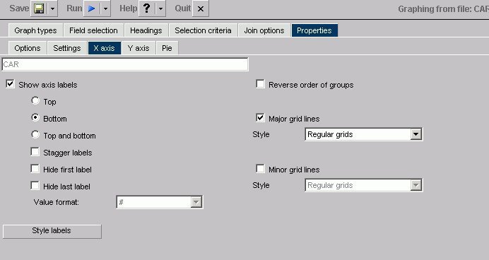
Reference: Graph Assistant Properties Tab (X-Axis)
The following
image shows the X-axis subtab of the Properties tab, in the Managed Reportingenvironment.
 x
x
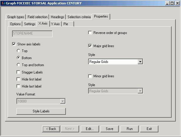
The following image shows the X-axis subtab
of the Properties tab, in the Developer Studio environment.
-
Show axis labels
-
x
Top.
X-axis labels appear above vertically oriented graphs and to the
right of horizontally oriented graphs.
Bottom. X-axis labels appear
below vertically oriented graphs and to the left of horizontally
oriented graphs. (This is the default.)
Top and Bottom.
X-axis labels appear both above and below vertically oriented graphs
and to both the left and right of horizontally oriented graphs.
x
Stagger Labels.
When this box is checked, X-axis labels will be staggered.
x
Hide first label.
When this box is checked, the first X-axis label will not appear.
x
Hide last label.
When this box is checked, the last X-axis label will not appear.
x
-
Value Format
- Enables you to select a format for the display of X-axis
values. You can only change the display format if your x-axis values
are numeric and the graph style is bubble, histogram (bar), or scatter. x
-
Style Labels
- Opens the X-axis properties dialog box where you can select
and style the fonts for the X-axis. x
-
Reverse order of groups
- When checked, enables the display of the groups (X-axis)
data in reverse order. When unchecked, the graph will display groups
in natural order. x
x
-
Major grid lines
- Divide a graph at regular intervals according to the scale.
Major grid lines cross their axis line at the exact location of
the scale label. Styles include:
Regular Grids. Normal
grid lines that are the height of the frame.
Grids and Ticks.
Normal grid lines that extend outside the frame.
Inner Ticks.
Small tick marks from the frame edge inward.
Outer Ticks.
Small tick marks from the frame edge outward.
Spanning Ticks.
Small tick marks that span the frame edge.
x
x
-
Minor grid lines
- Divide a graph at regular intervals according to the scale.
Minor grid lines cross their axis line at equal intervals between
major grids/ticks; they never align directly with a scale label.
Styles include:
Regular Grids. Normal grid lines that
are the height of the frame.
Grids and Ticks. Normal
grid lines that extend outside the frame.
Inner Ticks.
Small tick marks from the frame edge inward.
Outer Ticks.
Small tick marks from the frame edge outward.
Spanning Ticks.
Small tick marks that span the frame edge.
x
x
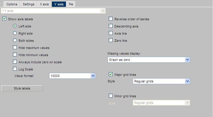
Reference: Graph Assistant Properties Tab (Y-Axis)
The following
image shows the Y-axis subtab of the Properties tab, in the Managed Reporting environment.
 x
x
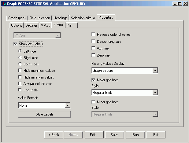
The following image shows the Y-axis subtab
of the Properties tab, in the Developer Studio environment.
-
Axis Selection List Box
- If you have more than one Y-axis, select which axis you would
like to apply properties to here, either Y1 Axis or Y2 Axis.
x
x
-
Show axis labels
-
Left Side. Y-axis labels will appear on the low (bottom
or left) side of the graph.
Right Side. Y-axis labels
will appear on the high (top or right) side of the graph.
Both Sides. Y-axis
labels will appear on both the low and high sides of the graph.
x
Hide Maximum Value. When
checked, the largest Y-axis label will not appear.
x
Hide Minimum Value. When
checked, the smallest Y-axis label will not appear.
x
Always include Zero on Scale. Includes
zero on the Y-axis scale when checked. If you have manually set
your scale range to exclude zero, this property will be ignored.
x
Log Scale. When
checked, the Y-axis scale will use logarithmic scaling. When unchecked,
the Y-axis scale will use linear scaling.
-
Value Format
- Enables you to select a format for the display of Y-axis
series values. Value Format cannot be used in combination with Slice
Label. x
-
Style Labels
- Opens the Y-axis properties dialog box where you can select
and style the fonts for the Y-axis. x
-
Reverse order of series
- When checked, enables the display of the series (Y-axis)
data in reverse order. When unchecked, the graph will display its
series in natural order. x
-
Descending Axis
- Inverts the direction of the Y-axis so values of zero or
less appear at the top of the graph, while values greater than zero
appear at the bottom of the graph. x
-
Axis Line
- Enables the display of the Y-axis base line. x
-
Zero Line
- Enables the display of the Y-axis Zero line when zero is
within the Y-axis range. x
-
Missing Values Display
- Displays
missing data values (in a bar graph, line graph, area graph, or
any variation of these graph types) in one of the following formats:
- Graph as zero.
- Graph as gap.
- Dotted line to zero.
- Interpolated dotted line.
x
x
-
Major Grid Lines
- Divide a graph at regular intervals according to the scale.
Major grid lines cross their axis line at the exact location of
the scale label. Styles include:
Regular Grids. Normal
grid lines that are the height of the frame.
Grids and Ticks. Normal
grid lines that extend outside the frame.
Inner Ticks. Small
tick marks from the frame edge inward.
Outer Ticks. Small
tick marks from the frame edge outward.
Spanning Ticks. Small
tick marks that span the frame edge.
x
x
-
Minor Grid Lines
- Divide a graph at regular intervals according to the scale.
Minor grid lines cross their axis line at equal intervals between
major grids/ticks; they never align directly with a scale label.
Styles include:
Regular Grids. Normal grid lines that
are the height of the frame.
Grids and Ticks. Normal
grid lines that extend outside the frame.
Inner Ticks. Small
tick marks from the frame edge inward.
Outer Ticks. Small
tick marks from the frame edge outward.
Spanning Ticks. Small
tick marks that span the frame edge.
x
x
Reference: Graph Assistant Properties Tab (Pie)
The following
image shows the Pie subtab of the Properties tab, in the Managed Reporting environment.
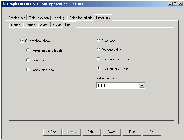
The following image shows the Pie subtab
of the Properties tab, in the Developer Studio environment.
x
x
-
Show Slice Labels/Show Axis Labels
-
Note: This option appears as Show
Slice Labels in the Developer Studio environment, and
as Show Axis Labels in the Managed Reporting
environment of the Graph Assistant.
When checked, it enables
the display of feelers and data text in a pie graph.
Feeler Lines and Labels. Shows
both feelers and data text.
Labels Only. Shows only
data text.
Labels on Slices. Shows data text on slices.
A
feeler is a line, or set of lines, that stretch from a pie slice
label to its pie slice. Feelers are visual aids that help you know
that a particular number belongs to a particular pie slice.
x
-
Slice Label
- When this option button is selected, the Y-axis label will
appear at the end of the feeler.
-
Percent Value
- When this option button is selected, the Y-axis value expressed
as a percentage appears at the end of the feeler.
-
Slice Label and % Value
- When this option button is selected, the Y-axis label, and
its value expressed as a percentage, appear at the end of the feeler.
-
True Value of Slice
- When this option button is selected, the Y-axis value appears
at the end of the feeler. x
-
Value Format
- Enables you to select a format for the display of Y-axis
series values. Value Format cannot be used in combination with Slice
Label.