In this section: |
When creating a graph, it is important to select the appropriate graph type with which to display your data. You may select from a number of basic graph types, as well as refinements on these types, known as graph styles. Basic graph types include line graphs (connected point plots), bar graphs, pie graphs, and scatter graphs. Use the brief descriptions (see Selecting a Graph Type) to select a graph type that suits the data set you are displaying and the change you want to highlight. Keep in mind that the data are the sets of numbers that you are displaying, and the scales are the numbers or variable measures that appear along the axes of the graph.
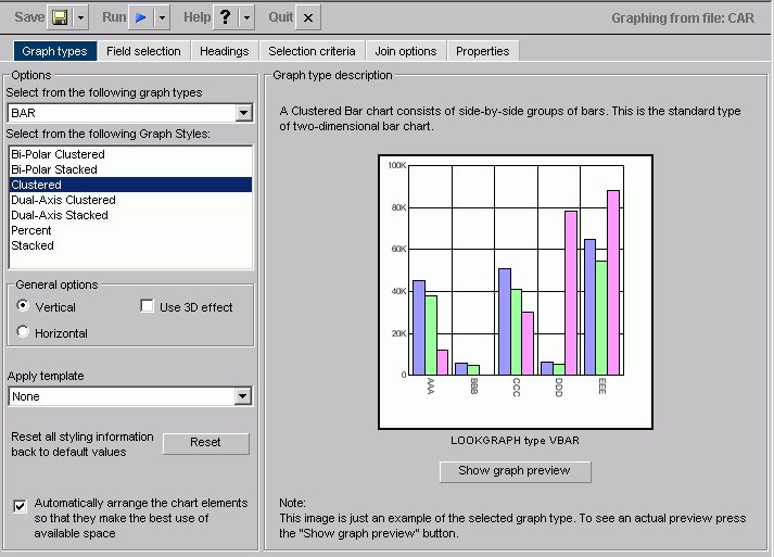
The Graph types tab of the Graph Assistant provides a list and brief descriptions of the many graph types and graph styles available in your environment.
Note: When using a stacked chart of any type at least two series are required. Negative values are not supported in stacked charts.
The following image shows the Graph types tab with a sample cluster bar chart in the Managed Reporting environment.
The following image shows the Graph types tab with a sample cluster bar chart in the Developer Studio environment.
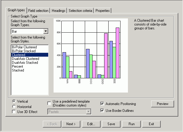
You can choose among several graph styles for each graph type. First you select the graph type with which you want to work in the Graph Type drop-down list box, and then you select the graph style from the Graph Styles drop-down list box. A thumbnail graph with a graph type and style definition appears to the right on the Graph types tab.
For details about graph styles, see Selecting a Graph Type.
The graph in the Graph Preview window displays the graph type and style you chose as well as any styling information you specified from the template drop-down list or in the Properties tab.
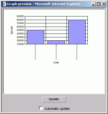
In the Managed Reporting environment, the Preview does not open by default for other resolutions. In this case, you have to click the Show Graph Preview button.
In the Developer Studio environment,the Preview does not open automatically. To view the Preview in the Graph Assistant, you must click the Preview button. Note: If the Graph Assistant window is maximized, then the Preview will also be maximized. This happens because new windows inherit the properties of previous windows.
The following image is of a bar graph that uses the 3DBAR graph style in the Managed Reporting environment. This generic chart is a two-dimensional chart with three-dimensional type bars.
The following image is of a bar graph that uses the 3DBAR graph style in the Developer Studio environment. This generic chart is a two-dimensional chart with three-dimensional type bars.
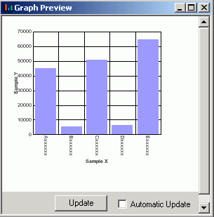
The data used for this Graph preview is built with the selected field format types of the data sources and lengths of the data. In this case, the X-axis field is alphanumeric (A16) and will be displayed as Axxxxxxxxxxxxxxxx as the series label
where:
The Y-axis scale is based on a data range of selected Y-axis fields.
You can manually update the Graph preview by clicking the Update button to see how your changes will look in a graph. You can choose to have the Graph preview updated automatically any time you make changes by selecting the Automatic update check box.
Important:
How to: |
The auto arrange feature enables the Graph preview to arrange all the elements in a graph report efficiently. The auto arrange feature is checked by default.
In the Managed Reporting environment, check the Automatically arrange the chart elements check box so that they make the best use of the available space.
In the Developer Studio environment, check the Automatic Positioning option.
Note: This option is checked by default. If you uncheck this feature, WebFOCUS will arrange the elements.
In the Graph types tab:
or
In the Developer Studio environment, uncheck the Automatic Positioning option.
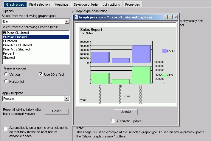
The Graph preview window opens. The following image shows the Graph types tab , in the Managed Reporting environment, with a bi-polar stacked bar chart of a sales report with sales and mpg dimensions.
The Graph preview window opens. The following image shows the Graph types tab, in the Developer Studio environment, with a bi-polar stacked bar chart of a sales report with sales and mpg dimensions.
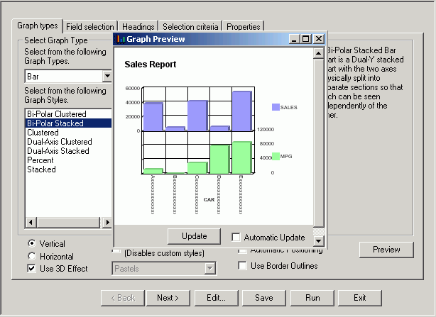
Note how the MPG symbol partially blocks the data along the right Y-axis.
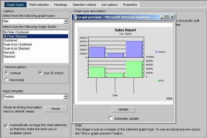
A new Graph preview window opens. The following image shows the same bi-polar stacked bar chart, in the Managed Reporting environment, with the elements arranged automatically.
A new Graph preview window opens. The following image shows the same bi-polar stacked bar chart, in the Developer Studio environment, with the elements arranged automatically.
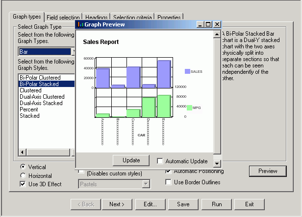
Note how the Y-axis labels and X-axis labels fit within the size of the report.
A thumbnail image and a brief description of the graph are provided when you highlight a graph type and style. Be sure to read the description of the graph before selecting a graph type and style. Certain graph types require a particular number and/or type of data values. If your data does not satisfy the requirements, your graph will not accurately represent your data.
How to: |
After you have chosen a graph type, you should select an appropriate scale. A scale is a classification scheme or series of measures that you select for application to the axes of your graph. The scale provides the framework against which your data are plotted. When you choose an appropriate scale for your data, meaningful patterns can emerge, and when you modify a scale, the overall shape of your graph changes.
Steps or measures in the scale are represented along the axes of your graph by marks. The type of scale you choose determines the number of divisions along the scale. There are two general types of scales you can apply to the y-axis of your graph:
A linear scale is a scale in which the values increase arithmetically. Each measure along the scale is one unit higher than the one that precedes it. Linear scales are useful when the data you are plotting are relatively small in range.
A logarithmic scale is a scale in which the values increase logarithmically. Each measure along the scale represents an exponential increase in the data value. Logarithmic scales are useful when you need to accommodate a large range of numbers.
| WebFOCUS |