You can associate data visualization bar graphs with
any numeric measure that appears in the report output.
The type of bar graph that you can apply depends on the placement
of the dimensions included in the report:
xData Visualization Bar Graph Attributes
The following table outlines
the default attributes used to display data visualization bar graphs
applied from the OLAP selections pane or the OLAP Control Panel. The
first column lists the bar graph attribute, while the second column
lists the default value.
|
Bar graph attribute
|
Default value
|
|---|
|
Color
|
Positive values:
Blue
Negative values: Red
|
|
Length
|
Vertical bar graph: 60 pixels
Horizontal
bar graph: 80 pixels
|
|
Width
|
The size of the font in the report output
is used to define a default value for the width of the bar graph.
|
Note: Currently, you cannot modify
bar graph attributes from the OLAP selection panel or the OLAP Control
Panel.
xApplying Bar Graphs to Measures in an OLAP Report
The quickest way to apply data visualization bar graphs
to numeric measures is from the report itself.
x
Procedure: How to Apply Bar Graphs to Measures in an OLAP Report
-
Right-click
the title of a measure column.
-
Choose Visualize from
the menu.
The report
runs automatically, displaying a column of bar graphs following
the selected measures column.
Tip: To remove the bar
graphs, right-click the measure column title and choose Remove
Visualize from the menu.
Example: Applying and Sorting Bar Graphs in a Report
In the following OLAP report:
- Right-click Line
Cost of Goods Sold and choose Visualize to
apply a data visualization bar graph to each value in the column,
as shown in the following image.
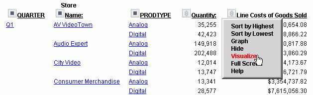
Note: The options available may
vary, dending on your OLAP format settings. For more information,
see Setting OLAP Reporting Options.
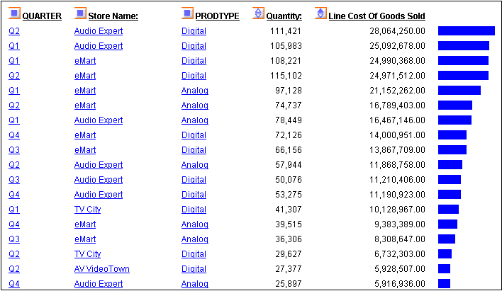
The display changes instantly,
as shown in the following image.
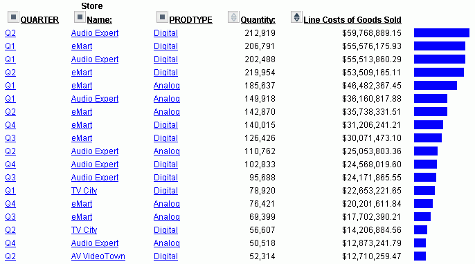
- Sort the data
by highest value. You can either right-click Line Cost
of Goods Sold and choose Sort by Highest,
or click the Up arrow (the tool tip reads Sort
LINE_COG highest to lowest).
The following image shows
the results of sorting the data by the highest value.
xApplying Bar Graphs to Measures Using the Selections Pane or Control Panel
You can apply data visualization bar graphs to any numeric
measure.
To indicate the measures for which you want to display bar graphs,
you click the check box located to the left of each measure. This
check box has three states that control the display modes for the
measure.
In the following table the first column
shows the three check box states and the second column provides
descriptions for the display modes.
|
Check Box State
|
Display Mode for the Measure
|
|---|
|
 Check
mark Check
mark
|
Displays the measure.
|
|
 Graph
icon Graph
icon
|
Applies a bar graph to the measure and displays
both the measure and its associated bar graph.
|
|
 Blank
box Blank
box
|
Does not display the measure or an associated
bar graph.
|
You click the check box next to a measure until it reflects the
display mode you want.
If an OLAP report contains a measure that does not appear in
the report, the Measure control shows a blank check box. To display
the measure, click the check box once. To display the associated
bar graph, click the check box again.
Note: The three-state check box is not active when
you apply Stack Measures to your report. These features are mutually
exclusive.
x
Procedure: How to Apply Bar Graphs to Measures Using the Selections Pane
-
From
the OLAP selections pane, click the arrow to the left of the Measures
control.
-
Click
the check box beside each numeric measure to which you want to add
a bar graph. The check mark in the box is replaced with the Graph icon.
-
Click Run.
The new report appears with the associated bar graphs.
x
Procedure: How to Apply Bar Graphs to Measures Using the Control Panel
-
Click
the OLAP button in the OLAP selections pane
to open the OLAP Control Panel. The Measures box appears in the
lower-right corner.
-
If Stack
Measures is applied to the report, click the Stack Measures check
box to turn off this feature.
-
To apply
data visualization bar graphs to a measure, click the check box to
the left of the measure.
To apply data visualization graphs to a non-displaying
measure, click the check box twice.
The check mark in the
box is replaced with the Graph icon. This icon indicates that data
visualization bar graphs are applied to the measure. (If you have
not done so in step two, this also deactivates the Stack Measures
feature.)
You can apply data visualization bar graphs to as
many numeric measures as you want.
-
After
you select all the measures for which you want to display bar graphs,
click Run.
The new report output appears with the associated bar graphs.
-
To continue
to modify the report (either data visualization or another OLAP
configuration), click the OLAP button again.
x
Procedure: How to Remove Bar Graphs Using the Selections Pane or Control Panel
-
From
the Measures drop-down list in the OLAP selections pane or the Measures
box in the OLAP Control Panel, click the check box for any measure
to which you have applied data visualization bar graphs.
This removes the Graph icon and displays a blank check
box indicating that the measure will not appear in the report output
when you run the report.
-
To display
the measure, click the same check box again. A check mark appears
in the box.
-
Click Run to
display the new report output, where the measure appears without
its associated bar graph.
Example: Applying Data Visualization Bar Graphs to Measures Using the Selections Pane
Suppose
that you want to associate data visualization bar graphs with the
Profit column in the following report in order to represent visually
the differences between the Costs for and the Prices of your various
Products.
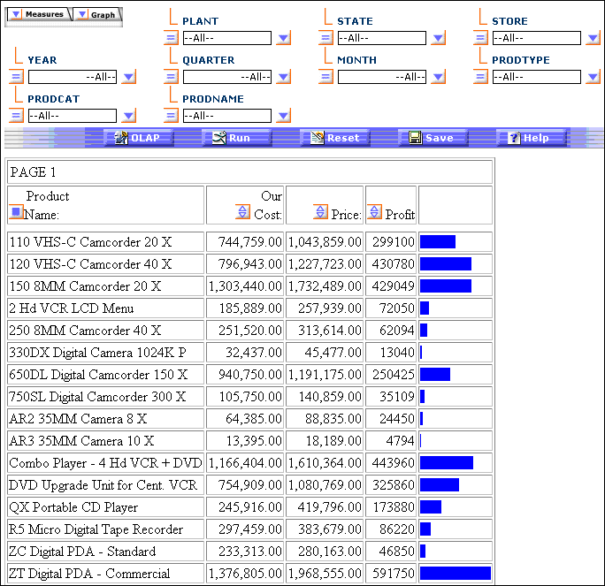
You have created the following OLAP report, as
shown in the following image, which displays the report data by
Product Name.
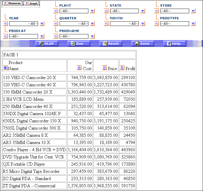
To associate data visualization bar
graphs with the Profit column:
- Click the Measures drop-down
list in the report (or open the OLAP Control Panel by clicking the OLAP button),
as shown in the following image.
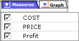
The check marks indicate that the measures
will appear in the report output.
- Click the Profit check
box again. The following image shows the Measures drop-down list
in the OLAP Control Panel with the Profit check box selected as
a Graph icon.
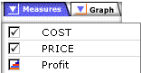
The
Graph icon replaces the check mark. This icon indicates that the
measure will appear with its associated bar graph.
- Click the Run button
to display the new report output.
Notice that the report now contains
a new column to the right of the Profit measure. This column displays
a horizontal bar chart comprised of bar graphs that visually represent
the individual data values for the Profit measure, as shown in the
following image.
x
Reference: Display Modes in the OLAP Control Panel
The
Measures box, from which you select a display mode, is located in
the lower-right corner of the OLAP Control Panel, as shown in the
following image.
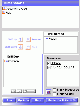
The
state of each measure check box determines how the measure appears
in the report output. In this illustration:
- The COST and
PRICE measures will appear in the report output (check mark in the
boxes).
- The Profit measure
and its associated bar graph will appear in the report output (Graph
icon in the box).
Note that the Stack Measures option
is inactive when a bar graph is applied to a measure.