Incorporating Additional Chart Properties in a Map Chart
You can use some of the general chart properties, as
well as properties specific to heatmap and bubble charts, to adjust
your chart output.
xAdjusting the Heat Scale on Choropleth Maps
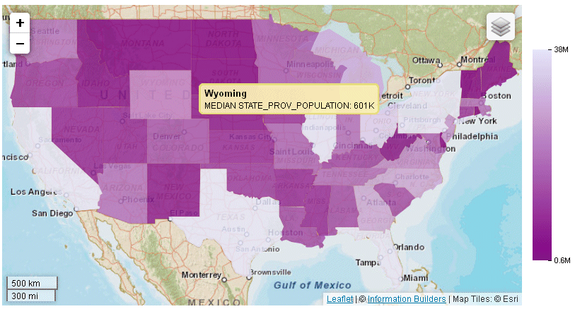
You can use the colorScale property
to define colors for your choropleth map. You can list any number
of colors, using color names, rgb values, or hex values. For example,
the following code defines a red, white, and blue color scale:
colorScale: colors:{['#C4161C', 'white', 'rgb(0,0,255)']}For information, see How to Define the Color Scale in a Treemap, Heatmap, or Tagcloud Chart.
You can also define discrete color bands for the map and legend
using colorScale:colorMode properties. For information, see Defining a Discrete Color Scale for Heatmap and Choropleth Charts.
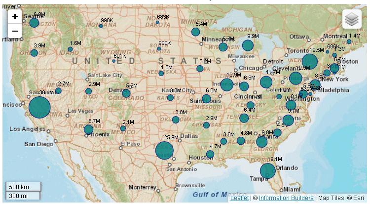
Example: Adding a Heat Scale Legend to a Choropleth Chart
The following request makes the legend
visible.
Note: Due to their length, certain lines of
syntax in the example below may wrap onto the next line of text.
Wrapping may create breaks within strings or url references, which
may cause errors when run. If you copy and paste this example, be
sure to remove these line breaks before running it.
GRAPH FILE WFLITE
SUM MDN.STATE_PROV_POPULATION
BY STATE_PROV_NAME
WHERE COUNTRY_NAME EQ 'United States'
WHERE STATE_PROV_NAME NE 'Puerto Rico'
ON GRAPH HOLD FORMAT JSCHART
ON GRAPH SET LOOKGRAPH CHOROPLETH
ON GRAPH SET STYLE *
*GRAPH_JS
  legend: {visible:true},
mapProperties: {
  engine: 'leaflet',

leaflet: {
initPos: {
                  center: [37.8, -96],
                  level: 4
            },
overlayLayers: [{
title: 'United States of America',
dataLookup: 'properties.state_name',
layerInfo: {
maxZoom: -1,
minZoom: -1,
type: 'regions'
},
type: 'tdg',
url: function(){ return tdgchart.getScriptPath() + 'map/US.json'}
}],
controls: [
{control: 'L.Control.Layers'},
{
control: 'L.Control.Scale',
options: {
imperial: true,
metric: true }
}
],baselayers: [{
title: "ArcGIS_World_Street_Map",
layerInfo: {
maxZoom: 17,
minZoom: 0,
attribution: function(){ return "&|copy; <a target='_blank' href='http://www.InformationBuilders.com'>Information Builders</a> | " + "Map Tiles: &|copy; Esri";}
},
url: function(){return 'http://services.arcgisonline.com/ArcGIS/rest/services/World_Street_Map/MapServer/tile/{z}/{y}/{x}';
}
}]
}
},
*END
ENDSTYLE
ENDThe output now has a legend
that defines the color for each population range:
xAdjusting the Hover Color
As with any other type of chart, you can define a color
or opacity setting for adjusting the display of a marker when the
mouse hovers over it. To do this, you use the MouseOverIndicator
property,
For example, the following property makes
the selected chart area or marker 70% opaque when the mouse hovers
over it:
mouseOverIndicator: {
color: '70%'
}The following property makes the marker
yellow when the mouse hovers over it:
mouseOverIndicator: {
color: 'yellow'
}For more information, see Formatting the Mouse Over Indicator (mouseOverIndicator).
xAdjusting the Color and Size of Bubbles on Bubblemaps
You can use series-specific properties to control the
color and border of bubbles on any bubble chart, including a bubblemap.
For example, the following code makes the markers red with transparent
borders:
series: [
{series:0, color: 'red', marker:{border: {color: 'transparent'}}}
]For information about marker properties, see Defining the Size, Border, Color, Shape, and Rotation of Series Markers.
In addition, you can control the size of bubble markers on a
bubblemap or a bubble chart using the bubbleMarker: maxSize property.
This property is not part of the mapProperties block, it is a property
of bubble charts.
x
Syntax: How to Set the Maximum Size of Bubbles on a Bubblemap
Use the following property to specify
the radius of the largest bubble:
bubbleMarker: {maxSize: size}where:
- maxSize: size
Determines the radius of the largest bubble. It can be a
number of pixels or a percent string enclosed in single quotation
marks and including a percent symbol (from '1%' to '100%'). If you
use a percent string, it takes the minimum of the width and height
of the chart container and then calculates the percent.
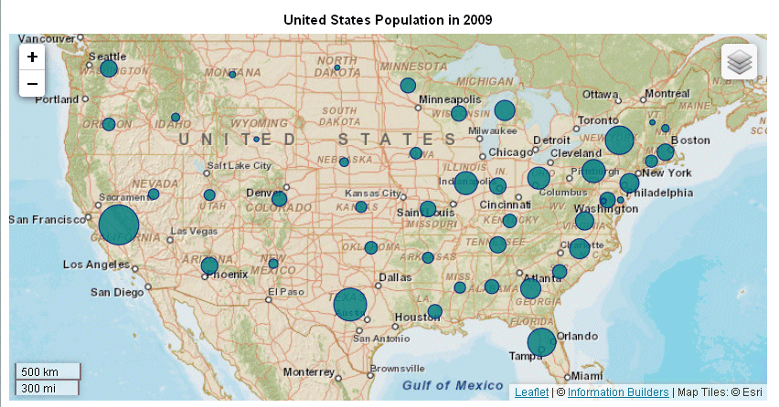
Example: Formatting Bubbles on a Bubblemap
The
following request generates a bubblemap. Using the bubbleMarker
property, it sets a maximum size for the bubbles. Using the series
marker properties, it makes the bubbles teal with a navy border
and defines a label to appear in the legend. The title property
assigns a title to the chart.
Note: Due to their length,
certain lines of syntax in the example below may wrap onto the next
line of text. Wrapping may create breaks within strings or url references, which
may cause errors when run. If you copy and paste this example, be
sure to remove these line breaks before running it.
GRAPH FILE WFLITE
SUM MDN.STATE_PROV_POPULATION
BY STATE_PROV_NAME
WHERE COUNTRY_NAME EQ 'United States'
WHERE STATE_PROV_NAME NE 'Puerto Rico'
WHERE TIME_YEAR EQ 2009
ON GRAPH HOLD FORMAT JSCHART
ON GRAPH SET LOOKGRAPH BUBBLEMAP
ON GRAPH SET STYLE *
*GRAPH_JS
mapProperties: {
engine: 'leaflet',
leaflet: {
initPos: {
center: [37.8, -96],
level: 4
},overlayLayers: [{
title: 'United States of America',
dataLookup: 'properties.state_name',
layerInfo: {
maxZoom: -1,
minZoom: -1,
type: 'regions'
},
type: 'tdg',
url: function(){ return tdgchart.getScriptPath() + 'map/US.json'}
}],
controls: [
{control: 'L.Control.Layers'},
{
control: 'L.Control.Scale',
options: {
imperial: true,
metric: true }
}
],baselayers: [{
title: "ArcGIS_World_Street_Map",
layerInfo: {
maxZoom: 17,
minZoom: 0,
attribution: function(){ return "&|copy; <a target='_blank' href='http://www.InformationBuilders.com'>Information Builders</a> | " + "Map Tiles: &|copy; Esri";}
},
url: function(){return 'http://services.arcgisonline.com/ArcGIS/rest/services/World_Street_Map/MapServer/tile/{z}/{y}/{x}';
}
}]
}
},
legend: {visible:true},bubbleMarker: {maxSize: '10%' },
series:[{series:0, marker:{color: 'teal', border:{color: 'navy', width: 1}},label: 'Population'}],
title: {visible: true, text: 'United States Population in 2009'} ,
*END
ENDSTYLE
ENDThe output is:
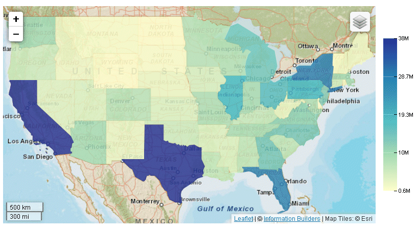
xDefining Colors and Tooltips on Choropleth Charts
The following request generates
a choropleth with a color scale consisting of purple and lavender.
It also defines automatic HTML-style tooltips.
Note: Due to their length, certain lines of syntax in
the example below may wrap onto the next line of text. Wrapping
may create breaks within strings or url references, which may cause
errors when run. If you copy and paste this example, be sure to
remove these line breaks before running it.
GRAPH FILE WFLITE
SUM MDN.STATE_PROV_POPULATION
BY STATE_PROV_NAME
WHERE COUNTRY_NAME EQ 'United States'
WHERE STATE_PROV_NAME NE 'Puerto Rico'
ON GRAPH HOLD FORMAT JSCHART
ON GRAPH SET LOOKGRAPH CHOROPLETH
ON GRAPH SET STYLE *
*GRAPH_JS
mapProperties: {
engine: 'leaflet',
leaflet: {
initPos: {
center: [37.8, -96],
level: 4
},overlayLayers: [{
title: "United States of America",
dataLookup: "properties.state_name",
layerInfo: {
maxZoom: -1,
minZoom: -1,
type: 'regions'
},
type: 'tdg',
url: function(){ return tdgchart.getScriptPath() + 'map/US.json'}
}],
controls: [
{control: L.Control.Layers},
{
control: L.Control.Scale,
options: {
imperial: true,
metric: true
}
}
],baselayers: [{
title: "ArcGIS_World_Street_Map",
layerInfo: {
maxZoom: 17,
minZoom: 0,
attribution: function(){ return "&|copy; <a target='_blank' href='http://www.InformationBuilders.com'>Information Builders</a> | " + "Map Tiles: &|copy; Esri";}
},
url: function(){return 'http://services.arcgisonline.com/ArcGIS/rest/services/World_Street_Map/MapServer/tile/{z}/{y}/{x}';
}
}]
}
},
legend:{visible:true},
title: {visible: true, text: 'United States Population in 2010'},colorScale: {colors: ['purple', 'lavender'] },
htmlToolTip: {enabled: true, snap:true},
series: [{series: 'reset', tooltip:'auto'}] ,
*END
ENDSTYLE
ENDThe output is:
You can also visualize the colors as discrete color bands. For
information, see Defining a Discrete Color Scale for Heatmap and Choropleth Charts.
xDisplaying Data Text Labels on a Bubblemap
Data text labels will display on a bubblemap if you
show data values for all series and set the dataLabels property
to true:
series: [{series:'all', showDataValues:true}],
dataLabels: {
visible: true
}
Example: Showing Data Text Labels on a Bubblemap
The following request generates a bubblemap
with data text labels.
Note: Due to their length, certain
lines of syntax in the example below may wrap onto the next line
of text. Wrapping may create breaks within strings or url references, which
may cause errors when run. If you copy and paste this example, be
sure to remove these line breaks before running it.
GRAPH FILE WFLITE
SUM MDN.STATE_PROV_POPULATION
BY STATE_PROV_NAME
WHERE COUNTRY_NAME EQ 'United States'
WHERE STATE_PROV_NAME NE 'Puerto Rico'
WHERE TIME_YEAR EQ 2009
ON GRAPH HOLD FORMAT JSCHART
ON GRAPH SET LOOKGRAPH BUBBLEMAP
ON GRAPH SET STYLE *
*GRAPH_JS
series: [{series:'all', showDataValues:true}],
dataLabels: {
visible: true
},legend: {visible:false},
bubbleMarker: {maxSize: '10%' },
series:[{series:0, marker:{color: 'teal', border:{color: 'navy', width: 1}},label: 'Population'}],
title: {visible: true, text: 'United States Population in 2009'},
mapProperties: {
engine: 'leaflet',
leaflet: {
initPos: {
center: [37.8, -96],
level: 4
},overlayLayers: [{
title: 'United States of America',
dataLookup: 'properties.state_name',
layerInfo: {
maxZoom: -1,
minZoom: -1,
type: 'regions'
},
type: 'tdg',
url: function(){ return tdgchart.getScriptPath() + 'map/US.json'}
}],
controls: [
{control: 'L.Control.Layers'},
{
control: 'L.Control.Scale',
options: {
imperial: true,
metric: true }
}
],
baselayers: [{
title: "ArcGIS_World_Street_Map",
layerInfo: {
maxZoom: 17,
minZoom: 0,
attribution: function(){ return "&|copy; <a target='_blank' href='http://www.InformationBuilders.com'>Information Builders</a> | " + "Map Tiles: &|copy; Esri";}
},
url: function(){return 'http://services.arcgisonline.com/ArcGIS/rest/services/World_Street_Map/MapServer/tile/{z}/{y}/{x}';
}
}]
}
},
*END
ENDSTYLE
END
The output is shown on
the following image: