In this section: |
|
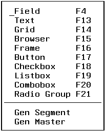
The Objects menu enables you to create controls for your Winform. (Controls are called objects by the Winform Painter.) Selecting the Objects menu yields:
The Objects menu offers the following options:
In this section: |
|
An entry field enables a user to enter and edit a simple variable. When a Winform is displayed, the entry field's initial value comes from the current row (indicated by FocIndex) of the specified stack column, from a default value, or from the Current Area. When the Winform is closed, the field's value is written to the current row of the specified stack.
For general information about how an end user manipulates an entry field, see Using Entry Fields.
You are prompted to point to where you would like to place the field in the Winform.
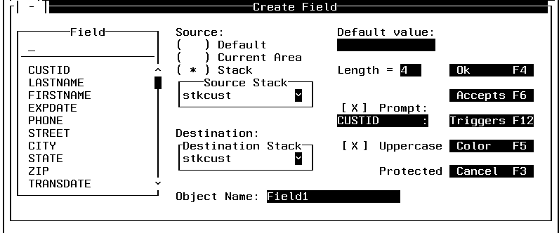
The Create Field dialog box is displayed:
When you are done making your selections in the Create Field dialog box, you may either:
The Field combo box lists all the fields in the Master Files that are used by the current procedure. Select a field to associate with this entry field in the Winform, or type the name of a user-defined variable (that is, a variable created with the COMPUTE or DECLARE commands) to associate with this entry field.
If you specify a user-defined variable, the procedure must declare it before displaying the Winform.
Tip: If you want to add all of the fields in a data source or all of the fields in one segment of a data source to a Winform quickly, use the Gen Segment or Gen Master commands. For more information, see Gen Segment and Gen Master.
For the source of the field's data when the Winform is first displayed, you may select:
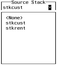
Position the cursor on the stack you wish to use and press the Enter key. You are returned to the Create Field dialog box with your selection displayed in the Source Stack dialog box.
You may use any stacks contained in the Destination Stack drop box. To view the stacks that are available to you, place the cursor in the Destination Stack entry field and press the Enter key. A drop box similar to the Source Stack list box is displayed, containing the stacks available to you. Position the cursor over the stack you wish to use and press the Enter key. You are returned to the Create Field dialog box with your selection displayed in the Destination Stack drop box.
You must specify the same stack for both source and destination.
Provide a name for the field, or accept the default name. Names enable you to refer to controls within your procedure, so that you can dynamically manipulate them in response to run-time events.
Enter a default value if you wish to use the same value in many instances. For example, if your data source contains a field named City, and City's most frequent value will be "New York City", you may wish to specify this as the default value. If you specify a default value you must check Default as your source.
The Winform Painter does not support default values for fields in the current release.
Length specifies the display length of the field in the Winform. It defaults to the length needed to display the field's data and display options as defined in the Master File or in the COMPUTE or DECLARE command.
The display length must accommodate the largest value to be displayed or entered. To ensure this, we recommend that you specify a length at least as great as the length of the data as defined in the Master File or in the COMPUTE or DECLARE command. You can specify a greater length if you wish to accommodate display options.
As elsewhere in FOCUS, display options are significant only when displaying or printing a value. When Maintain writes a field from a Winform to a stack or the Current Area, it writes the data only, not the display options.
Prompt enables you to display a field with more descriptive text if it is deemed necessary. For example, if you wish to display a field called Partno in a more meaningful way, you might use Part Number. Prompt is checked by default.
Check Uppercase if you wish to display a field in uppercase. If Uppercase is not checked, the field displays as it was originally entered, whether uppercase, lowercase or mixed case. Uppercase is checked as the default.
Check Protected if you want to deny the application user the ability to change the value of a field. This is useful for protecting key fields. Protected is unchecked by default.
The Accepts button allows you to specify data validation values for the current field. At run time, if an end user attempts to enter invalid data into the field on a Winform, the invalid data is not accepted, and the field's valid values are displayed. You can specify the valid values in:
The existence of an ACCEPTS attribute automatically enables data validation for that field in a Winform; you do not need to set anything in the Accept List dialog box.
To activate data validation for the field using values specified in the Winform Painter, ensure that the field has no ACCEPTS attribute in the Master File, select the Stack List radio button in the Accept List dialog, and select one or both of the On Error and On PFKey check boxes in the Accept List dialog.
Because data validation values in the Master File take precedence over data validation values specified in the Winform Painter, if values for a field already exist in the Master File, the Winform Painter prevents you from specifying values for that field in the Painter.
To edit data validation information in the Winform Painter for the current field, press PF6. The Accept List dialog box is displayed:
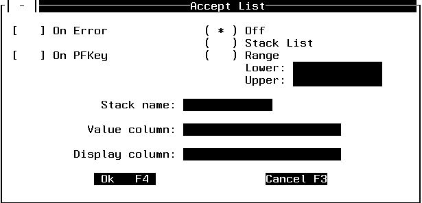
You can edit the following data validation properties:
If the valid values are meaningful to the application user, you can identify a single stack column to contain the list of values and to display that same list on the screen. However, if the values need to be explained, you can use one column to contain the list of valid values and another column to contain a description of each value: Maintain displays only the description column on the screen, and when the application user picks an item in the description column, Maintain writes the corresponding item from the valid data column to the field.
For example, in an invoice application you might use the ValidData stack to contain a list of valid product codes. You can keep the product codes themselves in the ValidData.Code column, and the product name corresponding to each code in the ValidData.Name column. When a user presses PF1 to see a list of valid values, and then chooses "Hammer" from the ValidData.Name column, Maintain copies the Hammer product code—11375—from the ValidData.Code column to the field.
You may assign up to twenty-five control-level triggers to each entry field. These triggers are invoked when an end user presses the specified function key when the cursor is in the entry field. For more information about triggers, see Using Triggers, Button Short Cuts, and System Actions. I deleted description of Triggers dialog box, because it was a repeat of what is now in Using Triggers, Button Short Cuts, and System Actions.
Color displays the Set Colors dialog box, which allows you to change the color of the field:
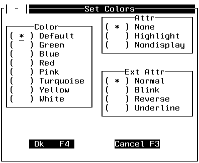
In the Set Colors dialog box, you may change the color, attributes, and extended attributes of the field. The current settings are indicated with asterisks. Note that you can also change the color of a Winform control dynamically at run time by issuing the WINFORM SET command from the Maintain procedure, as described in WINFORM.
In the Color radio button group, you may change the color of the fields in your Winform by marking the appropriate color. It is initially set to the default color. The color is dependent on your hardware and terminal emulation. Your terminal must be capable of displaying color to use this feature.
In the Attr radio button group, you may:
In the Ext Attr radio button group, you may:
In order to use color, attributes, or extended attributes, your terminal or terminal emulator software must support it. When you are finished, press PF4. Press PF3 if you wish to cancel what you have entered.
In this section: How to: |
The Text control enables you to place static text into a Winform, such as instructions or a title.
You are prompted to point to where you would like to place the text in the Winform.
If you choose to display the field, the Text dialog box is displayed:
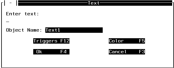
Enter the text as you would like it to be displayed.
Provide a name for the text, or accept the default name, so that you can refer to the text within your procedure. Text1 is the initial default.
You may assign up to twenty-five control-level triggers to each text control. These triggers are invoked when an end user presses the specified function key when the cursor is in the text control. For more information about triggers see Using Triggers, Button Short Cuts, and System Actions.
Press PF5 if you wish to edit the color of the text. Pressing PF5 yields the Set Colors dialog box. For detailed information about the Set Colors dialog box see Color.
In this section: How to: |
A grid is a stack editor that enables you to display and edit selected stack columns.
For information about scrolling a grid, see SetScroll. For information about positioning the cursor in a grid, see SetCursor.
You are prompted to point to the top left corner of the grid and press the Enter key, or press PF3 to cancel.
Move the cursor to the position where you wish the upper left-hand corner of the grid to be displayed, and press the Enter key.
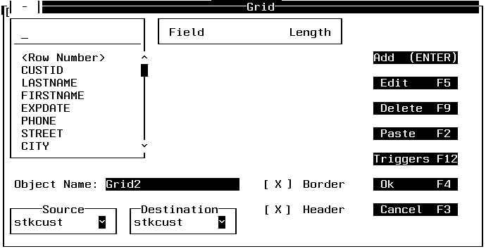
Move the cursor to the position where you wish the lower right-hand corner of the grid to be displayed, and press the Enter key. The Grid dialog box is displayed:
If the grid you are trying to put in the Winform covers some of the same space as another control, the following is displayed:
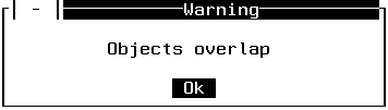
You must change the position of your grid so that it does not overlap with other Winform controls. Press Enter and you are returned to the prompt for the lower right-hand corner of the grid. When you choose a proper place to put the grid, the Grid dialog box is displayed.
When you are finished working on the Grid dialog box, press PF4 to save the information or PF3 to cancel the action.
The combo box in the left part of the Grid dialog box displays the fields in the Master File. As you add fields to the grid, another list box is created below Field in the Grid dialog box. The length of the field comes from the Master File and may be changed. Row Number allows you to see the row in the stack that is visible to the user. It is a good idea always to include it. You may not change the value of Row Number.
Select Add to add columns from the source stack to a grid.
In order to add a field to the grid, you can place the cursor under the name of a field in the left combo box and press the Enter key. You may change the length of the field in the grid by changing it in the length column.
Select Edit to edit the column name and to specify other column attributes of a field that is currently displayed in the grid. To edit a column name, press PF5. The Edit Column dialog box is displayed:
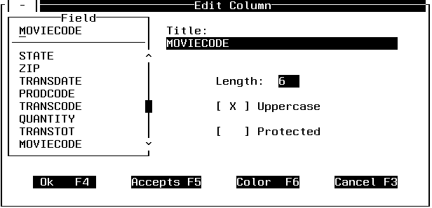
The Edit Column dialog box shows the column name last selected or edited in the grid, in this case MovieCode. You may edit the following column properties:
You can also select another field to edit. To do so, place the cursor under the selected field and press the Enter key. Scroll through the combo box to see which other fields you can edit. Press PF8 to scroll forwards or PF7 to scroll backwards.
You can exit the Edit Column dialog box, saving what you have entered, by pressing PF4. This returns you to the Grid dialog box. Otherwise you can cancel the action and return to the Grid dialog box by pressing PF3.
Select Delete to move a column to another part of the grid or erase a column from the grid. Position the cursor in the right list box at the column you wish to delete, and press PF9. The column name is removed from the list of displayed column names, and the column is removed from the grid.
Select Paste to reposition a column in the grid that has previously been deleted. Press PF2 to paste a column. This brings the column name back to the active column list box in the Grid dialog box, and returns it to the grid.
You may assign up to twenty-five control-level triggers to each grid. These triggers are invoked when an end user presses the specified function key when the cursor is in the grid. For more information about triggers, see Using Triggers, Button Short Cuts, and System Actions.
Destination displays all destination stacks and lets you select one as the destination of your grid's data.
You must specify the same stack for both source and destination.
In this section: How to: |
The browser generates the necessary logic and Winform controls to enable you to display one stack row, and to scroll forward and backward through the stack one row at a time. The browser adds two buttons for moving forward and backward through the stack and changing the value of FocIndex accordingly. The browser also adds text and two fields—the first FocIndex, the second FocCount—in the upper-left corner of the Winform to identify the current row to the user. There can only be one browser per application.
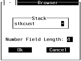
Select the stack that you would like to scroll through. All stacks defined to the Winform are displayed.
How to: |
Select Frame to put a border around an area in the Winform. A useful feature of the frame is the ability to move all the controls in the frame at one time, simply by moving the frame itself.
You are prompted to place the cursor at the upper left-hand corner of the frame you wish to create.
Place the cursor at the desired upper left-hand corner of the frame, and press the Enter key.
Place the cursor at the desired lower right-hand corner of the frame, and press the Enter key.
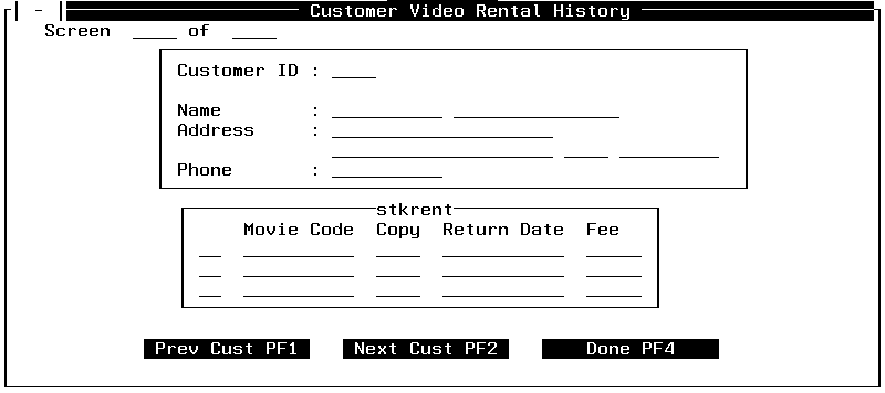
A screen similar to the following appears after you have finished positioning the frame, in this case around Customer ID, Name, Address and Phone:
In this section: How to: |
When a user clicks a button to which you have assigned a trigger, it immediately executes the associated Maintain function or system action. (Maintain functions—often simply called functions—are referred to in the Winform Painter as cases.) For example, clicking a button might trigger a function that updates a data source. The user selects a button by moving the cursor to the desired button and pressing Enter.
For general information about how an end user would manipulate a button, see Using Command Buttons.
You are prompted to place the cursor at the upper left-hand corner of the button you wish to create.
Place the cursor at the desired upper left-hand corner of the button, and press the Enter key.
Place the cursor at the desired lower right-hand corner of the button, and press the Enter key.
The Button dialog box is displayed after you have finished positioning the button:
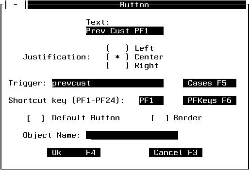
When you have finished entering information about a button, press the OK button. The button is then displayed in the Winform. Press PF3 if you wish to cancel the action.
Enter into the Text entry field what you wish to appear on the button. The size of the entry field is dependent on the dimensions you have chosen for the button. This means that you can only enter text that fits on the button.
Justification allows you to choose whether to center, left-justify or right-justify the text on the button. Place an X next to your choice of justification.
You may assign one Maintain function or the Exit or Close system action to the button. This function or action is invoked when an end user presses the specified shortcut key, or the Enter key, if Default Button is selected. For more information about triggers, see Using Triggers, Button Short Cuts, and System Actions.
Enter a PF key number if you want to be able to press a PF key as a shortcut, rather than having to move the cursor to the button and press the Enter key. To see a list of PF keys and the triggers currently assigned to them, press PF6 or move the cursor to the PFKeys button and press the Enter key. When running the application, pressing the PF key or moving the cursor to the button and pressing Enter produces the same results.
Tip: You may want to avoid assigning the Enter key as a button's shortcut key. Because end users must press the Enter key to click a button, it is recommended that you do not assign the Enter key as a trigger unless you intend end users to trigger the specified function or system action each time they click the button.
If Default Button is selected, and the user runs the application, pressing Enter clicks the button. In other words, Enter serves as a shortcut key for the button. There can only be one default button per form.
Provide a name for the button, or accept the default name, so that you can refer to the button within your procedure.
Select Cases to see the functions and system actions available for use as a trigger action. The Available Cases dialog box is displayed. For more information about the Available Cases dialog box, see Specifying Triggers.
Select PFKeys to see which PF keys currently have form-level triggers assigned to them. You can use this dialog box to select an available key (that is, one to which no form-level triggers or button shortcuts are assigned) for use as the current button's shortcut key. To select an available key, place the cursor under the PF key you wish to use and press PF4.
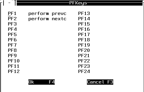
To exit the PFKeys dialog box without assigning a shortcut key, press PF3 or move the cursor to the Cancel F3 button and press the Enter key.
Note that you cannot use this dialog box to change existing key assignments; it is designed for displaying key assignments only.
In this section: How to: |
A check box enables the end user to select or clear (that is, deselect) an option. When you design the check box, you associate a variable with it; at run time, if the end user checks the box, the variable is assigned a value of 1; if the end user clears the check box, the variable is assigned a value of 0.
You can test the value of the variable in your application after the form is displayed to determine whether or not the box is checked. If you wish a check box to be checked by default, you can assign a value of 1 to the check box variable at run time before displaying the Winform.
For general information about how an end user would manipulate a check box, see Using Check Boxes.
You are prompted to point to a location and press the Enter key or PF3 to cancel.
If you press the Enter key, the Check Box dialog box is generated:
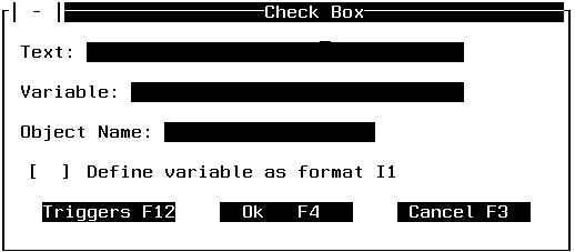
This is the name of the variable that will be associated with the check box. At run time, if the end user checks the box, the variable is assigned a value of 1; if the end user clears the check box, the variable is assigned a value of 0. You can test the value of the variable in your application after the form is displayed to determine whether or not the box is checked, and you can assign a value to the variable before the form is displayed to provide a default setting for the check box.
The application must declare the field before it is referred to in a Winform. Enter the name of the variable as it will appear in your source code. For further information about naming conventions, see Language Rules Reference.
Provide a name for the check box, or accept the default name, so that you can refer to the check box within your procedure.
Check this box if you want Maintain to declare the variable automatically. Maintain declares the variable in your WINFORMS file as a one-digit integer (a format of I1), therefore you should not define this variable yourself in your application.
You may assign up to twenty-five control-level triggers to each check box. These triggers are invoked when an end user presses the specified function key when the cursor is in the check box. For more information about triggers see Using Triggers, Button Short Cuts, and System Actions.
In this section: How to: |
List boxes display a list of items from which the end user can select one item. The list is taken from a stack column at run time when the Winform is displayed; you identify which stack column to use when you design the Winform.
If there are more list items than can fit in the list box, automatic scroll bars enable the application user to scroll through the list.
When the end user selects an item from the list, FocIndex points to the stack row that the user selected. For example, the following code displays a Winform that has a list box populated by the CustID column in the CustStack stack, and then assigns to the SelectedCustomer variable the value that the end user had selected from the list box:
FOR ALL NEXT CustID INTO CustStack;
WINFORM SHOW CustForm;
SelectedCustomer = CustStack().CustID;
FocIndex determines which list item is the default choice when the Winform is first displayed at run time. You can control which item is the default by setting the value of FocIndex. In the example below, the list box is populated by CustStack.CustID, and the default value is taken from the second row of CustStack.CustID:
FOR ALL NEXT CustID INTO CustStack;
CustStack.FocIndex = 2;
WINFORM SHOW CustForm;
SelectedCustomer = CustStack().CustID;
For general information about how an end user would manipulate a list box, see Using List Boxes.
You are prompted to point to a location and press the Enter key or PF3 to cancel.
If you press the Enter key, the Listbox dialog box is generated:
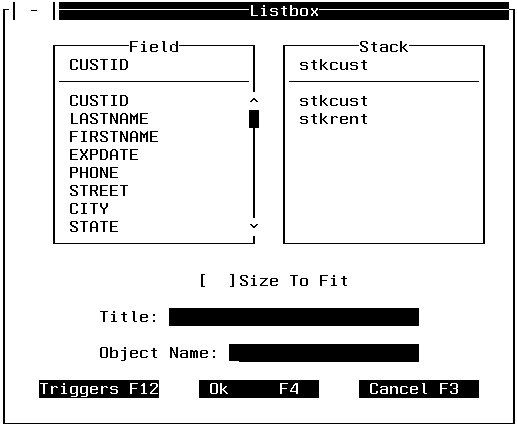
The Field combo box lists all the fields in the Master Files that are used by the current procedure. Select the field whose column in the selected stack you want to populate the list box, or type the name of a user-defined column in the selected stack (that is, a column created with the COMPUTE command) that you want to populate the list box.
If you specify a user-defined column, the procedure must declare it before displaying the Winform.
Select the stack whose column will populate the list box when the Winform is displayed. You can choose from all the stacks that are defined to the Winform.
You may provide a name for the list box, or accept the default name, so that you can refer to the list box within your procedure.
You may assign up to twenty-five control-level triggers to each list box. These triggers are invoked when an end user presses the specified function key when the cursor is in the list box. For more information about triggers see Using Triggers, Button Short Cuts, and System Actions.
Tip: You may want to avoid assigning a trigger to the Enter key. Because end users must press the Enter key to select an item from a list box, it is recommended that you do not assign a trigger to the Enter key unless you intend end users to trigger the specified function each time they select an item from the list.
In this section: How to: |
A combo box is a kind of drop-down list box: it enables the end user to select an item from a list that drops down. A combo box differs from a list box in that a list box is always displayed dropped (that is, fully extended), while in a combo box only the box showing the selected item is displayed until the end user selects the box's v button to drop its list. When the combo box's list is dropped, the end user can select an item from it; the selected item is then displayed in the box at the top of the list, and the list closes.
You can choose to populate the list from:
The combo box is populated from the specified source at run time when the Winform is displayed. You identify the source of the combo box's values when you design the Winform.
How you determine which value the end user selected depends on how you populated the combo box. If you populated it using:
FOR ALL NEXT CustID INTO CustStack;
WINFORM SHOW CustForm;
SelectedCustomer = CustStack().CustID;formname_comboboxname_ACCEPTS().RECFor example, the following code displays a Winform named CustForm that has a combo box named CustListBox, and then assigns to the SelectedCustomer variable the value that the application user had selected from the combo box:
WINFORM SHOW CustForm;
SelectedCustomer = CustForm_CustListBox_ACCEPTS().REC;
If you populate a combo box from a stack, FocIndex determines the default value—that is, the value that will appear in the box when the Winform is first displayed at run time. You can control which value is the default by setting FocIndex. In the example below, the combo box is populated by CustStack.CustID, and the default value will be taken from the seventh row of CustStack.CustID:
FOR ALL NEXT CustID INTO CustStack;
CustStack.FocIndex = 7;
WINFORM SHOW CustForm;
SelectedCustomer = CustStack().CustID;
For general information about how an end user would manipulate a combo box, see Using Drop Boxes.
You are prompted to point to a location and press the Enter key or PF3 to cancel.
If you press the Enter key, the Combobox dialog box is generated:
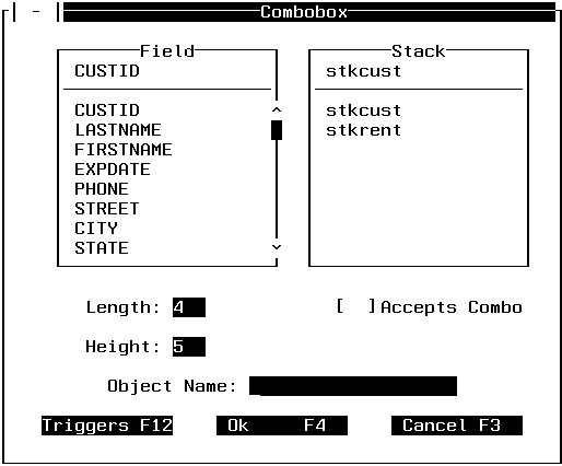
Field displays all the fields in the Master Files that this procedure uses. Fields that have an ACCEPT attribute in the Master File are displayed with an asterisk (*).
If you are designing this combo box to be populated from:
If you specify a user-defined column, the procedure must declare it before displaying the Winform.
Select the stack whose column will populate the combo box. You can choose from all the stacks that are defined to the Winform.
You can edit the combo box's length (that is, the column's width) by placing the cursor at the number following Length and entering the new length. For further details concerning column width, see Length.
You can edit the combo box's height by placing the cursor at the number following Height and entering the new height.
If you select Accepts Combo, the combo box will be populated by the list of values in the selected field's ACCEPT attribute in the Master File. This requires that the field's description in the Master File has an ACCEPT attribute that specifies a list of values.
You may provide a name for the combo box, or accept the default name, so that you can refer to the combo box within your procedure.
You may assign up to twenty-five control-level triggers to each combo box. These triggers are invoked when an end user presses the specified function key when the cursor is in the combo box. For more information about triggers see Using Triggers, Button Short Cuts, and System Actions.
Tip: You may want to avoid assigning a trigger to the Enter key. Because end users must press the Enter key to select an item from a combo box, it is recommended that you do not assign a trigger to the Enter key unless you intend end users to trigger the specified function each time they select an item from the combo box.
In this section: How to: |
A radio button group represents several mutually exclusive options: an end user can select one button from a group.
The radio button group is defined by a stack column:
When the end user selects a radio button, FocIndex points to the stack row that the user selected. For example, the following code displays a Winform that has a radio button group populated by the CustID column in the CustStack stack, and then assigns to the SelectedCustomer variable the value that the end user has selected from the group:
FOR ALL NEXT CustID INTO CustStack;
WINFORM SHOW CustForm;
SelectedCustomer = CustStack().CustID;
FocIndex determines which radio button is selected by default when the Winform is first displayed at run time. You can control which button is the default by setting the value of FocIndex. In the example below, the radio button group is populated by CustStack.CustID, and the default value will be taken from the fifth row of CustStack.CustID:
FOR ALL NEXT CustID INTO CustStack;
CustStack.FocIndex = 5;
WINFORM SHOW CustForm;
SelectedCustomer = CustStack().CustID;
For general information about how an end user would manipulate a radio button group, see Using Radio Buttons.
You are prompted to point to a location and press the Enter key or PF3 to cancel.
If you press the Enter key, the radio button group dialog box is generated:
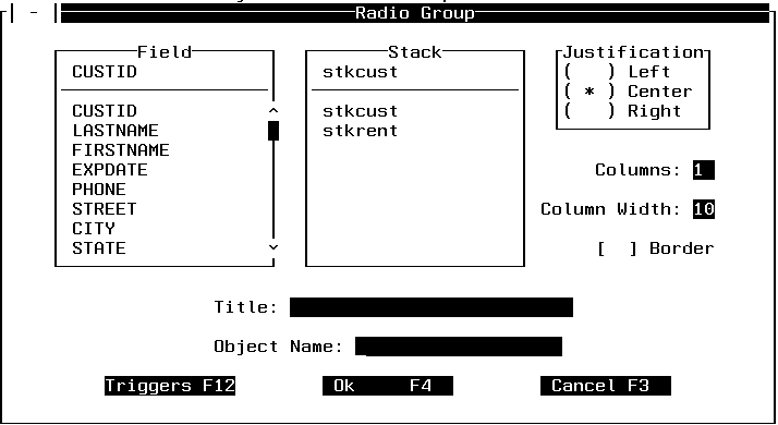
The Field combo box lists all the fields in the Master Files that are used by the current procedure. Select the field whose column in the selected stack you want to populate the radio button group, or type the name of a user-defined column in the selected stack (that is, a column created with the COMPUTE command) that you want to populate the radio button group.
If you specify a user-defined column, the procedure must declare it before displaying the Winform.
Select the stack whose column will populate the radio button group when the Winform is displayed. You can choose from all the stacks that are defined to the Winform.
Justification allows you to choose whether to center, left-justify or right-justify each button's text. Justification is not supported for radio button groups in the current release.
This determines the width of the columns in which the buttons are displayed. For database stack columns, this defaults to the length of the selected field as defined in the Master File plus six, to allow for spacing between columns; for user-defined stack columns it defaults to 13.
If you specify a column width that is less than the field or variable length, any stack values exceeding the specified width will be truncated when they are displayed.
Tip: If you enter a two-digit width, or change the width's units digit, be aware of the cursor position before pressing Enter or a function key. This is because, when typing a units digit in the Column Width field, the cursor's automatic tabbing then moves to the next control in the dialog box, which is the list of fields in the Fields combo box. If you then press the Enter key or a function key to confirm your new width, you will also be resetting the selected field to the field on which the cursor is positioned.
You may provide a name for the radio button group, or accept the default name, so that you can refer to the radio button group within your procedure.
You may assign up to twenty-five control-level triggers to each radio button group. These triggers are invoked when an end user presses the specified function key when the cursor is in the radio button group. For more information about triggers see, Using Triggers, Button Short Cuts, and System Actions.
How to: |
Select Gen Segment to place all the fields in a segment into a Winform at one time.
Select Gen Segment. You are prompted to point to the starting line. Press the Enter key, or press PF3 to cancel. If you press the Enter key, the Pick Segment dialog box is displayed:
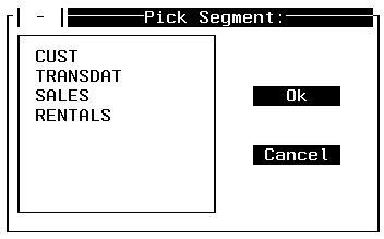
Place the cursor under the name of the segment you wish to display and press the Enter key. Press PF3 if you wish to cancel.
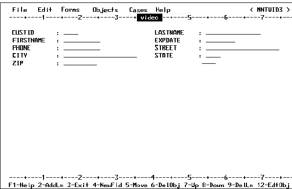
For example, if you choose CUST the following is displayed:
You may:
Gen Master is similar to Gen Segment except it generates fields for all of the fields in a data source rather than just for a single segment. For example, if you select Gen Master and you are working with the VideoTrk data source, a screen similar to the following is displayed:
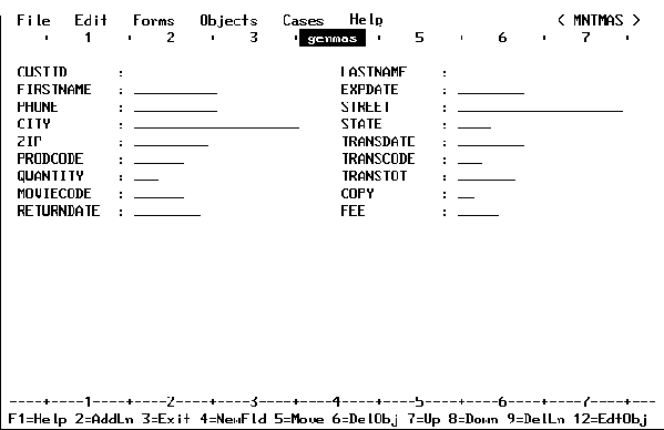
You may perform the same actions on these fields that were discussed in Gen Segment.
| Information Builders |