This section describes the five graph forms produced
by FOCUS, and their basic elements. Connected point plots are described
first, followed by histograms, bar charts, pie charts, and scatter
diagrams. The adjustable graphic features are mentioned only briefly
with the graph forms and fully described in Adjusting Graph Elements.
As seen in the examples in GRAPH vs. TABLE Requests, there are similarities between the requests for
some of the forms. For example, a request for a connected point
plot (with an alphanumeric ACROSS field) creates a histogram instead
if the HISTOGRAM parameter is set on (the default). This feature
enables you retrieve data once, then switch from one form to the
other by changing the HISTOGRAM value and issuing REPLOT.
Histograms are often called vertical bar charts, but the physical
similarities between these forms mislead users. Although the graphs
look similar and have parameters that perform similar functions
(HSTACK and BSTACK), the parameters used to control the widths and
spacing of bars on bar charts have no effect on histogram bars.
Histograms and vertical scatter plots (those created with BY
phrases) have variable-length vertical axes that are not subject
to the VAXIS parameter setting.
Pie charts and bar charts are different geometrical representations
of similar types of data, but pie charts are only possible if you
have a high-resolution device capable of drawing respectable curves.
x
Create a connected point plot (or a line plot on a high-resolution
device), with a request that combines the verb SUM (or the synonyms
WRITE or ADD) with an ACROSS phrase that specifies an alphanumeric
or a numeric field. If the field specified in the ACROSS phrase
is alphanumeric, the HISTOGRAM parameter must be set off in order
to generate a connected point plot.
The values for the field named in the ACROSS phrase are plotted
on the horizontal axis, and the values for the verb object(s) are
plotted along the vertical axis.
The example below illustrates a point
plot request.
SET HISTOGRAM=OFF

SET VAXIS=40,HAXIS=75
GRAPH FILE SALES
HEADING CENTER
"SAMPLE CONNECTED POINT PLOT"
SUM SALES ACROSS DATE
END
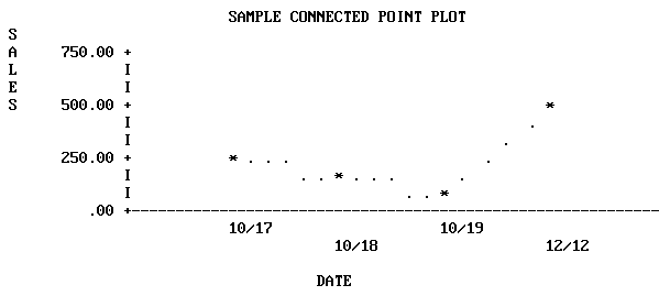
Note: The SET statements in the previous example were
added to limit the output graph to a convenient size for display
on the page. Without them, FOCUS sets the default horizontal axis
width at the capacity of the device selected, and a vertical height
of 66 lines, the normal page length.
x
-
Scale Titles. The
values associated with the class markers are printed below the horizontal
axis in the USAGE format of the variable being plotted (MM/DD in
our example).
-
Plot Characters. The
graphics characters used to plot the variables on connected point
plots depend on the type of display device:
- On high-speed
printers and non-graphics terminals, the data points are represented
by asterisks (*) when only one variable is plotted. If several variables are
plotted, the initial letters of the variable names are used (rename
duplicates with AS phrases). The data points are connected by periods
(.). You cannot create continuous line plots, as they are only available
on high-resolution devices.
- On high-resolution
displays, printers, and plotters, the lines connecting plot points
are drawn explicitly. When there are several variables, they are
distinguished either by color or by the type of connecting line
used (dotted, solid, or broken).
-
Axis Titles. You
can include vertical and horizontal axis titles for your graphs:
- For requests
with a single verb object, the vertical title is either its field name
or a replacement name you have provided in an AS phrase.
- When more
than one variable is plotted, FOCUS prints a vertical legend instead of
the vertical title. The legend specifies the field names or their
replacements, and provides a key showing which line represents each
variable. Titles are displayed staggered or folded on successive
horizontal lines to permit more titles than a single horizontal
line can contain.
The following example illustrates a point
plot with several variables, run offline.
SET HISTOGRAM=OFF
SET AUTOTICK=OFF, VCLASS = 200, VTICK = 25
DEFINE FILE SALES
SALES/D8.2=RETAIL_PRICE * UNIT_SOLD;
END
GRAPH FILE SALES
HEADING
"POINT PLOT WITH SEVERAL VARIABLES"
SUM SALES AND UNIT_SOLD AND INV AS 'ON HAND'
ACROSS DATE
END
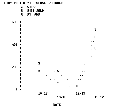
Up to five variables can be plotted on the same vertical axis.
The scale on the vertical axis is determined based on the combined
values of the vertical variables, and a separate point appears for
each value of each variable.
When planning graphs with multiple variables
or large numbers, adjust your variables so they are in the same
order of magnitude. By redefining the variable plotted on the horizontal
axis by a suitable power of 10, you can make the finished graph
more legible. A method for doing this is shown in the example below.
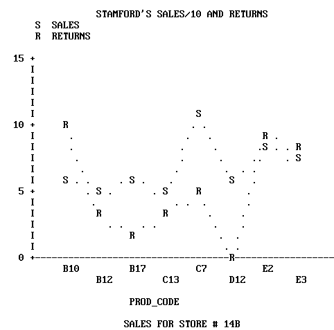
Run this as an offline request:
DEFINE FILE SALES
SALES/D8.2=(UNIT_SOLD * RETAIL_PRICE)/10;
END
SET HISTOGRAM=OFF
SET AUTOTICK=OFF, VCLASS = 5  , VTICK = 1
GRAPH FILE SALES
HEADING CENTER
"STAMFORD'S SALES/10 AND RETURNS"
SUM SALES AND RETURNS ACROSS PROD_CODE
BY STORE
IF CITY IS 'STAMFORD'
FOOTING CENTER
"SALES FOR STORE # <STORE_CODE"
END
x
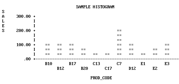
Histograms are vertical bar charts, and are useful for
portraying the component parts of aggregate values. They are an
alternate graphic format for plotting requests that could also generate
connected point plots. To switch from one format to the other, simply
reset the parameter HIST and issue REPLOT.
Create histograms by typing requests containing the verb SUM
(or the synonyms, WRITE or ADD) and an ACROSS phrase that specifies
an alphanumeric field. One bar appears on the graph for each verb
object. The example that follows illustrates a histogram with a
single variable. Run it as an offline request:
SET HISTOGRAM=ON
SET AUTOTICK=OFF, VCLASS = 100, VTICK = 40
DEFINE FILE SALES
SALES/D8.2=(UNIT_SOLD * RETAIL_PRICE);
END

GRAPH FILE SALES
HEADING CENTER
"SAMPLE HISTOGRAM"
SUM SALES ACROSS PROD_CODE
END
To draw the bars side by side, separate the verb objects with
spaces or AND. To draw superimposed (stacked) bars, separate the
verb objects with OVER. The example that follows illustrates a request
using OVER. Run it as an offline request:
SET HISTOGRAM = ON
SET AUTOTICK=OFF, VCLASS = 200, VTICK = 20
DEFINE FILE SALES
SALES/D8.2=(UNIT_SOLD * RETAIL_PRICE)   ;
END
GRAPH FILE SALES
HEADING
"SALES OVER INVENTORY AND RETURNS"
"ACROSS PRODUCT CODE"
SUM SALES OVER INV OVER RETURNS ACROSS PROD_CODE
END
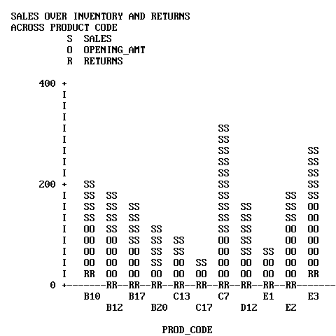
Note that the legend uses the full field names rather than the
aliases for the verb objects (OPENING_AMT for INV).
When you name three or more verb objects in a request, you can
have any combination of stacked and side-by-side bars.
x
Each vertical bar or group of bars represents a value
of the ACROSS sort field. The range of values for the verb objects
determines the scale for the vertical axis.
All of the vertical axis features on histograms are adjustable:
- To reset
the height of OFFLINE graphs, use the VAXIS parameter as described in How to Set the Height.
For online graphs, FOCUS automatically sets the height of your graph
based on the terminal dimensions.
- Reset the
upper and lower thresholds on the axis by setting the default scaling mechanism
off (VAUTO) and setting new upper and lower limits (VMAX and VMIN).
See How to Set the Scale: Assigning Fixed Limits.
- Reset the
class and tick intervals by overriding the default mechanism (AUTOTICK) and
setting new intervals (VCLASS and VTICK). See How to Set Class and Tick Intervals.
FOCUS automatically sets the width of the bars and the spacing
between them to fit within the HAXIS parameter limit. These can
be changed by resetting the HAXIS parameter (see How to Set the Width).
The values for the data points on the HAXIS are printed horizontally
on a single line or staggered (folded) on two or more lines, depending
on the available space.
To add a grid of parallel horizontal lines at the vertical class
marks, issue the following SET command before issuing your request:
SET GRID=ON
Vertical grids are not available on histograms.
To specify stacking of all bars without using OVER in the request,
you can set the parameter HSTACK (SET HSTACK=ON). Remember to set
it off again before moving to other requests.
Note: There is often confusion over histogram features
because of the similarity with bar charts. The BARNUMB facility
used to print summary numbers for the bars in bar charts does not
work with histograms.
x
Bar charts have horizontal bars arrayed vertically.
To produce a bar chart, type a request containing the verb SUM and
a BY phrase (but no ACROSS phrase). A separate group of bars is
created for each value of the BY field, and each group contains one
bar for each verb object in the request.
SET BARWIDTH=2, BARSPACE=1

GRAPH FILE SALES
HEADING
"BAR CHART"
SUM UNIT_SOLD BY CITY
IF PROD_CODE EQ B10
END
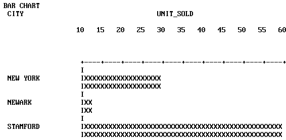
In the request above, the parameters BARSPACE and BARWIDTH were
set to enhance the appearance of the graph and improve readability.
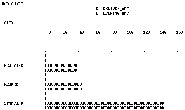
In requests with multiple verb objects, each bar appears beneath
its predecessor by default. If verb objects are connected by OVER
phrases, however, then the corresponding bars are stacked and appear
end-to-end. The following example illustrates stacked bars.
SET BARSPACE=2, BARWIDTH=2
GRAPH FILE SALES
HEADING
"BAR CHART"
SUM DELIVER_AMT OVER INV BY CITY
WHERE PROD_CODE EQ 'B10'
END
Alternatively, to request stacking of all bars, set the parameter
BSTACK (SET BSTACK=ON). If you use BSTACK you do not need OVER;
any graph can be replotted with and without stacking by simply changing
the value of this parameter and issuing REPLOT.
x
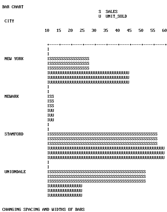
You can set the BARWIDTH parameter to change the widths
of the bars themselves, and set the BARSPACE parameter to change
the spacing between them. Set the GRID parameter to add a grid of
vertical parallel lines at the class marks on the horizontal axis.
The examples that follow illustrate the use of these parameters.
SET BARWIDTH=3, BARSPACE=2, BSTACK=OFF
DEFINE FILE SALES
SALES/D8.2=RETAIL_PRICE * UNIT_SOLD;
END

GRAPH FILE SALES
HEADING
"BAR CHART"
SUM AVE.SALES AND UNIT_SOLD BY CITY
WHERE PROD_CODE IS 'B10' OR 'B20'
FOOTING
"</2 CHANGING SPACING AND WIDTHS OF BARS"
END
The result follows:
To print a summary value at the end of each bar, set the BARNUMB
parameter.
Note: This feature is also available on pie charts, but
is not available on histograms.
The effects of BARNUMB and GRID are shown below.
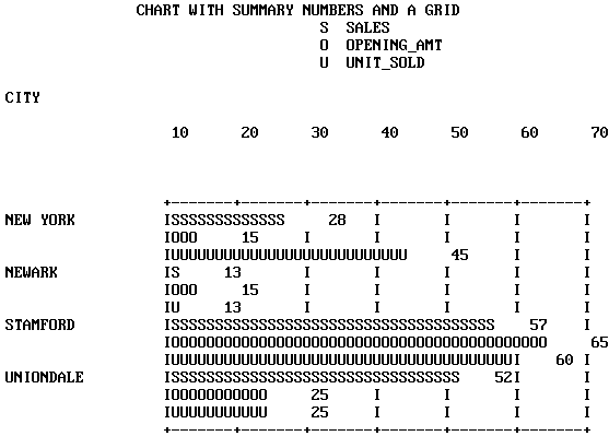
SET BARNUMB=ON, GRID=ON
DEFINE FILE SALES
SALES/D8.2=RETAIL_PRICE * UNIT_SOLD;
END

GRAPH FILE SALES
HEADING CENTER
"CHART WITH SUMMARY NUMBERS AND A GRID"
SUM AVE.SALES AND INV AND UNIT_SOLD BY CITY
WHERE PROD_CODE EQ 'B10' OR 'B20'
END
The horizontal axis features are all adjustable:
- To change
the width of OFFLINE graphs, alter the HAXIS parameter as described
in How to Set the Width. For ONLINE graphs, FOCUS automatically detects the
width of the terminal, and displays the graph accordingly.
- To reset the
numerical scale, turn off the default scaling mechanism (HAUTO)
and set new upper and lower limits (HMAX and HMIN). See How to Set the Scale: Assigning Fixed Limits.
- To change
the class and tick intervals, override the default mechanism (AUTOTICK) and
set new intervals (HCLASS and HTICK). See How to Set Class and Tick Intervals.
The vertical axis length is controlled by FOCUS. You can set
the bar widths and spacing as mentioned previously, but you cannot
set the vertical height to a fixed dimension.
x
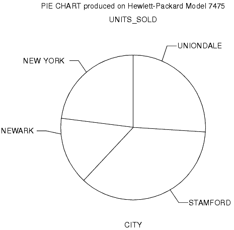
Pie charts can only be drawn on high-resolution graphic
devices. It is possible, however, to create a formatted pie chart
and save it for subsequent plotting on another device. See Saving Formatted GRAPH Output.
To create a pie chart, first set the PIE parameter ON and select
a device (SET DEVICE=), then type a request with the verb SUM (or
the synonyms, WRITE or ADD) and an ACROSS phrase that names an alphanumeric
field. When you finish your pie charts, set the PIE parameter OFF
before running other types of GRAPH requests.
SET PIE=ON, DEVICE=HP7220C
GRAPH FILE SALES
HEADING CENTER
"PIE CHART PRODUCED ON HEWLETT-PACKARD MODEL 7475"
WRITE RPCT.UNIT_SOLD ACROSS CITY
END
x
To add summary numbers for each
slice of the pie chart on the previous page, enter the following:
SET BARNUMB=ON
REPLOT
The effect is shown below:
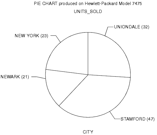
Note: FOCUS does not include a facility for displaying
exploded pie chart slices.
x
Scatter diagrams illustrate occurrence patterns and
distribution of variables. Create them by issuing requests containing
the verb PRINT and a sort phrase (BY or ACROSS). The choice of BY
or ACROSS dictates the vertical or horizontal bias of the graph.
The samples that follow illustrate both types.
GRAPH FILE SALES
HEADING CENTER
"SCATTER DIAGRAM USING ACROSS"
PRINT UNIT_SOLD ACROSS RETAIL_PRICE
END
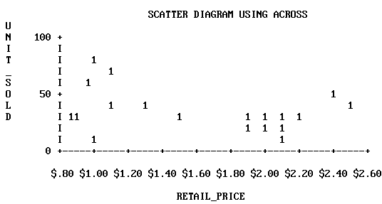
The point plots on the vertical axis represent the values for
the ACROSS field named. Each record selected contributes a separate
point. The sort control fields are plotted on the horizontal axis,
which is also scaled if the control field values are numeric.
When the request contains a BY phrase, the named sort control
field is plotted down the vertical axis and the data values are
scaled horizontally.
GRAPH FILE SALES
HEADING CENTER
"SCATTER DIAGRAM USING BY"
PRINT UNIT_SOLD BY RETAIL_PRICE
END
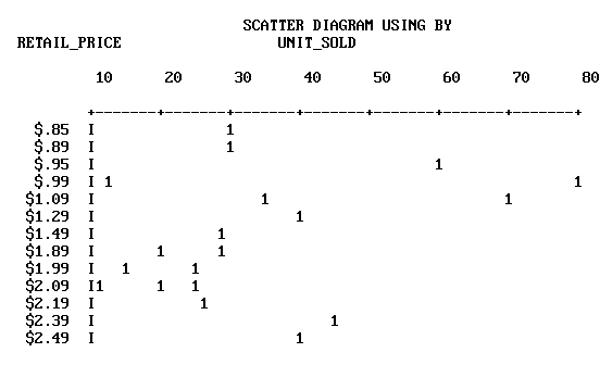
The vertical axis is not scaled even if the control field is
numeric. Each separate value of the control field is plotted on
a different line, but these are not arranged according to a numerical
scale. The full range of horizontal scaling options is available
(see The Horizontal Axis: System Defaults).
x
When multiple points fall in the same position, FOCUS
displays either a number (for up to nine occurrences) or an asterisk
(for more than nine occurrences).
When you specify more than one verb object (five are permitted),
they are represented by the first letter of the field name. If they
are not different, you can assign unique symbols with AS phrases.
Scatter diagrams can display the following:
- Trend
lines (available only in plots generated using ACROSS). Trend lines
are calculated by Ordinary Least Squares (OLS) regression analysis
and represent the line of best fit. You can add them to requests
containing ACROSS phrases by setting the parameter GTREND before
executing or replotting the request:
SET GTREND=ON
When
two fields are plotted with GTREND=ON, FOCUS provides two trend
lines. If more than two fields are plotted, however, FOCUS does
not provide trend lines.
- Horizontal
grids. You can add horizontal grid lines at the vertical class marks
by setting the parameter GRID:
SET GRID=ON
- Vertical grids
(available only in plots generated by requests using BY). You can
add vertical parallel lines at the horizontal class marks of the
scatter plot by setting the parameter VGRID:
SET VGRID=ON