
In this section: |
You use the Report tab to modify report properties, change the style of rows and columns on your report, or create filters. The Report tab contains the following groups: Filter, Report, Traffic Lights, Style, and Links. The Report tab is located at the top of the App Studio interface and is available only when you are creating or working with a report. The Report tab is shown in the following image.
In this section: |
You use the Filter group to define filter fields when creating a report. The Filter group is shown in the following image.

The commands are:
Filters fields using Where, If, Where Total, and Limits screening options. You can access the Expression Builder by selecting Where, If, or Where Total from the Filter drop-down menu.
Using the Expression Builder, you can create expressions quickly by selecting fields, relations, operators, and values from lists. You can base selection criteria on a specified value, a variable value, or a field value. For more information, see Using the Expression Builder.
If you selecting Limits, the Retrieval Limits dialog box opens, where you can set the Record Limit and Read Limit values. This enables you to set how much data is displayed or previewed.
The Expression Builder enables you to create expressions quickly by selecting fields, relations, operators, and values from lists. You can base selection criteria on a specified value, a variable value, or a field value.
You can access the Expression Builder by clicking Where, If, or Where Total from the Where/If drop-down menu. The Expression Builder dialog box displays.
The Expression Builder is divided into four sections. The Data section is located in the upper-left of the Expression Builder. The Criteria section is located to the lower-left of the Expression Builder. The Advanced section is located in the lower-right of the Expression Builder. The Expression Grid is located to the upper-right of the Expression Builder.
The Data section displays a list of all fields in the data source. Double-click or drag the field into the Expression Grid to build an expression using the options provided. You can also drag fields to the Criteria section and the Advanced section, once it is enabled.
The Criteria section displays which expression you are working on, as well as which expressions, of the same type, you have already created. If you double-click a field and it is added to the Expression Grid, the field will be shown in the Criteria section. Alternatively you can drag a field into the Criteria section begin working on a new expression. Dragging more than one field into the Criteria section allows you to create multiple of whatever type of statement you selected (Where, If, or Where Total). For example, if you clicked Where to open the Expression Builder, then dragging more than one field into the Criteria section will create multiple Where expressions. Selecting an expression in the Criteria section will show you the details of that expression in the Expression Grid and/or the Advanced section.
Note: The type of expression you are creating is shown next to the Criteria section.
The Advanced section is where, instead of creating an expression using the Expression Grid, you are creating it using syntax. This is for if you do not want to use the Expression Grid to create an expression. The Advanced check box is only available to be checked once a field is in the Criteria or Expression Grid. Once the Advanced check box is checked, the Advanced section, the Function button, and the Variable button are available for use.
The Expression Grid is where you build an expression using the drop-down options available. You can add more fields to the Expression Grid to make a more complex expression by using OR and AND.
The Expression Builder dialog box has the following sections:
Displays a list of all of the fields in the data source. Double-click or drag a field to add it to the Expression Grid.
Create an expression by using the drop-downs in correlation with a field.
You can delete expressions from the Expression Grid using the Delete key or right-click Delete option when either the And/Or or Column to filter columns are selected. If you use the Delete key or right-click Delete option on any other column, it will only delete that column option. You can only delete entire expressions, using the Expression Grid, when there are multiple expressions present. If you want to delete a single expression, you must do it from the Criteria section.
Displays the keyword used in the expression listed in the Expression list box. You must select more than one field for the expression to activate this option.
Allows you to add either one, two, or three parentheses before and after an expression.
The field you clicked or dragged in from the Data section. This field can be changed after being added by clicking the drop-down list and selecting a different field.
Displays a list of possible relations between the selected data source field and the value, parameter, or other field that WebFOCUS will compare it to. Select a relation to activate the Compare Type column.
The following relations are available from the drop-down list:
Note: The is and is not relations are only available for an IF statement. The matches the pattern, does not match the pattern, is like, is not like, is in literal list, is not in literal list, is in external file of literals, and is not in external file of literals relations are only available for a WHERE statement.
Indicates the nature of the comparison you wish to make to the field selected in the field section.
The following is a list of the available Compare Types and a brief description of what each is:
Note: The external file should be a text file with new line delimiters.
Note: After choosing Other and double-clicking on Compare Value to enter a value, you will be prompted with the following warning message.
If using a literal value, it must be enclosed in single quotes.
Please use "Compare Type" "Value" instead for quotes to be added automatically.
You can choose to not show this message again by selecting the option at the bottom of the warning window.
Specifies the literal value, parameter, or other field to which the selected field is compared.
The choices available here are dependent on the selection you make in the Compare Type column.
The Criteria section shows the different expressions you created. Selecting an expression in the Criteria section will show you that expressions details in the Expression Grid and/or the Advanced section.
This option can only be checked if there is an expression in the Criteria or Expression Grid section. This option will enable you to use the Advanced section, the Function button, and the Variable button.
In this section you can type an expression out rather than using the Expression Grid.
Only available when Advanced is checked. Opens the Functions Arguments dialog box to assist in the creation of an expression that is being made with the Advanced section.
Only available when Advanced is checked. Opens the Functions Arguments dialog box to assist in the creation of an expression that is being made with the Advanced section.
Deletes an expression.
Moves an expression up one.
Moves an expression down one.
In the Expression Builder dialog box:
The field is added to the Expression Grid.
Note: Repeat this process to add other values to the list.
The values are shown in the Compare Value column.
In the Expression Builder dialog box:
The field is added to the Expression Grid.
This creates a Multiselect OR parameter. If you want to make a single select parameter, double-click the Compare Value column to open the Variable Editor and change the Variable Type to Single Select.
In the Expression Builder dialog box:
In the Expression Builder dialog box:
The field is added to the Expression Grid.
The Multiple Value Builder opens.
Note: A Single or Multiple Value Builder opens, based on your Logical Relation selection. In the Multiple Value Builder, you may select more than one value. In the Single Value Builder, only one value may be selected.
Note: The external file should be a text file with new line delimiters.
The imported values are loaded into the Data Source area of the Multiple Value Builder.
The imported values are added to the Compare Value area.
In the Expression Builder dialog box, you can select multiple values or fields to be used for record selection criteria by selecting options in the And/Or column. The And/Or column is only available if you have more than one Column to Filter.
Note: For every Column to Filter after the topmost one, And is already selected for you.
To start a new expression that will be combined with the previous expression by the keyword AND.
To start a new expression that will be combined with the previous expression by the keyword OR.
Note: When the keyword And is used, WebFOCUS only selects data that meet both conditions. When the keyword Or is used, WebFOCUS selects data that meet either condition.
How to: |
You use the components of the Report group to customize your reports. For example, you can add a header and footer to your report and include row and column totals. You can also sort the data on your report. The Report group is shown in the following image.
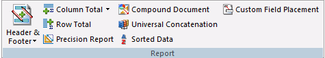
The commands are:
Adds a header, footer, or both to your report. You can define a Report Header, Page Header, Page Footer, or Report Footer.
Displays column totals in the report. You can select No Totals, Column Totals, or Summarize.
Displays row totals in the report. You can select Row Total or Off.
Converts your report to a precision report.
Converts your report to a Compound document. The original report remains unchanged while a copy of that report is placed on the Document canvas.
Retrieves data from unlike data sources in a single request. Opens the Universal Concatenation dialog box, where you can add the additional data sources to concatenate. For more information, see How to Concatenate Data Sources.
Assumes that the data is already sorted in the database. If the data you are accessing is already in the correct sort order, you can prevent WebFOCUS from resorting it. This feature provides a fast method of retrieving data if it is already stored in the order required for display, and no further sorting is required.
Allows sort fields to be moved from their default location.
Universal concatenation specifies how to combine data from sources with dissimilar Master Files.
This contains all the formatting for the resulting report and names the first file to be concatenated. It also contains all printing and sorting information. The fields printed and the sort fields must exist as real or DEFINE fields in each file.
The Universal Concatenation dialog box opens.
The Open File dialog box appears.
If there are temporary HOLD files associated with the procedure, HOLD files are available from the Open dialog box.
The selected data source is added, showing the Report Field Resolutions and Filters. Additionally, the Define Tool is activated.
Note: If the field names for the selected data source are not the same names and formats as the fields being printed and sorted in the main request, the Universal Concatenation dialog box indicates that you need to define these fields with status icons.
or
The Define Tool opens.
Note: The Define Tool opens automatically if the Create all needed fields for a data source when launching the Define tool option is selected. This creates the missing defines for the data source. A message appears before the Define tool opens, stating which DEFINEs will be created and require expressions, followed by a list of the created DEFINE fields. This option is off by default.
The DEFINE expression is written in the procedure ahead of the TABLE request.
You may create a filter through a WHERE clause.
The Expression Builder opens.
How to: |
You use the Traffic Lights group to set styling and hyperlinks conditions. The Traffic Lights group is shown in the following image.
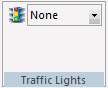
Sets the current condition for styling and hyperlinks. Options include:
The styling you add to a condition appears as a preview in the Report canvas when you select the condition in the Traffic Lights drop-down list box.
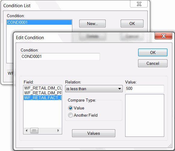
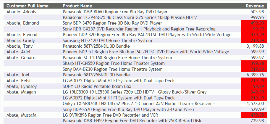
This procedure shows how you can use the Traffic Lights feature to set styling in your report based on conditions that you define. This example will use a red background to highlight revenue amounts that are less than 500.
The Report Wizard opens.
The Report Wizard - Select Procedure Location window opens.
The Report Wizard - Select a master file window opens.
In this section: |
You use the tools in the Style group to apply stylistic changes to a report, including data, title, and all other components of the report. The Style group is shown in the following image.
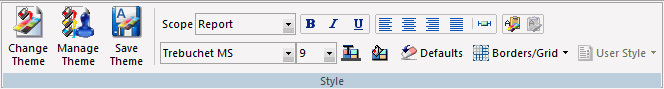
The commands are:
Changes the theme of the report from a list of available style sheets.
References or embeds an external StyleSheet or applies no styling to your report. The WebFOCUS StyleSheet is applied by default. When you click this button, the StyleSheet Selection dialog box opens.
Saves your current theme options.
Indicates the scope to which your changes will apply. For example, if you choose Report, your style changes will be applied to the whole report. If you choose Footing, your changes will be applied to the footer only. You can use the Scope function to apply styling to different areas of your report. The Scope options available from the Report tab are:
Note: The (Selected Item) scope is only available when you select a text or field item. The type of item selected will come before (Selected Item). For example, if you have text selected in the Page Footer, the Scope would display Page Footer (Selected Item).
Applies bold font formatting to the highlighted text or text within a selected object.
Applies italic font formatting to the highlighted text or text within a selected object.
Underlines the highlighted text or text within a selected object.
Aligns the highlighted text or text within a selected object to the left.
Aligns the highlighted text or text within a selected object to the center.
Aligns the highlighted text or text within a selected object to the right.
Aligns the highlighted text or text within a selected object to the default alignment option. This aligns numbers to the right and text to the left.
Sets report width options.
Copies the current style settings, enabling the Paste Style button.
Pastes the copied style settings.
Changes the font of the highlighted text or text within a selected object. Fonts are listed in alphabetical order.
Changes the font size of the highlighted text or text within a selected object. Font sizes range from 8 to 72 (whole numbers only).
Changes the font color of the highlighted text or text within a selected object. Applies the color change to the selected Scope. Opens the Color dialog box, where you can select the font color.
Changes the background color of the highlighted text or text within a selected object. Applies the color change to the selected Scope. Opens the Color dialog box, where you can select the background color.
Resets the style settings of the highlighted text or text within a selected object to the default (original) style.
Turn on or disable borders and grid lines. You can apply borders and gridlines to HTML, Excel, and PDF reports. For all other report types, this option is disabled.
Enables you to set User Format Style Blocks, if available.
Related Information:
The StyleSheet Selection dialog box enables you to reference or embed an external style sheet, use the default WebFOCUS StyleSheet, or apply no styling to your report. You may also save and include multiple style sheet. The StyleSheet Selection dialog box is accessible from the Style group on the Report canvas ribbon.
The StyleSheet Selection dialog box provides the following capabilities:
To open the StyleSheet Selection dialog box, on the Report tab, in the Style Group, click Manage Theme.
Note: The StyleSheet Selection dialog box opens to the Include StyleSheet File section, since every procedure has existing embedded styling by default. You may click Change Options and choose to embed or reference an external StyleSheet, use the WebFOCUS default StyleSheet, or turn off all report styling, as described in the procedures below.
Since every procedure has existing styling, the Include StyleSheet File section opens by default.
When a StyleSheet is included, part of the styling is embedded in the report. You may include StyleSheets up to an INCLUDE depth of three in your report, with the last selected StyleSheet having precedence.
The StyleSheet Selection dialog box opens.
The Open File dialog box opens.
Note: The last selected StyleSheet has precedence in the report. You may use the arrows to reorder the arrangement of StyleSheets.
The following syntax will be added to the procedure for the included StyleSheets.
ON TABLE SET STYLE *
     INCLUDE = citrus,
$
     INCLUDE = teal,
$
     INCLUDE = olive,
$
...
In addition to including StyleSheets to your report, you may apply an external Cascading Style Sheet to your report. An external Cascading Style Sheet (CSS) is an extension to HTML that enables you to specify formatting for an HTML document. To link the CSS to the report, use the External Cascading Style Sheet URL field in the StyleSheet Selection dialog box.
Note: An external Cascading Style Sheet is only applicable when using the HTML report output format.
The Stylesheet Selection dialog box opens.
Note: The external CSS (cascading style sheet) file should be saved in an alias on the web server.
Note: A CSS file is separate from a StyleSheet file and can exist on its own.
Embedding a StyleSheet stores your style information within the report, from which you can read an existing file as a starting point, start with a empty style, or leave the current StyleSheet contents without any modifications.
The StyleSheet Selection dialog box opens.
Note: Preserve referenced StyleSheets so any “INCLUDE=name” will not be deleted is selected by default. When a StyleSheet is included, a reference of the StyleSheet is added to the report syntax as INCLUDE=name. This reference is added to the existing style information already in the TABLE request.
The StyleSheet File Selection dialog box appears.
The selected StyleSheet file is shown as the origin embedded StyleSheet file. Optionally, you may include additional StyleSheets or add an External Cascading StyleSheet (CSS).
The selected StyleSheet code is imported into the procedure and overwrites any existing styling in the report.
Note: Preserve referenced StyleSheets so any INCLUDE=name is selected by default. When a StyleSheet is included, a reference of the StyleSheet is added to the report syntax as INCLUDE=name. This reference is added to the existing style information already in the TABLE request.
The Include StyleSheet File section opens indicating that the origin of the embedded StyleSheet file is unknown.
Tip: You may select StyleSheet files to embed to your currently empty style.
Starting with an empty style clears any styling from the report and initializes a procedure with the WebFOCUS default style code (basic styling that is used when styling is not specified).
Note: Preserve referenced StyleSheets so any INCLUDE=name is selected by default. When a StyleSheet is included, a reference of the StyleSheet is added to the report syntax as INCLUDE=name. This reference is added to the existing style information already in the TABLE request.
The Include StyleSheet File section opens indicating that the origin of the embedded StyleSheet file is unknown.
Tip: You may include StyleSheets to be added to the report.
The WebFOCUS Default Styling section applies the default StyleSheet to your report, with no styling visible in the procedure.
Note: The default WebFOCUS StyleSheet disables any styling options in the report. No further styling options of any kind can be applied to the report.
The StyleSheet Selection dialog box opens.
Tip: To remove the default WebFOCUS StyleSheet and enable styling, click the Style File Selection button to open the StyleSheet Selection dialog box and select the Normal Embedded Styling option.
To reset the default Report canvas styling in the StyleSheet Selection dialog box:
The StyleSheet Selection dialog box opens.
After including StyleSheets and applying styling options from Report canvas, you may save the StyleSheet as a new StyleSheet file (.sty).
The Save As dialog box opens.
The .sty file is saved in the working directory. You may browse to select a different location.
Tip: The saved StyleSheet can be included in other reports from the StyleSheet File Selection dialog box.
The following apply when using the StyleSheet Selection dialog box in Report canvas:
If the StyleSheet already exists in the current application, it does not get overwritten.
To refresh an existing StyleSheet, you must copy the new StyleSheet to the working directory or remove the StyleSheet from the procedure, delete it from the working directory, and then add it back to the procedure.
Note: If you go back and select to embed or reference a StyleSheet, or use the WebFOCUS default option, the StyleSheet that was in the report will get overwritten.
ON TABLE SET STYLE OFF
The Color dialog box lets you choose a color by selecting it from the color palette or entering a hexadecimal value
The Color dialog box displays.
You use the Borders dialog box to add borders to your report.
You can add borders to an entire report, a column, or another object area, such as a heading or footing.
Note: You must remove grids from the report, column, or object area before you can apply borders.
You can set borders to a report globally, so that they will apply to all objects you subsequently add to the report.
Note: Ensure that HTML, Excel, or PDF is selected as the report output format on the Format tab.
To set global borders:
The Borders dialog box opens.
Note: By default, the Make all borders the same option is selected.
OFF to turn borders off.
LIGHT to apply thin border lines.
MEDIUM to apply medium border lines.
HEAVY to apply thick border lines.
After you select your border width, style, and color selections, you can see them in the Border Preview window in the Borders dialog box.
Note: You can restore the original default borders by clicking the Default button.
To apply a border to a column:
The Borders dialog box opens.
OFF to turn borders off. (This is the default.)
LIGHT to apply thin border lines.
MEDIUM to apply medium border lines.
HEAVY to apply thick border lines.
After you select your border width, style, and color selections, you can see them in the Border Preview window in the Borders dialog box.
Note: If the OFF option is selected in the Width drop-down list, no borders will be shown.
To apply a border to another object area:
The Borders dialog box opens.
OFF to turn borders off. (This is the default.)
LIGHT to apply thin border lines.
MEDIUM to apply medium border lines.
HEAVY to apply thick border lines.
After you select your border width, style, and color selections, you can see them in the Border Preview window in the Borders dialog box.
Note: If the OFF option is selected in the Width drop-down list, no borders will be shown.
The Width Options dialog box allows you to set how values will be handled if they extend the report cell. You can also enter a value to specify a limit for how large or small a value can be before these options take effect.
The Width Options dialog box displays.
Note: This only applies to Truncate and Wrap.
How to: |
You use the Links Group to create drill-down procedures. The Links group is shown in the following image.

Enables you to create a drill-down procedure.
The Drill Down dialog box displays.
The Drill Down fields are enabled.
Note: The Refresh BI Portal drill-down type will be displayed only when you are working with a report that was created in the Content development area.
Select the procedure to drill to and click OK.
The Parameters dialog box opens.
The Parameter fields are enabled.
The Parameters dialog box closes and you return to the Drill Down dialog box.
The Drill Down dialog box closes.
| WebFOCUS |