In this section: |
You use the options on the Data tab to manipulate mathematical data in a report. You can create defines and computes.
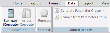
This tab contains the Calculation, Forecast, and Guided Reports groups. The Data tab is located at the top of the App Studio interface. It is only available when you are creating a report. The Data tab is shown in the following image.
In this section: How to: |
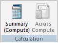
You can use the options in the Calculation group to include calculated values, or computes in your report. The Calculation group is shown in the following image.
The commands are:
Opens the Computed Field Creator dialog box, where you can create and manage calculated values to be used in a report. Specifically, you can create a computed field, type a name for the field, and enter a format. You can also specify how missing values are handled using the Options command, in the dialog box. For more information, see How to Access the Computed Field Creator and Defines and Computes.
Opens the Across Compute dialog box, where you can create a calculated value to be used in a report.
Note: An Across Compute can only be applied to an Across field. For example, if Sort Across is indicated on the Field tab, you can then apply an Across Compute to that field.
On the Data tab in the Calculations group, click Summary (Compute).
The Computed Field Creator dialog displays.
The Calculation group contains commands to create Define and Compute fields.
DEFINE and COMPUTE fields are two different types of temporary fields. A temporary field is a field whose value is not stored in the data source, but can be calculated from the data that is there, or assigned an absolute value. A temporary field takes up no storage space in the data source, and is created only when needed.
When you create a temporary field, you determine its value by writing an expression. You can combine fields, constants, and operators in an expression to produce a single value.
You can specify the expression yourself, or you can use one of the many supplied functions that perform specific calculations or manipulations. In addition, you can use expressions and functions as building blocks for more complex expressions, as well as use one temporary field to evaluate another.
A virtual field (DEFINE) is evaluated as each record that meets the selection criteria is retried from the data source. The result of the expression is treated as though it were a real field stored in the data source.
A calculated value (COMPUTE) is evaluated after all the data that meets the selection criteria is retrieved, sorted, and summed. Therefore, the calculation is performed using the aggregated values of the fields.
Note: To enable the objects when creating a Define, click the New button.
In this section: |
You can calculate trends in numeric data and predict values beyond the range of those stored in the data source by using the Forecast feature. The Forecast group is shown in the following image.

For more information on Forecasting, see Overview of Forecasting.
The command is:
Opens the Forecast dialog box, where you can calculate trends in numeric data and predict values beyond the range of values stored in the data source. You can also add a Forecast column to the report. For more information, see How to Calculate a Simple Moving Average.
You can calculate trends in numeric data and predict values beyond the range of those stored in the data source by using the Forecast feature.
The calculations you can make to identify trends and forecast values are:
When predicting values in addition to calculating trends, Forecast continues the same calculations beyond the data points by using the generated trend values as new data points. For the linear regression technique, the calculated regression equation is used to derive trend and predicted values.
Forecast performs the calculations based on the data provided, but decisions about their use and reliability are the responsibility of the user. Therefore, Forecast predictions are not always reliable, and many factors determine how accurate a prediction will be.
Conditional Formatting
You can create conditional formatting and data visualizations for forecast data. This makes it easy to distinguish between actual and forecast values in a column. For more information, see How to Set Conditional Styling for Forecast Data, or How to Set Data Visualizations for Forecast Data.
The Forecast dialog box opens.
If you select the same field as the By or Across field, this field will not appear in the output even if it is included in a display command.
This procedure shows how you can use the Traffic Lights feature to set styling in your report for forecast data.
The Field and Appearance tabs open.
The Color dialog box opens.
This means that forecast data will appear in red and actual data will appear in the default black.
Apply other style attributes from the Style group as needed to visually distinguish your forecast data.
Note: In cases where you have multiple forecasts in a report, all forecasts will appear with the same styling that you specify in this procedure.
This procedure shows how you can use the Traffic Lights and Data Bars features to set data visualizations in your report for forecast data.
The Appearance tab opens.
The Data Visualization dialog opens.
The Conditional Styling button becomes active.
The Data Visualization Conditional Styling dialog opens.
You are returned to the Data Visualization dialog.
Note: The Data Visualization Conditional Styling dialog allows you to remove a Forecast data visualization after it has been saved. However, if you click Remove it will also remove any conditional styling that you applied to the forecast. In this case, you would need to reset the conditional styling after the data visualization has been removed.
In this section: |
A Guided Report is a highly parameterized report that allows you to select fields and options that participate in a report at run time. Fields and options that have been added to the Guided Report are displayed in controls and are available for selection. Selecting fields from controls and running the report will display the data that correlates to the field values. For more information, see Overview of Guided Reports.
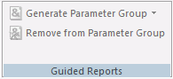
You use the options in the Guided Reports group to generate and delete parameter groups. The Guided Reports group is shown in the following image.
The commands are:
Generates a parameter group from the selected column or columns. It opens a drop-down menu that has the One variable for each selected column and One variable for all selected columns options. One variable for each selected column creates one control for every selected column with all the selected field names as values. One variable for all selected columns creates one control for all selected columns with all the selected field names as values. For more information, see How to Generate a Parameter Group for One or More Columns.
Removes a column or columns from the parameter group. This command is available only when the selected columns are part of a parameter group. For more information, see How to Remove One or More Columns from a Parameter Group.
A Guided Report is a highly parameterized report that allows you to select fields and options that participate in a report at run time.
Fields and options that have been added to the Guided Report are displayed in controls and are available for selection. Selecting fields from controls and running the report will display the data that correlates to the field values.
The advantage of using a Guided Report is that you can create one streamlined, highly parameterized report, and from that one report, you can generate thousands of different report outputs at run time. It requires no knowledge of code to customize the final report with the data you want displayed.
You use this procedure to assign one or more columns to a Parameter Group with either a unique or common variable.
Note: To reverse a parameter group assignment, you can press Ctrl-Z, provided that this is immediately following the assignment and no other action has taken place on the canvas.
You use this procedure to remove one or more columns from a Parameter Group assignment.
Note: Parameter Group assignments are indicated
by an ampersand  in the top-left to signify that
it is a member of a parameter group. If multiple variables were
indicated, each column icon will have a different color scheme.
For example, COLUMN1 may have a blue background with a yellow ampersand and
COLUMN2 may have a blue background with a white ampersand. The color
scheme varies depending on how the Parameter Groups were assigned
(one variable for each selected column or one variable for all selected
columns).
in the top-left to signify that
it is a member of a parameter group. If multiple variables were
indicated, each column icon will have a different color scheme.
For example, COLUMN1 may have a blue background with a yellow ampersand and
COLUMN2 may have a blue background with a white ampersand. The color
scheme varies depending on how the Parameter Groups were assigned
(one variable for each selected column or one variable for all selected
columns).
| WebFOCUS |