In this section: |
This appendix is separated into two sections. The first section, Building a Chart Control Manually, provides you with step by step instructions on building a chart control. The second section, Building a Chart Control From Existing Code, provides you with sample code you can use to insert a chart control into your own projects, and contains instructions on how to customize the code.
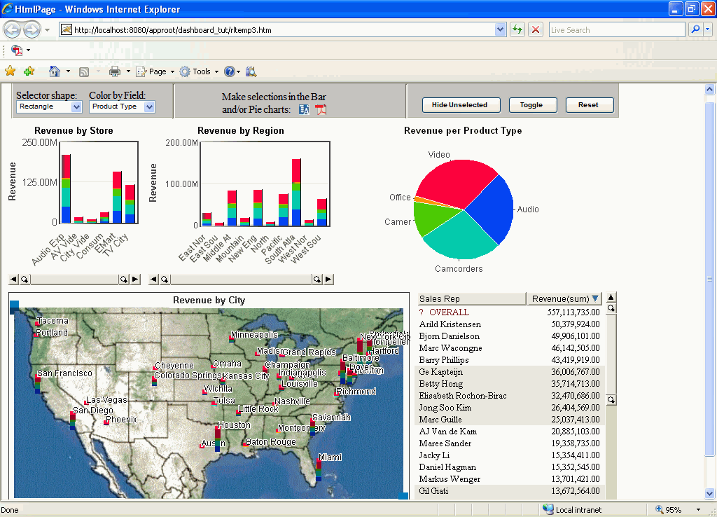
The final output looks similar to this:
In this section: How to: |
This topic illustrates how to build a chart control interface by manually building the dashboard and inserting the necessary code. For a quicker method, see Building a Chart Control From Existing Code.
In this part of the tutorial, you add JavaScript to a sample HTML file to define the properties of Visual Discovery components. The procedures assume that you know the basics of JavaScript concepts and syntax. Also see JavaScript Tags, which summarizes the use of the tags you will need to know in this part of the tutorial.
You can place JavaScript code anywhere within HTML code. In this part of the tutorial, you will place JavaScript code both at the beginnning and at the end of HTML code.
Make sure that you complete one of the JavaScript tutorials available on the Web. As you go through this part of the tutorial, refer to the following table, which summarizes basic constructs.
|
Construct |
Description |
|---|---|
// |
Comment line. Used at the end of a line of code or on a line by itself. |
/*...*/ |
Multi-line comment. Used for a comment that spans several lines of code. |
<SCRIPT>...</SCRIPT> <OBJECT>...</OBJECT> |
Opening and closing tags that identify a script entity and an object entity. |
{...} |
Opening and closing braces that contain the code for a function. |
; |
Semicolon required at the end of each JavaScript statement. |
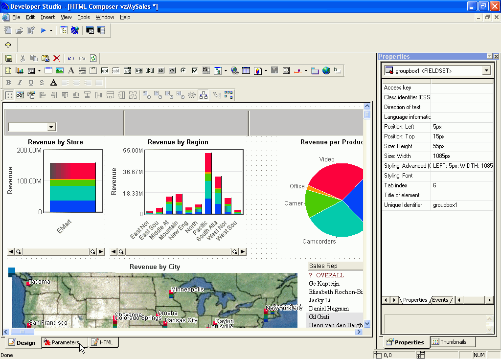
Make sure that groupbox1 <FIELDSET> is the selected property in the Properties menu pane, then click the Styling: Advanced (CSS) ellipsis button.
Make sure that line1 <SPAN> is the selected property in the Properties menu pane, then click the Styling: Advanced (CSS) ellipsis button.
This procedure will add a control to the menu bar, which can be used to set the way the mouse selects data graphically at run time. This applies to non-3D components only.
Make sure that combobox1 <SELECT> is the selected property in the Properties menu pane. Set these attributes as follows:
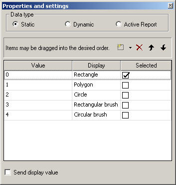
The Properties and settings dialog box appears.
Note: For the steps below, it is important that you make sure that cboSelection <SELECT> is the selected property in the Properties menu pane before you open the Parameters window. If it is not selected, you can select it from the drop-down menu at the top of the Properties menu. If it does not appear in the drop-down menu, you need to refresh the menu. You can do this by clicking anywhere on the active form, then back on the Properties window.
 button,
and add the following options:
button,
and add the following options:
|
Value |
Display |
|---|---|
| 0 | Rectangle |
| 1 | Polygon |
| 2 | Circle |
| 3 | Rectangular brush |
| 4 | Circular brush |
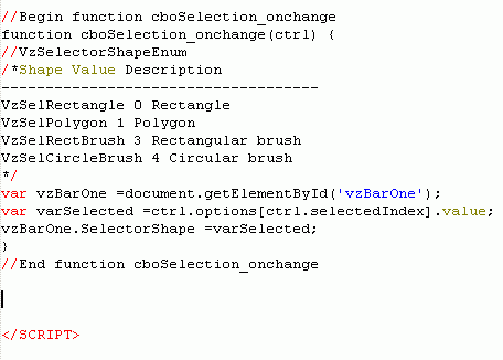
//VzSelectorShapeEnum
/*Shape	        Value   Description
------------------------------------
VzSelRectangle    0       Rectangle
VzSelPolygon      1       Polygon
VzSelRectBrush    3       Rectangular brush
VzSelCircleBrush  4       Circular brush
*/
var vzBarOne             =document.getElementById('vzBarOne');
var varSelected          =ctrl.options[ctrl.selectedIndex].value;
vzBarOne.SelectorShape   =varSelected;
Note: The steps above added JavaScript code to the project. For more information on JavaScript standards and best practices, see Using the Visual Discovery JavaScript API.
Make sure that text1 <SPAN> is the selected property in the Properties menu pane. Set these attributes as follows:
An important issue to consider when designing scripted web visualizations is the communications overhead in the thin-client environment. Also, if a script is going to call several component methods or set several component properties that would cause the display to refresh, you can improve the overall performance in the thin-client environment by disabling the automatic refreshes beforehand. The following procedure adds the VzSuspendImages() routine, which disables automatic refreshes. For more information on JavaScript standards and best practices, see Using the Visual Discovery JavaScript API.
Place your cursor before the end </SCRIPT> tag and after the closing curly bracket of the last function.
function suspendThinClient(blnState) {
    if(blnState) {
       if(typeof VzSuspendImages == "function") {
          VzSuspendImages();      //save thin-client transactions
       }
    }
    else {
       if(typeof VzRefreshImages == "function") {
          VzRefreshImages();      //save thin-client transaction
       }
    }
}
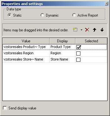
This procedure will add a control to the menu bar, which can be used to color any table in the Data Pool by the specified field at run time.
Make sure that combobox1 <SELECT> is the selected property in the Properties menu pane. Set these attributes as follows:
The Properties and settings dialog box appears.
Note: For the steps below, it is important that you make sure that cboColorBy <SELECT> is the selected property in the Properties menu pane before you open the Parameters window. If it is not selected, you can select it from the drop-down menu at the top of the Properties menu. If it does not appear in the drop-down menu, you need to refresh the menu. You can do this by clicking anywhere on the active form, then back on the Properties window.
button,
and add the following options:
|
Value |
Display |
|---|---|
| vzstoresales Product~ Type | Product Type |
| vzstoresales Region | Region |
| vzstoresales Store~ Name | Store Name |
suspendThinClient(true);
var vzBarOne     =document.getElementById('vzBarOne');
var varSelected  =ctrl.options[ctrl.selectedIndex].value;
vzBarOne.ColorBy =varSelected;
suspendThinClient(false);
Note: The steps above added JavaScript code to the project. For more information on JavaScript standards and best practices, see Using the Visual Discovery JavaScript API.
Make sure that text1 <SPAN> is the selected property in the Properties menu pane. Set these attributes as follows:
This procedure will add a control to the menu bar that omits unselected items from the current display.
Note: This method is different from excluding. When you hide unselected items the data is still present in other views, it would not be if excluded.
Make sure that button1 <INPUT> is the selected property in the Properties menu pane. Set these attributes as follows:
suspendThinClient(true);
vzBarOne.Command(7111, "", 0, 0); //***Excluded Unselected
suspendThinClient(false);
Note: The steps above added JavaScript code to the project. For more information on JavaScript standards and best practices, see Using the Visual Discovery JavaScript API.
This procedure will add a control to the menu bar that toggles the actively selected items (selected items become unselected, and the unselected items become selected).
Make sure that button1 <INPUT> is the selected property in the Properties menu pane. Set these attributes as follows:
suspendThinClient(true);
vzBarOne.Command(7117, "", 0, 0); //***Toggle Unselected
suspendThinClient(false);
Note: The steps above added JavaScript code to the project. For more information on JavaScript standards and best practices, see Using the Visual Discovery JavaScript API.
This procedure will add a control to the menu bar that refreshes all components on the page to their original state.
Make sure that button1 <INPUT> is the selected property in the Properties menu pane. Set these attributes as follows:
suspendThinClient(true);
vzBarOne.Command(7112, "", 0, 0); //***Restore Excluded
vzBarOne.Command(7115, "", 0, 0); //***Select All
suspendThinClient(false);
Note: The steps above added JavaScript code to the project. For more information on JavaScript standards and best practices, see Using the Visual Discovery JavaScript API.

This procedure adds two controls to the menu bar. Each control generates a list of strings representing the labels displayed for the selected items. One displays an active report, and the other displays a PDF.
Make sure that text1 <SPAN> is the selected property in the Properties menu pane. Set these attributes as follows:
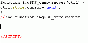
Make sure that image1 <IMG> is the selected property in the Properties menu pane. Set these attributes as follows:
openReport('AHTML');
ctrl.style.cursor='hand';
openReport('PDF');Place your cursor before the end </SCRIPT> tag and after the closing curly bracket of the last function.
function openReport(strOutputType){
var urlLink = 'http://localhost:8080/ibi_apps/WFServlet';
var urlQString = 'IBIF_ex=vzdashboard' +
'&IBIAPP_app=VZ_ChartControl' +
'&OUTPUT_TYPE=' + strOutputType;
var strStoreName = getValues('vzBarOne');
var strRegion = getValues('vzBarTwo');
var steProductType = getValues('vzPie');
urlQString += '&' + 'STORENAME=' + formatForReportURL(strStoreName);
urlQString += '&' + 'REGION=' + formatForReportURL(strRegion);
urlQString += '&' + 'PRODUCTTYPE=' + formatForReportURL(steProductType);
window.open(urlLink + '?' + urlQString, '');
}
function getValues(strActiveXName){
//VzSelectionFilter selectionMask
/*Value Description
-----------------------------------------
1 Include hidden (deleted) categories
2 Include visible categories
4 Include selected categories
16 Include semi-selected categories
*/
var vzActiveX = document.getElementById(strActiveXName);
var selectionMask = 4 + 16;
var strValues = vzActiveX.FindSelectedValues(selectionMask);
return(strValues);
}
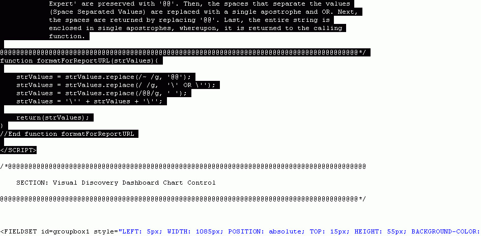
function formatForReportURL(strValues){
strValues = strValues.replace(/~ /g, '@@');
strValues = strValues.replace(/ /g, '\' OR \'');
strValues = strValues.replace(/@@/g, '');
strValues = '\'' + strValues + '\'';
return(strValues);
}Note: The steps above added JavaScript code to the project. For more information on JavaScript standards and best practices, see Using the Visual Discovery JavaScript API.
How to: |
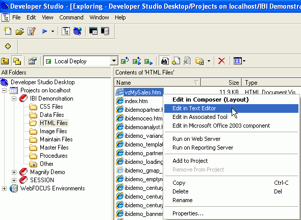
To set up and run the sample application, you will use vzMySales.html located in the IBI Demonstration project. vzMySales will be used as the sample application, showing you where to paste the code provided in this Appendix and how to edit it so that it can be used for any application.


The code that you added in step 11 inserted the Chart Control that you see at the top of your dashboard, as shown below.
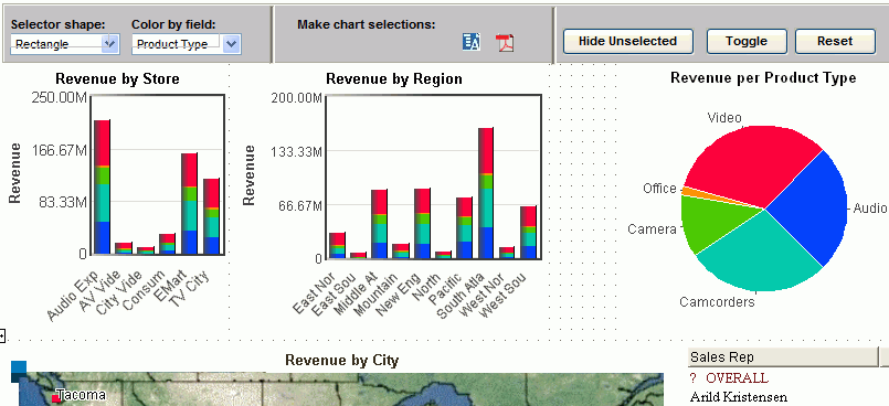
Note: The code from step 11 inserted the buttons with no functionality, the following steps adds the JavaScript you will use to make the buttons active.
Note: You will need to customize some of the code that you just inserted for the Chart Control to work. For step-by-step instructions, see How to Customize the Chart Control.
In the code that follows, you have to customize variables in order for the vzMySales project to work properly.
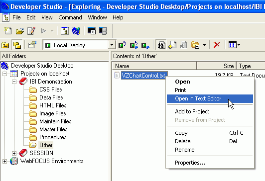
Note: Each piece of the following code is from the vzChartControl.txt file that you pasted into your project in How to Set Up the Sample Application. The variables that must be changed are highlighted in bold.
/*Global Script variables*/
var strtActiveXGBL = 'activex1';
/*Global Script variables*/
var strtActiveXGBL = 'vzBarOne';
//Begin function openReport
function openReport(strOutputType){
     var urlLink = 'http://localhost:8080/ibi_apps/WFServlet';
     var urlQString = 'IBIF_ex=VZdashboard' +
                      '&IBIAPP_app=ibidemo' +
                      '&OUTPUT_TYPE='+strOutputType;
var strStoreName = getValues('activex1', ' ', 'vzstoresales');
var strRegion = getValues('activex2', ' ', 'vzstoresales');
var steProductType = getValues('activex3', ' ', 'vzstoresales');
urlQString += '&' + 'STORENAME=' + formatForReportURL(strStoreName);
urlQString += '&' + 'REGION=' + formatForReportURL(strRegion);
urlQString += '&' + 'PRODUCTTYPE=' + formatForReportURL(steProductType);
window.open(urlLink + '?' + urlQString, '');
}
//End function openReport
//Begin function openReport
function openReport(strOutputType){
     var urlLink = 'http://localhost:8080/ibi_apps/WFServlet';
     var urlQString = 'IBIF_ex=VZdashboard' +
                      '&IBIAPP_app=ibidemo' +
                      '&OUTPUT_TYPE='+strOutputType;
var strStoreName = getValues('vzBarOne', ' ', 'vzstoresales');
var strRegion = getValues('vzBarTwo', ' ', 'vzstoresales');
var steProductType = getValues('vzPie', ' ', 'vzstoresales');
urlQString += '&' + 'STORENAME=' + formatForReportURL(strStoreName);
urlQString += '&' + 'REGION=' + formatForReportURL(strRegion);
urlQString += '&' + 'PRODUCTTYPE=' + formatForReportURL(steProductType);
window.open(urlLink + '?' + urlQString, '');
}
//End function openReportNote: The urlLink and urlQString values (bold in Step 5) should also be replaced with the proper values, depending on url of your server and the FOCUS executable file you are using. For this example, the values are correct.
| WebFOCUS |