In this section: |
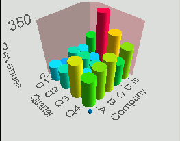
Multiscapes provide a visual representation of the interaction or relationship between two or more associated data fields by plotting one variable on the X-axis and one or more variables on the Y-axis. Multiscapes are a very effective means for understanding large bar charts with multiple categories, and are typically used to compare objects based on several attributes at the same time.
With WebFOCUS Visual Discovery, you can generate two-dimensional or three-dimensional multiscapes to rapidly find patterns between sets of statistics characterizing an object. These multiscapes can accommodate scenarios with hundreds of bars along each axis, and you can touch any individual bar to highlight its categories, sweep across a range of bars to see detail, or interactively isolate groups of bars by choosing other attributes.
Other features include:
How to:
Reference: |
Multiscapes are available in:
A multiscape is useful when you want to examine the relationship between two or more variables of any type. Using the default Weight By value to size the glyphs, you can easily discover the variables that are most frequently associated with each other in the data records (that is, are most strongly related) by finding the largest glyphs. By changing the Weight By variable, you can change the size of the multiscape glyphs to represent the value of a third variable from the data set. This enables you to compare three variables at once in a 2D display.
Tip: From the pop-up menu, select Column Order or Row Order.
By default, the Weight By value is set to <none>. The default size of the multiscape glyphs is proportional to the number of data records represented by the glyph.
Tip: From the pop-up menu select Display As.
The glyphs in the multiscape are immediately recolored so that each glyph with the same height is the same color. The color scale used for the coloring is the default scale unless another scale is set on the Colors tab. The size of the glyphs is determined by the Weight By value.
Note:
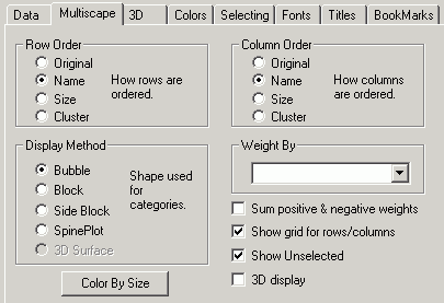
Reorders the rows in a multiscape. See How to Reorder a Multiscape.
Changes the display method. See How to Change the Display Method and Select the Field to Weight By.
Recolors the graph so that each glyph with the same height is the same color. This lets you easily identify glyphs that have common values.
The Color Scale used for the coloring is the default scale unless another scale is set on the Colors tab. See How to Color a Multiscape By Size.
Reorders the columns in a multiscape. See How to Reorder a Multiscape.
Is the variable (data field) for the option selected in the Display Method field. See How to Change the Display Method and Select the Field to Weight By.
Adds negative and positive weights together (creates two values, the sum of all negative weights and the some of all positive weights, shown in one glyph). When this is not selected, the negative and positive values are added together in one value. For example, if the negative and positive weights are added separately and the values are –8, –7, 5, and 10, the glyph shows a value of –15, + 15, and the glyph spans from –15 to + 15. When negative and positive weights are added together, the value is 0 and the glyph rests on 0.
Displays a grid.
Shows unselected data in gray. If Show Unselected is not checked, unselected data is omitted from the display.
To add unselected data, either turn on Show Unselected in the Properties dialog box, or use the right mouse button menu in the view and choose Select All.
In 3D graphs, Show Unselected must be turned on in the initial visualization component if you want to make unselected items transparent.
Displays glyphs in three dimensions. This must be selected for the 3D Surface option to become available.
The pop-up menu appears when you right-click a Visual Discovery component in the analytical dashboard. These options do not appear when you are developing a component in the HTML Composer.
Displays a grid.
Changes the appearance of the glyphs. Options are Bubble, Block, Side Block, SpinePlot, and 3D Surface.
Specifies the order in which items are presented. Options are Original, Name, Count, and Cluster.
Specifies the order in which items are presented in rows. Options are Original, Name, Count, and Cluster.
Shows unselected data in gray. If Show Unselected is not checked, unselected data is omitted from the display.
To add unselected data, either turn on Show Unselected in the Properties dialog box, or use the right mouse button menu in the view and choose Select All.
Enables you to use the mouse (RMB, which is the Right Mouse Button) with the Shift and Ctrl key to Zoom, Rotate XY (rotate the X and Y axes), or Rotate Z (rotate the Z axis).
This option is only available for 3D multiscapes.
Reverses the previous action. You may repeatedly undo actions retained in the history file for your current session by selecting Undo over and over again. A description of the previous action appears on the pop-up menu. If you have performed no action, there is nothing to undo and so Undo is not available for selection and no action appears to the right of the word Undo.
Restores the previous undo action. If you have performed no action, there is nothing to Redo and so Redo is not available for selection and no action appears to the right of the word Redo.
Selects all of the items in the graph. When you choose Select All, any previous selections are ignored. Selection state returns to the original setting.
When selected, all of the items become unselected. All items appear in the unselected color (gray, by default) or are hidden in the graph (if hide unselected is active).
Reverses the selection state of items. Selected items become unselected and unselected items become selected.
Excludes (temporarily removes) items from the graph.
Restores the items you excluded. If you accidentally excluded the unselected, this menu option restores those excluded items.
Enables you to save the graph to a GIF or JPEG file.
Enables you to copy the selected component and paste it to another file.
Takes you to the collection of tabs available for the respective visualization component. Common tabs include Data, Selecting, and Colors.
How to: Reference: |
In a 3D graph, some trends or other information might appear that you might not have considered on a 2D graph. 3D graphs are helpful when you want to look at different aspects, attributes, or characteristics of one data item at the same time.
One thing to be aware of when using a 3D multiscape is perspective. At times an object in the foreground may appear larger than objects in the background. If you are comparing the relative size of objects, perspective could lead you to believe objects in the back of a graph are smaller than objects in the front of a graph, when, in fact, they are equal. You can avoid this by choosing the Parallel option in the 3D tab, which presents glyphs more accurately.
From the 3D tab you can also control the color or transparency of unselected glyphs (to gray or color), the background walls for the graph, and the size of the X, Y, or Z axis.
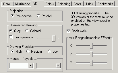
Displays glyphs in the foreground slightly larger than the glyphs in the background, which produces the expected illusion of perspective. This is the default.
Glyphs are not changed to give the illusion of perspective. For this reason, the glyphs may give a more accurate representation of the data.
Displays unselected items in gray, so it appears as if they fade from view. The Gray color scale uses shades of black and white to show differences or similarities between/among items.
Displays unselected items in a color.
Displays unselected items as transparent compared to the selected items. You can adjust the degree of transparency by moving the slider to the right or left.
Indicates how accurately the graph is rendered. Because the basic unit of drawing (pixel) is square, the accuracy of the drawing depends on how many pixels are used to draw a graph. Select High, Medium, or Low drawing precision.
Note that the High option, while more accurate, takes longer to render.
Enables you to use the mouse and various keystrokes to add functionality to a 3D graph. You can use keystrokes and the mouse to pan, zoom, rotate, select, show field level help, and turn continuous indicate on.
Displays background walls on the graph.
Adjusts the length of the X, Y, or Z-axis. Move the slider to the right to make the axis longer, more the slider to the left to make the axis shorter. By default, the axes are medium length.
| WebFOCUS |