Creating the Graph

How to:

Begin by creating a procedure that contains a graph. Later, you will add this graph to a frame in the HTML file and drill down to it from a report that you will soon create.


Top of page

x
Procedure: How to Create the Graph
  1. Right-click the Procedures folder under the Century project.
  2. Select New, then select Procedure from the context menu.

    The Add Procedure dialog box opens.

  3. Type STORSAL in the File name text box and verify that Procedure Files (*.fex) is selected from the Files of type drop-down menu.
  4. From the Create with drop-down menu, select Procedure Viewer.
  5. Click Open.

    The Procedure viewer window opens.

  6. Click the diamond to the right of the default Comment component and select Advanced Graph from the component connector toolbar.

    or

    Click the Advanced Graph Tool button on the Procedure Viewer toolbar.

  7. Select the CENTORD Master File and click Open.

    The Advanced Graph Assistant opens.

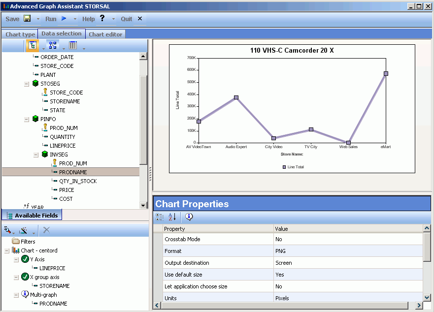
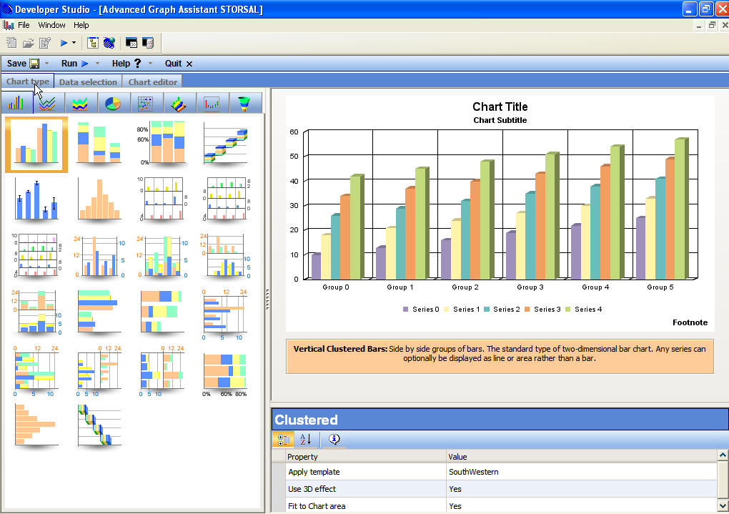
    The following image is the Advanced Graph Assistant which opens at the Chart type tab.

    Advanced Graph Assistant

  8. Select Line from the Chart type subtabs.

    The available line chart types appear.

  9. Select Absolute as the type of Line chart.

    The Advanced Graph Assistant refreshes showing a sample absolute line chart.

  10. Click the Data selection tab.
  11. Double-click LINEPRICE in the Fields list to add it as the Y-axis in the Available Fields area.

    LINEPRICE is added as the field value plotted on the Y-axis.

  12. Select STORENAME in the Fields list, then click and drag the field into the X group axis heading in the Available Fields area.

    STORENAME is added as the field value plotted on the X group axis.

  13. Select PRODNAME in the Fields list, then click and drag the field into the Multi-graph heading in the Available Fields area.

    Multi-graph creates a separate graph for each value of this field, in this case, the Product Name.
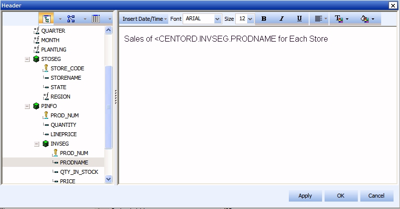
  14. Click Save.

    The following image shows the completed Data selection tab with fields selected for the Y axis, X group axis, and Multi-graph areas.

    Advanced Graph Assistant


Top of page

x
Procedure: How to Create a Heading for the Graph

Adding a heading to your graph provides important information to describe the data you want to display. You can add headings and footings for your graph from the Data selection tab of the Advanced Graph Assistant. In this tutorial, you will add a heading with an embedded field to the graph.

  1. Click the Data selection tab.
  2. Select Multi-graph from the Available Fields area.

    The Chart Properties refresh for the Multi-graph field.

  3. Click the Header Value field in the Chart Properties to open the Header dialog box.
  4. Type Sales of and leave a space.
  5. Double-click PRODNAME from the Field list.

    <CENTORD.INVSEG.PRODNAME is added to the Heading.

  6. Place the cursor after <CENTORD.INVSEG.PRODNAME and leave a space.
  7. Type for Each Store.
  8. Click Apply then OK to apply and close the Heading dialog box.

The following image shows how the Header dialog box in the Advanced Graph Assistant should appear.

Header dialog box


Top of page

x
Procedure: How to Limit Graphed Data

You can limit the data displayed in a report or graph by adding a filter. Here you will create a statement that limits the data in the graph to a certain product. You will enter this criteria as a parameter, and use the parameter later in the tutorial when you set the drill-down option for the report.

  1. Click the Data selection tab.
  2. Click Filters from the Available Fields area to view the Filter expression builder and specify record selection criteria.

    The following image shows the Filter expression builder which appears in the Advanced Graph Assistant.

    Filter expression builder

  3. In the Filter expression builder:
    • Double-click PRODNAME from the Fields list.
    • Select Equal to from the Logical Relation drop-down list. Equal is the default value.
    • Click Select Value to open the Select Value - Multiple Values dialog box.
    • Click the Parameter option from the Select Value dialog box.
    • Click the Edit Parameter Properties icon.

      The Select Value - Variable Editor dialog box opens.

    • Type PNAME in the Parameter input field.
    • Leave Selection as Dynamic.
    • Select CENTORD as the Data Source Value.
    • Select Product Name as the Value field.
    • Click OK to close the Select Value - Variable Editor dialog box.
    • Click OK to close the Select Value - Multiple Values dialog box.

    The PNAME parameter is added as the Filter, as shown in the following image.

    Filter

  4. Click Save to save your selections.

You will use the PNAME parameter later to set up the drill-down report.


Top of page

x
Procedure: How to Customize Your Graph

From the Chart editor tab in the Advanced Graph Assistant, you can select properties for your graph. You may adjust the background color, font, templates, and line border colors for your chart, axes, and labels. Here you will add background color to the graph.

  1. Click the Chart editor tab.

    The Chart editor shows all of the chart objects and their properties.

  2. Select Quick chart from the Chart folder.
  3. Double-click in the Background color Value field to open the Color dialog box.
  4. For this example, select Gray.

    The selected color appears and the color attributes are filled in.

  5. Click OK to close the Color dialog box.

    The background color is applied to the chart.

    The following image is an example of the Quick Chart properties in the Chart editor tab of the Advanced Graph Assistant.

    Quick chart properties

  6. Click Quit and save your graph.

WebFOCUS