In this section: |
In Document Composer and InfoAssist, you can add one or more active form controls to an active dashboard in order to create complex filter relationships among report and chart components. An active form control is available for an active dashboard in HTML and for an active dashboard for Adobe Flash Player and for PDF.
The following are the types of active form controls that you can use to apply filters to an active dashboard:
- List box
- Drop-down list
- Text input field
- Check box
- Radio button
This topic describes the WebFOCUS code that supports the implementation of the preceding active form controls.
The syntax is
OBJECT={LIST|COMBOBOX|TEXTINPUT|CHECKBOX|RADIOBUTTON}, NAME=’object_name',
ARDATA_REPORT='name_of_source_report', ARDATA_COLUMN='column_name',
ARFILTER_TARGET=’target_report_name1,target_report_name2,...',
ARFILTER_CONDITION='{EQ|NE|LT|LE|GT|GE}', ARFILTER_SHOWALL={ON|OFF},
ARFILTER_PARENT=’name_of_parent_object', ARDATA_FILTERONLY={ON|OFF},
ARFILTER_MULTIPLE={ON|OFF}, POSITION=(left top), DIMENSION=(width height),
FONT=font_type, SIZE=font_size, COLOR=font_color, $
where:
- OBJECT={LIST|COMBOBOX|TEXTINPUT|CHECKBOX|RADIOBUTTON}
-
Is the type of active form control. The available values are:
- LIST adds a list box.
- COMBOBOX adds a drop-down list.
- TEXTINPUT adds a text input field. This field is case-sensitive. The value that is typed in the field at run time must match the exact case of the value that is stored in the database.
- CHECKBOX adds a check box.
- RADIOBUTTON adds a radio button.
- NAME='object_name'
-
Is the name of the active form control.
- ARDATA_REPORT='name_of_source_report'
-
Is the name of the source report that contains the data that populates the active form control with selection values from which you choose at run time.
This property is required for the LIST, COMBOBOX, CHECKBOX, and RADIOBUTTON controls. This property is optional for the TEXTINPUT control.
- ARDATA_COLUMN='column_name'
-
Is the name of the specific column in the source report that populates the data selection values in the LIST, COMBOBOX, CHECKBOX, and RADIOBUTTON controls.
For the TEXTINPUT control, this property is the column to which the filter condition is applied. There is no initial data value for the TEXTINPUT control at run time. It remains blank until the user supplies a value.
This property is required. The column must exist in both the source report and target report.
The active form controls do not support the use of ACROSS sort fields in active reports or charts. You cannot use ACROSS sort fields to populate the data selection values and apply filters.
- ARFILTER_TARGET=’target_report_name1,target_report_name2,...’
-
Is the name of the target report or target chart component that is filtered by the active form control. You can specify one or more target report or target chart components. To specify multiple target components, provide a list of report or chart component names, separating each name with a comma (,).
This property is required.
- ARFILTER_CONDITION='{EQ|NE|LT|LE|GT|GE}'
-
Is the filter condition that is used. The available values are:
- EQ. Equal to. This is the default value.
- NE. Not equal to.
- LT. Less than.
- LE. Less than or equal to.
- GT. Greater than.
- GE. Greater than or equal to.
- ARFILTER_SHOWALL={ON|OFF}
-
Specifies whether or not to show the string value "[ALL]" in the list of data selection values for the active form control. The default value is ON, which displays the string value "[ALL]" in the list of data selection values. At run time, selecting this value from the control displays all the data in the report. Set this property to OFF to suppress the string value "[ALL]" in the active form control.
This property is optional for the LIST, COMBOBOX, CHECKBOX, and RADIOBUTTON controls.
This property does not apply to the TEXTINPUT control. For the TEXTINPUT control, removing the value supplied in the text input field removes the filter and displays all the values in the target reports and charts.
- ARFILTER_PARENT=’name_of_parent_object'
-
Is the name of the parent active form control using the NAME property to create a nested (parent/child) filter relationship between active form controls.
This is a user-specified property. There is no default value.
- ARDATA_FILTERONLY={ON|OFF}
-
Is a property that is used internally by Developer Studio.
The default value is ON for chained active form controls. The source report for a control can also be a target report for another control that applies a filter to the report. This property allows you to decide whether to filter the data in a control populated by a report that is filtered by another control. When this property is set to OFF, all the values for the column in the report are displayed as the data selection values for the control. When this property is set to ON, only the values after a filter has been applied are available as the data selection values.
- ARFILTER_MULTIPLE={ON|OFF}
-
Is an optional property for the LIST and CHECKBOX controls. When this property is set to ON, you can select multiple values from a LIST or CHECKBOX control at run time. With a list box, hold down the Shift key to select multiple values in sequence, or hold down the Ctrl key to select multiple values that are not in the order listed at run time. With check boxes, you can simply check or uncheck multiple check boxes at run time.
The default value is OFF.
This property does not apply to the COMBOBOX, RADIOBUTTON, or TEXTINPUT control, because those controls allow only single-value selection at run time.
- POSITION=(left top)
Is the position of the active form control on the active dashboard.
- The value left indicates the position of the control from the left edge of the active dashboard, in the units set.
- The value top indicates the position of the control from the top edge of the active dashboard, in the units set.
- DIMENSION=(width height)
Is the size of the active form control on the active dashboard.
- The value width is the width of the active form control on the active dashboard, in the units set.
- The value height is the height of the active form control on the active dashboard, in the units set.
- FONT=font_type
Is the type of font used to display the values in the active form control, for example, ARIAL.
- SIZE=font_size
Is the size of the font used to display the values in the active form control, for example, 12.
- COLOR=font_color
Is the color of the font used to display the values in the active form control, for example, BLACK.
The following image shows a partial active dashboard with a single tabular active report and a drop-down list (COMBOBOX). The drop-down list is positioned to the right of the active report. The drop-down list allows you to filter data in the tabular report on the value of the STATE column in the procedure. The data selection value All is provided in the drop-down list. When selected, All displays all the data in the report.
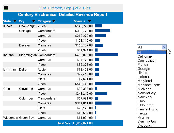
The WebFOCUS code for the drop-down list is as follows.
OBJECT=COMBOBOX, NAME='combobox1',
POSITION=(6.010 2.167), DIMENSION=(1.667 0.208),
ARDATA_REPORT='report1', ARDATA_COLUMN='STATE',
ARFILTER_TARGET='report1', ARFILTER_CONDITION='EQ',
ARFILTER_SHOWALL=ON,  $