ibiDataGrid Customization Options

In this section:


Top of page

x
Using AS Phrase to Change Column Titles

In the same manner that you can use AS syntax in a WebFOCUS procedure to change the column heading names to what you specify, you can now change column titles in the data grid using AS phrase.


Top of page

x
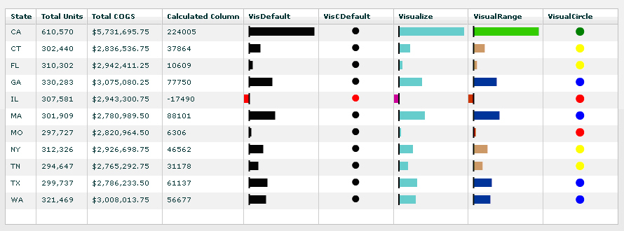
Adding Data Visualization Graphics

You can add visualization graphic bars as well as stop light images inside ibiDataGrid columns, similar to the functionality of WebFOCUS reports.

The following prefix operators can be used:

Prefix

Operation

Visualize.

Adds visualization bars.

VisualRange.

Adds visualization bars with colors specified for the expected range of values.

VisualCircle.

Adds stop light images.

The effect of the visualizations can be seen in the following image.


x
Using the ibiRequestTimeout Property to Set TImeouts

When using the seturl property to send an HTTP request to retrieve data, you can now specify a timeout limit by using the ibiRequestTimeout property, available in the ibiDataGrid component.

The Flex default value used by the ibiDataGrid component is -1. This causes the ibiDataGrid component to attempt to retrieve data from the WebFOCUS URL indefinitely. Using the ibiRequestTimeout property, you can assign a value of one (1) or more to have the internal HTTPService request for ibiDataGrid timeout after that number of seconds.

Property

Description

ibiRequestTimeout

Number in seconds. The default value is -1. When there is no numeric entry, the ibiDataGrid component attempts to retrieve data indefinitely.


Example: Using the ibiRequestTimeout Property

The following ibiDataGrid component will stop sending the HTTP request to retrieve data after five seconds:

<ibi:ibiDataGrid x="34" y="54" width="467" height="225"
    id="grid1"
    seturl="http://localhost:8080/ibi_apps/WFServlet?IBIF_ex=century
            sales&amp;IBIAPP_app=ibiflexdemo"
    ibiRequestTimeout="5" />

Top of page

x
Properties Supported in ibiColumnStyle

The following data grid column styling properties are supported in the ibiColumnStyle property for the ibiDataGrid component.

Style Accepted Values Property

Accepted Values

backgroundColor:

Hex Color Code; Color Name

color:

Hex Color Code; Color Name

bold:

true; false

italic:

true; false

underline:

true; false

fontFamily:

Font Name

fontSize:

Number Value

textAlign:

right; center; left (default)

headerWordWrap:

true; false

wordWrap:

true; false

width:

Number Value

Note: User specified variables are in italic.


x
Flex Data Grid Property Support

The ibiDataGrid component supports Flex DataGrid component properties. You can add more detailed styling and effects while still utilizing the data aggregation, calculation, and filtering options Enable components provide.

Due to the nature of XML in MXML source code, flex properties that exist under the Adobe mx namespace prefix need to be nested as children of the properties in the ibi namespace prefix, as shown in the following example.

<ibi:columns>
  <mx:DataGridColumn headerText=" Region " dataField=" REGION "
      fontSize=" 18 " width=" 60 " wordWrap=" true " />
  <mx:DataGridColumn headerText=" State " dataField=" ST "
      fontSize=" 18 " fontWeight=" bold " width=" 100 " />
  <mx:DataGridColumn headerText=" City " dataField=" CITY "
      width=" 50 " fontStyle=" italic " wordWrap=" true " />
</ibi:columns>

WebFOCUS