Logically Organizing Content With the TabNavigator
The Flex Builder TabNavigator allows you to organize
content logically into separate pages so that the user can navigate
an application simply by clicking the applicable tab. This topic
uses the TabNavigator to organize the examples in this manual.
Drop shadow makes the TabNavigator more visually appealing. Flex
Builder components have many properties but not all of them are
exposed on the Properties pane. However, all of them are accessible
in the MXML code.
Many free style explorers can help you find the exact Cascading
Style Sheet (CSS) property. For example:
http://examples.adobe.com/flex3/consulting/styleexplorer/Flex3StyleExplorer.html
x
Procedure: How to Logically Organize Content With the TabNavigator
-
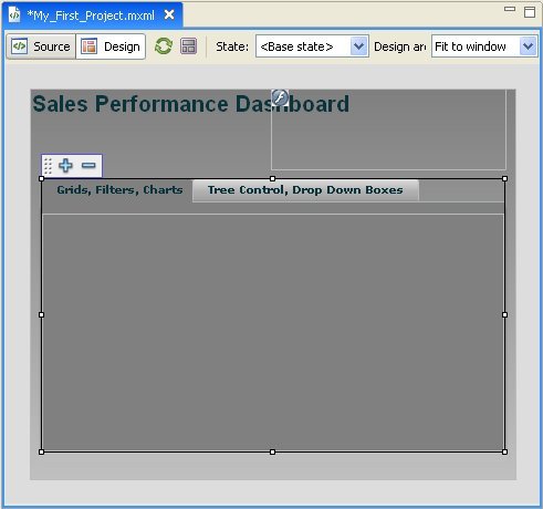
Select the TabNavigator from
the Navigators folder in the Components pane and drag it onto the canvas.
-
Adjust the
size to be within the application canvas, and place it below the
SWFLoader so that the tabs appear below the loader. Extend it approximately
to the end of the application window.
-
Set up the
vertical and horizontal constraints so that the tabs expand and
contract proportionately to the browser window.
-
On the Properties
pane, set the background color of the TabNavigator to #808080.
-
Click Tab
1 on the TabNavigator. Access the label property and
enter the following title for the first tab:
Grids, Filters, Charts
-
To add a
second tab, click the plus sign (+) at the
top-left corner of the TabNavigator. In the pop-up window, enter
the following title (label) and click OK:
Tree Control, Drop Down Boxes
Later, if you would like, you can change the title
in the label property field or in the MXML code.
x
Procedure: How to Add Drop Shadow to the TabNavigator
-
Switch to
Source view.
-
Place the
cursor in the mx:TabNavigator section after the last property that
was generated.
-
Press the
space bar to display a pop-up window with accessible properties.
-
Enter D
to navigate to the properties beginning with that letter, select dropShadowEnabled,
and set it to true.
Note: You can also use the dropShadowVisible property.
-
Repeat the
steps to select shadowDistance, and set it
to 4. That property determines the height of the shadow at the bottom
of the TabNavigator component.
-
Switch to
Design view and notice that all your selected styles have been applied.

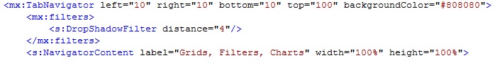
Note: TabNavigator in a Spark theme does not have
the ShadowDistance property. You can use a DropShadowFilter instead.
-
Switch back
to Source view to see the MXML code that was generated for you in
your work with the TabNavigator.
For SDK 3.x:
<mx:TabNavigator top="72" left="10" bottom="10" right="10"
    backgroundColor="#808080" dropShadowEnabled="true" shadowDistance="4">
  <mx:Canvas label="Grids, Filters, Charts" width="100%" height="602%">
  </mx:Canvas>
  <mx:Canvas label="Tree Control, Drop Down Boxes" width="100%" height="100%">
  </mx:Canvas>
</mx:TabNavigator>
For SDK 4.x: