- In the My_First_Project folder in Flex Builder, select the My_First_Project.mxml file.
-
Select the Source tab
to see the MXML generated for the application.
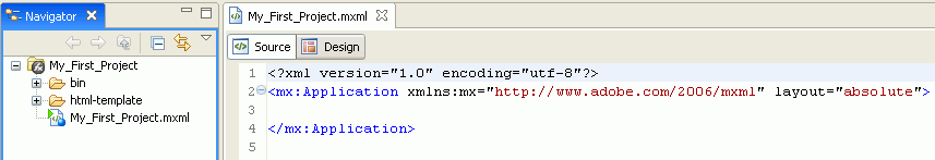
- Select the Design tab to switch to layout view, where you can drag and drop components onto the Flex Builder canvas.
-
From the
Enable or WebFOCUSEnable folder, drag and drop the ibiCanvas component
onto the My_First_Project.mxml canvas.
Note: You can also use the ibiSparkCanvas component.
-
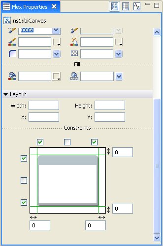
Adjust the
size of the ibiCanvas object as desired. You can do this in one
of the following ways:
- Drag its sides with the mouse to the desired width and height.
- Explicitly define the width and height in the Layout properties pane to the right of the canvas.
- Constrain it to the application layout, which proportionately stretches the ibiCanvas component to the size of the application.
Tip: Constraining is useful when you want the application to fill the entire browser window, and expand or shrink based on that window. For details on how to constrain a component to the application layout, see the Flex Builder documentation.
In this example, on the Properties pane under Constraints, select the first and third check boxes on the horizontal axis to constrain the component to the application layout so it will stretch proportionately to the width of the application as it adjusts to fit the browser window.
- Set the margins to 0 so that the ibiCanvas component matches the application width of 100%.
-
Repeat the
process to set the height constraints.
-
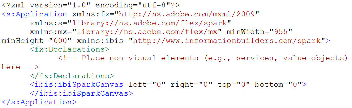
Switch to
Source view, where you will see the following new tags (in boldface)
added to the application code.
For SDK 3.x:
<?xml version="1.0" encoding="utf-8"?>
<mx:Application xmlns:mx="http://www.adobe.com/2006/mxml"
     layout="absolute" xmlns:ibi="http://www.informationbuilders.com>"
   <ibi:ibiCanvas top="0" left="0" bottom="0" right="0"></ibi:ibiCanvas>
</mx:Application>
For SDK 4.x:
-
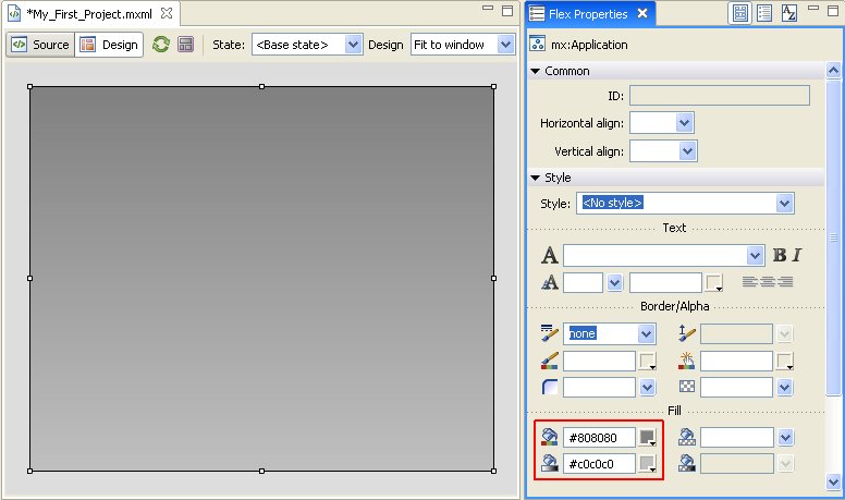
Set the
application background color to a light gray gradient. In the Fill section
of the Properties pane in Design view, enter (or select from the
color palette) the primary and secondary gradient color, for example,
#808080 and #c0c0c0.
Tip: To select the Application component so you can set the application background color, you must go to Source view and position the mouse cursor within the tag of the hidden or invisible component (in this case, Application). You will also need to do this if you set the property of a component to visible=false. Another method is to select the Window menu option, and then select Outline. In the Outline pane, you will see all the components used in the application.
The color transitions from the primary selection to the secondary selection.
Each component has a rich set of options that you can choose from to give the component a custom look and feel. For more information on styling, see the Flex Builder documentation.
Note: Creating a gradient in Spark applications requires a separate skin or that you include the Rect object directly in the application, as shown below.
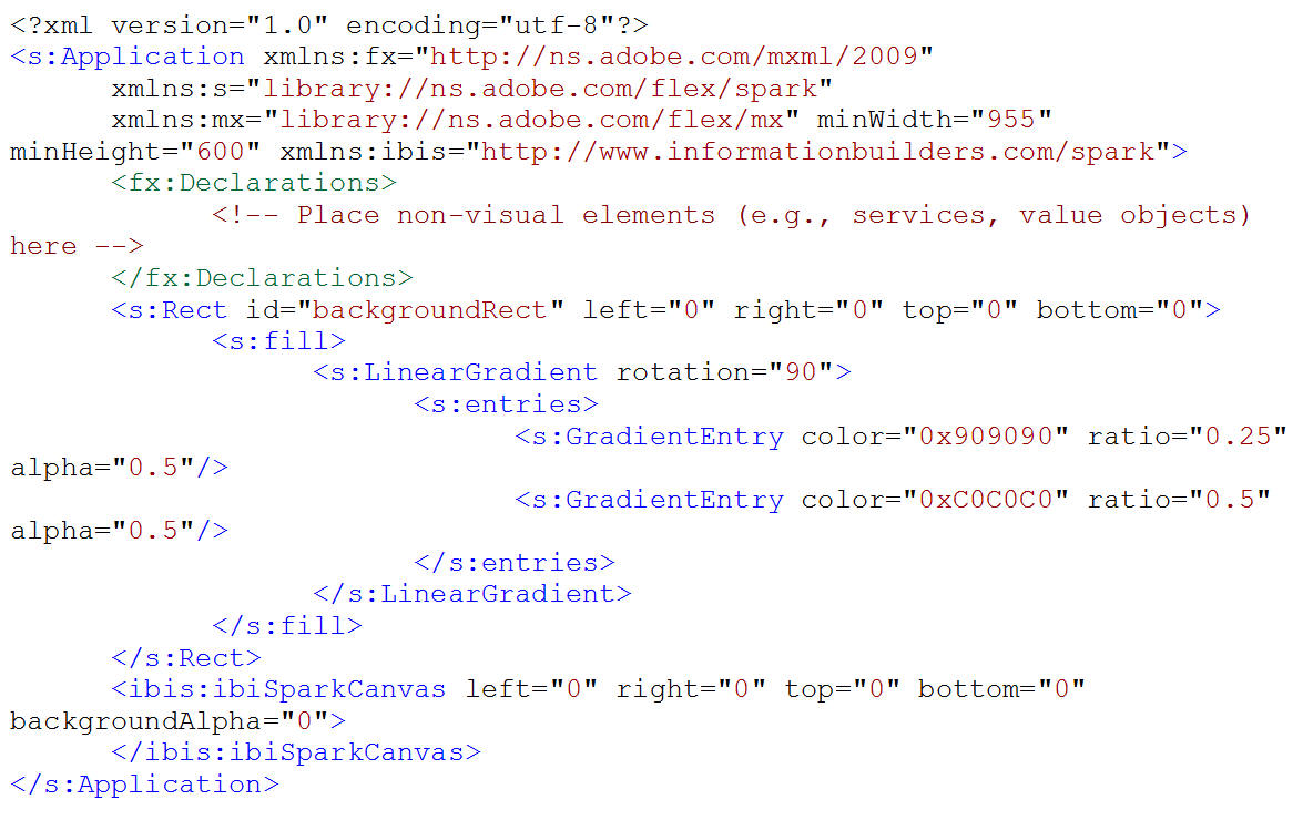
-
Switch to
Source view to see the new color properties in the MXML code.
<?xml version="1.0" encoding="utf-8"?>
<mx:Application xmlns:mx="http://www.adobe.com/2006/mxml"
    layout="absolute" xmlns:ibi="http://www.informationbuilders.com"
    backgroundGradientColors="[#808080, #c0c0c0]">
   <ibi:ibiCanvas left="0" top="0" bottom="0" right="0"></ibi:ibiCanvas>
</mx:Application>