Customizing Component Properties
xSorting Values Alphabetically in ibiComboBox and ibiList
By setting the ibiSortValues property to true, the data
inside the ibiComboBox and ibiList can be set to sort alphabetically.
The default value for the ibiSortValues property is false.
In addition to setting the ibiSortValues property to true, setting
the ibiFilterValsReverse property to true sorts the data inside
the ibiComboBox and ibiList in descending alphabetical order (z
to a). The default value for ibiFilterValsReverse is false.
|
Property
|
Value
|
|---|
|
ibiSortValues
|
True/False. If true,
values sorted alphabetically.
|
|
ibiFilterValsReverse
|
True/False. If true,
reverses the order of the values. (ibiSortValues must also be set
to true.)
|
xCustomizing ibiComboBox and ibiList String Values Using the ibiALLString Property
By setting the ibiFilterShowALL property to true when
in the ibiComboBox or ibiList components, the value ALL is displayed
within the combo or list box. You can change it to custom strings
in the ibiComboBox or ibiList components by using the ibiALLString
property.
|
Property
|
Value
|
|---|
|
ibiALLString
|
Enter any text string value to display within
a combo box or list component. The default value is ALL.
|
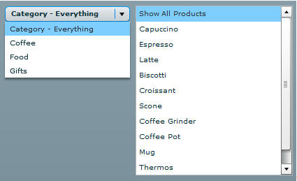
Example: Customizing the Value ALL Using the ibiALLString Property
In
the following example, the drop-down box will display the string
value "Category - Everything" and the list box will display the
string value "Show All Products" instead of the default value [ALL].
<ibi:ibiComboBox x="409"y="286"
            id="combo2"
            ibiParent="maingrid"
            ibiFilterAble="true"
            ibiColumn="CATEGORY"
            ibiALLString="Category - Everything" width="179" />
<ibi:ibiList x=" 596 " y="285" width="225" height="243"
            id="list2"
            ibiParent="maingrid"
            ibiFilterAble="true"
            ibiFilterParent="combo2"
            ibiColumn="PRODUCT"
            ibiALLString="Show All Products" />
The
following image shows the resulting output.
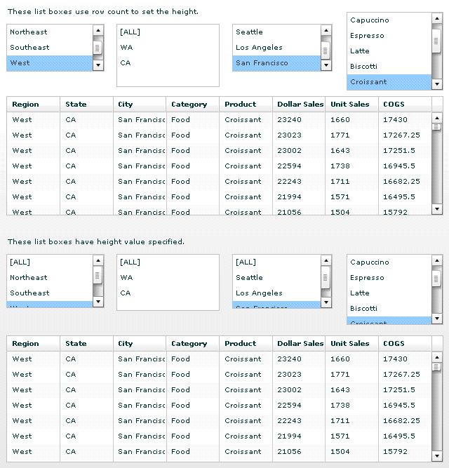
xRetaining the Position of the Selected Item in ibiList
ibiList component automatically adds the scroll bar
on the right when there is a greater number of records than what
can fit into the size specified. When a user scrolls down an ibiList
component and selects a value, the value selected may only be partially
visible to the user depending on the height property set in the
ibiList component. The application considers these partially visible
values visible even though it is out of view to the user.
In this case, you can set the rowCount property instead on the
ibiList component so that it uses the exact height to display all
the visible values to the user.
Example: Using the rowCount Property
Replace
the fixed height property in the ibiList component with the rowCount
property. The value for the rowCount property specifies how many
records to display in the ibiList component to determine the height.
<ibi:ibiList x="10" y="36" width="140" rowCount="3"
ibiParent="main01" id="listrow1" ibiColumn="REGION" ibiFilterAble="true"/>
Note: The
rowCount property is not available on a Spark List (ibiList in the
Spark library). You must implement a skin using a Vertical Layout
and its requestedrowCount property.
Notice when
the height of IBI list box is set to a specific value, the value
selected can become partially visible in the application, as shown
in the following image.
xibiHSlider/ibiVSlider: Using Custom dataTipFormatFunction
You can create dataTipFormatFunction to customize the
values for the data tips that appear in ibiHSlider and ibiVSlider
components. For example, the slider data tip can use the values in
the slider labels or in the array specified using ActionScript instead
of the default values from the data in the column set for ibiColumn
property.
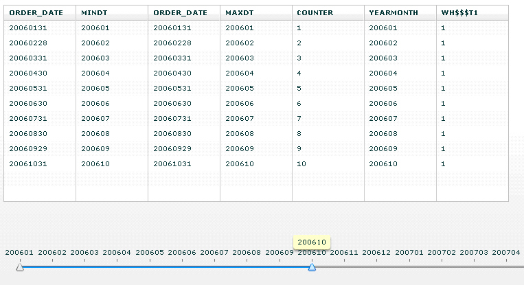
Example: Creating Custom Data Tips
Because
the slider only accepts numeric values, the values from the COUNTER
column are used to sort and order the data for this ibiHSlider example.
The labels for the tick marks in the slider are specified using
an array collection of dates in the labels property.
<ibi:ibiHSlider x="10" y="315" width="1134" height="130"
                id="SLIDER01"
                ibiParent="MAIN01"
                ibiColumn="COUNTER"
                ibiFilterAble="true"
                ibiFilterCond="BT"
                thumbCount="2"
                ibiAutoLimits="false"
                labels="[200601, 200602, 200603, 200604, 200605,
                         200606, 200607, 200608, 200609, 200610,
                         200611, 200612, 200701, 200702, 200703,
                         200704, 200705, 200706, 200707, 200708,
                         200709, 200710, 200711, 200712]"
                minimum="1"
                maximum="24"
                tickInterval="1"
                snapInterval="1"
                showDataTip="true"
                dataTipFormatFunction="sliderDataTip"
                showTrackHighlight="true"
                allowThumbOverlap="true" />
The default data tip is replaced to also display the same
dates as in the labels using the dataTipFormatFunction property
to call the custom data tip function. In this case, the function
subtracts 1 to locate the correct array number of the item in the
labels property.
private function sliderDataTip(item:Object):String
{
  return SLIDER01.labels[(Number(item)-1)].toString();
}
The result of applying the custom data
tips can be see in the following image.
xFiltering Data using the ibiTextInput
By specifying ibiColumn to use any filter properties
to filter data in the ibiParent, ibiTextInput box works just like
ibiComboBox or ibiList to provide filters to data automatically.
The combination of using ibiTextInput with ibiReloadButton enables
you to retrieve only the filtered results of a data set in the data
grid when retrieving data from WebFOCUS. By providing the value
for the parameter to be sent to WebFOCUS in the ibiUrlParms property of
ibiReloadButton, the URL request to retrieve data from WebFOCUS
in the seturl property contains the value for the parameter when
you click on the ibiReloadButton so only the filtered result set
of data can be retrieved. The same process can be applied to ibiComboBox or
ibiList when used with ibiReloadButton.
x
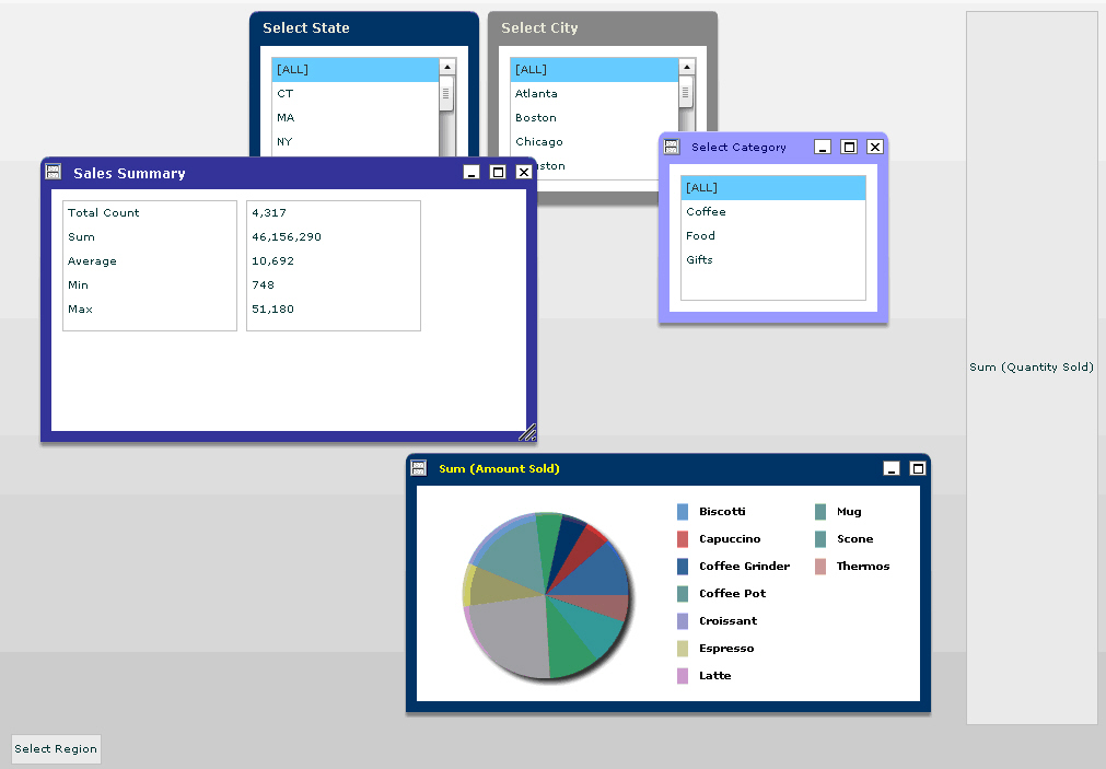
ibiWindow component extends Flex TitleWindow control
to allow users to minimize, maximize, and drag to resize or move
window control inside the application at run time. You can decide
to allow users to resize the window or whether to include Minimize,
Maximize and/or Close buttons from the Window title bar in ibiWindow
component. Using a mouse click, the user is able to grab and move
ibiWindow at run time by default.
The location for ibiWindow to minimize in the application has
to be defined using HBox or VBox controls outside of ibiCanvas.
The minimized window can be restored to its last location in the
application by clicking on them. When ibiWindow is closed using
the Close button, the user can restore the window with ActionScript
in order to retrieve the closed windows.
Example: Using the ibiWindow Component With the Minimize Option
Determine
the location where minimized window should reside using HBox or
VBox components. These controls have to be defined outside of ibiCanvas.
<mx:HBox x="10" y="671" width="892" height="28">
   <mx:name>windowhmin</mx:name>
 </mx:HBox>
 <mx:VBox x="883" y="10" height="653" width="141">
   <mx:name>windowvmin</mx:name>
 </mx:VBox>
In the minWinName property, specify
either an HBox or VBox name you have defined. In this example, the
window will reside in the HBox when minimized. The close button
and maximize buttons are hidden in this window. The user has the
option to minimize the window or resize the window. By default,
the user is able to grab and move any one of ibiWindow using a mouse
click.
<ibi:ibiWindow x="394" y="202" width="480" height="237"
  winTitle="Sum (Amount Sold)"
  borderColor="#0A246A"
  minWinName="windowhmin"
  ibiTitleColor="yellow"
  ibiTitleFontWeight="bold"
  showCloseButton="false"
  showMaxButton="false"
  showMinButton="true"
  ibiResizable="true"
  fontSize="10">
The following image shows windows
minimized to the side, as well as the bottom of the application.
x
Similar to ibiDataGrid, the ibiDataSource component
can be used to bind the data from WebFOCUS to an Enable application.
All the properties used to retrieve data in ibiDataGrid are available
in ibiDataSource.
When ibiDataSource is used to retrieve data, you can specify
the ibiDataSource component ID in the ibiDataSourceId property of
the other ibi components instead of ibiParent.
ibiDataSource has the following requirements.
- There has to be at
least one main ibiDataSource component with the seturl value.
- The filtering cannot
be applied directly to the main data source with the seturl value.
- The aggregation cannot
be applied directly to the main data source with the seturl value.
Example: Using the ibiDataSource Component
<ibi:ibiDataSource x="10" y="10" id="mainsource1">
<ibi:seturl>http://localhost:8080/ibi_apps/WFServlet?IBIF_ex=xmltest&
IBIAPP_app=ibiflexdemo</ibi:seturl>
</ibi:ibiDataSource>
<ibi:ibiDataGrid x="38" y="10" width="680" height="190"
id="datagrid1" ibiDataSourceId="mainsource1"/>
xibiFilter and ibiFilterComponent Components
ibiFilter and ibiFilterComponent allow you to construct
far more complex filter relationships between filtering components
and ibiDataSource components. When using ibiFilter, the relationship
between filtering components and the data sources where the filters
are applied and are represented in an XML hierarchy tree format
structure.
The ibiFilter component is the parent of the Filter hierarchy
structure, where you specify which data source to apply the filters
to.
Under the ibiFilter component, you can have as many ibiFilterComponents
grouped by Filters property as desired. The filtering component
ID, such as ibiComboBox or ibiList is specified in the ibiFilterComponent.
When there are multiple ibiFilterComponents grouped under Filters,
the relationship of each filter becomes linked or applied with an
AND condition.
Each ibiFilterComponent can also have as many ibiFilterComponents
under it grouped by the Filters property. This represents the nested
filter relationship.
You can also have a combination of both to create chained filters
that cannot be achieved by using ibiFilterable properties.