OLAP provides facilities that make it easy for you to
query and analyze data from within the OLAP report itself, from
the OLAP selections panel, or from the OLAP Control Panel.
This section describes how to use the various OLAP tools to analyze
your data. For details and more examples, see the Creating Reporting Applications With Developer Studio manual.
x
Procedure: How to Manipulate Data Directly in the Report
You
can drag and drop dimensions directly within the report and use
the context menu to apply data visualization.
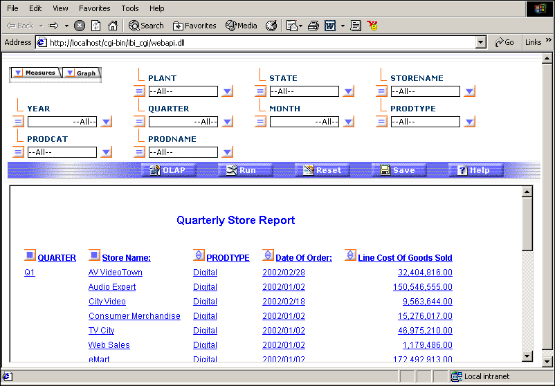
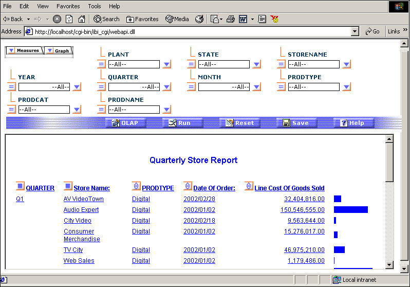
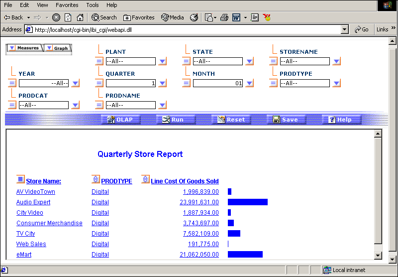
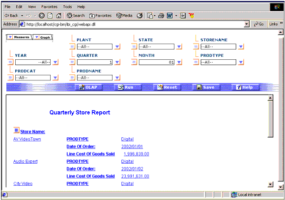
Before you begin your analysis, the OLAP
report appears as the following image.
-
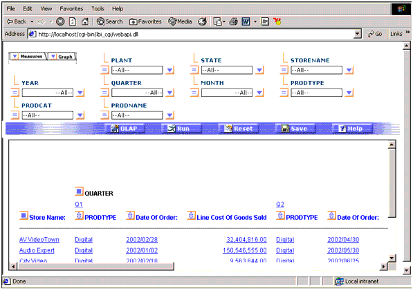
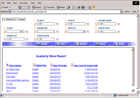
Suppose
you want to see a horizontal display of the QUARTER column. Drag
and drop QUARTER above the report.
The report changes and appears as follows.
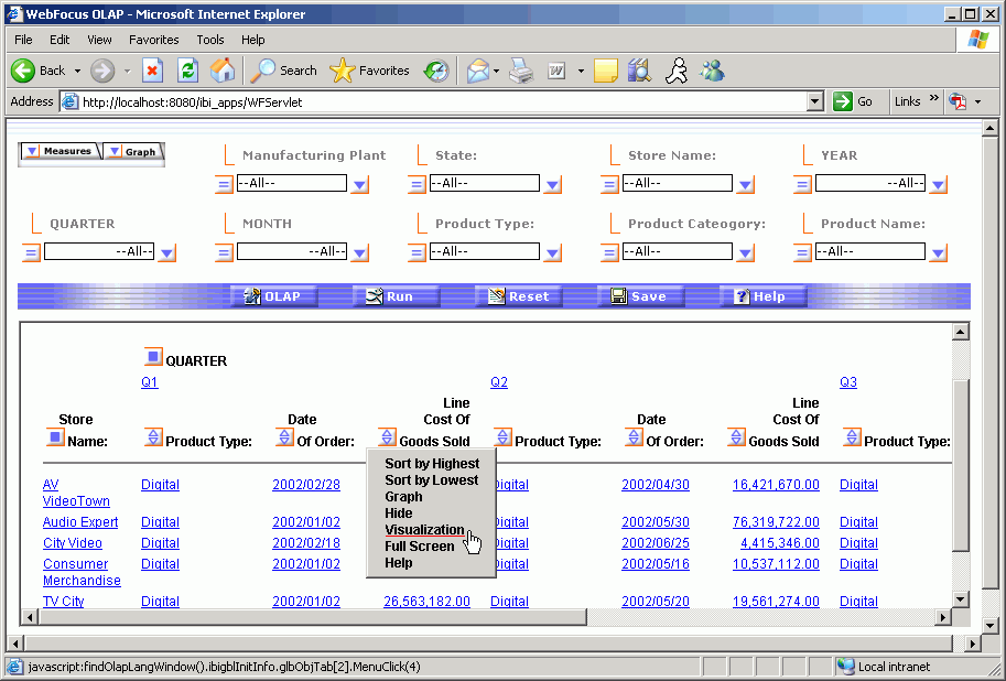
Suppose
you want to discover a trend in the Line Cost of Goods Sold column.
-
Right-click Line
Cost of Goods Sold and choose Visualization.
This applies a data visualization bar graph to each value in the
column.
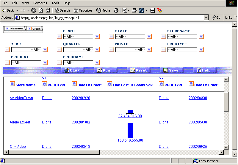
Scroll
down in the report to see the bar graphs that are now applied to
the values in the Line Cost of Goods Sold column.
-
Drag
and drop the QUARTER field back to its original
location to the left of the Store Name field. Now you see a horizontal representation
of the bar graphs.
Now
that you have manipulated data directly within the report, you can
try different methods from the OLAP Selections Panel in the next exercise.
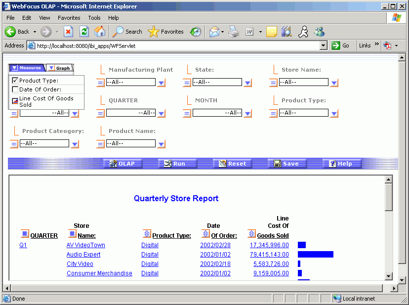
xManipulating Output With the OLAP Selections Panel
You can quickly customize the report from the OLAP selections
panel. Every dimension in the hierarchy has a control (drop-down
list) next to it. You can multi-select values from any of the dimension
controls to further simplify your report output.
You can also use Measures and Graph controls. Each control contains
a down arrow to the left that, when clicked, opens the corresponding
pane. These controls enable you to make basic customizations on
the measures present in your report. They are located to the left
of the first dimension control.
x
Procedure: How to Manipulate Output With the OLAP Selections Panel
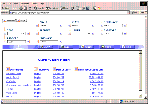
This
procedure demonstrates how to use the controls from the OLAP selections
panel to customize your report output.
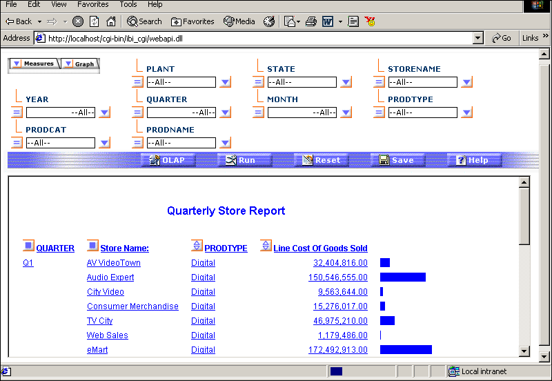
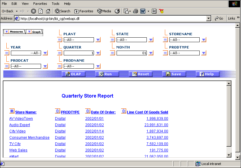
Before you begin your
analysis, the OLAP report, CENTREP.FEX, appears as the following
image.
To
use the Measures control so that this report does not display the
Date of Order column:
-
Click
the down arrow to the left of the Measures control and uncheck the Date
of Order box.
-
Click
the Run button. The report output no longer
shows the Date of Order column.
-
Drill
down on the Q1 hyperlink.
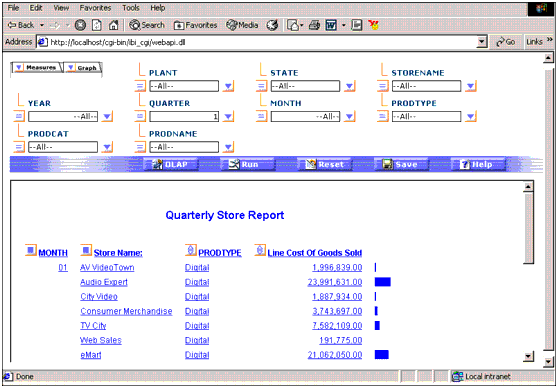
-
Drill
down on the 01 hyperlink.
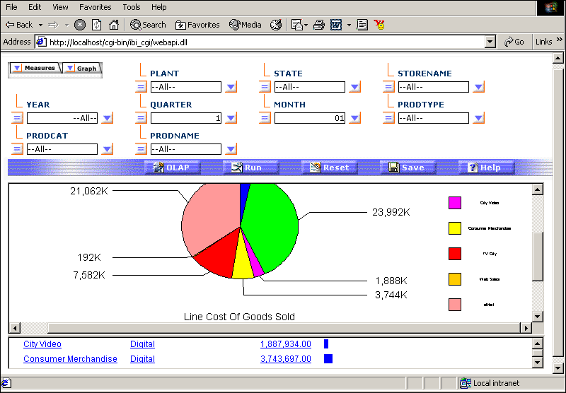
Now
you can use the Graph control to view a graph that shows product
sales for the first month of the quarter.
-
Click
the down arrow to the left of the Graph control.
-
Check
the box to the left of Line Cost of Goods Sold.
-
Change
the graph style from the default style, Vertical Bar Chart, to the Pie
Chart style by clicking the Graph
 icon.
icon.
-
Click Run.
The Line Cost of Goods Sold is graphed for the first month.
You
have just experimented with the OLAP Selections Panel to drill down
on dimensions and change the graph style.
In the next exercise,
you will use the OLAP Control Panel (OCP) to perform other functions
that will customize your report with even greater precision.
xManipulating Report Output With the OLAP Control Panel
From the OLAP Control Panel (OCP), you can perform every
function available to a WebFOCUS OLAP user. In this section, you
will perform certain functions that can only be performed from the
OCP.
For more details about the OLAP Control Panel and its functions,
see the Creating Reporting Applications With Developer Studio manual.
x
Procedure: How to Stack Multiple Measures
When
you have more than one measure, the OLAP Control Panel enables you
to stack the measures of your OLAP-enabled report by either rows
or columns (the default is by rows). Enable this feature by clicking
the Stack Measures check box in the OLAP
Control Panel.
Note: You cannot apply data visualization
when stacking measures. For details, see the Creating Reporting Applications With Developer Studio manual.
-
Before
stacking measures, turn off the graph control. Click the down arrow
to the left of the Graph control and uncheck the box to the left
of Line Cost of Goods Sold.
Use the Measures control so that the report displays the
Date of Order column.
-
Click
the down arrow to the left of the Measures control and check the Date
of Order box.
-
Click
the Line Cost of Goods Sold check box until Include
Measure is selected.
-
Click Run.
-
Click
the OLAP button in the selections panel to
open the OLAP Control Panel.
-
Select
the Stack Measures check box to display measures
in separate rows.
-
Click Run to
execute your report.
The measures for PRODTYPE, Date of Order, and Line Cost
of Goods Sold are now displayed in stacked rows.
x
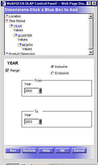
Procedure: How to Specify a Date Range From the OLAP Control Panel (OCP)
You
can choose selection criteria from a date selection panel containing
the appropriate controls for the date format. When you apply selection
criteria to date elements, the results are limited by the date(s)
you select. For example, you can select to view data associated
with a particular date or to exclude data from the specified date.
The
OLAP Control Panel provides a date selection panel that enables
you to select a full date format (YYMD) or a partial date format
(YMM) that includes only the month or year, and to specify a quarter
of the year when applying selection criteria to date elements.
Imagine
that you want to restrict information in your report to data that
ranges from 2000 to 2003. Before you specify a range, unstack the
measures:
-
Click
the OLAP button in the selections panel to
open the OLAP Control Panel.
-
Uncheck
the box to the left of Stack Measures.
-
Click Run.
-
Click
the OLAP button in the selections panel to
open the OLAP Control Panel.
-
In the
Dimensions box, click Time Period, then Values under Year.
The Date selection panel for YEAR opens.
-
Check
the Range box.
The From and To drop-down lists open. You can select a
range of years from these lists.
-
Change
the From year to 2000 by
clicking the down arrow.
-
Ensure
that 2003 is the value for the To year.
-
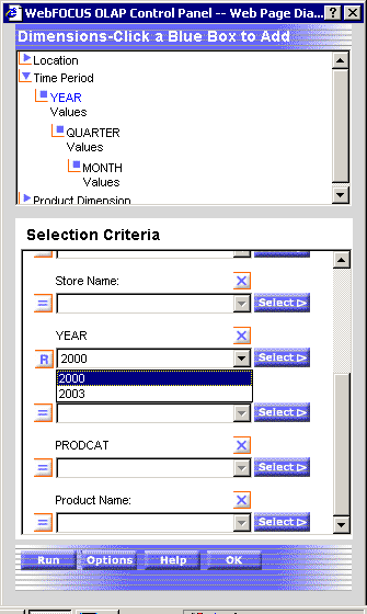
Click OK to
return to the Selection Criteria panel.
-
Scroll
down in the Selection Criteria panel until you see the Year drop-down
list. The range 2000-2003 should appear in the Year drop-down list.
-
Click OK again.
-
Click Run to
execute your report. Only order dates for Q1 that fall between the
years 2000 and 2003 are shown.
Congratulations!
You have successfully completed this tutorial. Now you can customize
your OLAP-enabled reports.