When creating a graph, it is important to select the
appropriate graph type with which to display your data. You may
select from a number of basic graph types, as well as refinements
on these types. Basic graph types include line graphs (connected
point plots), bar graphs, pie graphs, and scatter graphs. Use the
brief descriptions (see Graph Types) to select a graph type that suits the data set you
are displaying and the change you want to highlight. Keep in mind
that the data are the sets of numbers that you are displaying, and
the scales are the numbers or variable measures displayed along
the axes of the graph.
x
After you have chosen a graph type, you should select
an appropriate scale. A scale is a classification scheme or series
of measures that you select for application to the axes of your
graph. The scale provides the framework against which your data
are plotted. When you choose an appropriate scale for your data,
meaningful patterns can emerge, and when you modify a scale, the
overall shape of your graph changes.
Steps or measures in the scale are represented
along the axes of your graph by marks. The type of scale you choose
determines the number of divisions along the scale. There are two
general types of scales you can apply to the y-axis of your graph:
- Linear scales
- Logarithmic
scales
A linear scale is a scale in which the values increase arithmetically.
Each measure along the scale is one unit higher than the one that
precedes it. Linear scales are useful when the data you are plotting
are relatively small in range.
A logarithmic scale is a scale in which the values increase logarithmically.
Each measure along the scale represents an exponential increase
in the data value. Logarithmic scales are useful when you need to
accommodate a large range of numbers.
x
Syntax: How to Select Scales
To use logarithmic scales in your graph,
add the following to your GRAPH request:
ON GRAPH SET STYLE *
*GRAPH_SCRIPT
setY1LogScale(value);
*END
ENDSTYLE
END
where:
- value
Is one of the following:
true turns
on logarithmic scaling.
false turns off
logarithmic scaling. Linear scaling is used instead.
xDetermining Graph Styles With Display Commands and Sort Phrases
Each GRAPH request must include a sort phrase and at
least one display field (up to five are allowed).
The fields, which are the subjects of the graph, may be real
or virtual fields, with or without direct operation prefixes (AVE.,
MIN., MAX., etc.). They may also be calculated values.
Note: Display fields used only for calculations need not
appear in the graph. You can use the NOPRINT or SUP-PRINT phrases
to suppress the display of such fields. For details, see Sorting Tabular Reports.
By default, a particular combination
of display commands and sort phrases determines the graph format.
The combinations are:
|
Graph Type
|
Display Command and Sort Phrase
|
|---|
|
Line graph
|
PRINT A {ACROSS|BY} B(where
B is alphanumeric) |
|
Vertical bar graph
|
SUM A ACROSS B (where
B is alphanumeric) |
|
Horizontal bar graph
|
SUM A BY B |
|
Pie graph
|
SET LOOKGRAPH=PIE
SUM A {ACROSS|BY} B
or SET PIE=ON
SUM A {ACROSS|BY} B |
|
Scatter graph (without connecting lines)
|
PRINT A ACROSS B (where
B is numeric) |
|
Scatter graph (with connecting lines)
|
SUM A ACROSS B (where
B is numeric) |
You can override the default graph format using the LOOKGRAPH
parameter. For details, see Determining Graph Styles Using LOOKGRAPH.
x
Syntax: How to Create a Line Graph
To create a line graph, issue a GRAPH
request with the following display command and sort field combination
PRINT fieldname1 [AND] fieldname2...
{ACROSS|BY} sortfield
where:
- fieldname1...
Is the name of the field to be displayed on the Y-axis of
the graph. There can be a maximum of 5 display fields in a GRAPH
request.
- AND
Is an optional phrase used to enhance readability. It can
be used between any two field names and does not affect the graph.
- sortfield
Is the name of the field to be displayed on the X-axis of
the graph. This must be an alphanumeric field in order to generate
a line graph. If the field specified is numeric, you can still create
a line graph by using the LOOKGRAPH=LINE parameter. For details,
see Determining Graph Styles Using LOOKGRAPH.
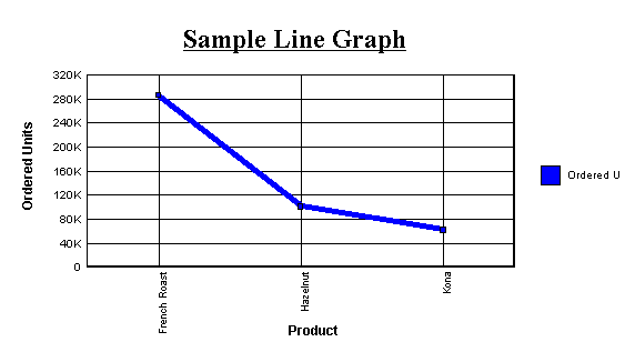
Example: Creating a Line Graph
The following illustrates how to create
a line graph using the LOOKGRAPH command:
SET LOOKGRAPH = LINE, GRID=ON
SET HAXIS=600, VAXIS=315
GRAPH FILE GGORDER
HEADING CENTER
"Sample Line Graph"
PRINT QUANTITY
ACROSS PRODUCT_DESC
WHERE PRODUCT_DESC EQ 'French Roast' OR 'Hazelnut' OR 'Kona'
END
The output is:
x
Syntax: How to Create a Horizontal Bar Graph
To create a horizontal bar graph, issue
a GRAPH request with the following display command and sort field combination
SUM fieldname1 [AND] fieldname2...
BY sortfield
where:
- fieldname1...
Is the name of a field to be displayed on the Y-axis of the
graph. There can be a maximum of 5 display fields in a GRAPH request.
- AND
Is an optional phrase used to enhance readability. It can
be used between any two field names and does not affect the graph.
- sortfield
Is the name of a field to be displayed on the X-axis of the
graph. A separate group of bars is created for each value of the
BY field, and each group contains one bar for each display command
(SUM) object.
x
Syntax: How to Create a Vertical Bar Graph
To create a vertical bar graph, issue
a GRAPH request with the following display command and sort field
combination
SUM fieldname1 [AND] fieldname2...
ACROSS sortfield
where:
- fieldname1...
Is the name of the field to be displayed on the Y-axis of
the graph. There can be a maximum of 5 display fields in a GRAPH
request.
- AND
Is an optional phrase used to enhance readability. It can
be used between any two field names and does not affect the graph.
- sortfield
Is the name of an alphanumeric field to be displayed on the
X-axis of the graph.
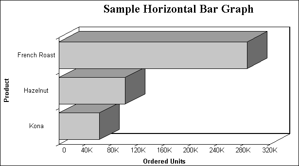
Example: Creating a Horizontal Bar Graph
The following illustrates how to create
a horizontal bar graph:
GRAPH FILE GGORDER
HEADING CENTER
"Sample Horizontal Bar Graph"
SUM QUANTITY
BY PRODUCT_DESC
WHERE PRODUCT_DESC EQ 'French Roast' OR 'Hazelnut' OR 'Kona'
END
The output is:
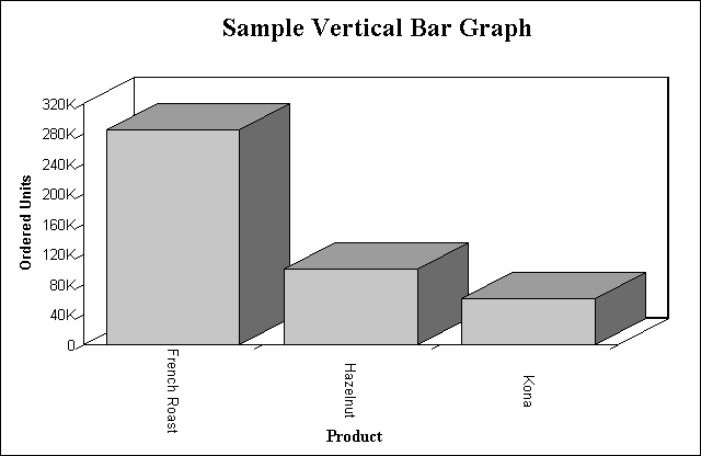
Example: Creating a Vertical Bar Graph
The following illustrates how to create
a vertical bar graph:
GRAPH FILE GGORDER
HEADING CENTER
"SAMPLE VERTICAL BAR GRAPH"
SUM QUANTITY
ACROSS PRODUCT_DESC
WHERE PRODUCT_DESC EQ 'French Roast' OR 'Hazelnut' OR 'Kona'
END
The output is:
x
Syntax: How to Create a Pie Graph
To create a pie graph, issue a GRAPH
request with the following SET command and display and sort field
combination
SET LOOKGRAPH=PIE
SUM fieldname1 [AND] fieldname2...
{ACROSS|BY} sortfield
where:
- fieldname1...
Is the name of the field to be displayed in the graph. There
can be a maximum of 5 display fields in a GRAPH request.
- AND
Is an optional phrase used to enhance readability. It can
be used between any two field names and does not affect the graph.
- sortfield
Is the name of the field to be displayed in the graph. Each
value in the sort field will be represented by a section in the
pie graph.
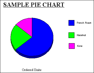
Example: Creating a Pie Graph
The following illustrates how to create
a pie graph using a BY sort phrase and the LOOKGRAPH command:
SET LOOKGRAPH=PIE
GRAPH FILE GGORDER
HEADING CENTER
"SAMPLE PIE CHART"
SUM QUANTITY
BY PRODUCT_DESC AS COFFEES
WHERE PRODUCT_DESC EQ 'French Roast' OR 'Hazelnut' OR 'Kona'
END
The output is:
x
Syntax: How to Create a Scatter Graph
To create a scatter graph, issue a GRAPH
request with the following display command and sort field combination
{PRINT|SUM} fieldname1 [AND] fieldname2...
ACROSS sortfield
where:
- fieldname
Is the name of the field to be displayed in the graph. There
can be a maximum of 5 display fields in a GRAPH request. When you
specify more than one display field, they are represented by different
symbols.
- AND
Is an optional phrase used to enhance readability. It can
be used between any two field names and does not affect the graph.
- sortfield
Is the name of the numeric field to be displayed on the X-axis
of the graph.
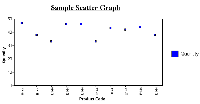
Example: Creating a Scatter Graph
The following illustrates how to create
a scatter graph:
GRAPH FILE GGORDER
HEADING CENTER
"Sample Scatter Graph"
PRINT QUANTITY AS 'Quantity'
ACROSS PRODUCT_CODE
WHERE PRODUCT_CODE EQ 'B144'
WHERE QUANTITY LT 51
END
The output is:
xDetermining Graph Styles Using LOOKGRAPH
By default, a particular combination of display commands
and sort phrases determines the graph format. You can override the
default graph format by using the LOOKGRAPH parameter.
The LOOKGRAPH parameter enables you to change the format of the
graph without having to set individual control parameters or restructure
the graph request. However, even if you use LOOKGRAPH, you can choose
to set individual control parameters (for example, SET GRID=ON).
x
Syntax: How to Specify a Graph Style Using LOOKGRAPH
SET LOOKGRAPH= option
where:
- option
Specifies the graph style. For details on graph styles, see:
x
Reference: Style Options for Line Graphs
Choose one of the following LOOKGRAPH
values to change the style of connected point plots:
|
SET LOOKGRAPH=
|
Description
|
|---|
LINE |
A vertical connected point plot graph.
|
HLINE |
A horizontal connected point plot graph.
|
HLINE2 |
A horizontal connected point plot graph
with two axes.
|
HLINE2S |
A horizontal connected point plot graph
with two separate axes.
|
HLINSTK |
A stacked horizontal connected point plot
graph.
|
HLINSTK2 |
A stacked horizontal connected point plot
graph with two axes.
|
HLNSTK2S |
A stacked horizontal connected point plot
graph with two separate axes.
|
HLNSTKPC |
A stacked horizontal connected point plot
graph showing percentages.
|
VLINE |
A vertical connected point plot graph.
|
VLINE2 |
A vertical connected point plot graph with
two axes.
|
VLINE2S |
A vertical connected point plot graph with
two separate axes.
|
VLINSTK |
A stacked vertical connected point plot
graph.
|
VLINSTK2 |
A stacked vertical connected point plot
graph with two axes.
|
VLNSTK2S |
A stacked vertical connected point plot
graph with two separate axes.
|
VLNSTKPC |
A stacked vertical connected point plot
graph showing percentages.
|
x
Reference: Style Options for Bar Graphs
Choose one of the following LOOKGRAPH
values to change the style of bar graphs:
|
SET LOOKGRAPH=
|
Description
|
|---|
BAR |
A bar graph with the bars displayed beside
each other.
|
STACK |
A bar graph with stacked bars.
|
VBAR |
A vertical bar graph.
|
VBAR2AX |
A vertical bar graph with two axes.
|
VBAR2AXS |
A vertical bar graph with two separate axes.
|
VBRSTK1 |
A stacked vertical bar graph.
|
VBRSTK2 |
A stacked vertical bar graph with two axes.
|
VBRSTK2S |
A stacked vertical bar graph with two separate
axes.
|
VBRSTKPC |
A stacked vertical bar graph that shows
percentages.
|
HBAR |
A horizontal bar graph.
|
HBAR2AX |
A horizontal bar graph with two axes.
|
HBAR2AXS |
A horizontal bar graph with two separate
axes.
|
HBRSTK1 |
A stacked horizontal bar graph.
|
HBRSTK2 |
A stacked horizontal bar graph with two
axes.
|
HBRSTK2S |
A stacked horizontal bar graph with two
separate axes.
|
HBRSTKPC |
A stacked horizontal bar graph that shows
percentages.
|
x
Reference: Style Options for Pie Graphs
Choose one of the following LOOKGRAPH
values to change the style of pie graphs:
|
SET LOOKGRAPH=
|
Description
|
|---|
PIE |
A pie graph.
|
PIESINGL |
A single pie graph.
|
PIEMULTI |
Multiple pie graphs.
|
PIERING |
A ring-shaped pie graph.
|
PIEMULPR |
Multiple, ring-shaped pie graphs of proportional
size.
|
PIEMULTP |
Multiple pie graphs of proportional size.
|
PIEMULTR |
Multiple, ring-shaped pie graphs.
|
x
Reference: Style Options for Scatter Graphs
Choose one of the following LOOKGRAPH
values to change the style of scatter graphs:
|
SET LOOKGRAPH=
|
Description
|
|---|
SCATTER |
Produces a scatter graph.
|
SCATTERD |
A dual scatter graph. Values from an additional
data set are displayed on a second value (Y) axis.
|
SCATTRLS |
A scatter graph that labels each data point
with its exact numeric value.
|
SCATTRLD |
A dual scatter graph that labels each data
point with its exact numeric value.
|
x
Reference: Style Options for Three-Dimensional Graphs
Choose one of the following LOOKGRAPH
values to change the style of three-dimensional graphs:
|
SET LOOKGRAPH=
|
Description
|
|---|
3DAREAG |
A three-dimensional connected group area
chart.
|
3DAREAS |
A three-dimensional connected series area
chart.
|
3DBAR |
A two-dimensional bar graph with three-dimensional bars.
|
3D_BAR |
A three-dimensional chart with bars.
|
3DCUBE |
A three-dimensional bar graph in which all
data points are blocks of identical size, hovering at the position
that shows their data value.
|
3DGROUP |
A three-dimensional chart with bars.
|
3DOCTAGN |
A three-dimensional bar graph with octagon-shaped
bars that have no roots.
|
3DPYRAMD |
A three-dimensional pyramid chart.
|
3DRIBBNG |
A three-dimensional connected group ribbon
chart.
|
3DRIBBNS |
A three-dimensional connected series ribbon
chart.
|
3DSPHERE |
A three-dimensional bar graph in which all
data points are spheres of identical size, hovering at the position
that shows their data value.
|
3DSTACK |
A two-dimensional stack chart with three-dimensional
type bars.
|
3DSURFCE |
A three-dimensional surface chart that graphs
all data points as a three-dimensional surface, like a rolling wave.
|
3DSURFHC |
A three-dimensional honeycomb surface chart
that graphs all data points as a three-dimensional surface using
a honeycomb effect.
|
3DSURFSD |
A three-dimensional surface chart with sides
that graphs all data points as a three-dimensional surface with
solid sides.
|
x
Reference: Style Options for Area Graphs
Choose one of the following LOOKGRAPH
values to change the style of area graphs:
|
SET LOOKGRAPH=
|
Description
|
|---|
VAREA |
A vertical area graph.
|
VAREASTK |
A stacked vertical area graph.
|
VAREAR2 |
A vertical area graph with two axes.
|
VARESTK2 |
A stacked vertical area graph with two axes.
|
VARESTKP |
A stacked vertical area graph that shows
percentages.
|
HAREA |
A horizontal area graph.
|
HAREAR2 |
A horizontal area graph with two axes.
|
HAREASTK |
A stacked horizontal area graph.
|
HARESTK2 |
A stacked horizontal area graph with two
axes.
|
HARESTKP |
A stacked horizontal area graph that shows percentages.
|
x
Reference: Style Options for Stock Charts
Choose one of the following LOOKGRAPH
values to change the style of stock charts:
|
SET LOOKGRAPH=
|
Description
|
|---|
STOCK |
A stock chart.
|
STOCKH |
A high-low stock chart. Bars representing
higher numeric values are placed behind bars representing lower
numeric values. Only the top of the higher bar is visible, clearly
illustrating the difference in value.
The most popular application
of this type of graph is to represent stock prices. Each bar represents
the highest and lowest prices for a given stock on a given day.
|
STOCKHB |
A bipolar high-low stock chart. Values from
different data sets are displayed on separate poles.
|
STOCKHD |
A dual high-low stock chart. Values from
an additional data set are displayed on a second value (Y) axis.
|
STOCKHCL |
A high-low-close stock chart. The most popular
application of this type of graph is to represent stock prices.
Each bar represents the highest, lowest, and closing prices for
a given stock on a given day.
|
STOCKHCB |
A bipolar high-low-close stock chart. Values
from different data sets are displayed on separate poles.
The
most popular application of this type of graph is to represent stock
prices. Each bar represents the highest, lowest, and closing prices
for a given stock on a given day.
|
STOCKHCD |
A dual high-low-close stock chart. Values
from an additional data set are displayed on a second value (Y)
axis.
|
STOCKHOC |
A high-low-open-close stock chart.
The
most popular application of this type of graph is to represent stock
prices. Each bar represents the highest, lowest, opening, and closing
prices for a given stock on a given day.
|
STOCKHOB |
A bipolar high-low-open-close stock chart.
Values from different data sets are displayed on separate poles.
|
STOCKHOD |
A dual high-low-open-close stock chart.
Values from an additional data set are displayed on a second value
(Y) axis.
|
STOCKHV |
A high-low-volume stock chart.
|
STOCKHOV |
A high-low-open-close-volume stock chart.
|
STOCKC |
A candle stock chart.
|
STOCKHC |
A high-low candle stock chart.
|
STOCKCV |
A volume candle stock chart.
|
STOCKHCV |
A high-low-volume candle stock chart.
|
x
Reference: Style Options for Polar Charts
Choose one of the following LOOKGRAPH
values to change the style of polar charts:
|
SET LOOKGRAPH=
|
Description
|
|---|
POLAR |
A polar chart that displays data points
on a circle.
|
POLAR2 |
A dual polar chart. Values from an additional
data set are displayed on a second value (Y) axis.
|
x
Reference: Style Options for Radar Charts
Choose one of the following LOOKGRAPH
values to change the style of radar charts:
|
SET LOOKGRAPH=
|
Description
|
|---|
RADARA |
A radar area chart.
|
RADARL |
A radar line chart.
|
RADARL2 |
A dual radar line chart. Values from an
additional data set are displayed on a second value (Y) axis.
|
x
Reference: Style Options for Bubble Charts
Choose one of the following LOOKGRAPH
values to change the style of bubble charts:
|
SET LOOKGRAPH=
|
Description
|
|---|
BUBBLE |
A bubble chart.
|
BUBBLED |
A bubble chart with a dual axis.
|
BUBBLEDL |
A bubble chart with a dual axis and labels.
|
BUBBLEL |
A bubble chart with labels.
|
x
Reference: Style Options for Spectral Charts
Choose one of the following LOOKGRAPH
values to change the style of spectral charts:
|
SET LOOKGRAPH=
|
Description
|
|---|
SPECTRAL |
A spectral map chart. This is a chart with
a row or column matrix of markers that is colored according to the
data values.
|
x
Reference: Other Graph Types
|
SET LOOKGRAPH=
|
Description
|
|---|
GANTT |
Provides
a visual representation of project oriented time critical events.
Gantt charts require six display fields and one sort field, in that
order. Conditional styling and drill-down are not supported for
GANTT charts.
|
POSITION |
Product position charts provide a visual
representation of market share and growth versus revenue and measurement (past,
present, future). Product position charts require a set of three
display fields.
|
VWATERFL |
Vertical waterfall graph.
|
HWATERFL |
Horizontal waterfall graph.
|
PARETO |
Displays data following Pareto 80:20 rule.
Pareto charts require only one display field.
|
MULTI3Y
MULTI4Y
MULTI5Y |
Stacks charts in order to make it easier
to read, analyze and manage them.
|
x
Reference: Options for HTML5-Only Chart Types
The following LOOKGRAPH values are valid
only when generating an HTML5 chart:
|
SET LOOKGRAPH
|
Description
|
|---|
BUBBLEMAP |
A bubblemap is a chart in which
proportionally sized bubbles are displayed on relevant areas of
the map.
|
CHOROPLETH |
a chloropleth is a chart in
which areas on a map are shaded or patterned in proportion to the
value of the measure being represented,
|
MEKKO |
A Mekko chart is a variant
of a stacked bar chart, in which the width of the bars is adjusted
relative to its value in the data set.
|
PARABOX |
A Parabox (or parallel coordinates
chart) is similar to a regular line chart, except that each group
in the line chart has a unique and interactive numeric axis. Each
line represents one series of data. Each vertical bar represents
a numeric axis. You can click and drag along each of the axes to
select (filter) the lines that pass through that part of the axis
|
STREAM |
A streamgraph is a simplified
version of a stacked area chart. In a streamgraph, there are no
axes or gridlines. The baseline is free, which makes it easier to
perceive the thickness of any given layer across the data.
|
TAGCLOUD |
A tagcloud is a visual representation
of frequency. It displays only group labels. The size of each label
is proportional to its data value.
|
TREEMAP |
A treemap chart displays hierarchical data
as a set of nested rectangles.
|