You can create multiple graphs by selecting a second
horizontal category (X-axis).
The number of graphs created depends on the number of values
in the field you designate in the sort (BY, ACROSS) phrases. If
a request contains two BY fields, there will be as many graphs as
there are values in the first BY field. The second BY field will determine
the X-axis. For example, if you have selected a BY field with two
values, two graphs will be generated. If you have selected a field
with ten values, ten graphs will be generated.
If there is one BY phrase and one ACROSS phrase, as many graphs
will display as there are values in the BY field. The ACROSS field
will determine the X-axis.
You can select the second horizontal category by including multiple
BY phrases or an ACROSS and BY phrase in the same request.
Multiple graphs can be displayed in either merged format or in
columns. For details, see Merging Multiple Graphs and Displaying Multiple Graphs in Columns.
x
When you create a graph that has multiple BY fields,
or a BY and ACROSS field, multiple graphs are generated. You can
merge these graphs into a single graph.
To do this, use the SET command GRMERGE.
x
Syntax: How to Merge Multiple Graphs
SET GRMERGE={ON|OFF}where:
- ON
Turns on the merge graph option.
- OFF
Turns off the merge graph option. This is the default.
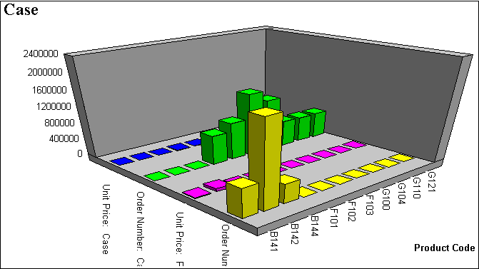
Example: Merging Multiple Graphs
The following illustrates a graph with
two horizontal, or X-axes, categories (PRODUCT_ID and PACKAGE_TYPE)
that have been merged.
SET GRMERGE=ON
GRAPH FILE GGORDER
SUM UNIT_PRICE ORDER_NUMBER
ACROSS PRODUCT_ID
BY PACKAGE_TYPE
END
The output is:
xMerging Multiple OLAP Graphs
When you create an OLAP graph that has multiple BY fields,
or a BY and ACROSS field, multiple graphs are generated. You can
merge these graphs into a single graph.
To do this, use the SET command OLAPGRMERGE.
x
Syntax: How to Merge Multiple OLAP Graphs
SET OLAPGRMERGE={ON|OFF}where:
- ON
Turns on the merge graph option.
With this setting AUTODRILL is disabled for the graph.
- OFF
Turns off the merge graph option and creates a separate graph
for every value of the outer sort field. OFF is the default value.
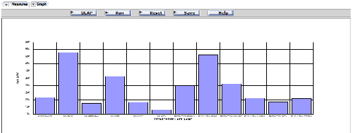
Example: Merging OLAP-Enabled Graphs
The following OLAP request against the
EMPLOYEE data source has two BY fields. To merge the graphs, the
SET OLAPGRMERGE=ON command is issued:
-OLAP ON
SET GRAPHEDIT=SERVER
SET OLAPGRMERGE=ON
TABLE FILE EMPLOYEE
SUM SALARY
BY DEP
BY LAST_NAME
ON TABLE SET PAGE-NUM OFF
ON TABLE NOTOTAL
ON TABLE PCHOLD FORMAT HTML
ON TABLE SET HTMLCSS ON
ON GRAPH SET HAXIS 300
ON GRAPH SET VAXIS 100
ON TABLE SET AUTODRILL ALL
ON TABLE SET OLAPPANE TABBED
ON TABLE SET STYLE *
     INCLUDE = endeflt,
$
     LEFTMARGIN=0.500000,
     RIGHTMARGIN=0.500000,
     TOPMARGIN=0.500000,
     BOTTOMMARGIN=0.500000,
$
TYPE=REPORT,
     TOPGAP=0.000000,
     BOTTOMGAP=0.013889,
$
ENDSTYLE
END
The output is:
xDisplaying Multiple Graphs in Columns
When you create a graph that
has multiple BY fields, or a BY and ACROSS field, multiple graphs
are generated. You can display these graphs in columns.
To do this, use the SET command GRWIDTH.
GRWIDTH may be set to any value between 0-512. The default is 0.
x
Syntax: How to Display Multiple Graphs in Columns
SET GRWIDTH=nn
where:
- nn
Is the number of columns in which to display multiple graphs.
This may be any value from 0-512. The default is 0.
All values
from 1-512 will display graphs in an HTML table with the corresponding number
of columns. The default value of 0 will display the graphs one under
the other in a Java applet.
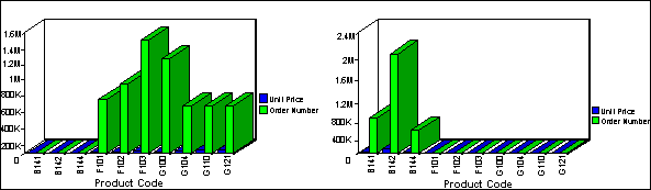
Example: Displaying Multiple Graphs in Columns
The following illustrates how to set
the number of columns in which you wish to display multiple graphs.
In this example, the graphs are set to display in two columns.
SET GRWIDTH=2
GRAPH FILE GGORDER
SUM UNIT_PRICE ORDER_NUMBER
ACROSS PRODUCT_ID
BY PACKAGE_TYPE
END
The output is: