You can view any two metrics, two objectives, or one
metric and one objective, to determine their relationship, or correlation.
For example, you can:
- Determine if
there is a real cause-and-effect relationship between two measurements,
and if so, determine if it is positive or negative.
- Correlate the
performance of a single metric in the different areas of your organization
to see if the performance is part of a general trend, or is an outlier
that is statistically unrelated to the rest of the data.
- Use the correlation
results to help you set targets for individual areas in your organization.
There are many ways to correlate data using various statistical
methods. PMF uses the percent achieved of an objective or measure
to determine how points of data are plotted on the Correlation scatter
plot. Each plotted dot represents the intersection of a single point
in time for two different metrics. The Correlation view displays
a linear plot showing the relationship between all points of data.
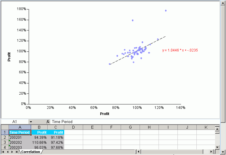
The following is an example of the PMF Correlation view.
The Correlation view also displays the correlation coefficient
equation, which indicates the correlation of the data. The following
are the three possible types of Correlation:
-
Positive Correlation. When
the correlation coefficient is close to +1, there is a positive
relationship between changes in the two measurements. This indicates
that when one measurement improves, it causes the other measurement
to improve in an equally positive manner.
-
Negative correlation. When
the correlation coefficient is close to -1, there is a negative
relationship between changes in the two measurements. This indicates
that when one measurement improves, it causes the other measurement
to decline in an equally negative manner. For example, if one measurement
improved by 10 percent, the other measurement declined by 10 percent.
-
Zero correlation. When
the correlation coefficient is close to zero, there is no linear
relationship between changes in the two measurements. This indicates
that there is a very low or non-existent level of correlation between
the two measurements.
x
Procedure: How to Run a Correlation View
-
Select
the Analytics tab.
-
Select Analysis, Objective,
or Measures Detail from the Type drop-down
menu and select Correlation from the View
drop-down menu.
-
Select
a value from the Time range drop-down menu. When you run the view,
it will display data for the selected time range.
Tip: Selecting the widest possible range of time
that is appropriate for your needs utilizes the most data and produces
the most accurate correlation results.
-
Specify
the X-Axis options.
- Select the Measure radio
button to display a measure on the X-Axis, or select the Objective radio
button to display an objective on the X-Axis.
- Select the specific
measure or objective from the drop-down menu beneath the radio buttons.
If
you selected Metric in the Synchronize Y to X axis on field, the
Y-Axis metric will mirror the X-Axis metric that you choose here.
- Select the dimension
and its value from the drop-down menus, or select All to
display information at the top level of that dimension.
If you
selected Dimension in the Synchronize Y to X axis on field, the
Y-Axis dimension values will mirror the X-Axis dimension values
that you choose here.
-
For the
Synchronize Y to X axis on field:
- Select Dimension to
compare different measures or objectives on the X-Axis and Y-Axis,
with the same dimension value on the X-Axis and Y-Axis. This option
causes the Y-Axis dimension value to mirror the X-Axis dimension
value.
- Select Metric to
compare the same measure or objectives on the X-Axis and Y-Axis,
with different dimension values on the X-Axis and Y-Axis. This option
causes the Y-Axis measure or objective value to mirror the X-Axis
measure or objective value.
- Select Don't
sync to suppress automatic mirroring of Y to X.
-
Specify the Y-Axis options.
- Select the Measure radio
button to display a measure on the Y-Axis, or select the Objective radio
button to display an objective on the Y-Axis.
- Select the specific measure or objective
from the drop-down menu beneath the radio buttons.
If you selected
Metric in the Synchronize Y to X axis on field, the metric chosen
for the X-Axis automatically appears here.
- Select the dimension
and its value from the drop-down menus, or select All to
display information at the top level of that dimension.
If you
selected Dimension in the Synchronize Y to X axis on field, the
dimension and its value chosen for the X-Axis automatically appears here.
-
Click Correlate when
you have supplied the criteria.
Tip: Depending on your browser security, you might
be asked if you want to open or save the file. Click Open.
PMF
generates two views.
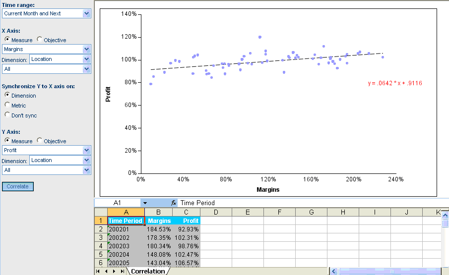
Example: Correlating Sales and Profit in Boston
As
manager of the Boston sales office, you frequently research cause-and-effect relationships
to find ways to improve the contribution of your office to the health
of the company. The Boston sales office in your organization has
shown strong sales. You would like to see how sales have affected
profit. To correlate sales and profit in the Boston office:
- Select the Analytics tab.
- Select Analysis, Objective,
or Measures Detail from the Type drop-down
menu.
- Select Correlation from
the View drop-down menu.
- For the Time
range field, select Current Period.
- For the X-Axis, select
the Measure option.
In the drop-down menu
below the Measure and Objective options, select Sales.
In the Dimension drop-down menu, select Organization and
select Boston in the drop-down menu below
that, under Sales, US, and East Cost.
Notice that the value
for the Dimension field Organization and the value for Organization
Boston automatically appear in the Y-Axis specification.
- In the Synchronize
Y to X axis on field, select the Dimension option.
- For the Y-Axis,
select the Measure option.
- In the drop-down
menu below the Measure and Objective options, select Profit.
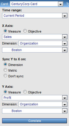
- Click Correlate.
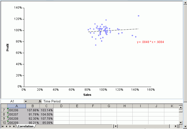
PMF
displays a scatter plot, and correlation data in an Excel spreadsheet
below, to compare sales and profit for the Boston office.
Example: Correlating Profit in Boston and St. Louis
The
Boston stores in your company historically report a profit that
reflects a national trend, while the St. Louis stores historically
fall below that trend. You need to examine how St. Louis profit
is doing compared to the national trend reflected by Boston profit.
To correlate profit in the St. Louis stores with profit in the Boston
stores:
- Select the Analytics tab.
- Select Analysis, Objective,
or Measures Detail from the Type drop-down
menu.
- Select Correlation from
the View drop-down menu.
- For the Time
range field, select Current Period.
- In the Synchronize
Y to X axis on field, select the Metric option.
- For the X-Axis,
select the Measure option.
- In the drop-down
menu below the Measure and Objective options for the X-Axis, select Profit.
Notice
that the Profit measure automatically appears in the Y-Axis specification.
- For the X-Axis,
in the Dimension drop-down menu, select Location.
In
the drop-down menu below Dimension, select BOS (Boston).
- For the Y-Axis,
in the Dimension drop-down menu, select Location.
In
the drop-down menu below Dimension, select STL (St. Louis).
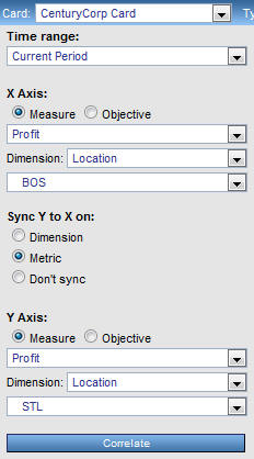
- Click Correlate.
PMF
displays two views comparing profit in Boston and St. Louis.