To create a chart:
-
Click Tools in the top pane of the iWay Service
Manager Administration Console.
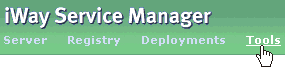
The iWay Service Manager Tools pane opens.
-
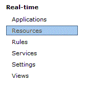
In the left pane, select Resources under
the Real-time section.
The Resources pane opens and displays the Gauges tab by default, as shown in the following image.
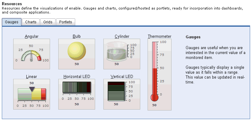
The Resources pane is used to define the visualization aspects of an iWay Enable application. A collection of gauges and charts, which can be configured and hosted as portlets, are ready to be incorporated into dashboards and composite applications.
In this iWay Enable application, sales data for the EU and US regions will be monitored.
-
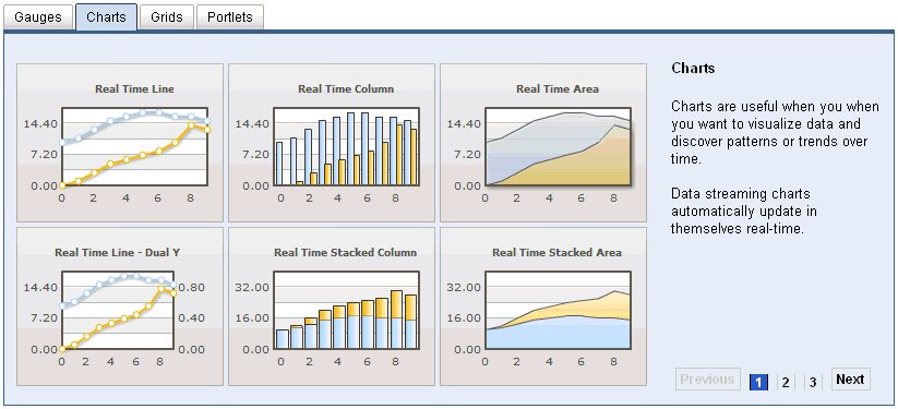
Click the Charts tab.
The Charts tab opens and displays the available charts that can be configured, as shown in the following image.
-
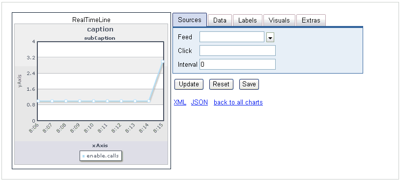
Click the Real Time Line chart.

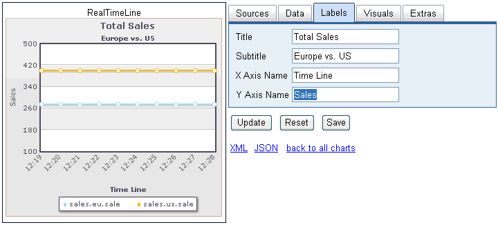
The Real Time Line Chart configuration pane opens, as shown in the following image. A visual representation of the selected chart (for example, Real Time Line) is displayed on the left. There are five configuration tabs (Sources, Data, Labels, Visuals, and Extras) located on the right. By default, the Sources tab is selected.
-
In the Interval field, enter a value of 2,
which indicates that the chart will update every two seconds.
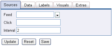
- Click Update.
-
Click the Data tab.
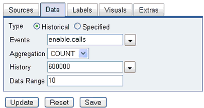
The Data tab is used to specify what events will be used to feed the data. Since more than one event will be monitored using the Real Time Line chart, you must manually type in the events instead of selecting a single event from the Events drop down list.
-
Provide the configuration properties, as defined in the following table.
Parameter
Value
Events
sales.eu.sale|sales.us.sale
Aggregation
SUM
History
600000 (Default)
Data Range
10 (Default)
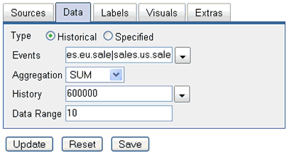
- Click Update.
-
Click the Labels tab.
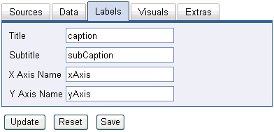
-
Provide labels that will be used to identify the data in the
Real Time Line chart, as defined in the following table.
Parameter
Value
Title
Total Sales
Subtitle
Europe vs. US
X Axis Name
Time Line
Y Axis Name
Sales
Notice that as you type values in the various label fields, the chart on the left updates to reflect the new data you entered.
-
Click Update.
Optionally, you can continue to modify additional visual elements for the Real Time Line chart (for example, Theme, Background, or Style) by selecting the Visuals tab.
The Extras tab can also be used to adjust the visual representation of the Real Time Line chart. For example, you can choose to show/hide the border, legend, current value, and the individual data points.
Once the Real Time Line chart is configured and meets your requirements, there are several additional options available, which include generating a JASON object, XML, or saving the configured chart to create a portlet.
-
Click Save.
The Save as Portlet dialog box opens.
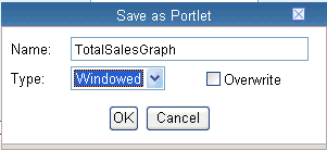
- In the Name field, type TotalSalesGraph.
- From the Type drop-down list, select Windowed, which indicates that a pop-up window will be used to display this portlet.
-
Click OK.
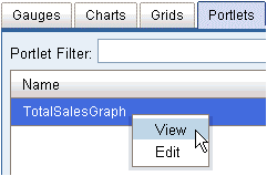
You are returned to the main Resources pane where the Portlets tab is now selected.
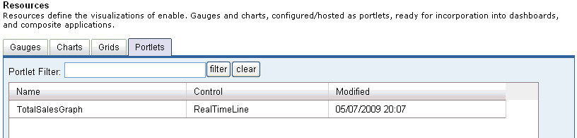
The new Real Time Line chart (TotalSalesGraph) is now added to the table.
-
Right-click TotalSalesGraph and select View from
the context menu. As a shortcut, you can also double-click the chart
name.
The TotalSalesGraph window opens and displays the Real Time Line chart you configured.
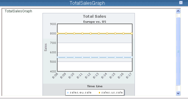
The Real Time Line chart contains two horizontal lines, which represent the earlier runs of data (EU and US sales). This data will be updated using the two second interval that was configured. You can also click the name of the chart in the title bar to view the chart in full-screen mode.
-
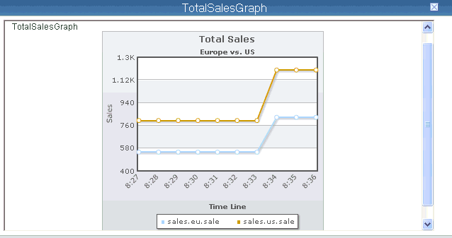
On your file system, copy the SalesTransactions.xml file
that was created earlier into the following input directory:
C:\Sales_Demo\sales_data\in
The Real Time Line chart will update in a few seconds to reflect new data.
Note that the use of gauges and charts is not required to generate feeds, since feeds can also be generated by creating a register set with the appropriate feed syntax.