Viewing Data as a Chart

In this section:

How to:

Reference:

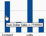
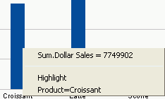
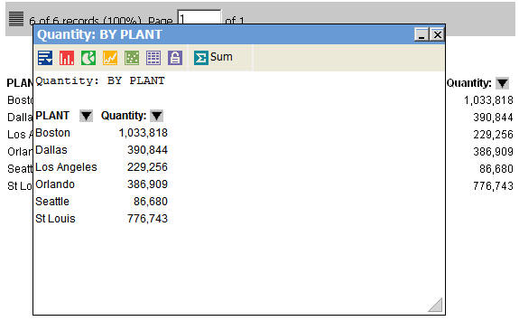
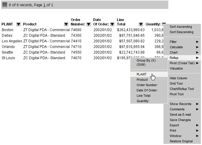
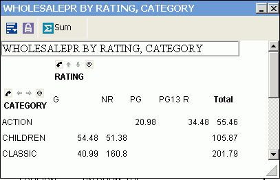
You can view data in your active report as a line, bar, scatter, or pie chart. For example, the following image shows an HTML active report.

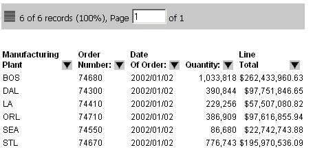
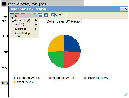
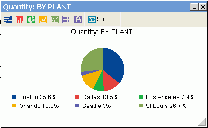
The following image shows a chart that was rendered from the data in the report. This is a pie chart that shows the sum of the values in the Quantity field by Plant.

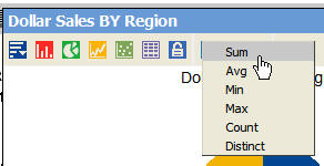
Once a chart is rendered, you can use the chart icons as follows.

Chart Icon

Action

Create new charts to compare values, especially when using the Freeze options.

Change or add fields. You can only add fields to a bar or line chart.

Export charts to another application or open the Chart/Rollup Tool.

Change the chart type to a bar chart.

Change the chart type to a pie chart.

Change the chart type to a line chart.

Change the chart type to a scatter chart.

Scatter charts are available for numeric columns.

View the chart as a report in table format.

Freeze Chart. You can link or unlink a chart to the filters you have applied in your report using the Freeze Chart button. The button indicates whether the report is linked to the filter (Freeze Chart) or not (UnFreeze Chart).

Change the aggregation method.

Procedure: How to View Data in a Chart

  1. Click the arrow in the heading of the column you want to chart and select Chart.
  2. Select the chart type (Pie, Line, Bar, Scatter) from the menu.

    Scatter charts are available for numeric columns.

    The menu that appears shows you how the chart is going to be created. The first row tells you the calculation, for example Group By (SUM), then the following rows list the vertical (By) sort fields in the report that you can select for the X-axis. The column title you clicked on is the field that displays on the Y-axis.

  3. Select a sort field.

    The chart is rendered. You may create a new chart from the chart window, create a Rollup Table, change the type of calculation for the column, and view data tips for the chart items.

    Tip: To view data tips in a chart, hover your mouse over the pie slice (or column, or dot, depending on your chart type), to view the data tip for the field. For example, the following image shows a data tip for a column in a bar chart.

    Data tip in a chart

    If you click on a column, the data tip includes the column data and name, as shown in the following image.

Procedure: How to Create New Charts From a Chart Window

  1. From a chart window in the active report output, select New from the first chart icon.

    Another chart window opens with the same chart.

  2. Select the Freeze icon to unlink the chart to the filters you applied in your report.

    Any additional filters that you apply do not affect this chart window.

    Select the Freeze icon again to unfreeze the chart and link the chart to the report when new filters are applied.

  3. Change the type of calculation for data in the column.

    You can select Sum, Avg, Min, Max, Count, or Distinct as the aggregation method (calculation type) for numeric data. You may select Count or Distinct as the aggregation method (calculation type) for non-numeric data.

    aggregation method for calculation data

    For information about the available types of calculation in active reports, see Calculating Data.

Reference: Usage Notes for Charts

The following apply to charts.

  • X-axis labels overlap and are cut off when you reduce the size of a chart.
  • If there are multiple Y-axis fields for a pie chart, the chart uses the first field selected to draw the chart. If adding multiple Y-axis fields to draw the pie chart from the chart window, the chart uses the first Y-axis field selected to draw the pie chart.
  • Scatter charts can represent only detailed data (numeric) without any aggregation method applied.
  • When you create a pie chart using the HTML active report output format (AHTML), the values are sorted alphabetically in the pie slices clockwise, from left to right.

Viewing Data in a Rollup Table

How to:

You can view data in an active report in a Rollup Table. For example, the following image shows a partial active report that has the Order Number, Date of Order, Line Total, and Quantity sorted by Plant and by Product. If you need to see only the quantity in stock for each plant, you can create a Rollup Table with only those fields, as shown in the following image.

Procedure: How to Create a Rollup Table

  1. Click the arrow in the heading of the column you want to create a Rollup Table for and select Rollup.
  2. Select the sort field from the submenu.

    The Rollup Table appears in a separate window.

Viewing Data in a Pivot Table

How to:

Reference:

Pivot Tables reorganize and summarize selected columns and rows of data in order to obtain a desired report. A Pivot Table pivots, or turns, the data to view it from different perspectives, without actually changing the data from the report.

Procedure: How to Create a Pivot Table in an Active Technologies Report

  1. Run the active report, click the arrow in any column heading, and select Pivot (Cross Tab).
  2. Select a column, and row, respectively, from the Pivot (Cross Tab) submenu.

    The selected column is the vertical sort field and the selected row is the horizontal sort field in the Pivot Table.

    The Pivot Table appears in the same Web browser session.

    The Pivot Table inherits the style used in the original active report.

    You may use the Pivot controls and Pivot Table menu options to select additional values and calculations.

Reference: Pivot Table Menu Options

The following image is an example of a Pivot Table for an HTML active report.

Pivot Table for HTML Active Report

The following icons are available from the Pivot Table:

New

The New New icon icon opens a new window with the same Pivot Table. This Pivot Table window can be used to compare values, especially when you use the Freeze option.

Add additional vertical sort fields (Add (Y)) and horizontal sort fields (Group By (X)) to the Pivot Table.

You may also export the Pivot Table to another application and open the Pivot Tool.

Freeze

Select the Freeze Freeze icon icon to keep the Pivot Table frozen so that additional selection criteria does not reflect in the Pivot Table.

Select the Freeze icon again to unfreeze the table and reflect new selection criteria in the Pivot Table.

Calculation

The Calculation Calculation icon icon identifies the calculation value for the Pivot Table. Options are Sum, Avg, Min, Max, Count, and Distinct.

Sum is the default calculation value.

Reference: Pivot Controls

The Pivot Table has individual controls for each sorting column or row. These controls enable you to alternate the sorting to analyze the data. The following image is an example of the Pivot controls in a Pivot Table.

Pivot Table

The following controls are available from the Pivot Table.

Button

Control

Moves a column sort to a row sort or vice versa.

Up/Down arrows enable you to switch the order of the sorts and moves the column to a new position in the Pivot Table.

Arrows are grayed out if there is only one sort column.

Right/Left arrows enable you to switch the order of the sorts and moves the row to a new position in the Pivot Table.

Arrows are grayed out if there is only one sort row.

Deletes the column or row from the Pivot Table.


Information Builders