axisname: {
  labels: {
    visible: boolean,
    font: 'string',
    color: 'string',
    excludeMin: boolean,
    excludeMax: boolean,
    rotation: number  }
}
where:
- axisname
Can be:
- xaxis
- yaxis
- y2axis
- zaxis
- visible: boolean
Controls the visibility of the axis labels. Valid values are:
- true, which makes the axis labels visible. This is the default value.
- false, which makes the axis labels not visible.
- font: 'string'
Is a string that defines the size, style, and typeface of the axis labels. The default value is '7.5pt Sans-Serif'.
- color: 'string'
Is a string that defines color of the axis labels using a color name or numeric specification string. The default value is 'black'.
For information about defining colors, see Colors and Gradients.
- excludeMin: boolean
Controls the visibility of the label for the minimum value. Valid values are:
- true, which makes the minimum label not visible.
- false, which makes the minimum label visible. This is the default value.
- 'auto', which lets the chart engine control whether to draw the minimum label. It will not draw the label if it is too close to or overlaps another label.
- excludeMax: boolean
Controls the visibility of the label for the maximum value. Valid values are:
- true, which makes the maximum label not visible.
- false, which makes the maximum label visible. This is the default value.
- 'auto', which lets the chart engine control whether to draw the maximum label. It will not draw the label if it is too close to or overlaps another label.
- rotation: number
Defines the rotation of axis labels, in degrees. Valid values are 0 (no rotation), 45, 90, 135, 180, 270, or undefined. The default value is undefined. Any value other than undefined will disable automatic layout of axis labels. For information, see Controlling Automatic Layout of Ordinal Axis Labels.
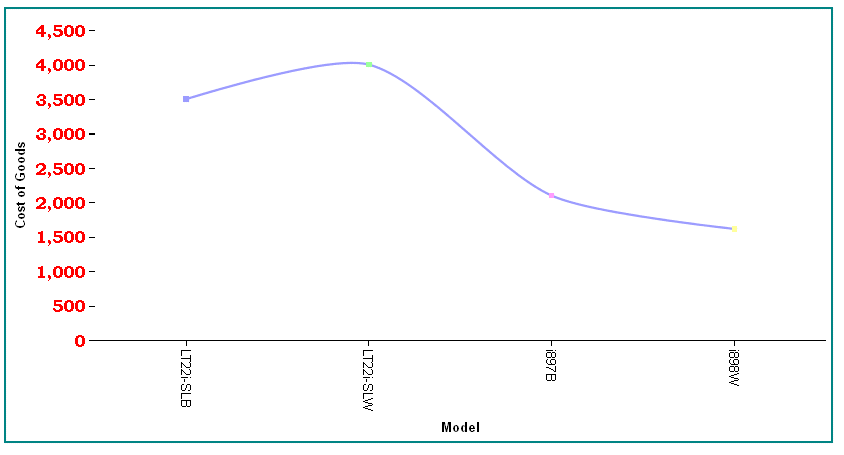
The following request generates a vertical line chart and makes the y-axis labels bold with a 12pt Bookman Old Style font, in red:
GRAPH FILE WFLITE
SUM COGS_US
BY MODEL
WHERE PRODUCT_CATEGORY EQ 'Computers'
ON GRAPH HOLD FORMAT JSCHART
ON GRAPH SET LOOKGRAPH VLINE
ON GRAPH SET STYLE *
*GRAPH_JS
border: {width: 2, color: 'teal'},
blaProperties: {lineConnection: 'curved'},
yaxis: {labels: {color: 'red', font: 'bold 12pt Bookman Old Style'}}
*END
ENDSTYLE
END
The output is:
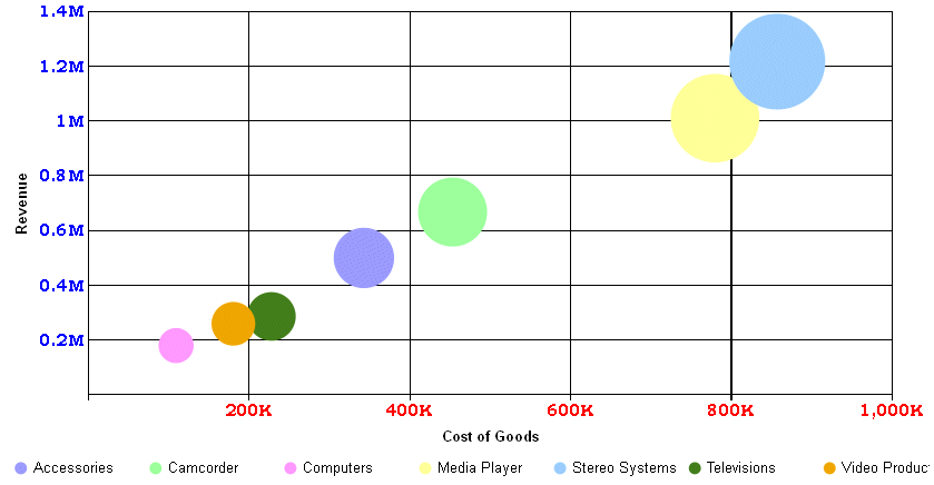
The following request generates a bubble chart and formats the axes labels to have the font 'bold 10pt Bookman Old Style'. The y-axis labels are blue, and the x-axis labels are red:
GRAPH FILE WFLITE
SUM COGS_US REVENUE_US DISCOUNT_US
BY PRODUCT_CATEGORY
ON GRAPH HOLD FORMAT JSCHART
ON GRAPH SET LOOKGRAPH BUBBLE
ON GRAPH SET STYLE *
*GRAPH_JS
border: {width:0},
series: [{series: 'all', marker: {shape: 'circle'}}],
  xaxis: {
    labels: {font: 'bold 10pt Bookman Old Style',color: 'red'}},
  yaxis: {
    labels: {font: 'bold 10pt Bookman Old Style',color: 'blue'}}
*END
ENDSTYLE
END
The output is:
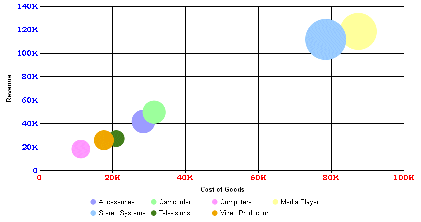
The following request does not draw the minimum axis labels (0,0):
GRAPH FILE WFLITE
SUM COGS_US REVENUE_US DISCOUNT_US
BY PRODUCT_CATEGORY
ON GRAPH HOLD FORMAT JSCHART
ON GRAPH SET LOOKGRAPH BUBBLE
ON GRAPH SET STYLE *
*GRAPH_JS
border: {width:0},
series: [{series: 'all', marker: {shape: 'circle'}}],
  xaxis: {
    labels: {font: 'bold 10pt Bookman Old Style',color: 'red', excludeMin:true}},
  yaxis: {
    labels: {font: 'bold 10pt Bookman Old Style',color: 'blue', excludeMin:true}}
*END
ENDSTYLE
END
The output is: