If you exited from the Winform Painter, you can display
it again by:
- Entering MPAINT
at the FOCUS command prompt. When the Open Maintain dialog box appears,
type or select CARSPECS and press Enter.
- Entering MPAINT
CARSPECS at the FOCUS command prompt.
In either case, you return to the Painter exactly where you left
off.
x
Perform one of the following
to add a field to the form:
- Select Field from
the Objects pull-down menu. At the bottom of the screen, the PF
key legend disappears. In its place, a message appears telling you
to move the cursor to where you want to position the field. The
cursor is positioned where it was when you last pressed Enter.
You must move the cursor to the starting position for the field
and press Enter.
- Position the
cursor at the screen position where you want the field to begin
and press PF4. (PF4 is the shortcut key for adding a field.)
If your terminal emulator indicates the cursor's row and column
position, position the beginning of the field at row 6, column 27.
This tutorial uses emulator coordinates for positioning controls
in the Winform. (The Winform Painter refers to controls as objects.)
To determine the same position using Winform row and column equivalents,
subtract 3 from the emulator row position, and 1 from the emulator
column position. For example, if you are determining row position
by manually counting from the first, that is, the top line inside
the Winform, this is row 3 and if you are determining column position
by using the rulers above and below the Winform, this is column
26.
The Painter displays the following dialog
box, and the cursor flashes in the Field entry field:

You can specify the following in this
dialog box:
- The name of
the field.
- The source and
destination of field's data.
- Whether the
text the user enters should be converted to uppercase.
- The length of
the field.
- Whether the
field allows data entry or is protected.
- Whether the
field name should be used as a prompt.
- The values the
field should accept.
- The name by
which you can refer to the Winform field in your procedure logic.
- The color of
the field.
- The triggers
for the field.
x
To specify the field to display, type a name in the
Field entry field and then press Enter; or
scroll through the list of field names in the Field list box, move
the cursor to the appropriate field name, and press Enter.
Try it now: For the purposes of this tutorial, specify
the Country field.
x
All controls—except frames and browsers—have names.
The Winform Painter refers to controls as objects, and to their
names as object names. These names enable you to refer to controls
within your procedure, so that you can dynamically manipulate them
in response to run-time events.
Object Name is located in the bottom middle of the dialog box.
Try it now: Name this field CountryField,
by overwriting the default name (Field1).
x
The Source radio button group enables you to select
a source for the field's initial value:
-
Default Value. Check
this source to specify a constant that is always displayed for this
field when the form initially opens, for example, a year field with
a default value of the current year. Enter a default value if the
default display for the user should come from a constant. The Winform
Painter does not support default values for fields in the current
release.
-
Current Area. Check
this source if the data to be displayed is to come from the Current
Area variable with the same name as the field specified. The Current Area
is essentially a stack that has one row.
-
Stack
The Source Stack drop
box lists every stack that was specified in the Winform Properties
dialog box.
If no stacks appear, exit this screen and return
to the Form Properties dialog box to enter stacks.
When you
click the Stacks radio button and then click the down-arrow button,
the Painter displays a list of available stacks.
To click
a radio button, position your cursor in the middle of the desired
button and press any character, for example, an "x".
To select
one of these stacks as the source of the field's initial value,
position the cursor on the desired stack and press Enter.
Try it now: Select CarStack as
your source. In this tutorial, you obtain your input data from this
stack.
When you press Enter or a function key—such
as PF4 to confirm your entries and close the dialog box—the character
you entered changes into an asterisk (*).
x
Note that the Source and Destination must be the same.
Both must either display <None> or the name of the stack.
The destination specifies where the field value supplied by the
end-user is to go. The Destination Stack drop box lists every stack
that was specified in the Winform Properties dialog box.
When you click the down-arrow button, the Painter displays a
list of available stacks.
To select a stack as the destination, position the cursor on
the desired stack and press Enter.
If you want the field's value to be written to the Current Area,
do not specify anything. Whether or not you select a destination
stack, all values are automatically copied to the Current Area.
Try it now: For this tutorial, specify CarStack as
the destination stack.
x
The Painter automatically fills this field when you
select a field from the Field list box or when you enter a data
source field name in the Field entry field. In this case, the Painter
fills in the length the next time you press Enter.
The Length is obtained from the Master File.
You can override the default length by typing in a different
length.
If the field length is longer than what is specified in the Master
File, all of the characters specified after the end of the Master
length are not added to the data source.
Try it now: For this tutorial you want the length specified
in the Master File, so you need not change the specification.
x
The Prompt check box indicates whether or not you want
the field name (or other text) to appear to the left of the field.
You can change the value in the Prompt entry field. However,
the prompt text may not exceed 13 characters. If you want the prompt
text to be longer than 13 characters, you must uncheck Prompt and
supply your own text using the method described in Step 4: Adding Text.
Try it now: For the Country field, you want the field
name to appear, so accept the default (checked). To enhance the
prompt's appearance, change all the letters following the first
to lowercase, so that it reads Country.
x
When the Uppercase check box is checked (this is the
default setting), whatever text the user types in is converted to
uppercase before being placed in the destination.
Try it now: Accept the default. For this tutorial, all
data should be converted to uppercase, because all data in the Car
data source is stored in uppercase.
x
Select the Protected check box to protect the field
from users changing its value. You check this box if this field
is to be display-only.
Try it now: In general, you want to protect key fields,
such as Country, so check this option.
x
Click OK (or PF4) after you finish
making all changes to the field dialog box. If you want to view
the dialog boxes associated with clicking PF5 and PF6, do not click
PF4 yet.
x
The Accepts button opens the Accept List dialog box
which enables you to specify a data validation test for the field,
as well as the conditions under which to display the list or range
of valid values. If valid values are already specified for this
field in the Master File, you use this dialog box to specify when
to display them.
For this tutorial you do not use the Accepts data validation
feature. Click PF3 to exit from this dialog
box.
x
Click the Color button when you want to change the colors
for a field. When you click this button, the following dialog box
opens:
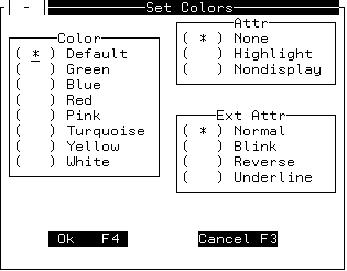
To select a color, an attribute, or an extended attribute, move
the cursor to the appropriate radio button and press any key.
Try it now: For this tutorial, you do not show colors.
Click PF3 to exit from this dialog box.
x
When you click the Cancel button, any changes made to
the Field dialog box are ignored, and you return to the Winform
Design Screen.
x
When you click the Triggers button, the Triggers dialog
box opens. It lists all of the system shortcut keys and enables
you to enter functions (which are referred to as cases in the Winform
Painter) against the corresponding keys.
When you finish entering options, the Field dialog box should
look similar to the following:
Try it now: Press PF4 to indicate
that you are done.
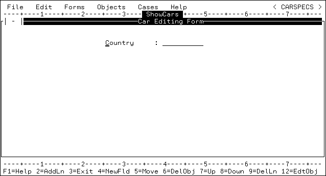
After you press PF4, the Country field appears, and the form
looks similar to the following:
x
To add additional fields, move the cursor two lines
below the Country field and press PF4. The Field dialog box appears.
Note that the changes you specified in the Field dialog box for
the Country field (for example, the CarStack stack) are the new
defaults.
Try it now: Select the Car field.
The length is obtained from the Master File.
- Ensure that
the Prompt, Uppercase,
and Protected check boxes are checked.
- Change the case
of the prompt so that it reads Car.
- Before pressing
PF4 to indicate that you are finished entering specifications, check the
dialog box for the Car field to confirm that it looks like the following:
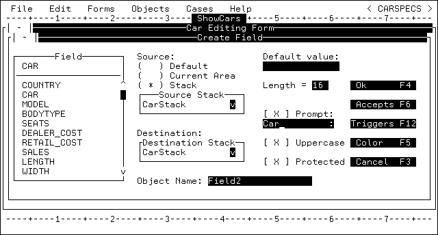
- Press PF4 when
you are finished entering specifications for the Car field.
xEditing, Moving, and Resizing Controls
When you are adding fields (or other controls later
in the tutorial), there are two ways to make changes. (Winform Painter
refers to controls as objects.)
One way is to remove the control and begin again. To remove a
control:
- Select Delete from
the Edit pull-down menu. Move the cursor to the control you want
to delete and press Enter.
- Alternatively,
move the cursor to the control you want to delete and press PF6.
The control no longer appears on the screen. Editing the control
presents an easier way to make changes. To edit a control:
- Select Edit
Object from the Edit pull-down
menu. Move the cursor to the control you want to change and press Enter.
- Alternatively,
move the cursor to the control you want to edit and press PF12.
The appropriate dialog box opens, and you can specify changes.
You may wish to move controls around on the screen to make the
screen more appealing. To move a control:
- Select Move from
the Edit menu. Position the cursor on the
control you want to move and press Enter.
Next, position the cursor to where you want the upper left corner
of the control to be and press Enter.
- Alternatively,
position the cursor at the control you want to move and press PF5. Next,
position the cursor where you want the upper left corner of the
control to be and press Enter.
You may want to resize a control, such as the grid described
in the next section, Step 3: Adding a Grid. To change the size of a control:
- Select Resize from
the Edit menu. Move the cursor to the control you want to resize
and press Enter. The border of the control
is highlighted and the cursor is at the bottom right of the control.
Move your cursor to where you want the bottom right corner to be
and press Enter.
- Alternatively,
move the cursor to the control you want to resize and press PF24.
The border changes as described in the previous paragraph. Move
the cursor to indicate the new size of the control and press Enter.