Box Plot Properties (boxPlotProperties)

In this section:

These properties control the general appearance of a box plot.

The following code segment shows the properties with their default values:

boxPlotProperties: {
   hatWidth: '50%', 
   drawHatAsBox: false,
   medianLine: {
      width: 1,
      color: 'black',
      dash: ''
   },
   connectorLine: {
      width: 1,
      color: 'black',
      dash: ''
   }
},

Top of page

x
Specifying Box Plot Hat Width

How to:

The hatWidth property controls the width of the hat that draws at the top and base of a box plot.


x
Syntax: How to Set the Width of the Box Plot Hats
boxPlotProperties: {
   hatWidth: width

where:

hatWidth: width

Can be a number that defines the width of the hat in pixel or a string that includes a percent symbol, enclosed in single quotation marks (') that expresses a percentage value ('0%'...'100%'). The default value is '50%'.

Note: The series and group border properties control the color and format of the hats when they are drawn as boxes. When they are not drawn as boxes, the connectorLine properties control the color and format of the hats. You can set the border width to zero to remove the hats entirely (the same as hatWidth: '0%' or hatWidth: 0).


Example: Specifying the Box Plot Hat Width

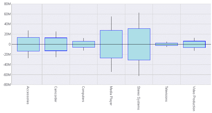
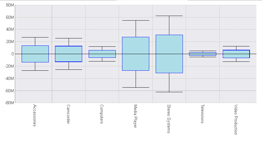
The following request sets the hat width to 100% of the box width:

DEFINE FILE WFLITE
DIFF1 = COGS_US  -100000;
DIFF2 = COGS_US  -200000;
DIFF3 = COGS_US +100000;
DIFF4 = COGS_US +200000;
END
GRAPH FILE WFLITE
SUM DIFF1 DIFF2 MDN.COGS_US  DIFF3 DIFF4
BY PRODUCT_CATEGORY
ON GRAPH HOLD FORMAT JSCHART
ON GRAPH SET LOOKGRAPH BOXPLOT
ON GRAPH SET STYLE *
INCLUDE=ENDEFLT,$
*GRAPH_JS
boxPlotProperties: {
   hatWidth: '100%',    
   },
series: [
 {series: 0, color: 'lightblue', border: {width: 1, color: 'blue'}}, 
]
*END
ENDSTYLE
END

The output is:

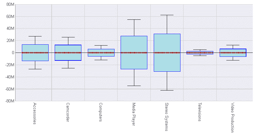
Setting the hatwidth to zero (0), removes the hats, but leaves the connector lines:

boxPlotProperties: {
   hatWidth: 0},

The output is:


Top of page

x
Controlling the Appearance of Box Plot Hats

How to:

The drawHatAsBox property controls the appearance of the box plot hats (upper and lower).


x
Syntax: How to Control the Appearance of Box Plot Hats
boxPlotProperties: {
   drawHatAsBox: boolean   },

where:

drawHatAsBox: boolean

Valid values are:

  • true, which draws box plot hats as boxes.
  • false, which draws normal hats. This is the default value.

Note: The series and group border properties control the color and format of the hats when they are drawn as boxes. When they are not drawn as boxes, the connectorLine properties control the color and format of the hats.


Example: Drawing the Box Plot Hats as Boxes

The following request draws the hats in the box plot as boxes:

DEFINE FILE WFLITE
DIFF1 = COGS_US  -100000;
DIFF2 = COGS_US  -200000;
DIFF3 = COGS_US +100000;
DIFF4 = COGS_US +200000;
END
GRAPH FILE WFLITE
SUM DIFF1 DIFF2 MDN.COGS_US  DIFF3 DIFF4
BY PRODUCT_CATEGORY
ON GRAPH HOLD FORMAT JSCHART
ON GRAPH SET LOOKGRAPH BOXPLOT
ON GRAPH SET STYLE *
INCLUDE=ENDEFLT,$
*GRAPH_JS
boxPlotProperties: {
   drawHatAsBox: true,    
   },
series: [
 {series: 0, color: 'lightblue', border: {width: 1, color: 'blue'}}, 
]
*END
ENDSTYLE
END

The output is:


Top of page

x
Controlling the Appearance of the Box Plot Median Line

How to:

The medianLine properties control the appearance of the box plot median line.


x
Syntax: How to Control the Appearance of the Box Plot Median Line
boxPlotProperties: {
   medianLine: {
      width: number,
      color: 'string',
      dash: 'string'
   }
},

where:

width: number

Is the width of the line in pixels. The default value is 1.

color: 'string'

Is a color defined by a keyword or numeric specification string. The default value is 'black'.

dash: 'string'

Is a string that defines the dash style. The default value is '', which produces a solid line. Use a string of numbers that defines the width of a dash followed by the width of the gap between dashes (for example, dash: '1 1' draws a dotted line).


Example: Controlling the Box Plot Median Line

The following request generates a red median line with a width of 4 and a dash with a width of 2 and a gap of 2:

DEFINE FILE WFLITE
DIFF1 = COGS_US  -100000;
DIFF2 = COGS_US  -200000;
DIFF3 = COGS_US +100000;
DIFF4 = COGS_US +200000;
END
GRAPH FILE WFLITE
SUM DIFF1 DIFF2 MDN.COGS_US  DIFF3 DIFF4
BY PRODUCT_CATEGORY
ON GRAPH HOLD FORMAT JSCHART
ON GRAPH SET LOOKGRAPH BOXPLOT
ON GRAPH SET STYLE *
INCLUDE=ENDEFLT,$
*GRAPH_JS
boxPlotProperties: {
   medianLine: {
      width: 4,
      color: 'red',
      dash: '2 2'      }},
series: [
 {series: 0, color: 'lightblue', border: {width: 1, color: 'blue'}}, 
]
*END
ENDSTYLE
END 

The output is:


Top of page

x
Controlling the Appearance of the Box Plot Connector Line

How to:

The connectorLine properties control the appearance of the box plot connector lines and hats. The connector line is only visible when drawHatAsBox is false.


x
Syntax: How to Control the Appearance of the Box Plot Connector Line
boxPlotProperties: {
   connectorLine: {
      width: number,
      color: 'string',
      dash: 'string'
   }
},

where:

width: number

Is the width of the line in pixels. The default value is 1.

color: 'string'

Is a color defined by a keyword or numeric specification string. The default value is 'black'.

dash: 'string'

Is a string that defines the dash style. The default value is '', which produces a solid line. Use a string of numbers that defines the width of a dash followed by the width of the gap between dashes (for example, dash: '1 1' draws a dotted line).


Example: Controlling the Box Plot Connector Line

The following request generates a red connector line with a width of 4 and a dash with a width of 2 and a gap of 2:

DEFINE FILE WFLITE
DIFF1 = COGS_US  -100000;
DIFF2 = COGS_US  -200000;
DIFF3 = COGS_US +100000;
DIFF4 = COGS_US +200000;
END
GRAPH FILE WFLITE
SUM DIFF1 DIFF2 MDN.COGS_US  DIFF3 DIFF4
BY PRODUCT_CATEGORY
ON GRAPH HOLD FORMAT JSCHART
ON GRAPH SET LOOKGRAPH BOXPLOT
ON GRAPH SET STYLE *
INCLUDE=ENDEFLT,$
*GRAPH_JS
boxPlotProperties: {
    connectorLine: {
      width: 4,
      color: 'red',
      dash: '2 2' }},
series: [
 {series: 0, color: 'lightblue', border: {width: 1, color: 'blue'}}, 
]
*END
ENDSTYLE
END

The output is:


Information Builders