|
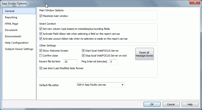
Show Welcome Screen
|
Controls the appearance of the Welcome screen
when App Studio is launched.
|
|
Confirm close
|
Displays a prompt for users to confirm that
they want to exit App Studio.
|
|
Start local WebFOCUS Server
|
Starts the local Reporting Server when App Studio
is launched.
|
|
Stop local WebFOCUS Server on
exit
|
Stops and closes the local Reporting Server when
you exit App Studio.
|
|
Recent file list limit
|
Allows you to set the number
of recently used files that appear in the Recent file lists. The
default value is 25.
|
|
Ping Interval (minutes)
|
Sets the frequency at which
requests are sent to the web or application server so your connection does
not time out. The default is 5.
|
|
Reset all message boxes
|
Resets all message boxes to
their default state. For example, if you selected the Don’t
show this message again check box in any message box, clicking
this button will reset all message boxes. Once you click this button,
it becomes inactive until you choose not to display a message box
in the product.
|
|
Use short Last Modified date format
|
Displays the short date format,
mm/dd/yyyy hh:mm AM/PM, in the Open File
dialog box, and the Environments Detail panel. This is the default format.
You can clear this option to display the long date format, day,
month, date, year hh:mm:ss AM/PM.
|
|
Default file editor
|
Lists file editor options, such as:
- Edit in App Studio
canvas
- Edit in Text Editor
- Edit in Windows registered
tool
Note: The Edit in
Windows registered tool is only visible if the file type you are
accessing has been associated with a Windows application.
The
file editor used determines which context menu options are available
and controls the default behavior for double-clicking and right-clicking files.
|
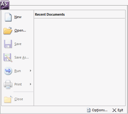
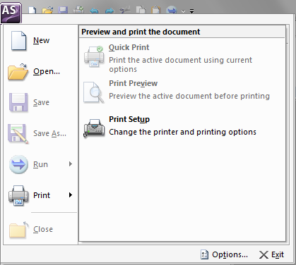
 , opens the Application
menu of file-related commands. You can create a new document, open
an existing document, save an active document, and print an active
document. The Options button opens the App Studio Options dialog
box, where you can set user preferences. The Application menu also
lists recently opened documents. The Application button is always available.
It is located in the upper-left corner of the App Studio interface.
, opens the Application
menu of file-related commands. You can create a new document, open
an existing document, save an active document, and print an active
document. The Options button opens the App Studio Options dialog
box, where you can set user preferences. The Application menu also
lists recently opened documents. The Application button is always available.
It is located in the upper-left corner of the App Studio interface.