In this section: |
|
You can use App Studio features and functions to develop applications in the canvas area of the interface. The size of your canvas depends on the placement and location of panels around the interface window.
As you develop in App Studio, tabs open in the canvas area. Since you can develop an HTML page at the same time that you create a report, each canvas opens with a different colored tab. The colored tab at the top of each canvas displays the name of the file you are developing.
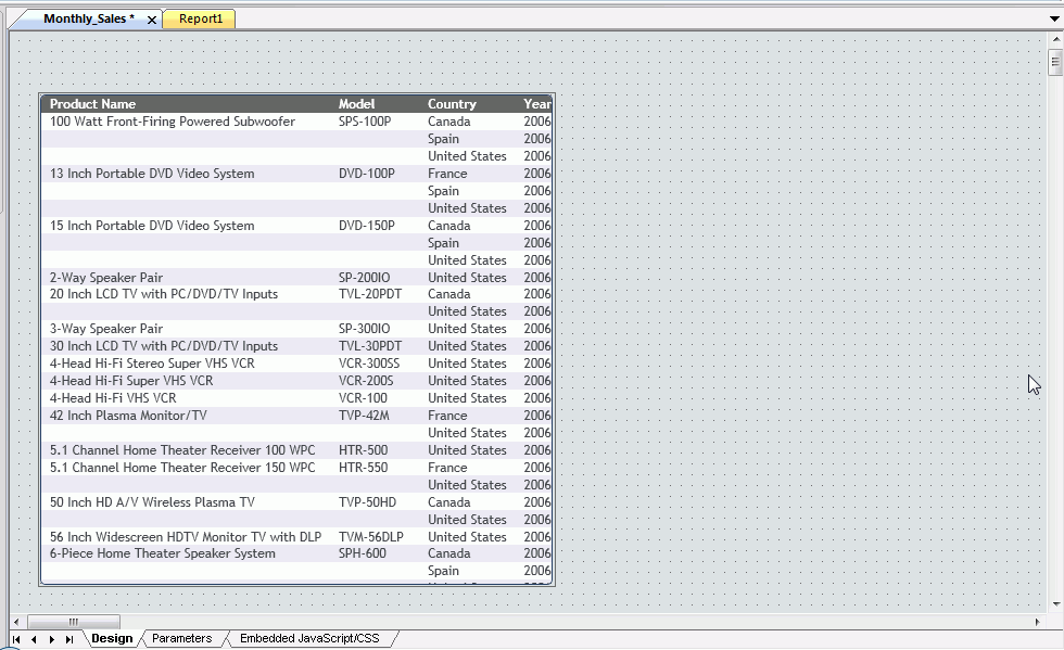
If you named the file in the Report, Chart, or HTML/Document Wizard, that name appears on the tab. If you chose to name the file after you develop the content, a default file name, such as Report1, appears on the tab, as shown in the following image.
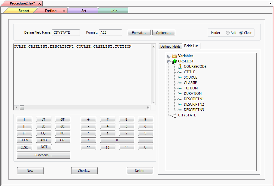
A second set of tabs opens when you create procedures with multiple components. For example, you can add Set, Define, and Join components to a procedure at anytime. These canvases open as tabs below the report or chart procedure, as shown in the following image.
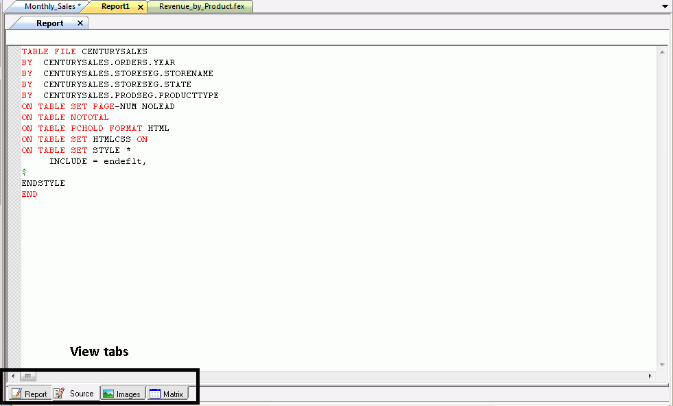
In addition to colored tabs, some canvases also contain View tabs. A View tab appears at the bottom of the canvas and changes the display of information on the canvas. View tabs are shown in the following image.
View tabs display different views of the same component.
View tabs, such as those on the HTML canvas, also enable additional features and functions that you can use to customize an application. For example, in the HTML canvas, you can add JavaScript functionality to an HTML page through the Embedded JavaScript view tab.
For more information, see View Tabs.
You can develop App Studio content in the following canvases.
The Alert Assist canvas enables you to distribute an entire report or selected sections of a report when certain test conditions are met.
To access the online Help for the Alert Assist canvas, click
the Alert Assist Help icon  , located within the Alert Assist
canvas.
, located within the Alert Assist
canvas.
The Alert Assist button opens a menu that contains the Save, Save As, Run, and Close buttons.
You can access frequently used commands on the Alert Assist Quick Access Toolbar, such as Save, Undo, Redo, View Code, and Run.
You can use the Alert Assist Home tab to access the features and functions necessary to create, open, edit or run an Alert Test or Alert Result. The Alert Assist Home tab contains the Navigation group.
You can create a new Alert Test or Alert Result, open a previously created Alert Test or Alert Result, edit a previously created Alert Test or Alert Result, and run the report in a new browser window. The commands are:
You can create a new Alert Test or Alert Result by selecting Test or Result, and then clicking New. This opens a menu from which you can choose to create a new WebFOCUS Report or Test for File Existence. New provides the same functionality as if you right clicked the Test node and created a report from the menu.
You can open a previously created Alert Test or Alert Result. This invokes the Chart canvas so that you can make changes to the chart. The Open option is activated only after a report test is created.
You can edit an Alert Test or Alert Result. This opens the Report on FILENAME data source dialog box. Here, you can edit the report in the Text Editor canvas.
You can run the report in a new browser window.
You can remove the report from the Alert Test or Alert Result. The command is:
You can remove the report from the Alert Test or Alert Result.
The Chart canvas enables you to create different types of charts. You can select from a variety of chart types and output formats, and add custom features to a chart. To access the Chart canvas, on the Home tab, in the Content group, click Chart. The Chart Wizard opens.
Related Information:
The Cascading Style Sheet canvas allows you to create a Cascading Style Sheet. The Cascading Style Sheet canvas uses the Microsoft IntelliSense® feature to assist in the creation of code segments. To access the Cascading Style Sheet canvas, click the Application button, and then click New. In the New dialog box, click Cascading Style Sheet, and click OK.
Note: Browser specific extensions, not provided by intellisense, may be typed into the Cascading StyleSheet canvas. However, some vendor prefixes may be harmful and should be thoroughly researched before being used. For more information on vendor prefixes, see:
The ESRI Configuration Utility canvas allows you to edit configuration options associated with ESRI, the ArcGIS Server, and the GIS Adapter. To access the ESRI Configuration Utility canvas, right-click an Application folder in the Data Servers area, point to New, and click XML Document with ESRI Configuration.
In this section: |
The JavaScript canvas allows you to create JavaScript code. To access the JavaScript canvas, click the Application button, and then click New. In the New dialog box, click JavaScript File, and click OK.
Related Information:
The JavaScript canvas and the Embedded JavaScript/CSS view tab use the Microsoft IntelliSense® feature to assist in the creation of code segments. When you begin typing a string, array, number, or user-defined object, a list of available JavaScript methods, related to those code segments, displays.
Note: If there is a syntax error, IntelliSense will not display.
The Text Editor canvas allows you to edit component code. To access the Text Editor canvas, right-click a component in the Procedure View panel, point to Open With, and then click Text Editor.
Related Information:
The Document canvas enables you to design reports, and to coordinate and distribute layouts made up of multiple reports and charts in a document. You can position reports and charts anywhere on a single page or combine a series of layouts within a single document. To access the Document canvas, on the Home tab, in the Content group, click HTML/Document. When the HTML/Document wizard opens, select Document from the available options. The Document canvas opens.
Related Information:
The HTML canvas enables you to graphically create an HTML page that incorporates forms, reports, graphs, and web objects. To access the HTML canvas, on the Home tab, in the Content group, click HTML/Document. When the HTML/Document wizard opens, select HTML Page from the available options. The HTML canvas opens.
The HTML canvas uses HTML 5 Document Type Definitions (DTD).
Related Information:
The Report canvas provides you with many features that enable you to create and style reports. To access the Report canvas, on the Home tab, in the Content group, click Report. The Report Wizard opens. Follow the prompts in the Report Wizard to create a report. The Report canvas opens.
Related Information:
The Reporting Object canvas enables you to present available data using different terms and formats. You can then use Reporting Objects as templates for the creation of a wide range of reports and charts.
To access the online Help for the Reporting Object canvas, click
the Reporting Object Help icon , located within the Reporting Object
canvas.
The Reporting Object button opens a menu that contains the Save, Save As, Run, and Exit buttons.
You can access frequently used commands on the Reporting Object Quick Access Toolbar, such as Save, Undo, Redo, View Code, and Run.
You can use the Reporting Object Home tab to access the features and functions necessary to create, open, edit or run an item. The Reporting Object Home tab contains the Navigation group.
You can create a new item, open a previously created item in the respective canvas, edit a previously created item, rename an item, and run the item The commands are:
You can create a new join, DEFINE statement, filter, or WHERE statement.
You can open a previously created items in the appropriate canvas.
You can open the item source code in the Text Editor canvas.
You can rename the selected filter or filter group.
You can run the selected item.
You can delete a selected item or all items of a specific type. The commands are:
You can delete the selected item.
You can delete all items of the selected item type. For example, all WHERE statements, all filters in a particular group, or all filters in every group.
The Metadata canvas provides a graphical interface that enables you to work with synonyms and perform tasks, such as creating, viewing, and modifying synonyms. To access the Synonym Editor canvas from the Environments Tree panel, right-click a Master File and select Metadata Canvas. To access the Metadata canvas from the ribbon, on the Home tab, in the Content group, click Data, and then click Synonym via Metadata Canvas.
Related Information:
The Join canvas allows you to temporarily join two or more data sources and use data from them as if they were one data source. Joined files remain physically separate but are treated as one data source. To access the Join canvas, right-click a procedure folder or component in the Procedure View panel, point to New, and then click Join.
Related Information:
The OLAP Dimensions canvas allows you to create temporary OLAP hierarchy and dimensions. To access the OLAP Dimensions canvas, right-click a procedure folder or component in the Procedure View panel, point to New, and then click OLAP Dimensions.
Related Information:
The Set canvas provides you with a graphical option for issuing a SET command. You can use the SET command to change parameters that govern App Studio and your environment. To access the Set canvas, right-click a procedure folder or component in the Procedure View panel, point to New, and then click Set.
Related Information:
The Use canvas enables you to specify the name and location of a WebFOCUS data source. This is helpful if the default naming convention is not used, the data source cannot be found on the standard search path, or an explicit extra option is desired. To access the Use canvas, right-click a procedure folder or component in the Procedure View panel, point to New, and then click Use.
Related Information:
In App Studio, you can customize the interface of the application and your development environment.
You can arrange toolbars, panels, and canvases within the application window, customizing access to the features that you use frequently.
You can also customize the development environment by setting specific user preferences that control the functionality of features in the interface.
The following information provides the basic customization options that you can control within the App Studio interface. These options customize the appearance of the application window. You can modify these options at any time during development.
The New, Open, Save, Quick Print, Undo, Redo, Cut, Copy, Paste, and Run buttons appear on the Quick Access Toolbar, by default. You can add the commands that you use most often. You can quickly add commands to the Quick Access Toolbar by right-clicking the ribbon, groups, or the individual commands, and selecting Add to Quick Access Toolbar. In addition, you can follow the steps in How to Add Commands to the Quick Access Toolbar.
To add frequently used commands to the Quick Access Toolbar, follow these steps:
The Customize dialog box opens, as shown in the following image.
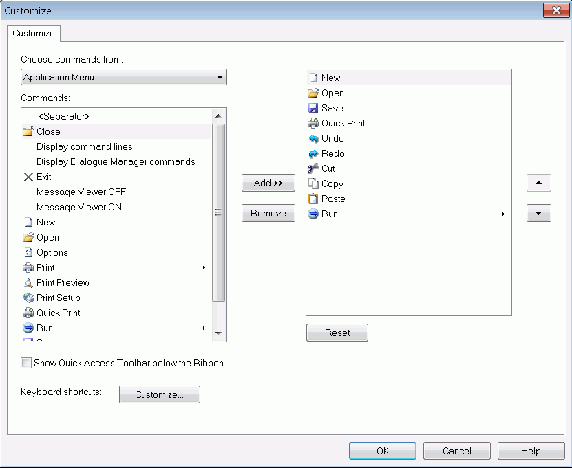
The commands associated with the command group that you selected appear in the Commands list.
The command name appears in the Quick Access Toolbar list.
Note the following about the Commands list:
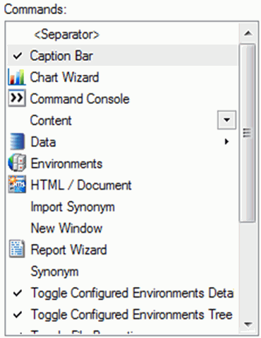
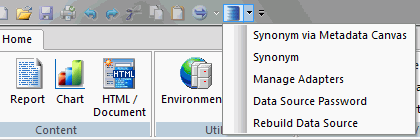
If you select a command group or a command with a submenu, all associated commands are accessible from the Quick Access Toolbar, as shown in the following image.
To remove a command name from the Quick Access Toolbar list, select the command, and then click Remove.
This action also rearranges how the command buttons appear in the modified Quick Access Toolbar.
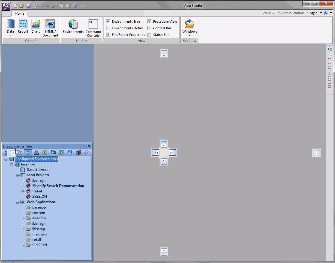
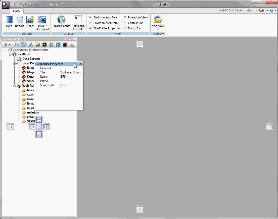
By default, all panels, except the Environments Tree panel, are auto hidden when they first open. You can use the panel customization options, which are located in the upper-right corner of the panel, to change the appearance and location of the panels around the canvas.
To rearrange a panel on your canvas using the panel properties menu, follow these steps:
 .
.
The panel properties menu opens, as shown in the following image.
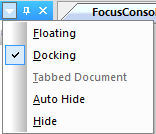
Note: You can also open the panel properties menu if you right-click the top of the panel.
You can pin a panel to the canvas to keep it open while you develop your application. When you unpin the panel, it becomes auto hidden again, and appears as a tab on the edge of the canvas. When you hover the mouse over this tab, the panel reopens.
 .
. .
.You can dock floating panels within the canvas to ease accessibility. When you drag a panel across the App Studio canvas, a set of handles appears. These handles guide the placement of the panel, and automatically dock the panel to the edge of the canvas upon which you rest the mouse.
The following image shows an example of the handles that appear when you drag the Environments Tree panel across the canvas.
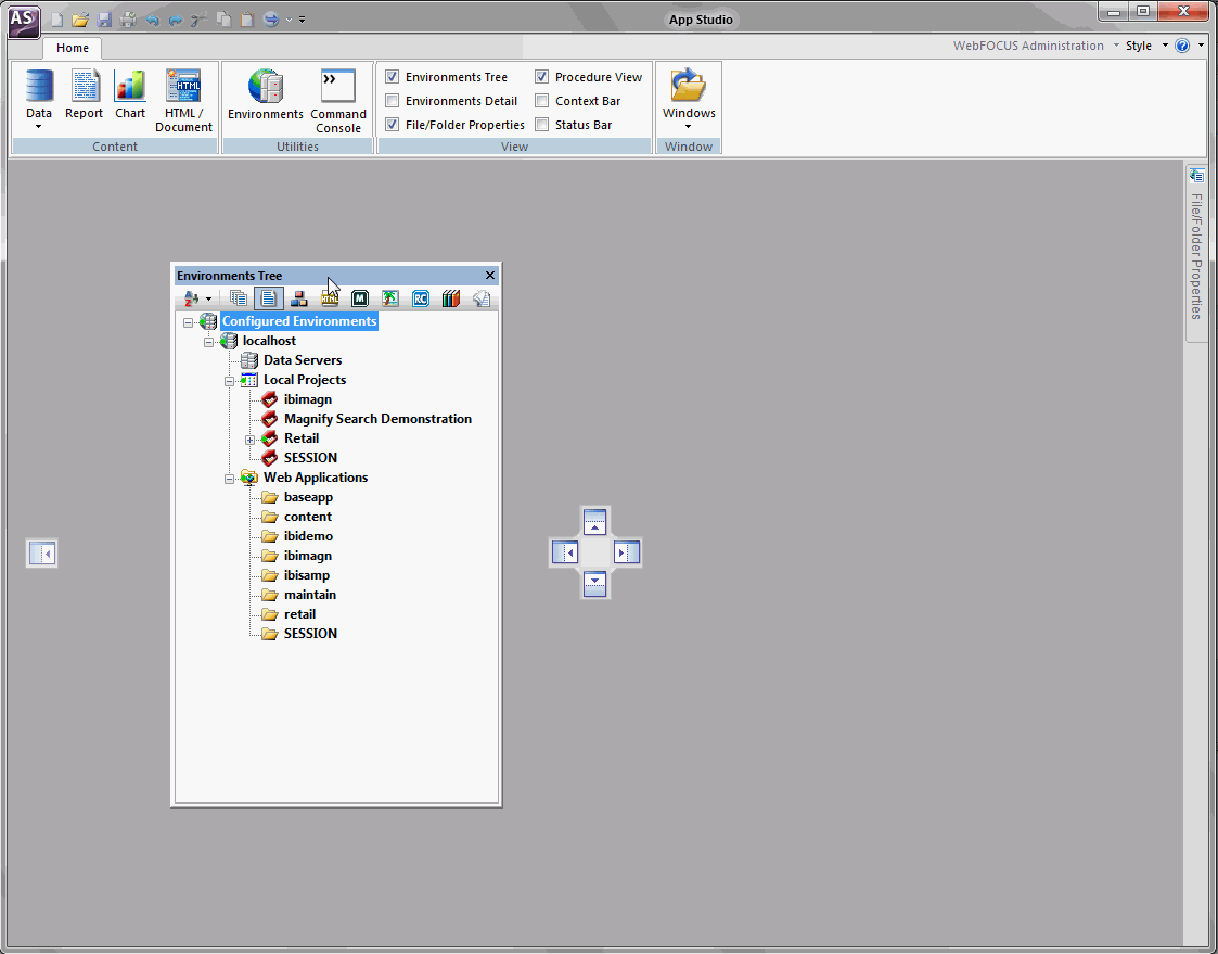
When you rest the mouse over a handle, a shaded area appears. This shaded area provides a preview of where the panel will dock if you release the mouse, as shown in the following image.
The panel automatically docks to the edge of the canvas.
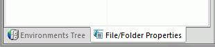
Additional panels open as you develop applications throughout the product. To conserve space around the canvas, you can combine these panels. When you mouse over a docked panel, a tabbed handle option appears, as shown in the following image.
This handle option combines the panels into a single container with tabs. You can switch between the panels by clicking the appropriate tab at the bottom of the container. An example of the Environments Tree tab and File/Folder Properties tab, in a combined panel container, are shown in the following image.
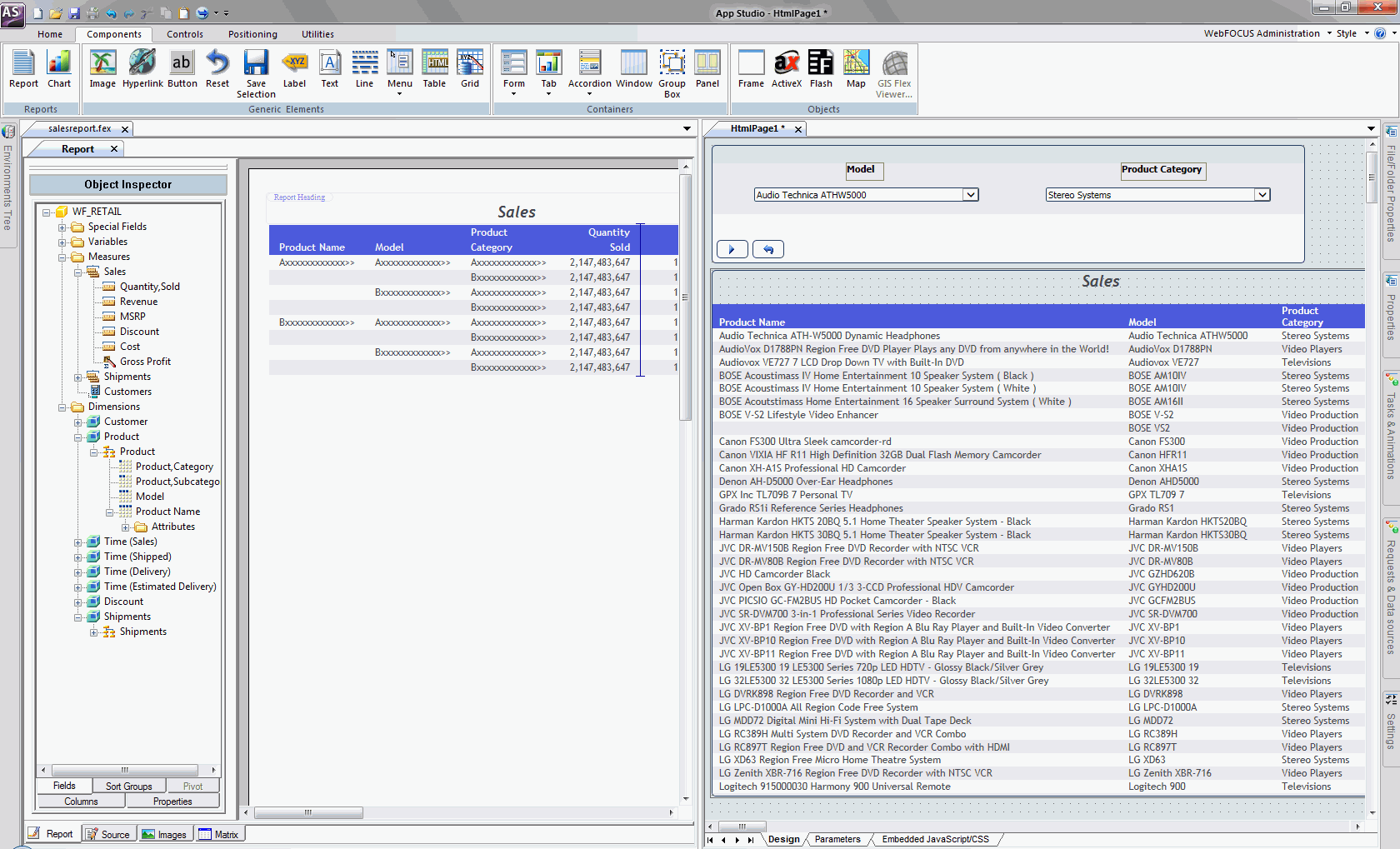
You can switch between the canvases by clicking the colored tab at the top of the canvas. You can also develop in the canvases side by side.
The following image shows an HTML canvas next to a Report canvas.
To create side-by-side canvas development, follow these steps:
A pointer with a document icon  appears.
The canvases now appear side by side.
Tip: Repeat the preceding steps to develop on additional canvases side by side.
You can customize App Studio by setting specific user preferences through the App Studio Options dialog box.
To open the Options dialog box, click Options in the Application menu. The tabs on this dialog box include the following:
These tabs are identified in the subsequent topics.
The General tab contains the following options.
Main Window Options
|
Option |
Description |
|---|---|
|
Maximize main window |
Maximizes the application window when you begin each session. |
Smart Context
|
Option |
Description |
|---|---|
|
Set new column type based on metadata/surrounding fields |
Sets new column types by using metadata and surrounding fields. |
|
Activate Field ribbon tab when selecting a field on the report canvas |
Activates the Field tab on the ribbon upon selection of a field within the report canvas. |
|
Activate Layout ribbon tab when no selection is made on the report canvas |
Activates the Layout tab on the ribbon when no selection is made on the report canvas and you click the white space. |
Other Settings
|
Option |
Description |
|---|---|
|
Show Welcome Screen |
Controls the appearance of the Welcome screen when App Studio is launched. |
|
Confirm close |
Displays a prompt for users to confirm that they want to exit App Studio. |
|
Start local WebFOCUS Server |
Starts the local Reporting Server when App Studio is launched. |
|
Stop local WebFOCUS Server on exit |
Stops and closes the local Reporting Server when you exit App Studio. |
|
Recent file list limit |
Allows you to set the number of recently used files that appear in the Recent file lists. The default value is 25 files. |
|
Ping Interval (minutes) |
Sets the frequency at which requests are sent to the Web/Application Server so your connection does not time out. The default value is 5 minutes. |
|
Reset all message boxes |
Resets all message boxes to their default state. For example, if you selected the Don’t show this message again check box in any message box, clicking this button will reset all message boxes. Once you click this button, it becomes inactive until you choose not to display a message box in the product. |
|
Default file editor |
Lists file editor options, such as:
Note: The Edit in Windows registered tool is only visible if the file type you are accessing has been associated with a Windows application. The file editor used determines which context menu options are available and controls the default behavior for double-clicking and right-clicking files. |
The Reporting tab contains the following options.
Field List Options
The following options affect the appearance of the Fields tab of the Object Inspector.
|
Option |
Description |
|---|---|
|
Sort the list by field name |
Sorts any list of field names alphabetically. |
|
Show fully qualified field names |
Displays any list of field names as qualified field names, which includes data source and table names, alphabetically. |
|
Display the field name |
Displays the full field name in the Fields tab, as specified in the file description. |
|
Display the field alias |
Displays the alternate field name in the Fields tab, as specified in the file description. |
|
Display field titles |
Displays the column title in the Fields tab, as specified in the file description. |
|
Display field descriptions |
Displays descriptive information about the field in the Fields tab, as specified in the file description. |
|
Display the data formats |
Displays the field length and format type in the Fields tab, as specified in the file description. |
|
Expand field tree |
Displays fields in expanded mode when using a Field tree. If this option is not selected, segments appear collapsed wherever a Field tree appears. Note: This option can also be accessed from the Field tree context menu. |
|
Display Filters in Filters Folder |
Displays Filters in a separate Filters folder of the Field tree. If this option is not selected, Filters appear with the rest of the fields in the segment. Note: This option can also be accessed from the Field tree context menu. |
Authoring Mode
The Authoring Mode options determine how field names in a procedure (.fex) are written in the WebFOCUS source code. These options are not affected by the selected Field List options.
|
Option |
Description |
|---|---|
|
Qualified fieldname |
Writes the source code using qualified field names, for example: BY 'GGSALES.SALES01.CATEGORY' |
|
Unqualified fieldname |
Writes the source code using unqualified field names, for example: BY CATEGORY |
|
Alias fieldname |
Writes the source code using alias field names, as defined in the ALIAS field of the file description. The ALIAS field assigns an alternative name for a column. The following example shows source code in which the Category field name is assigned E02 in the ALIAS field of the ggsales.mas file description. BY E02 |
Other
|
Option |
Description |
|---|---|
|
Default Report Format |
Select the display format for your reports. You can select from the following options:
|
|
Maximum number of records to retrieve |
Specifies a limit on the number of records to retrieve from the data source. Setting a retrieval limit creates selection criteria for both Retrieval Limit and Read Limit dialog boxes. Specify a retrieval limit when you need only a few records to test the design of a new report, or you know how many records meet the test criteria and want to stop a search after those records are retrieved. This reduces total retrieval time. |
|
Maximum number of readings to make |
Specifies a limit on the number of readings that can be made against the data source. |
|
Default Style Template |
Specifies the default styling template when you open the Report feature. |
|
Default Report Template |
Specifies the default report settings when you open the Report canvas. Click Browse to select user-created templates. |
The Reporting tab of the App Studio Options dialog box allows you to set a report format to use as the default format by the Report feature.
The following procedure describes how to set the default report format. In this example, User format is selected.
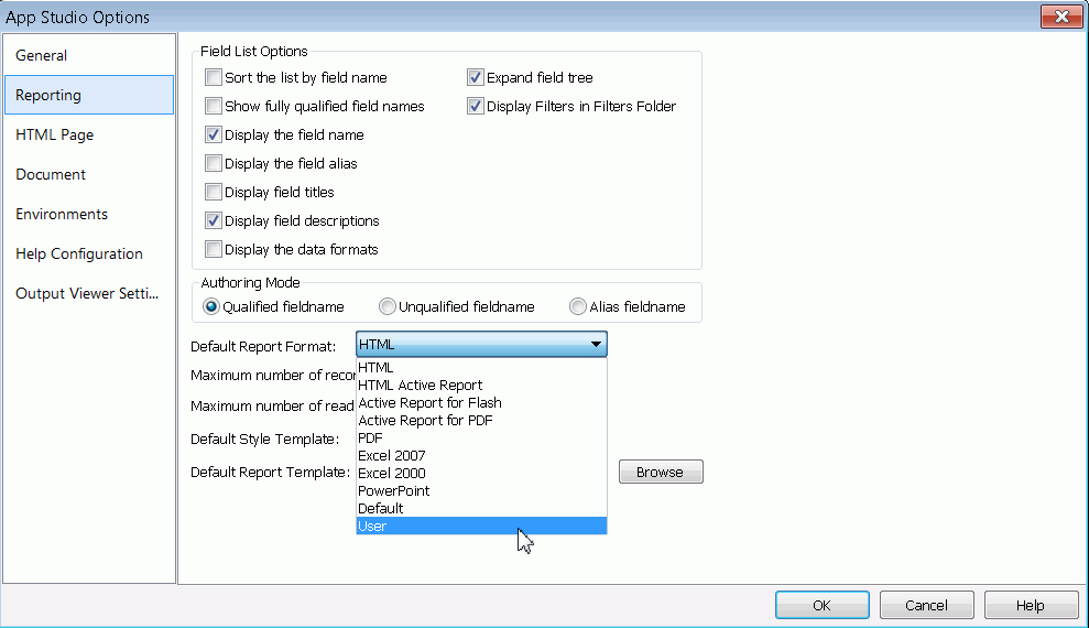
The User output is now the Default Report Option in the App Studio Report mode. The User format allows the application to select the actual output type at run time. For example, a developer could choose to view a report as Excel 2007, PDF, active report for Flash, and more.
The HTML Page tab contains the following options.
Grid Settings
|
Option |
Description |
|---|---|
|
Show Grid |
Enables you to view a grid while you create an HTML page. The Show Grid check box is selected by default. Clear this check box if you do not want to develop with a grid. |
|
Snap to Grid |
Enables you to snap to grid on demand. The Snap to Grid check box is selected by default. Clear this check box if you do not want to enable the snap to grid option. |
|
Width |
Customizes the width of your grid. The default value is 10 pixels. |
|
Height |
Customizes the height of your grid. The default value is 10 pixels. |
Form type
|
Option |
Description |
|---|---|
|
None |
Specifies no layers in the HTML page. |
|
Single layer |
Specifies a single layer in the HTML page. This is the default setting. |
|
Multiple layer |
Specifies multiple layers in the HTML page. |
|
Form Settings |
Opens the Form settings dialog box. The options for Form settings are described in Form Settings Dialog Box. |
Tab Characters
|
Option |
Description |
|---|---|
|
Insert spaces |
Indicates that, when the Tab key is pressed, the number of spaces specified in the Tab size option is inserted. |
|
Keep tabs |
Indicates that, when the Tab key is pressed, a tab character is inserted. |
|
Tab size |
Specifies the number of spaces inserted when you press Tab. |
Check boxes
|
Option |
Description |
|---|---|
|
Show 'New Parameters' dialog |
Sets the New Parameters dialog box to appear in the HTML page. This is the default setting. |
|
Default caching option |
Sets the Default caching option to run in the HTML page. By default, this option is not selected. |
|
Auto Arrange Objects |
Sets the objects in the HTML page to arrange automatically. This is the default setting. |
Preview settings
|
Option |
Description |
|---|---|
|
Reports and Charts Preview |
Enables you to preview reports and charts before saving and deploying the HTML page. This is the default setting. |
|
Simulated Data |
Enables you to run the HTML page based on simulated data from WebFOCUS. |
|
Live Data |
Enables you to run reports and charts using live data in the HTML page. This is the default setting. |
|
Record limit for reports |
Sets the record limit for reports. Values range from -1 to 999. The default setting is 500 records. |
|
Record limit for input controls |
Sets the record limit for input controls. Values range from -1 to 999. The default setting is 10 records. |
|
Use Prefix |
Sets a prefix to run before each report or chart component on an HTML page. |
|
Refresh thumbnails every seconds |
Sets the time interval for refreshing thumbnails. Values range from 0 to 999 seconds. The default setting is 20 seconds. |
|
Default Theme |
Sets the default theme for an HTML page from the Default Theme drop-down list. The Information Builders theme is the default theme. |
The following table describes the options available in the Form Settings dialog box.
|
Option |
Description |
|---|---|
|
To the left of the input |
Sets the prompt orientation to appear to the left of the form settings. |
|
Above the input |
Sets the prompt orientation to appear above the form settings. This is the default setting. |
|
Distance between prompt and input |
Sets the distance between prompt and input. The range is from 0 to 99 pixels. The default setting is 5 pixels. |
|
Horizontal distance between controls |
Sets the horizontal distance between controls. The range is from 0 to 99 pixels. The default setting is 4 pixels. |
|
Vertical distance between controls |
Sets the vertical distance between controls. The range is from 0 to 99 pixels. The default setting is 10 pixels. |
|
Number of columns |
Sets the horizontal distance between controls. The range is from 0 to 99 pixels. The default setting is 10 pixels. |
|
Add schedule button |
Adds a schedule to your HTML page. This is the default setting. |
|
Add defer button |
Enables deferred running of a report. This is the default setting. |
|
Start each chain on a new line |
Starts chains on a new line. This is the default setting. |
The Document tab contains the following options.
Grid Settings
|
Option |
Description |
|---|---|
|
Show Grid |
Enables you to view a grid while you create a document. The Show Grid check box is selected by default. Clear this check box if you do not want to develop with a grid. |
|
Snap to Grid |
Enables you to snap to a grid on demand. The Snap to Grid check box is selected by default. Clear this check box if you do not want to enable the snap to grid option. |
|
Width |
Customizes the width of your grid. The default is 10 pixels. |
|
Height |
Customizes the height of your grid. The default is 10 pixels. |
Tab Characters
|
Option |
Description |
|---|---|
|
Insert spaces |
Indicates that, when the Tab key is pressed, the number of spaces specified in the Tab size option is inserted. |
|
Keep tabs |
Indicates that, when the Tab key is pressed, a tab character is inserted. |
|
Tab size |
Specifies the number of spaces inserted when you press Tab. |
Preview Settings
|
Option |
Description |
|---|---|
|
Reports and Charts Preview |
Enables you to preview reports and charts before saving and deploying the document. This is the default setting. |
|
Simulated Data |
Runs the document based on simulated data from WebFOCUS. |
|
Live Data |
Runs reports and graphs using live data in the document. This is the default setting. |
|
Record limit for reports |
Sets the Record limit for reports. Values range from -1 to 999. The default setting is 500 records. |
|
Use Prefix |
Sets a prefix to run before each report or chart component on a document. |
|
Refresh thumbnails every seconds |
Sets the time interval for refreshing thumbnails. Values range from 0 to 999 seconds. The default setting is 20 seconds. |
Note: The Environments options are used to control the development areas that are visible in the Configured Environments tree. At least one option must be selected and applied to all configured environments.
The Environments tab contains the following options.
Environments settings
|
Option |
Description |
|---|---|
|
Show Projects area |
Displays the Projects area in the Configured Environments tree. This is the default setting. |
|
Show Data Servers area |
Displays the Data Servers area in the Configured Environments tree. |
|
Show Repository area |
Displays the Repository area in the Configured Environments tree. |
|
Show Web Applications area |
Displays the Web Applications area in the Configured Environments tree. |
The Help Configuration tab provides the fields in which you can modify the App Studio Help configuration information to access the online Help system from your environment.
|
Option |
Description |
|---|---|
|
Protocol |
Specify the protocol, either HTTP or HTTPS. |
|
Host |
Type the name of the machine where the Help resides. |
|
Port |
Type the port number of the web and/or Application Server. |
|
Help Context Root |
Type the context root for the location where the Help is hosted. |
The Output Viewer Settings tab enables you to set a specific browser to use for output or to use the App Studio Internal Viewer (default), and to set the navigation options for the output (run in new window, run in same window).
|
Option |
Description |
|---|---|
|
Browser Setup |
Select a browser to use for output or select the App Studio Internal Viewer (default). Note:
|
|
Browser executable path |
Sets the location of the browser executable. This field box is populated based on the browser selection. |
|
Web driver location |
Sets the location of the web driver for the browser. This field box is populated based on the browser selection. |
|
Test URL |
Indicates the test URL for testing the browser setup. The default URL is http://www.ibi.com. |
|
Test browser setup |
Tests the browser setup, using the test URL. If the test is successful, the webpage will display in the browser and you will receive a success message. If the test is unsuccessful, you will receive a failed message. |
|
Save selected browser setup |
Saves the setup information for the selected browser. |
|
Run in new window |
Sets the output to run in a new window. |
|
Run in same window |
Sets the output to run in the same window. |
| WebFOCUS |
 in the
upper-right corner of the panel.
in the
upper-right corner of the panel.