Autosize Children is an option you can access from the Properties panel, in the Miscellaneous section, in the HTML canvas. Autosize Children changes the size of any component added to the canvas to fit the maximum size of your available screen space. For example, one component will take up one hundred percent of the available space, while two components will take up fifty percent each. This option is used so that when your HTML page is run on different devices, components and controls do not appear off the screen and have to be scrolled to in order to use them. Depending on the available space, components may move to accommodate this. If a report and chart are side by side when run on a computer, they may appear stacked on top of each other when run on a tablet.
Note: When Autosize Children is turned on, the components you add to the canvas will be positioned and ordered differently, depending on the available space. When your HTML page is run at full screen, using the Autosize Children option, that HTML page will appear differently on 24-inch monitor than a 26-inch monitor.
You can use the Autosize Children option by doing the following:
- In the Properties panel, in the Miscellaneous section, change the Autosize Children option from No to Yes.
- In the HTML/Document wizard, on the Themes and Settings pane, in the Other Settings area, select the Autosize reports/charts for page option. Selecting this option changes the Autosize Children option from No to Yes when the HTML page is created.
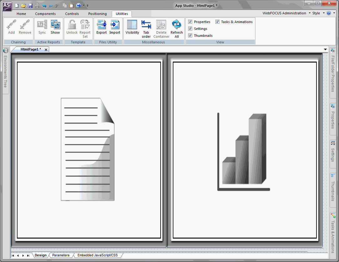
The Autosize Children option is turned off by default. The following image is an example of the Autosize Children option turned on.

The following image shows a report component and a chart component on the HTML canvas while Autosize Children is enabled. Both components share the available space evenly.
Autosize Children is available for any container object, such as a form, tab, window, accordion, panel, or group box. With multi-page containers, such as a tab container, Autosize Children is available for each page, so that each page can have this option on or off, independent of the rest.
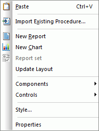
While Autosize Children is turned on for a container object, there is a small amount of canvas space shown to the bottom and right of the canvas or object. This is so you can use the canvas shortcut options. This extra canvas space is not shown at run time. The following image shows the canvas shortcut options when you right-click on the canvas.
Each component or control you add to the canvas has a Core attribute named Autosize options. Autosize options contains four selections that are used to set how you want that object to be handled in the HTML page. The following image shows the Autosize options property and selections.
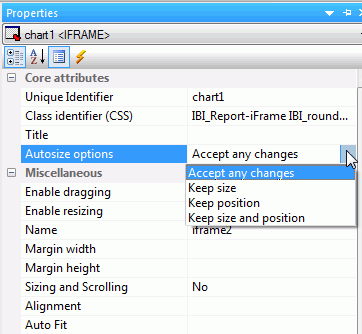
The four selections you can choose are:
- Accept any changes
-
The object can change in size and position when the HTML page adjusts to fill the available space.
- Keep size
-
The object can change in position but not in size when the HTML page adjusts to fill the available space.
- Keep position
-
The object can change in size but not in position when the HTML page adjusts to fill the available space.
- Keep size and position
-
The object cannot change in size or position when the HTML page adjusts to fill the available space.
Which objects are rendered first when a page is run depends on which option they have set from the Autosize options property. The rendering order is shown below.
- Objects with Keep size and position set.
- Objects with Keep position set.
- Objects with Keep size set.
- Objects with Accept any changes set.
You can move objects around the canvas at design time. However, objects with the Autosize options property set to Accept any changes, need to be moved by holding down the Alt key and dragging to the desired position. Once you are done moving objects around the canvas, right-click the canvas and select Update Layout to refresh the canvas and view the new layout positioning.
Note:
- Whether Autosize Children is on or not, the Autosize options property is available for any object.
- If you place an object that has Autosize Children set to No inside a container that has Autosize Children set to Yes and the Autosize options property set to Accept any changes, the object will move to the upper-left corner of the container.
- When a container has Autosize Children set to Yes, and a report or chart is added to that container, the Autosize options property for the report or chart is set to Accept any changes.
- If an object has the Autosize options property set to Keep size and position, and you would like that object to take up the entire width of available space, you must set the width property to 100%.
- On mobile devices, Autosize Children will recalculate whenever the orientation of the device changes from portrait to landscape or landscape to portrait.
- Reports and charts do not automatically re-execute once the page loads and the screen size changes. You will need to re-execute reports and charts to display them properly. If the output format of a chart is HTML5, the chart content will refresh automatically and you will not have to re-execute.