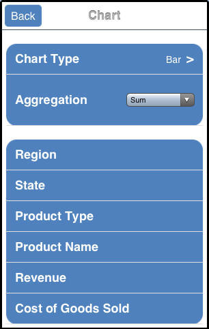
When you run an active report on an iPad, you can tap Chart or touch the right arrow for the Chart menu option to display a menu that specifies the default value for the type of chart that will be displayed and the default aggregation (calculation) that will be used to draw the chart. Also listed are the columns that are available for display on the X-axis of the chart (the Group By columns).
The following image shows a sample Chart menu. In this example, the default chart type is Bar and the default aggregation is Sum, for the selected numeric data column. Columns that can be displayed on the X-axis (Group By columns) are listed on the menu.
You can access the same menu from the Advanced Chart icon at the bottom of the screen if you are already in a chart in full-screen web app view. This menu and icon apply to ARGRAPHENGINE=JSCHART.
Tap a Group By column for the X-axis to automatically generate a chart that is the result of the default values and the selected X-axis column. The chart is displayed in tab view, with a new Chart tab appended after the Report tab and any other existing tabs.
The chart is generated in full-screen web app view by default, if you are in that view.
Alternatively, you can tap the Chart Type menu to change the chart type or tap the Aggregation drop-down menu to change the calculation type, before selecting the Group By column to generate the new chart.
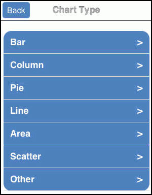
Tapping the Chart Type menu displays the Chart Type options, as shown in the following image.
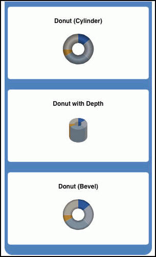
You can now tap a category, such as Pie, and then tap the Donut chart type that will be used to display the chart. The following image shows some of the charts in the Pie category.
If you are using the WebFOCUS Mobile Faves for iOS app, it may take a moment for the chart types in a chart category to be displayed. There is no JavaScript engine that renders JavaScript faster inside the iOS app, and JavaScript cannot take advantage of features such as hardware acceleration.
On the new Chart tab, you can change the values to customize the chart for your reporting needs. You can also manipulate the way that you present the data.
| WebFOCUS |