|
How to: |
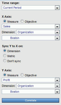
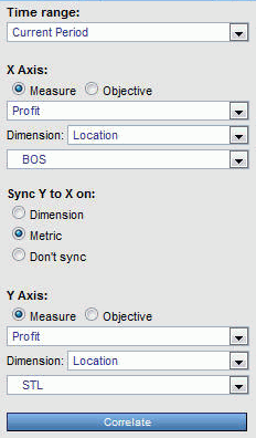
You can view any two metrics, two objectives, or one metric and one objective, to determine their relationship, or correlation. For example, you can:
- Determine if there is a real cause-and-effect relationship between two measurements, and if so, determine if it is positive or negative.
- Correlate the performance of a single metric in the different areas of your organization to see if the performance is part of a general trend, or is an outlier that is statistically unrelated to the rest of the data.
- Use the correlation results to help you set targets for individual areas in your organization.
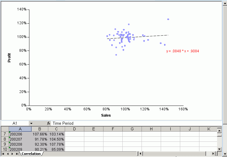
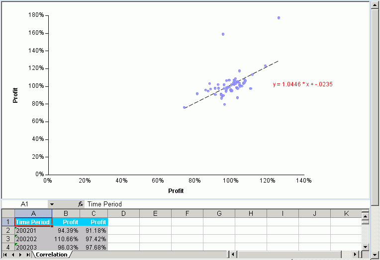
There are many ways to correlate data using various statistical methods. PMF uses the percent achieved of an objective or measure to determine how points of data are plotted on the Correlation scatter plot. Each plotted dot represents the intersection of a single point in time for two different metrics. The Correlation view displays a linear plot showing the relationship between all points of data.
The following image is an example of the PMF Correlation view.
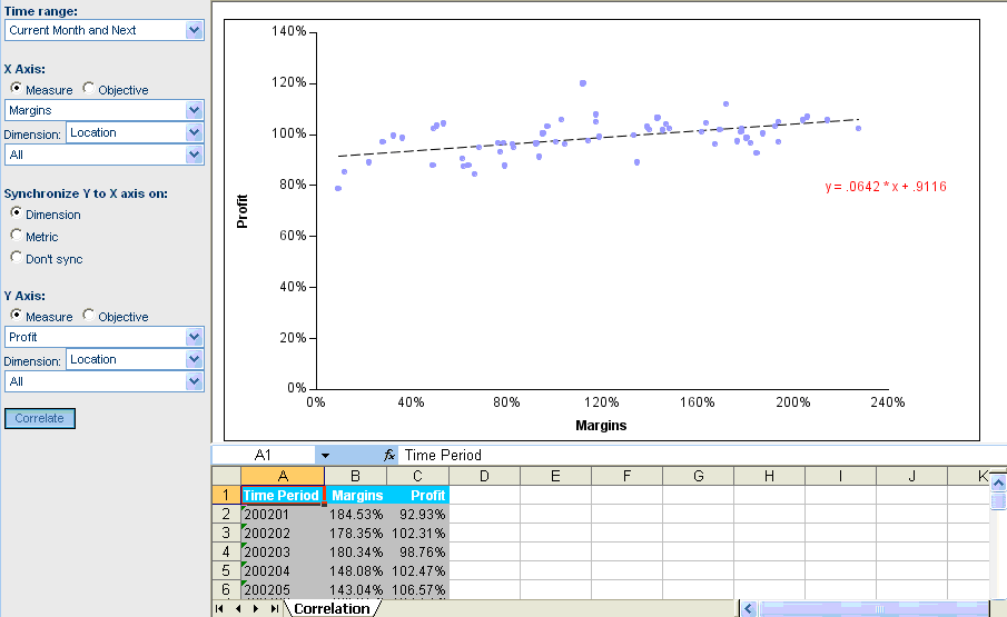
The Correlation view also displays the correlation coefficient equation, which indicates the correlation of the data. The following are the three possible types of Correlation:
- Positive Correlation. When the correlation coefficient is close to +1, there is a positive relationship between changes in the two measurements. This indicates that when one measurement improves, it causes the other measurement to improve in an equally positive manner.
- Negative correlation. When the correlation coefficient is close to -1, there is a negative relationship between changes in the two measurements. This indicates that when one measurement improves, it causes the other measurement to decline in an equally negative manner. For example, if one measurement improved by 10 percent, the other measurement declined by 10 percent.
- Zero correlation. When the correlation coefficient is close to zero, there is no linear relationship between changes in the two measurements. This indicates that there is a very low or non-existent level of correlation between the two measurements.
