In this section: How to: |
The Autosize Children option resizes all components on an HTML page to automatically fit the maximum available screen space on any monitor or device where it might be viewed. For example, a single component will take up one hundred percent of the available space, while two components will take up fifty percent each.
This option is used so that when your HTML page is run on different devices, components and controls do not appear off the screen and have to be scrolled to in order to use them. To accommodate this, the orientation of components may be different on different devices. For example, a report and chart that appear side-by-side when run on a desktop monitor, may appear stacked one above the other when run on a tablet. Similarly, this difference could occur when run on a 24-inch desktop monitor and a 26-inch desktop monitor.
There are autosize properties that work at both the document and component levels:
The Autosize Children property is also available at the component level for any container object, such as a form, tab, window, accordion, panel, or group box. With multi-page containers, such as a tab container, Autosize Children is available for each page, so that each page can have this option on or off, independent of the rest.
Note: To use Autosize Children with container objects, you must also set the Autosize options property to Accept any changes.
You can prevent the component from becoming too small, using the Autosize: min width and Autosize: min height options. Type the minimum number of pixels for the width, height, or both, in the appropriate fields. When a component reaches the minimum width or height that you specified, a scroll bar appears and the size of the component does not decrease further.
Note: You can use the Autosize options property for any HTML file, whether Autosize children is set to Yes or No.
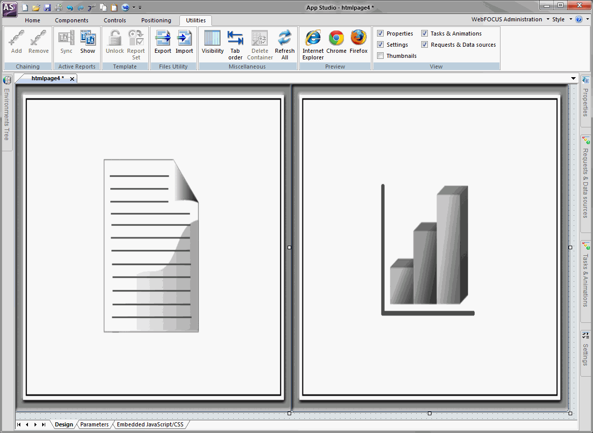
The following image shows a report component and a chart component on the HTML canvas where Autosize children is enabled. Both components share the available space equally.
You can enable autosize for an existing HTML file or create a new file with the option enabled.